

Akana Bros Construction
We had the pleasure of working with Akana Bros Construction, located in Kapolei, Hawaii. They came to us in needing professional branding for their construction business. We created a bold, vintage inspired logo for them that features a custom AB monogram.
Design Process
For the Akana Bros Constuction logo, we wanted a bold logo that signified strength and had a strong base to it. We created a custom monogram with the AB letters to tie in the Akana Brothers name and make it an iconic symbol that can be used by itself on other marketing ideas.
Overall, we wanted to give this logo a timeless and classic feeling, hinting at the idea that this company has been around for a long time and is a staple in Hawaii.
The colorway for this brand was inspired by nature, especially birds and the ocean. Mother nature comes up with the perfect color combos every time. We went through a bunch of color options and kept coming back to this version over and over… We loved the simplicity of the color pallet, the highlight inner line in the outside shape gives the logo a nice dimension, the bold white Akana that jumps out and the perfect dark ocean blue against the turquoise blue of the truck. The balance just felt right to us. The ocean vibe kept popping up in our brainstorm sessions, we are so tied to the ocean and nature it just made sense to incorporate these colors given the constraints of the truck color; it made for a really unique color combo that stands out from the rest of the competition!
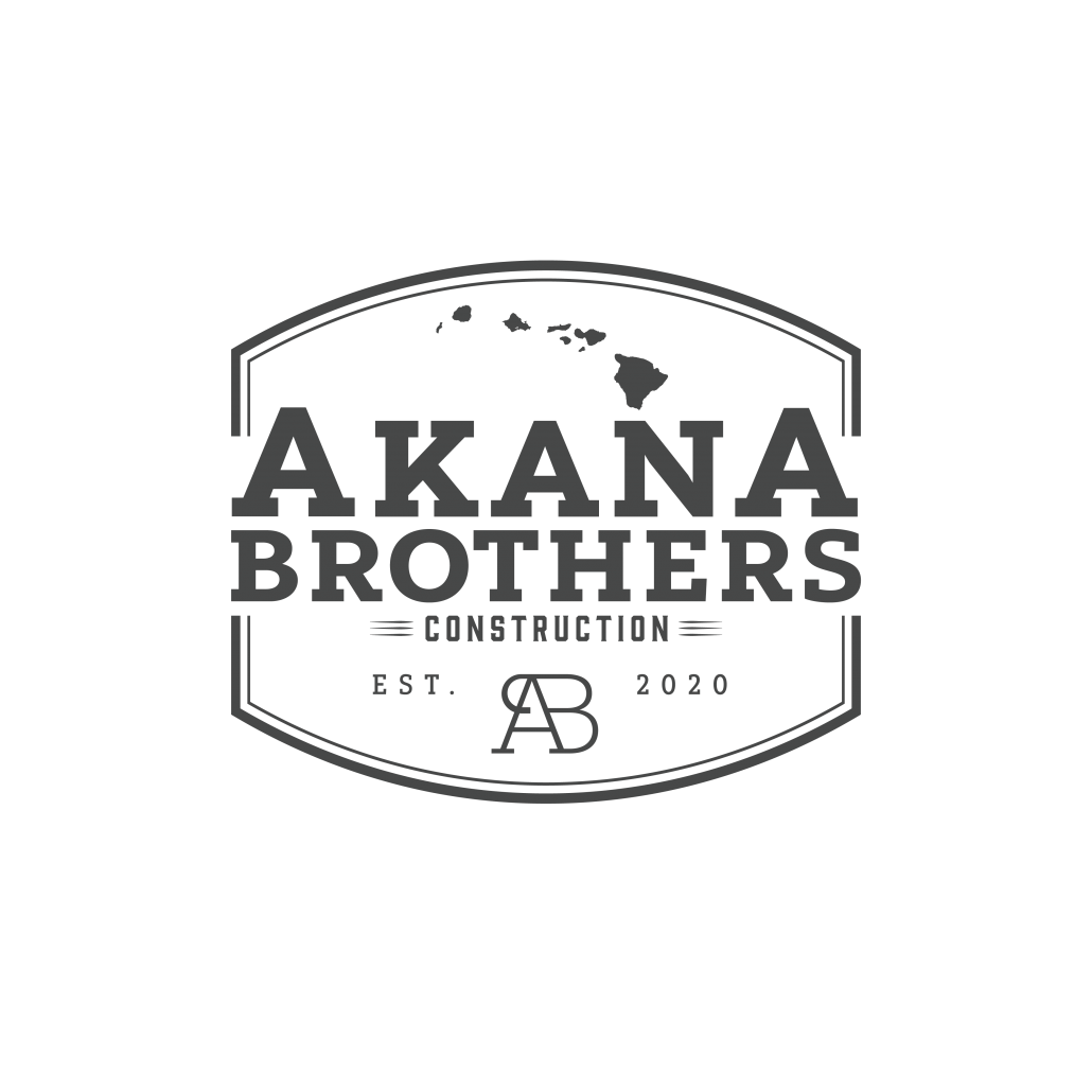
This was one of the first concepts we came up with! We decided we loved the vintage vibe and custom monogram we created.
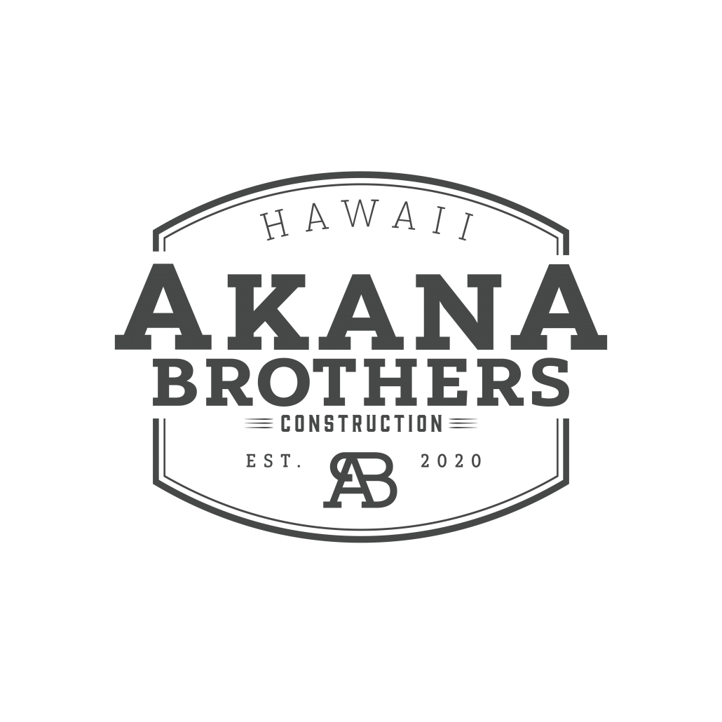
For this logo concept we added in Hawaii and adjusted the type and monogram a bit to make it feel more bold and strong. We also decided to remove the Hawaiian islands.
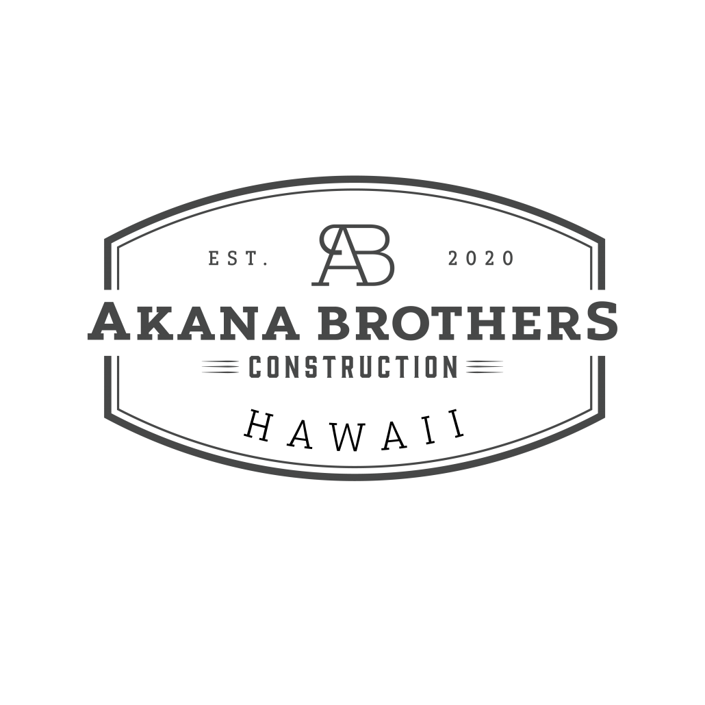
We adjusted the frame we created so that we could show “Akana Brothers” on one line. We loved the look of this. We also moved the monogram and Est. 2020 to the top of the design.
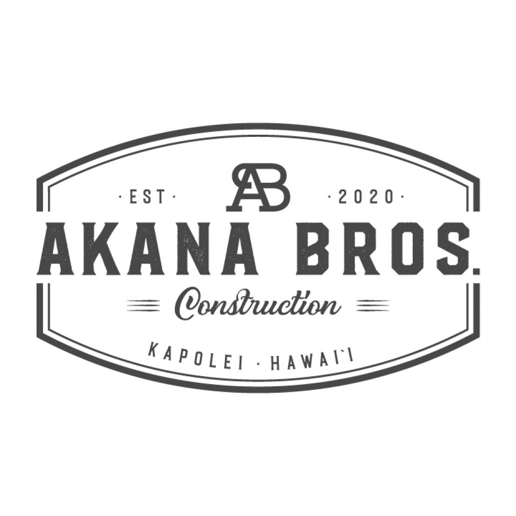
For our final design, we decided to shorten “Akana Brothers” to Akana Bros. We also brought in a vintage script for the “Construction” text and changed “Hawaii” to Kapolei, Hawaii to be more specific to where our client is located.
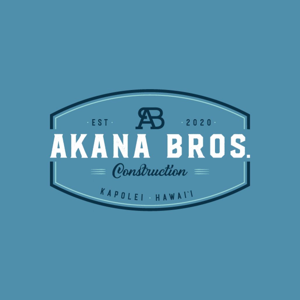
Here’s what our final design looked like in color! We absolutely loved this color scheme, and so did our client! It was inspired by birds and the colors of the ocean in Hawaii.
Branding Examples
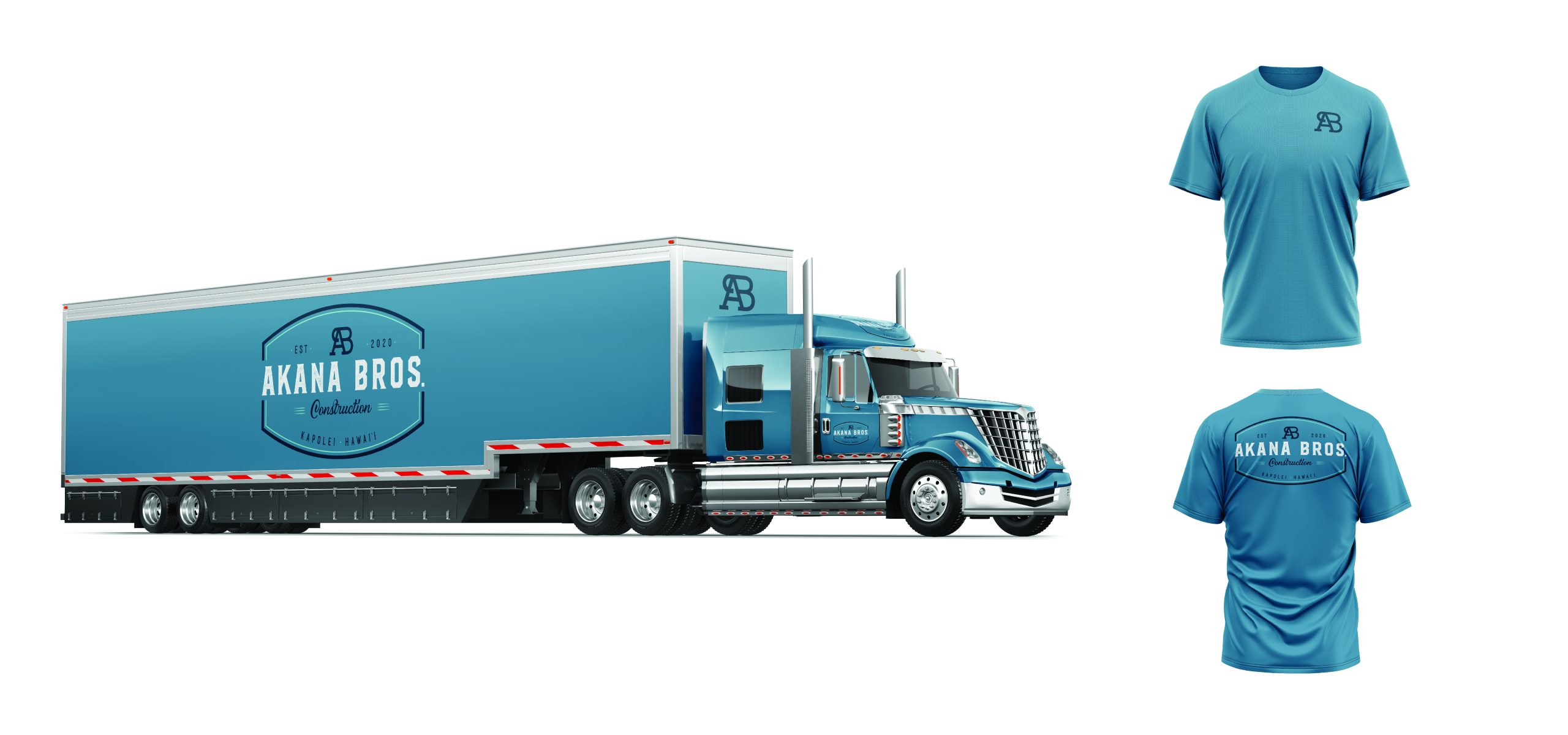
We presented two concepts to Akana Brothers Construction: a big rig truck with their logo on it along with the front and back of a t-shirt design.
