

Color Exploration: V2
Justin! Thank you for your patience, we reworked the colors according to your notes and created something we think you’re going to love. Let me know what you think!

Aloha! We have new colorways for you to review, we wanted to continue with the vintage look and chose colors that were reminiscent of that era. Let us know what you think!


Face Edits:
Let me know what you think of these edits:


Concept: Illustration Revision


Concepts: Round 1
Aloha, thank you for your patience as we explored various approaches for your logo! We have a few ideas for you to review. We wanted to give the logo an iconic sense of feel, our idea was to create a logo that seems like it has been around for decades! A logo that looks like its been established since the 70’s giving it an authentic trustworthy feel to it along with it being modern, fresh and stylish!

Concept 1: Has a beautiful and creative play with the A and S giving this logo a nice movement and boldness that stands out! Your grandmothers gaze is focused on the name which is a nice tie in that brings the whole layout together

Concept 2 centralizes Aunty with a graphic representation of a rainbow which symbolizes new growth, and the emergences of the new business as she looks down upon you with pride! We felt this was a very personal and intimate approach to the logo with a deeper story behind the graphics.

This really fun and clever approach pays homage to the vintage era, the golden age of design which makes this logo feel timeless and classic with a little bit of flair which is representational of your grandmothers contagious smile!
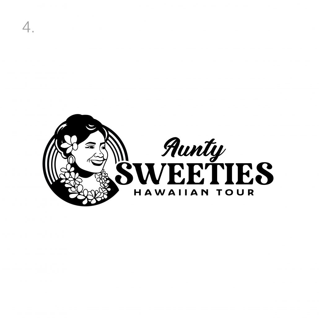
Concept 4 is a nice combination of all aspects discussed earlier and creates a unique layout with the abstract rainbow in the back. We love the interaction of the type with concept, very bold and iconic approach. This logo is based on vintage Hawaiian Airlines style of logo

Our last concept is a round version of the above that gives you a different layout to consider, we love the change of size with the two S’s. We hope you enjoyed and we hope we have brought your vision to life!
Mahalo
Aloha and welcome to your project webpage! We will use this page to track the process of the logo along with revisions and concepts.
“The vision I have for the logo is my grandmas face and her big smile ( I will get a picture of her to you). The composition is similar to the Hawaiian airlines logo with her head and neckline. I like the look of the old Hilo Hattie poster ( my grandma looks like her) and the vintage Pan Am Airline posters. Especially with the art and fonts of letters. Her favorite flower was the Gardena if that can be worked in. The color pallet is purple pink yellow white, along those lines. Most people who book tours and plan vacations are women so I’d like to appeal to their esthetics. It’s important that people have a feeling of family and the warmth of a grandma when they look at the logo.”


