Colorways:
V2 colorways:
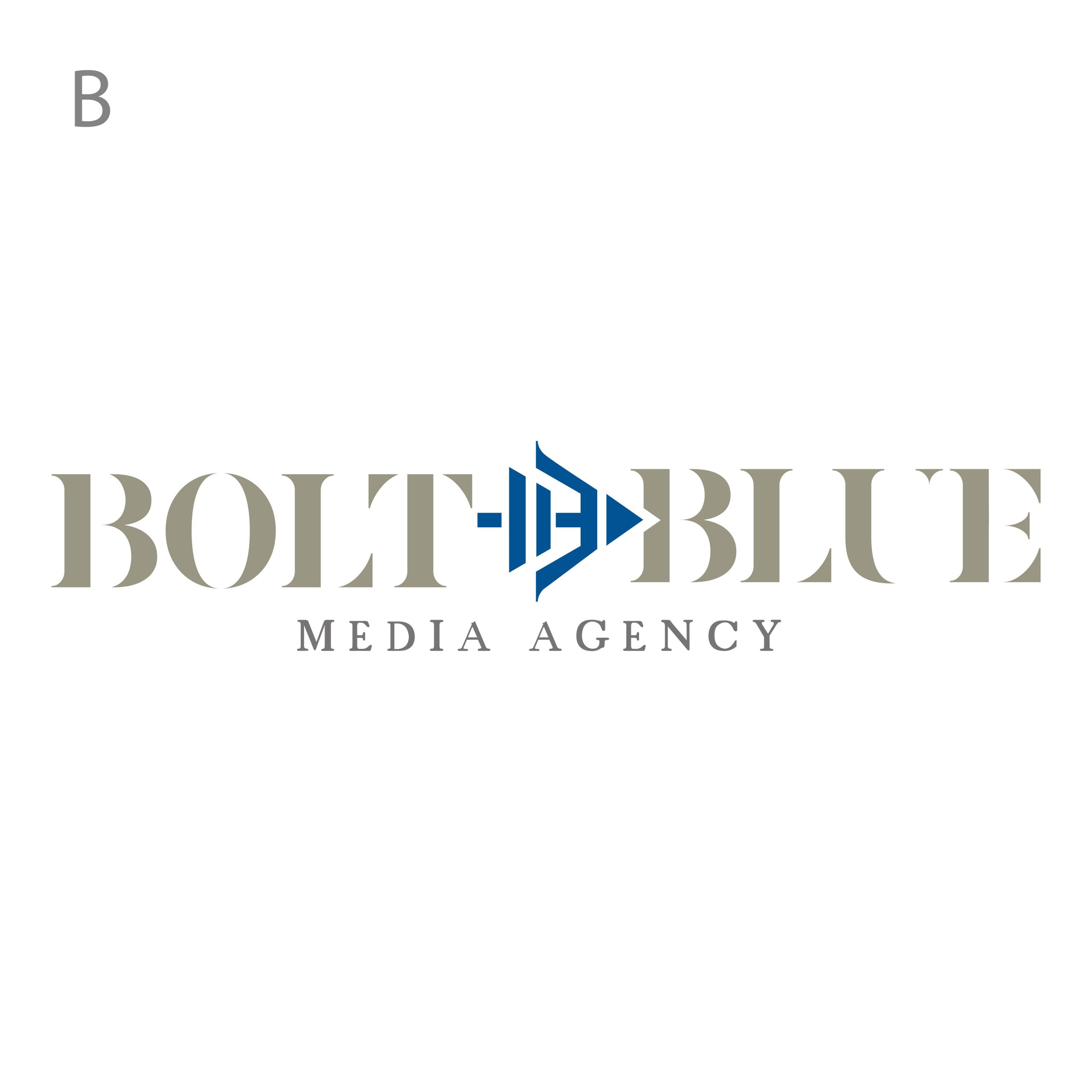
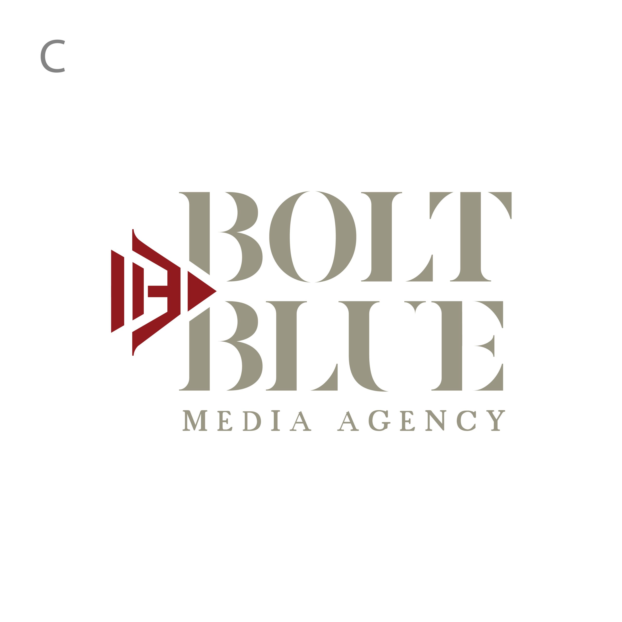

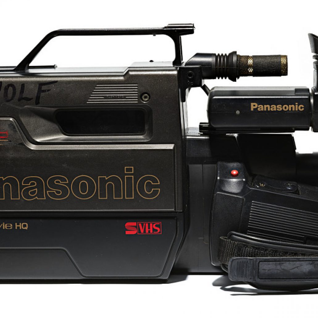
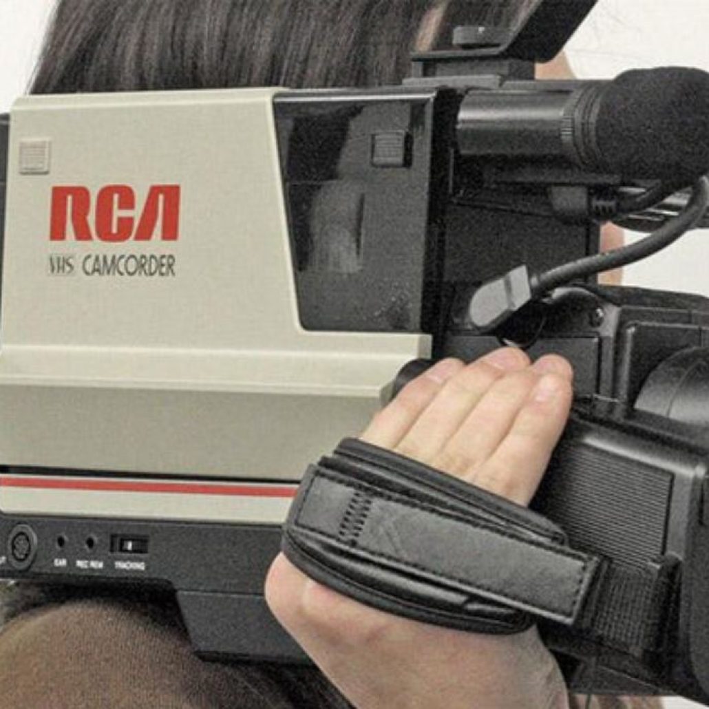
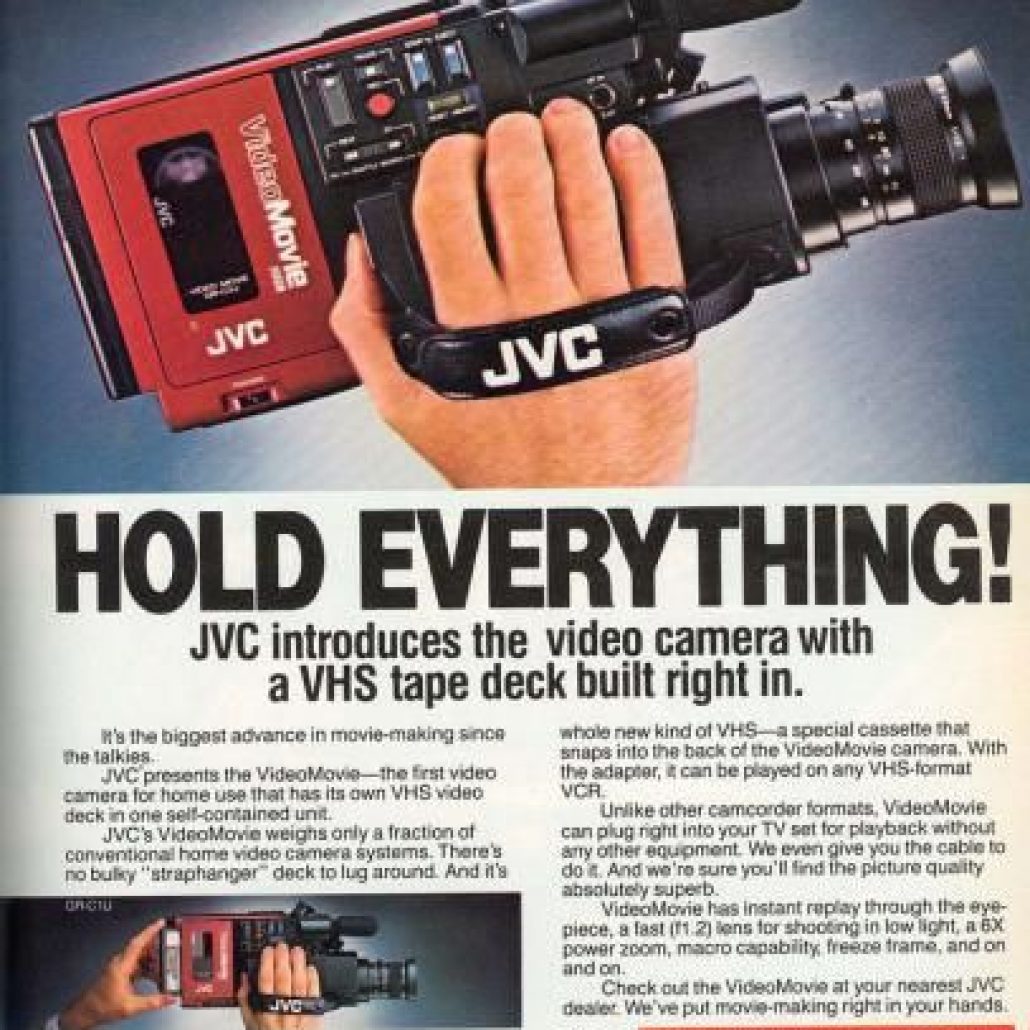
We are always trying to think outside of the box and go towards the unexpected. We wanted to veer left of the blue color. We were inspired by 1980s vintage VCR’s and Video Cameras.






Blue versions were inspired by the hues from a beautiful blue sky to give you that option as well
Revisions:
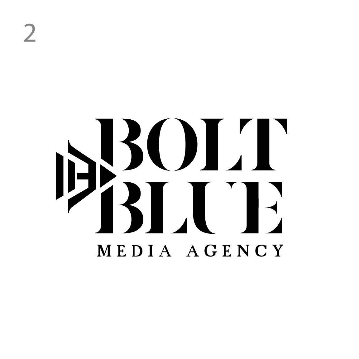
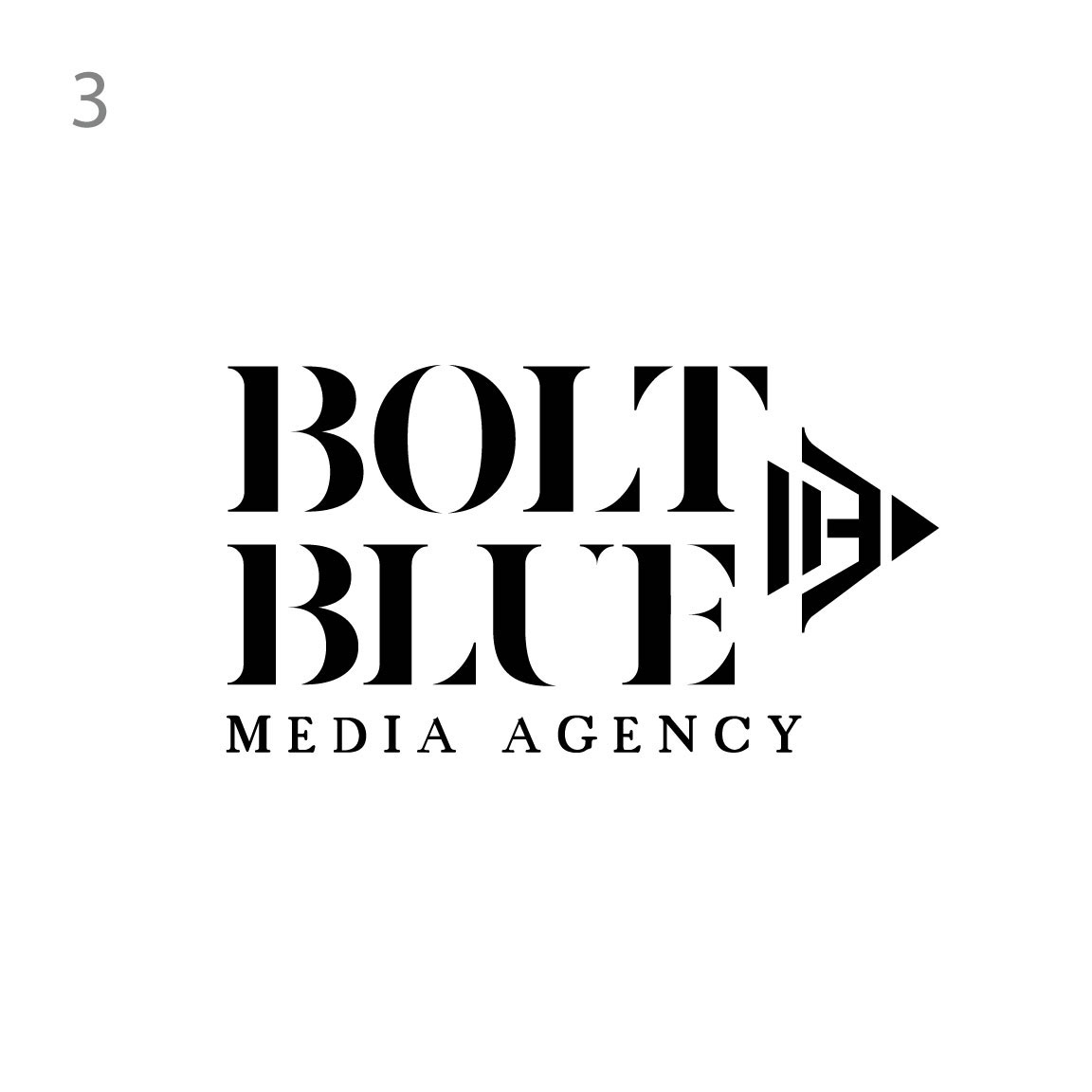
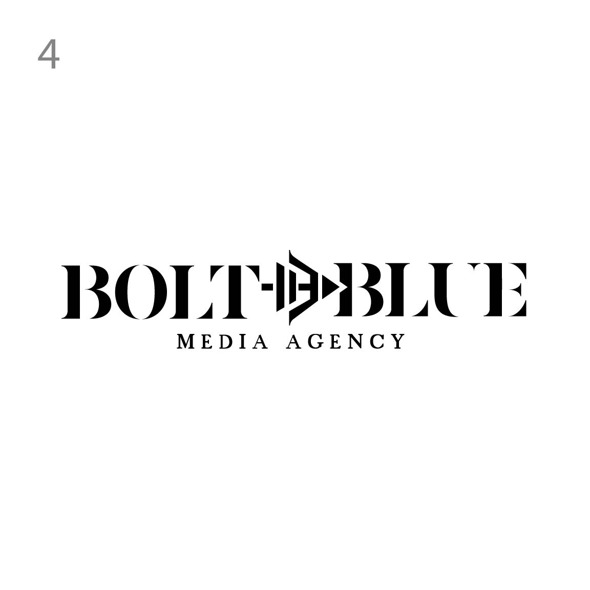


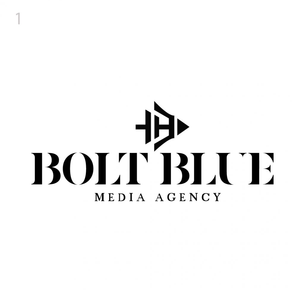
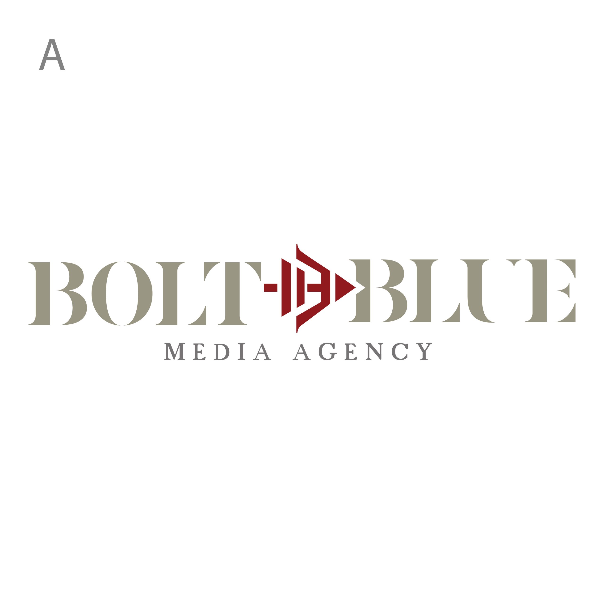
All our concepts have double and triple entendre , each logo has multiple layers of meaning. Our first concept is based on the crossbow, stemming from the term bolt out of the blue which referred to a cross bow falling out of the sky. The first crossbow was invented by the Chinese which we give an homage to with an abstract almost character version of the crossbow. The text mimics the form of the crossbow in the cut outs of the serifs, especially in the B’s. The icon if you look closely is compromised of the pause and play buttons which tie in with the video aspect of the company. Really subtle meaning that can be a great conversation starter. Icon would be a great merchandising graphic
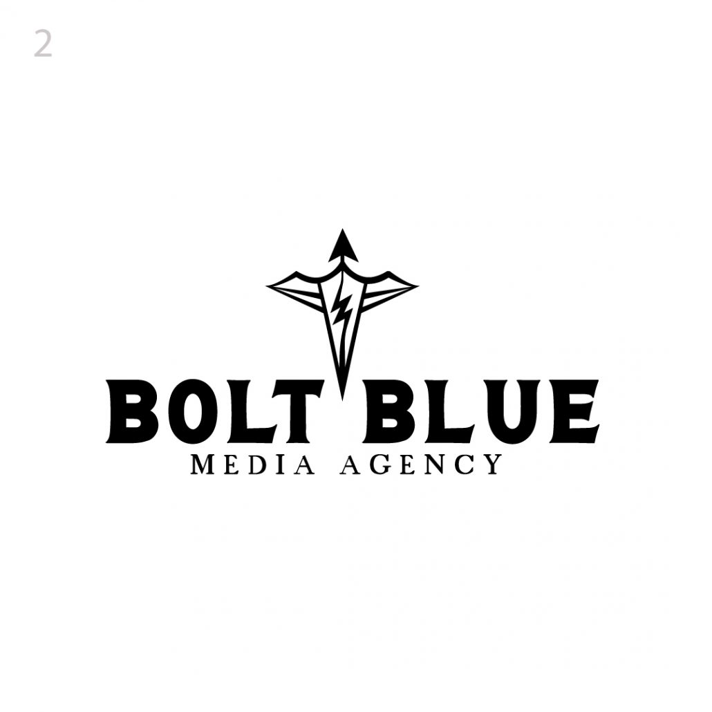
Our second concept also plays on the crossbow idea but with a new twist. This style of graphic is meant to evoke the shape of a crossbow but also an abstract bird which ties in the Hawaii element of the brand. A sea bird flying towards land as would be a “bolt” flying from the machine, the arrow pointing upwards signifies the company continuing to elevate and grow. Subtle lightning bolt in the middle of the bow is a great dichotomy between elevating and being grounded as you need both to be successful. The third meaning is an idea comes from above and is put through electricity onto the paper… from top to bottom figuratively
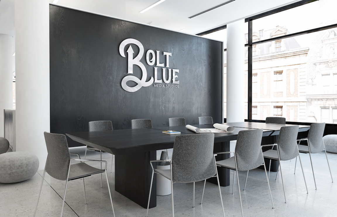
This very bolt and graphic logo takes a play on the vintage calligraphy ink pens. The reason for the pen on this logo stems from our conversation about your team writing and creating everything from scratch, scripts, concepts etc. The idea of electrifying the pen with creative genius is apparent in this concept. the boldness of the logo towards the top of the image and funneling down into a fine point is significant
This is a really fun and historical logo. The idea behind this concept is based on vintage logos from the 30’s with the old Sears & Roebuck style. This logo has a clever “bolt” graphic in the stem of the B. The feel for this logo is meant to give off the perception that this is a long established and reputable company that seems to have been around for decades. In the same breath, it has a really nice modern and hip feel to it

This concept breaks away from the previous ideas and explores a new approach. The idea behind this is a more literal movie clapper representation but still cleverly incorporates the bolt in negative and positive space within the same shape. A very iconic and unique solution
Our last concept is broken into three different versions, the idea behind this one was centered around a movie reel! The idea was based on the golden era of hollywood, an homage to the old film production studios with a modern twist. We love the art deco style and wanted to bring a little bit of that flavor into a concept
