

Dotson Garden Design & Yard Services
History of Dotson Gardens
Mr. Dotson wanted a logo and branding identity that would stand out from the rest of crowd. When we did our initial comp research into the landscaping industry we found that 90% of the logos looked the same and had the same color pallets; greens and yellows. We are very thankful for clients that think outside the box and dare to go against the norm, it lends itself to a very exciting and unique project that will make this business a leader in marketing and brand recognition.
Design Process
Our client had a deep affinity for orchids, his introduction into the landscaping industry came from his passion for growing orchids so we wanted to pay homage to that initial love. We wanted to approach this logo with a very soft, gentle and welcoming angle. When customers see this logo we wanted to convey these feelings; calm, trustworthy and friendly.
Our first approach was aimed towards a vintage bold typeface that we loved. During our initial meeting our client expressed that while they liked the look, it was a bit too hard for them. We agreed and continued to something softer and friendlier. They absolutely loved the orchid icon and the branches on the top so we kept that piece.
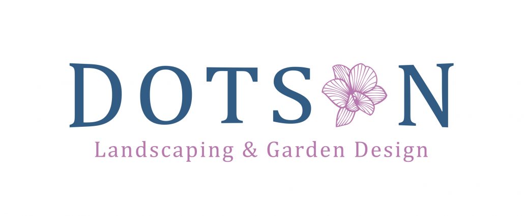
This was the beginning of softening up the look of the logo. We went to a more round style of typeface to smooth the feel of it. We kept the orchid image and added a tagline above. This logo ended up being just a bit busy
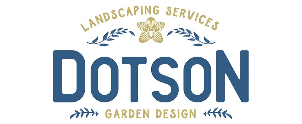
A new vision was created with this logo, this was the beginning of what would be the final. We discovered the serif font on this logo, we felt this was the right direction for the logo, it was still a bit soft but still had the strong foundation vibe we were looking for. The tagline in a capital serif really stood out for us and we wanted to explore this more.
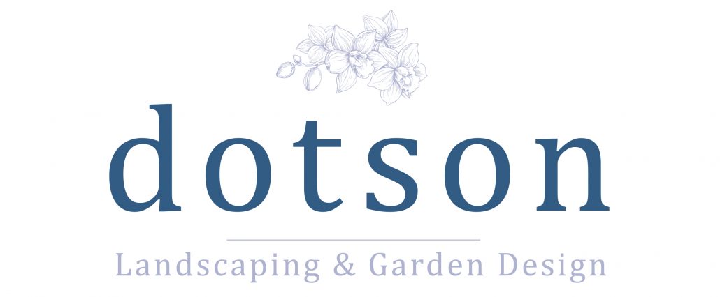
Our favorite version, we loved the capital serif typeface for the brand and we loved the introduction of the lavender color, the combination with the blue really gave this logo a very sophisticated and trustworthy approach. We loved the simplicity and classic feel of the tagline under the brand. The client wanted to stick with the orchid icon above the brand in the arch format.
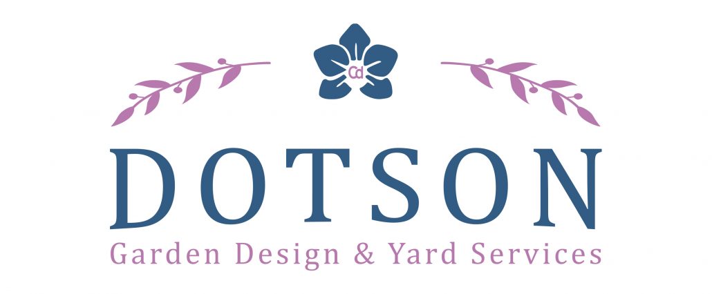
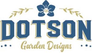
The final! We combined the capital serif from the previous version with the orchid icon on top and put both together to form a really elegant, iconic logo that we both really loved. You will remember this logo when you see it. We loved working on this project and are thankful for the trust.
Branding Examples
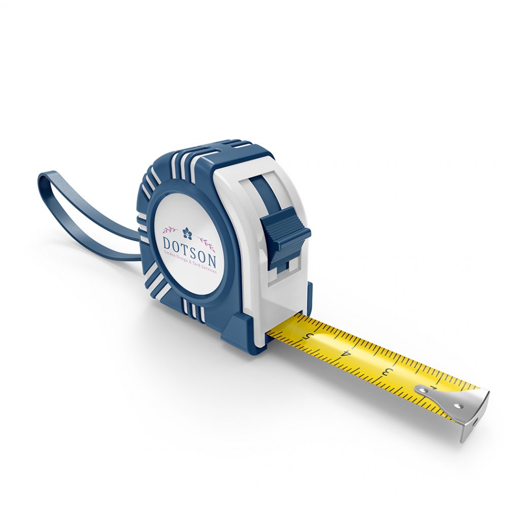
Through product mockups we give our customers the ability to see their brand in a real world scenario, we want to show clients how to use their new logos properly and the wonderful versatility a great logo can create. These products are offered through our promotional products website
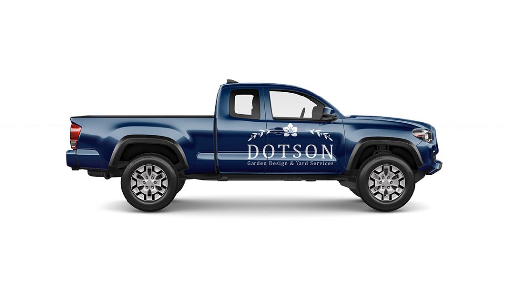
A vehicle wrap is such a great way to advertise your business. We spend so much time in traffic, why not take advantage of it! This is a simple logo placement, we can design full or partial wraps to suit your needs.
Brand Guidelines
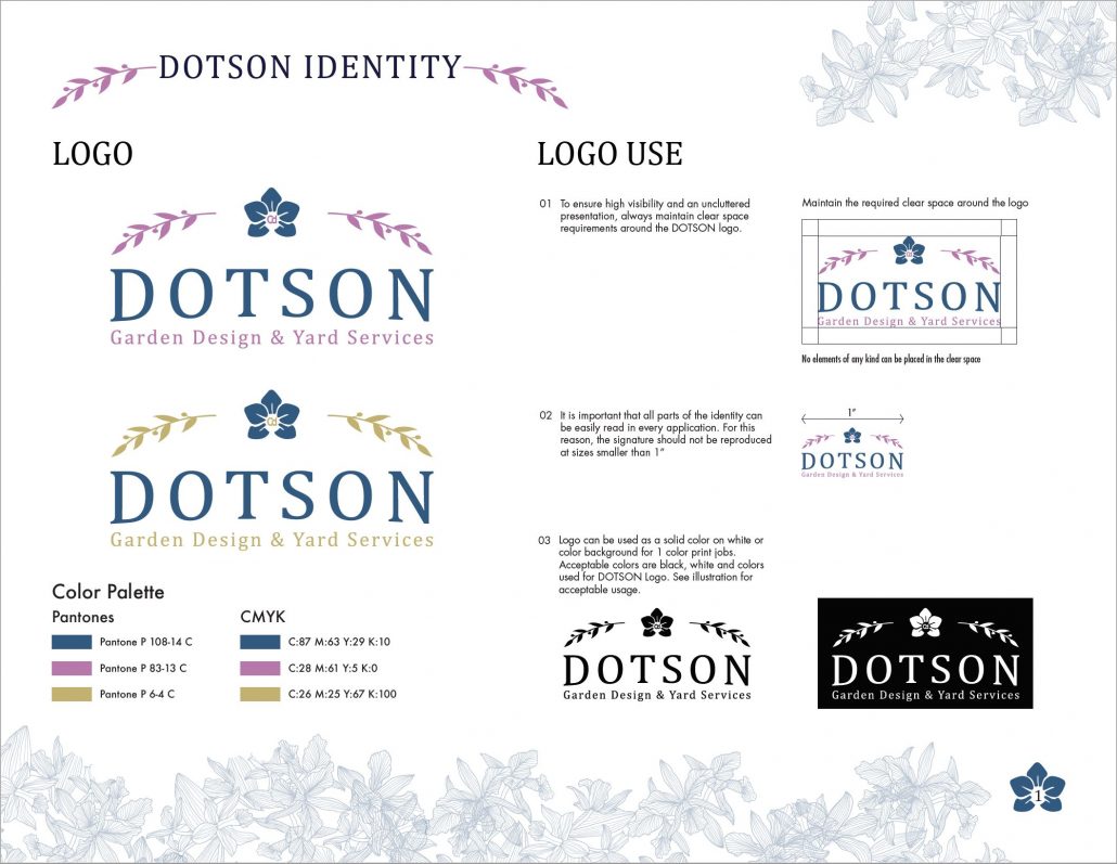
Our logo packages include a detailed brand guideline brochure that will help you stay consistent while using your new logo and color pallets. The key to a great brand is consistency and proper execution. We make that process simple and clear to follow.
