Hale Kealaula LLC
We were approached by Selena Green, the owner of Hale Kealaula LLC and a Certified Professional Midwife (CPM) with a rebranding project. They have a dedicated and supportive staff who and respect women and babies during the home birthing process. We loved bringing this client’s dream to life!
Design Process
Selena, the owner of Hale Kealaula and a Certified Professional Midwife (CPM) among with her staff are dedicated to supporting and respecting women and babies through home births.
After much collaboration, extensive research, sketches, initial drafts and thoughtful revisions, we were able to bring our client’s dream to life!
If you’d like to learn more about Hale Kealaula, visit their website: www.halekealaulallc.com
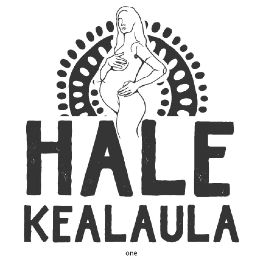
This logo concept was based on a linear contour drawing, the idea for the woman is that we use one continuous line to draw her figure representing our linear life from birth to death. We wanted to give her a power pose to symbolize the strength of women. African art inspired the stylized rising sun in the background represents a new day, tying in to the new beginnings meaning of the name.
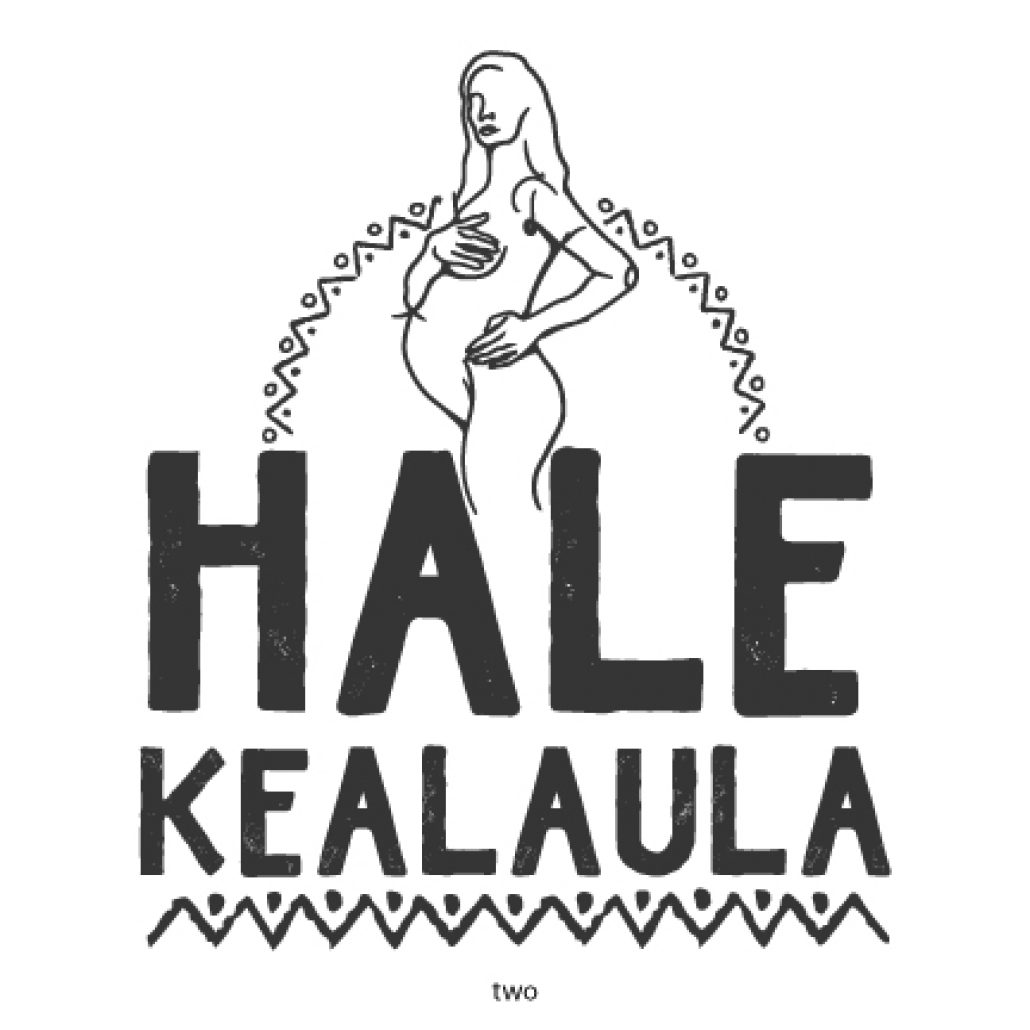
This next version uses a pattern that is more of a combination of Polynesian and African pattern work, interweaving both cultures. It uses finer lines for the woman above the text giving the design a more delicate feel. The sun was inspired by African art patterns. Like the previous design, we wanted to use bold, strong hand drawn typography to give the logo an organic and warm feel.
This unique approach uses negative space to create the outline of the A in Hale. The woman is standing strong as she looks up to receive that morning sun shine! The circle dots on the bottom of the text represent a subtle wave connecting our island culture to the logo. She is looking upward while holding her soon to be born child which represents looking forward to a new life and new beginnings!
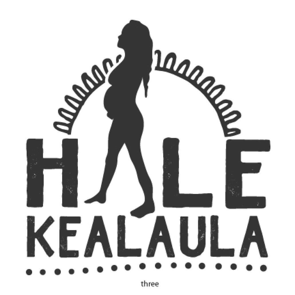
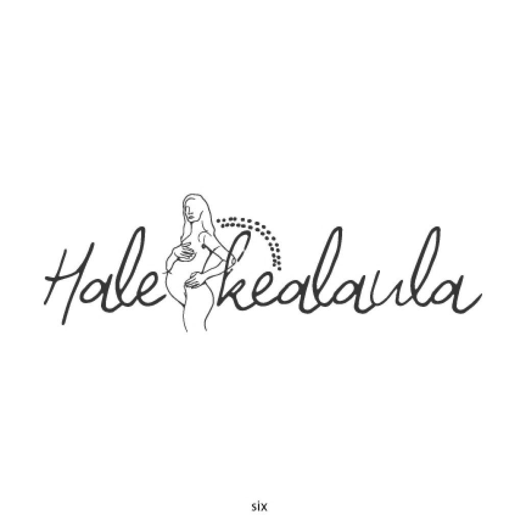
This variation uses a more simplistic sun drawing with the addition of the Polynesian influenced wave pattern tying in the sun, and ocean theme with the text and woman symbolizing our island. The interconnections of nature and man were our inspiration.
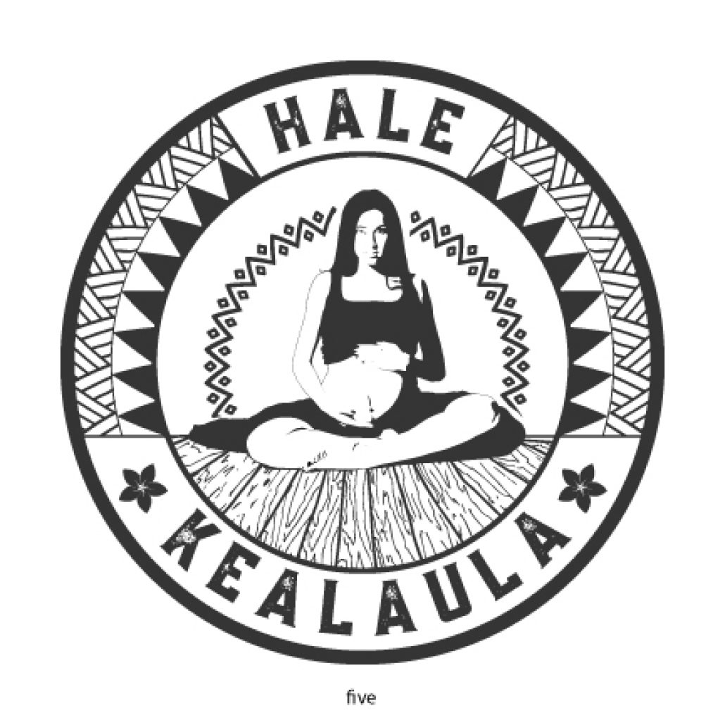
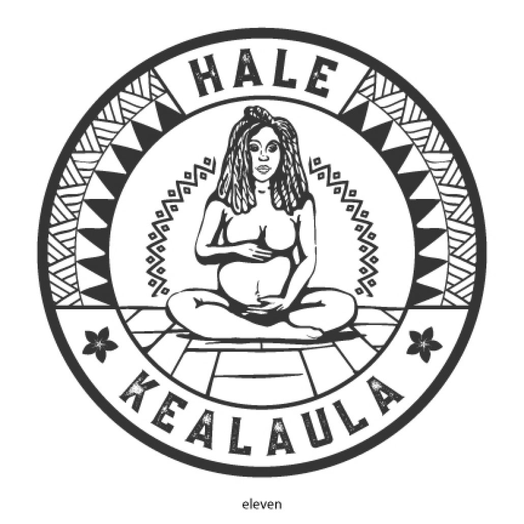
This concept goes in a complete different direction. Our inspiration behind this was to focus on the circle of life, positioning the detailed illustration of the mother in the center. We wanted to include both Polynesian and African inspired patterns in this as well. The concentric circles pay an homage to looking within for strength and being connected to everything else around us.
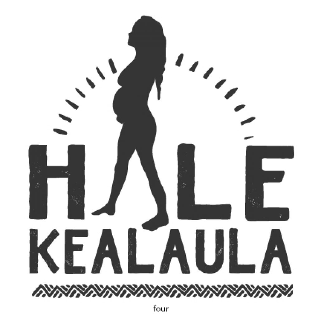
This version strips away a lot of the symbolism and focuses on the linear path discussed earlier. This type is connected throughout and represents one’s life span. Very clean, simplistic and elegant approach.
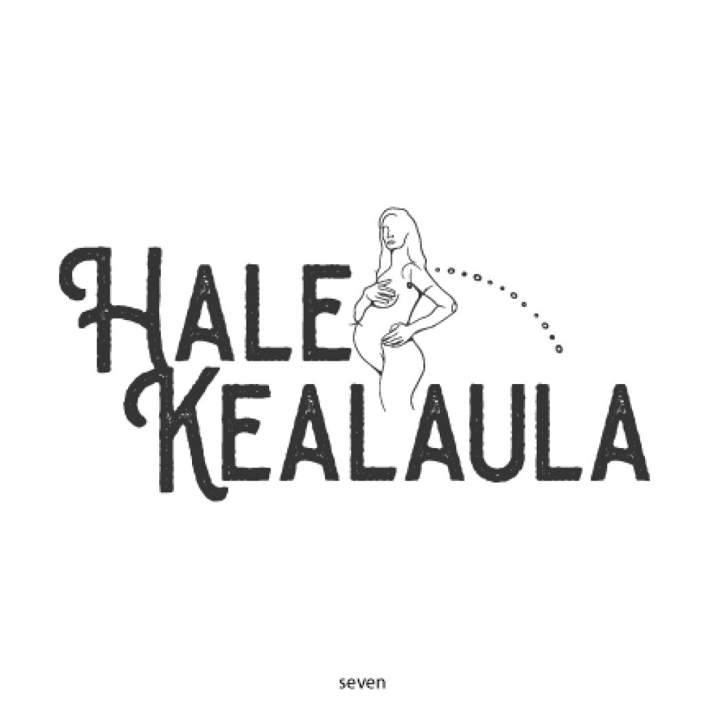
We loved the typography for this version and the way the H and K fit together. The typography flows nicely with the illustration of the woman and is a bold and unique approach.
This was our final version in black and white before we moved onto color options! For this final draft, we redrew the woman and added dreadlocks as requested by our client. We also redrew the flooring to represent the Tatami mat pattern. Our color scheme we wanted to be bright and joyful.
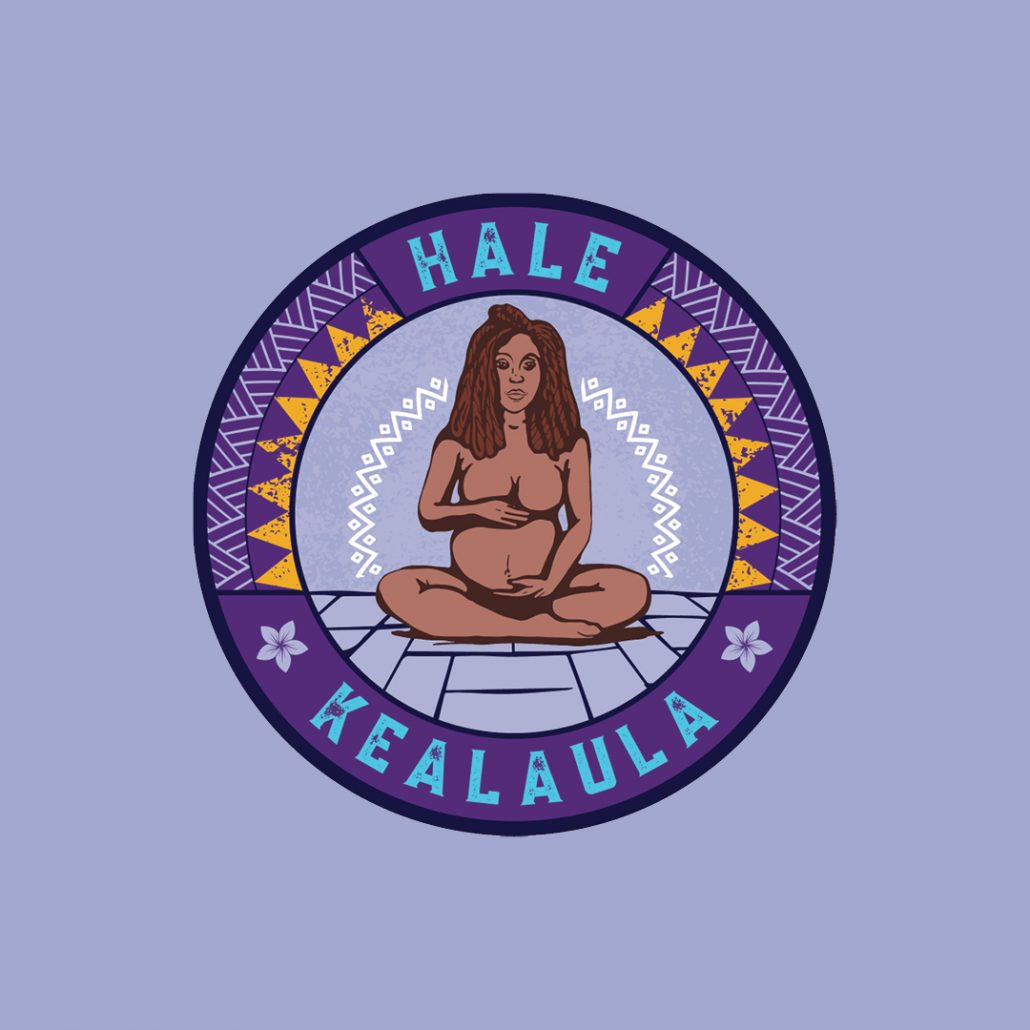
Our final color option was overall inspired by traditional textiles found in Africa. This color scheme was inspired by a specific piece that included a lot of purple, golds and turquoise. Our client loved her final logo and the color scheme we came up for her brand!
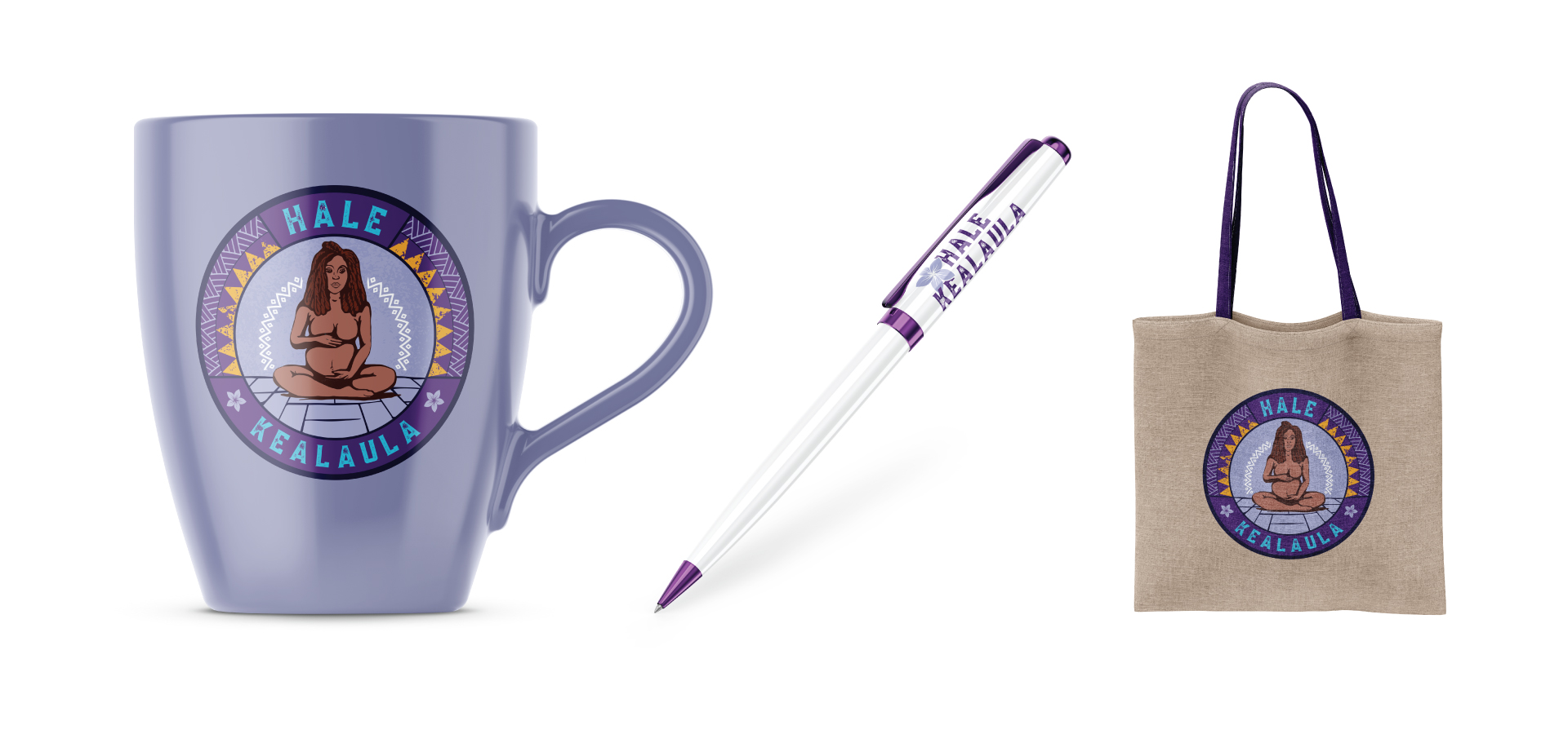
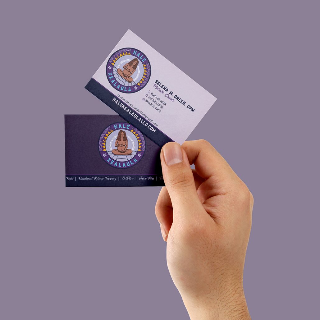
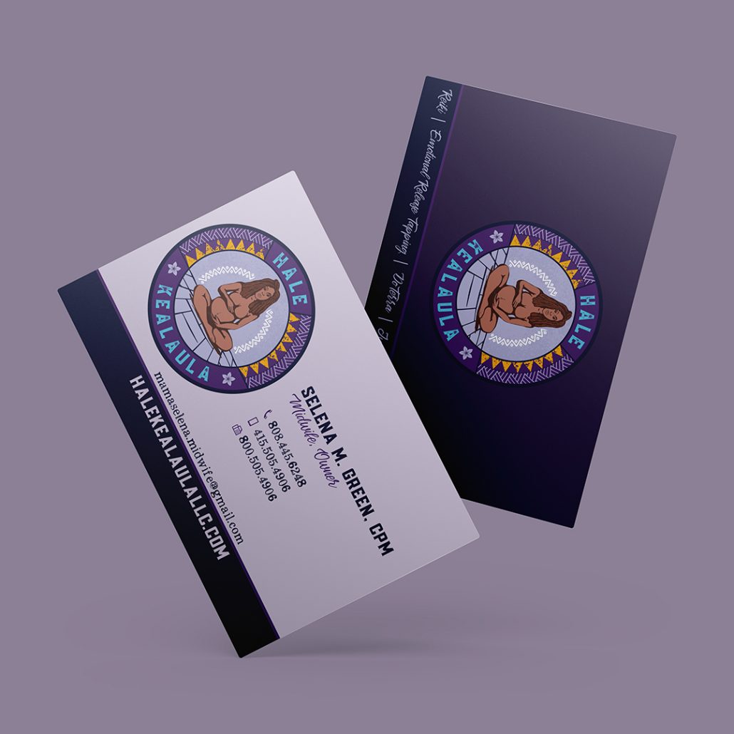
Branding Examples