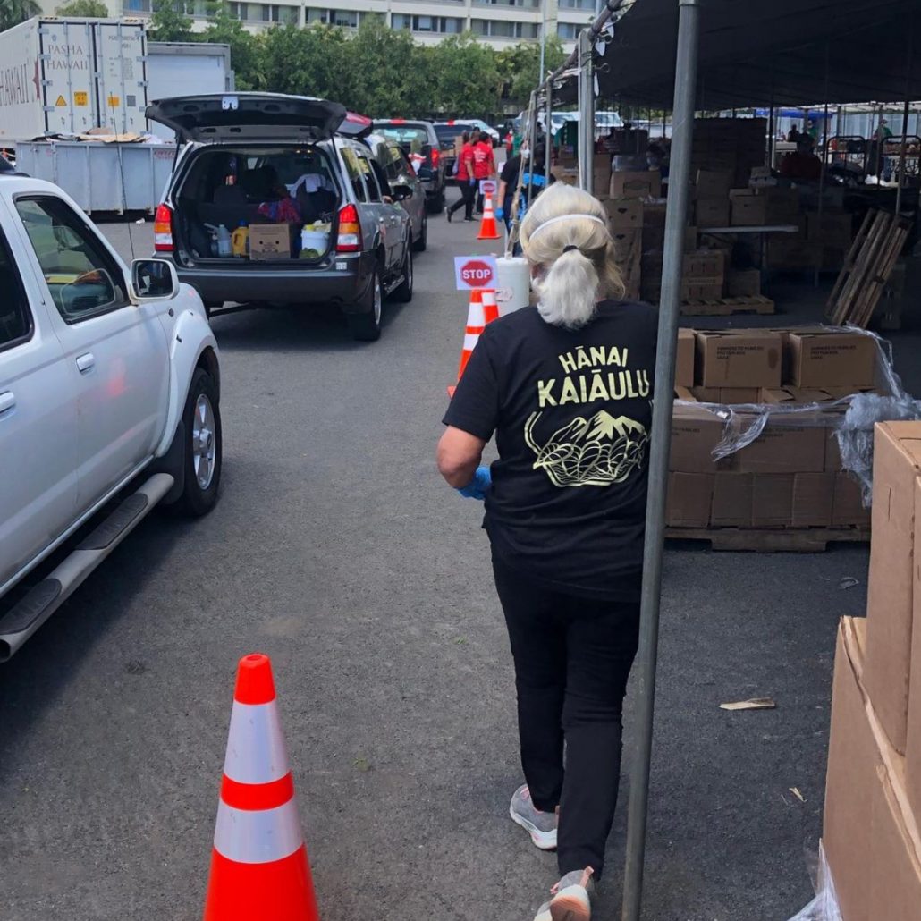
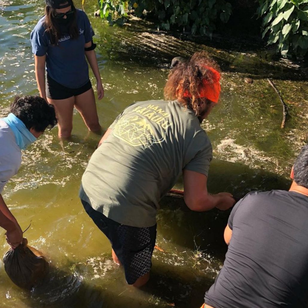
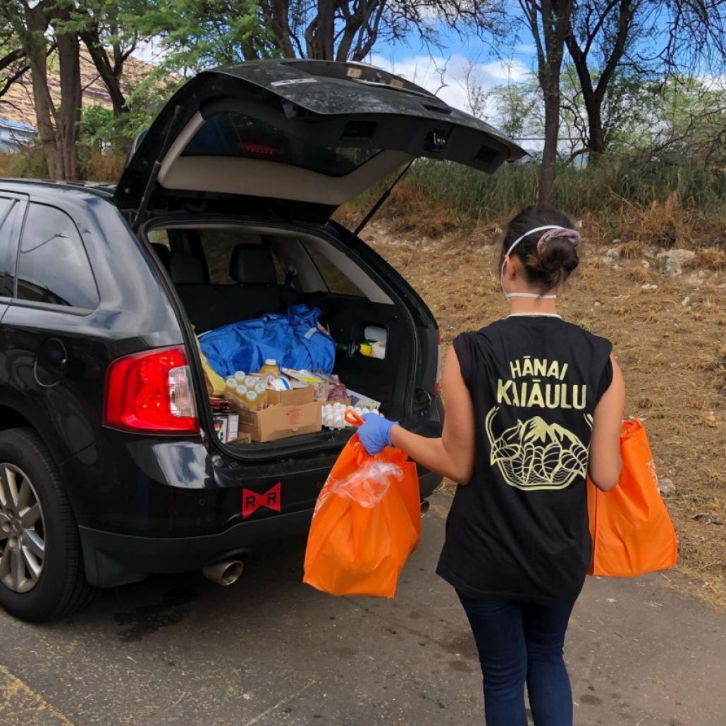
Hanai Kaiaulu
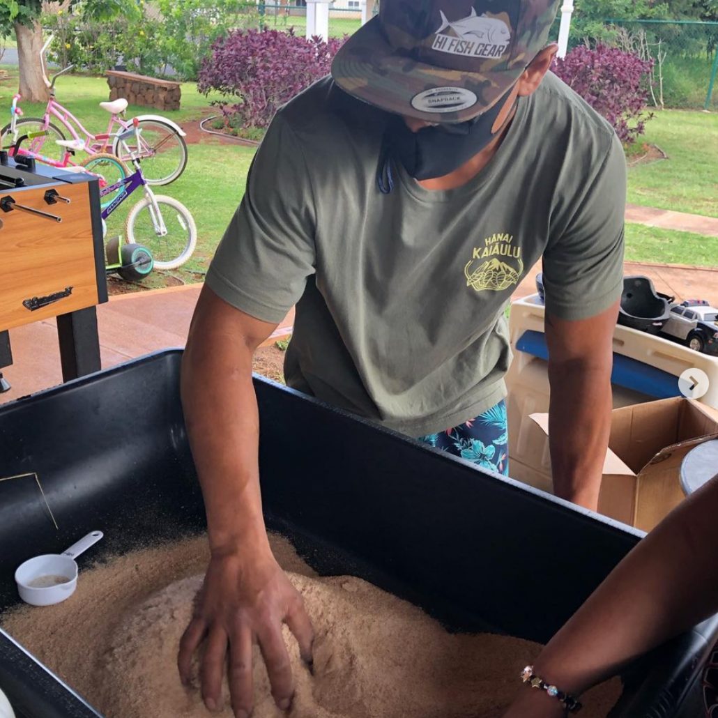
Hanai Kaiaulu’s mission is to reduce greenhouse gases, curb the need for landfills and replenish our soils. They are a community-based organization headquartered in Nanakuli, Hawaii. We helped them create their logo and overall branding identity.
Design Process
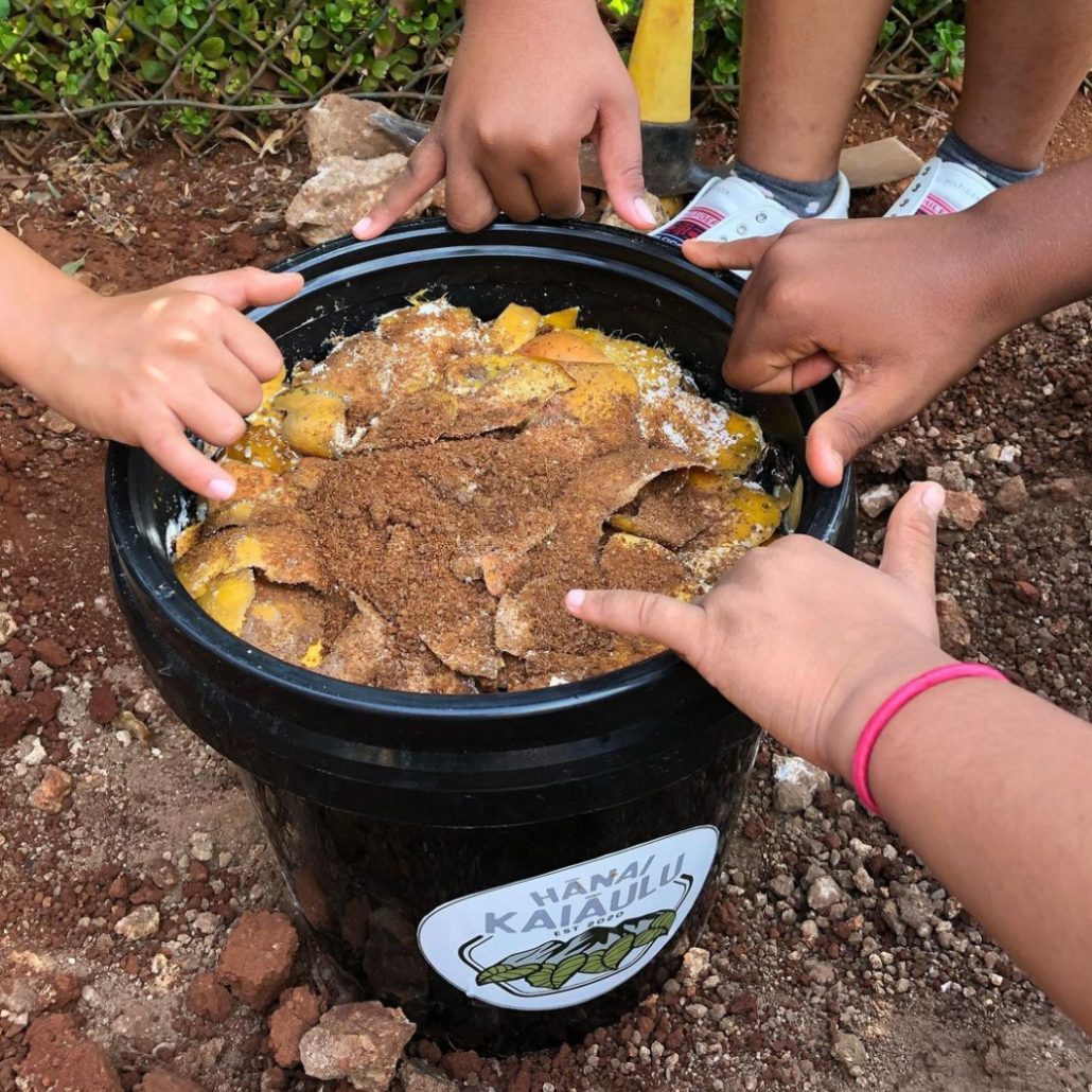
Hanai Kaiaulu is located in Nanakuli, Hawaii. They are a beautiful new composting project that was developed by a wonderful teacher at Nanakuli High School. She’s starting a composting business for the kids to learn about the land, conservation, self sustainability and business. All of these words ended up being the main inspiration for her new logo!
We were really proud to be a part of this genius idea. Another excellent team project!
Follow them on instagram @hanaikaiaulu to see what they’re up to!
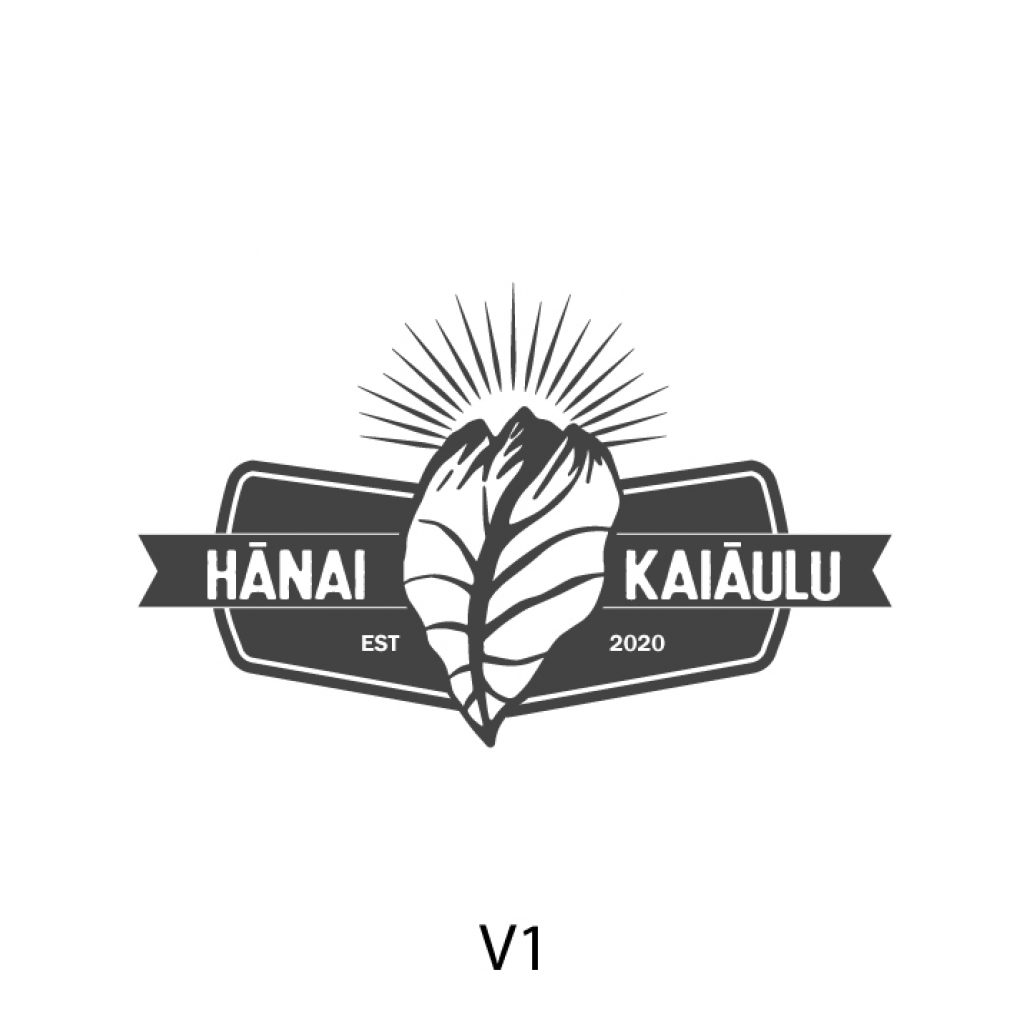
For version 1, we noticed that the top of the Kalo leaf looked a bit like the Waianae Valley Mountain Range, it was an idea we wanted to explore more. If you look at a Kalo leaf, the veins look exactly like the streams coming down from the Mauna nourishing the soil. It reminded us of the ingenious Ahupuaʻa system Hawaiians created. The sunrise behind the mountains symbolize a new day, a new beginning and therefore a new venture that has been established in 2020.
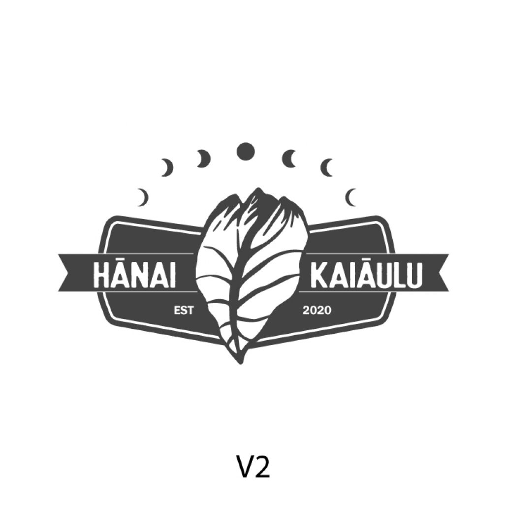
This next logo reflects the same concept as version 1, but this version focuses on the Mahina phases. We were inspired by your beautiful email explaining the importance of the Mahina stages. The full moon is at the center of the logo symbolizing the importance of starting a new community business.
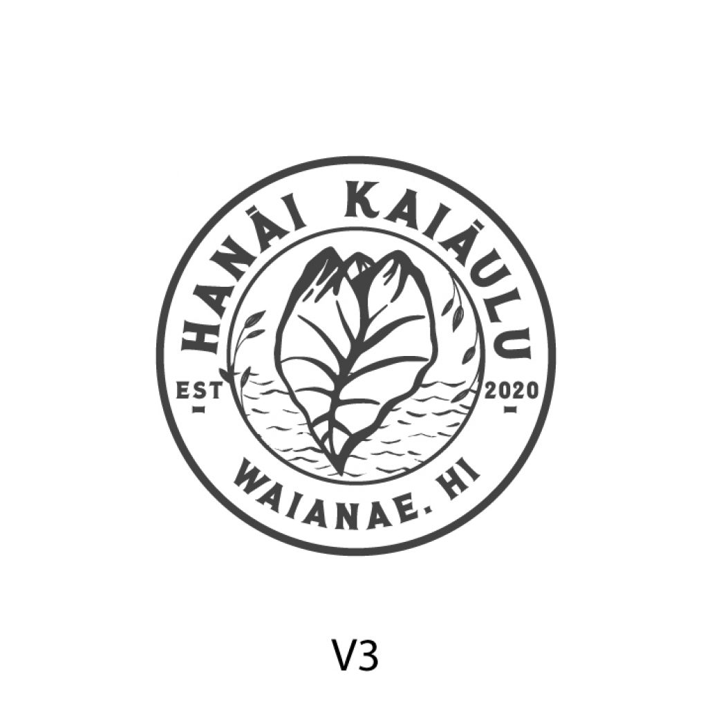
This logo takes a bit different approach. We wanted to create a logo that almost looked like an official stamp symbolizing officialness and importance. The inner circle has elements of nature in a circular motion subtly resembling a Hawaiian lei. The Wai elements at the bottom further emphasize the trajectory of the Wai from Mauna to Makai as water is the essence of life. We love this representation.
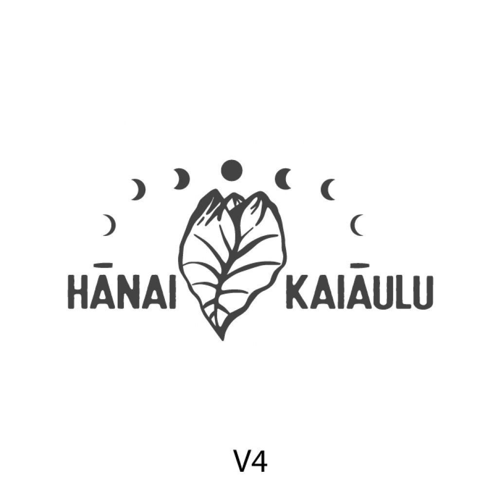
Version 4 was a simpler and cleaner representation of the previous ideas with the phases of Mahina. The phases of the moon rise and fall strategically over the top of the A in Hanai and in Kaiaulu.
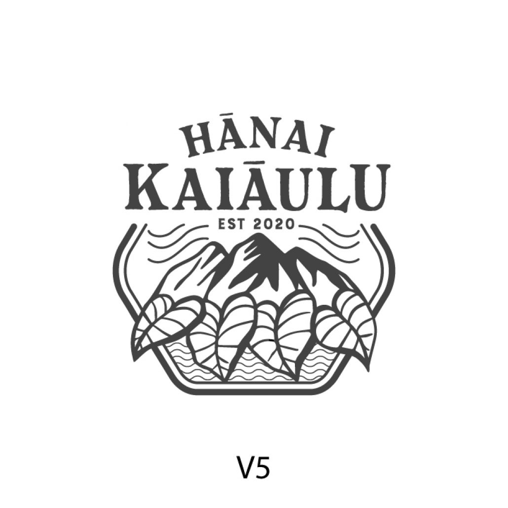
This beautiful logo is a graphic representation of the Ahupuaʻa system in a more simplistic straightforward manner, we also included a special touch based on our conversation regarding the Waianae winds flowing downwards into the valley. We wanted to use a typeface that seemed like this company has been around for a very long time, emphasizing something that can be trusted and time tested. We love the vintage, nostalgic old Hawaii feel to this logo.
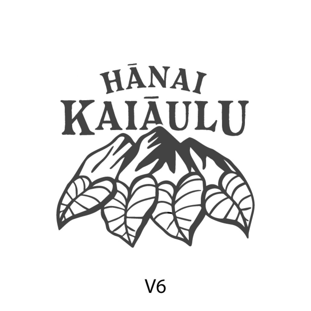
Version 6 is a similar concept to version 5, but we chose to simplify it a bit. We love the simplicity and boldness of this logo. This logo has a bit more dimension with the mountain/kalo illustration overlapping the Hanai Kaiaulu text.
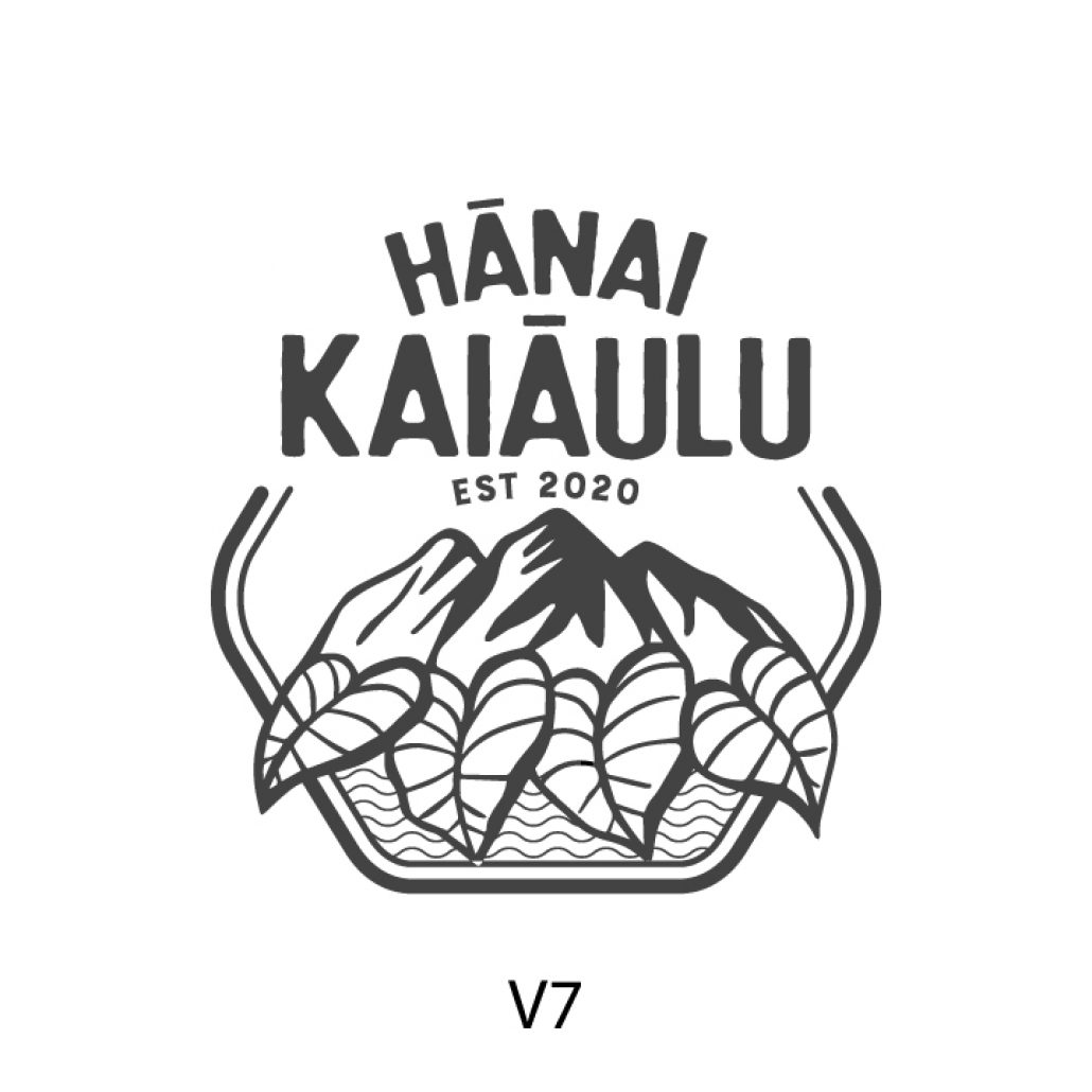
This next version is a similar style to version 5 but instead uses a different typeface. This typeface is a bit more fun, more joyful and more centered towards youth. It’s almost in homage to a campground logo.
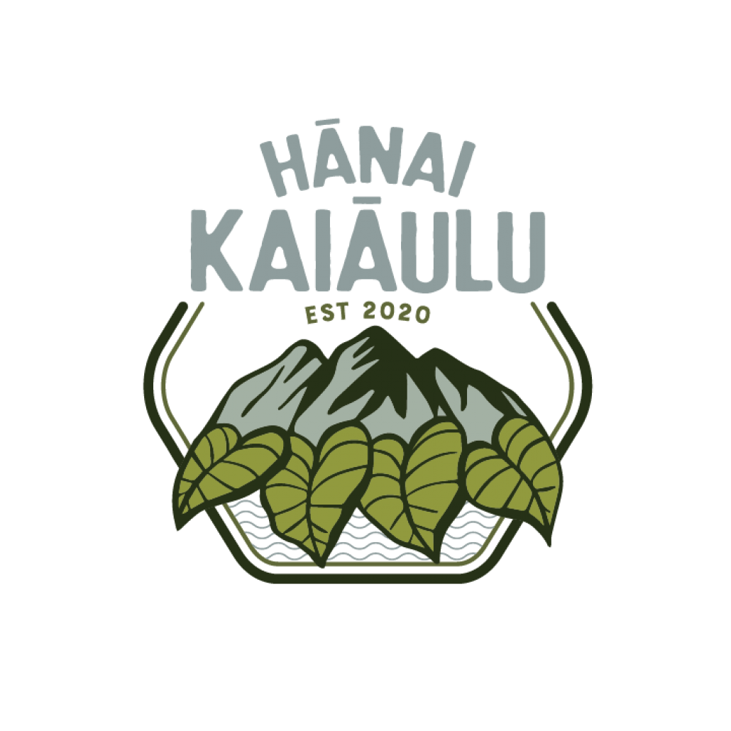
The final color scheme that was chosen was inspired by nature. We brought in the blue from the water to reflect the blue in the name tying both water, land and sky together in a symbolic hierarchy…a subtle little touch that most people will never even think about. We loved this color scheme and our clients were thrilled with the results!
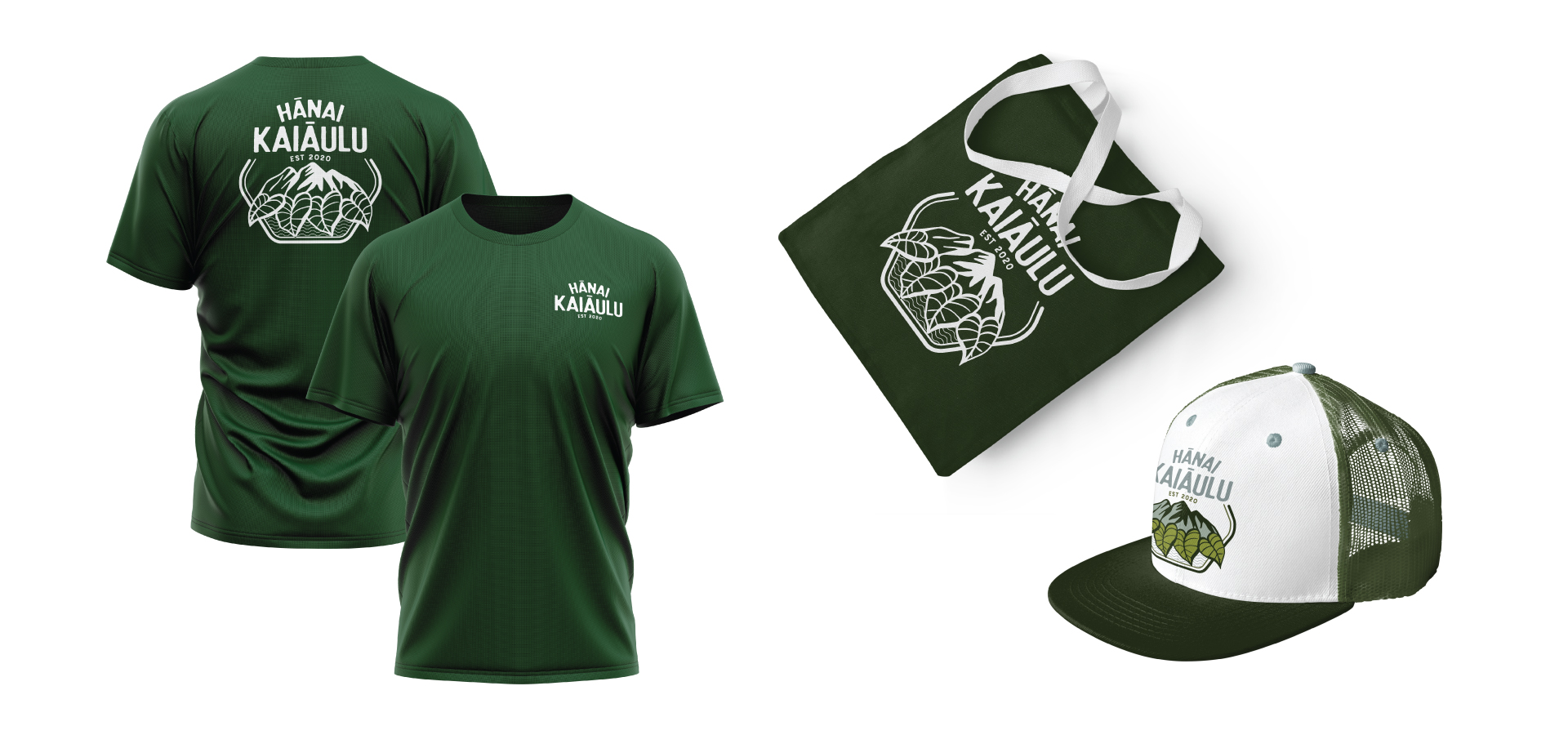
Branding Examples