

Hiilawe Construction LLC
This Maui based construction company branding was inspired by the 70’s boom in construction. A lot of iconic buildings rose in the 70’s so we wanted to embody a bit of a historical vibe with this logo.
Design Process
There are a few hidden ideas behind this concept. Hiilawe means to carry or lift in Hawaiian. The H symbolizes two abstract hands holding up the diamond shape, which then forms a hale, or home. It captures the structure of what this company is about.
Hiilawe is also the name of one of the biggest waterfalls in Hawaii, which we hinted at with the overall flow of the typography as well as the i’s. For a friendly touch, the first “I” resembles a person pointing to the H as if it’s their home or the beautiful waterfall.
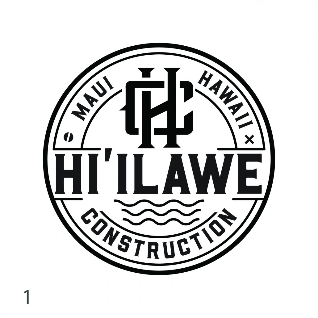
This first logo is a really iconic approach that is bold and stands out. We wanted to create a very cool and unique monogram design as well as incorporate subtle hints to the Hi’ilawe waterfall. The two legs of the “H” in the monogram represent the waterfall with the water flowing down to the ocean which is represented by the 3 waves at the bottom of the logo. We incorporated the two screw icons, phillips and flathead in the logo to tie in the construction aspect
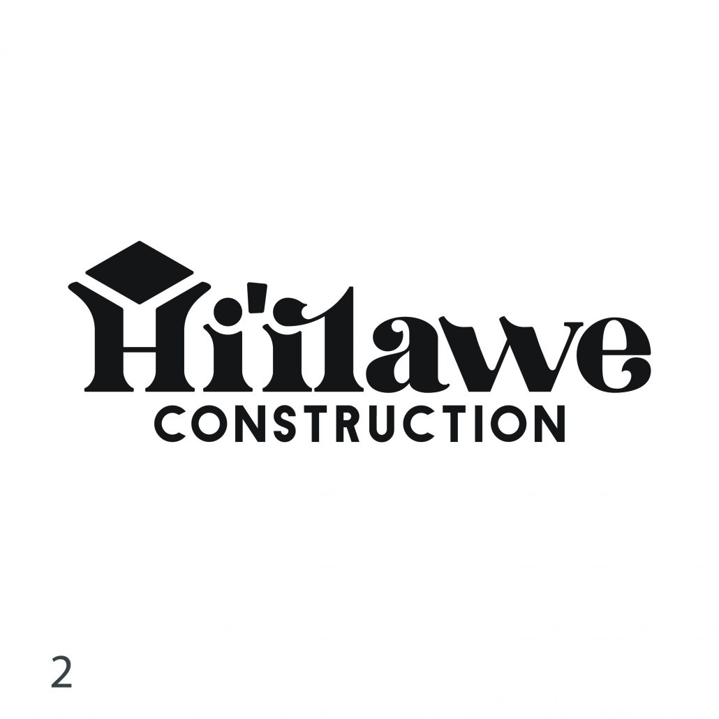
This next logo was inspired by late 70’s Hawaiian apartment and building logos. The 70’s saw a huge boom in construction and transformation into the modern Hawaii we all see now, a lot of iconic buildings rose in the 70’s so we wanted to tap into that a bit to give the brand a bit of a historical vibe to it. This logo has a custom font that we created based on our sketches, and have hidden meaning within the design of the H and two I’s coming together.
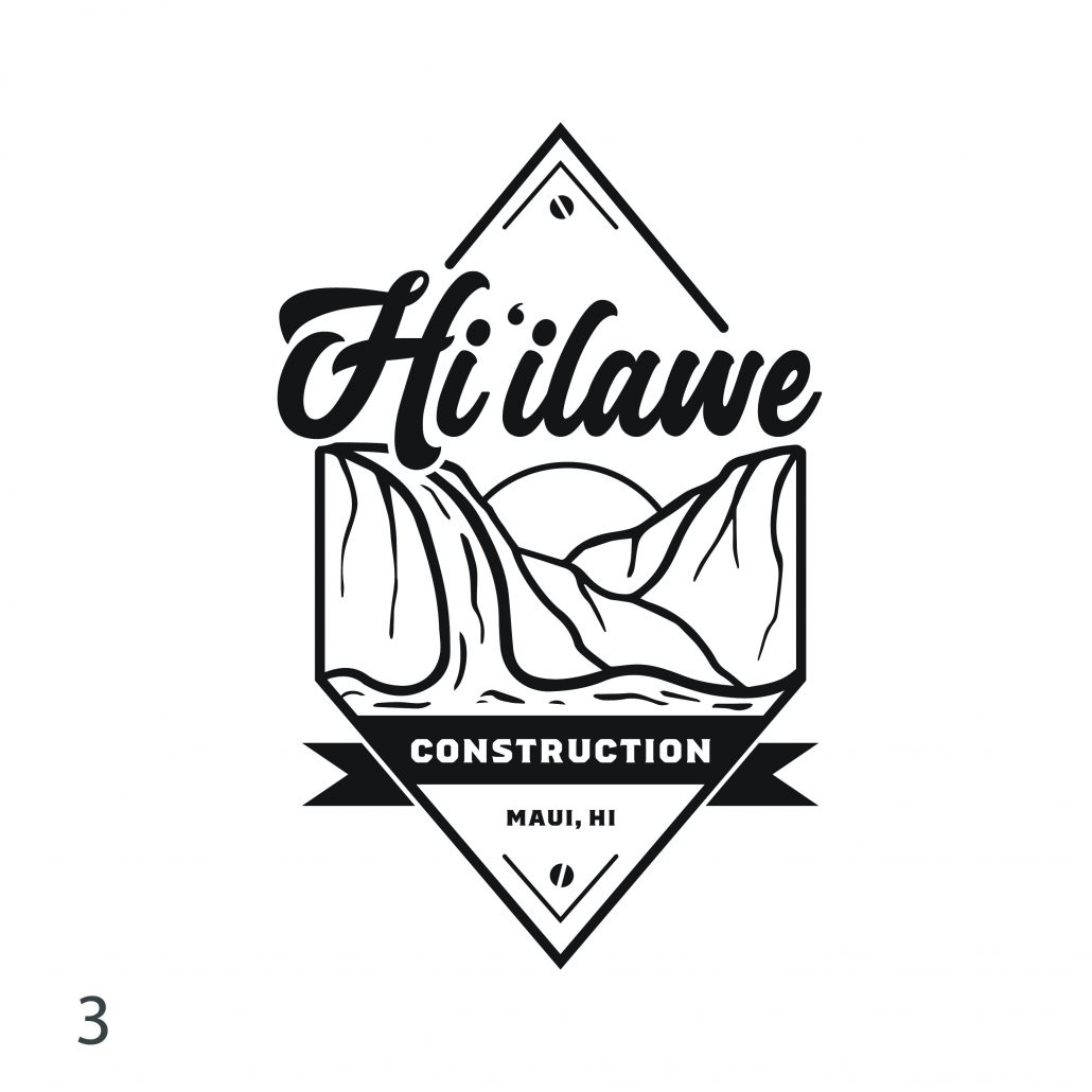
This next concept was a more illustrative logo. This was a really cool and creative approach to the brand. We illustrated the Waipio Valley landscape which brings a really beautiful cultural emotion to the logo. The Hi’ilawe font represents flow and movement, it symbolizes the movement of the wai and abstractly looks like waves, yet has a real strong and bold presentation.
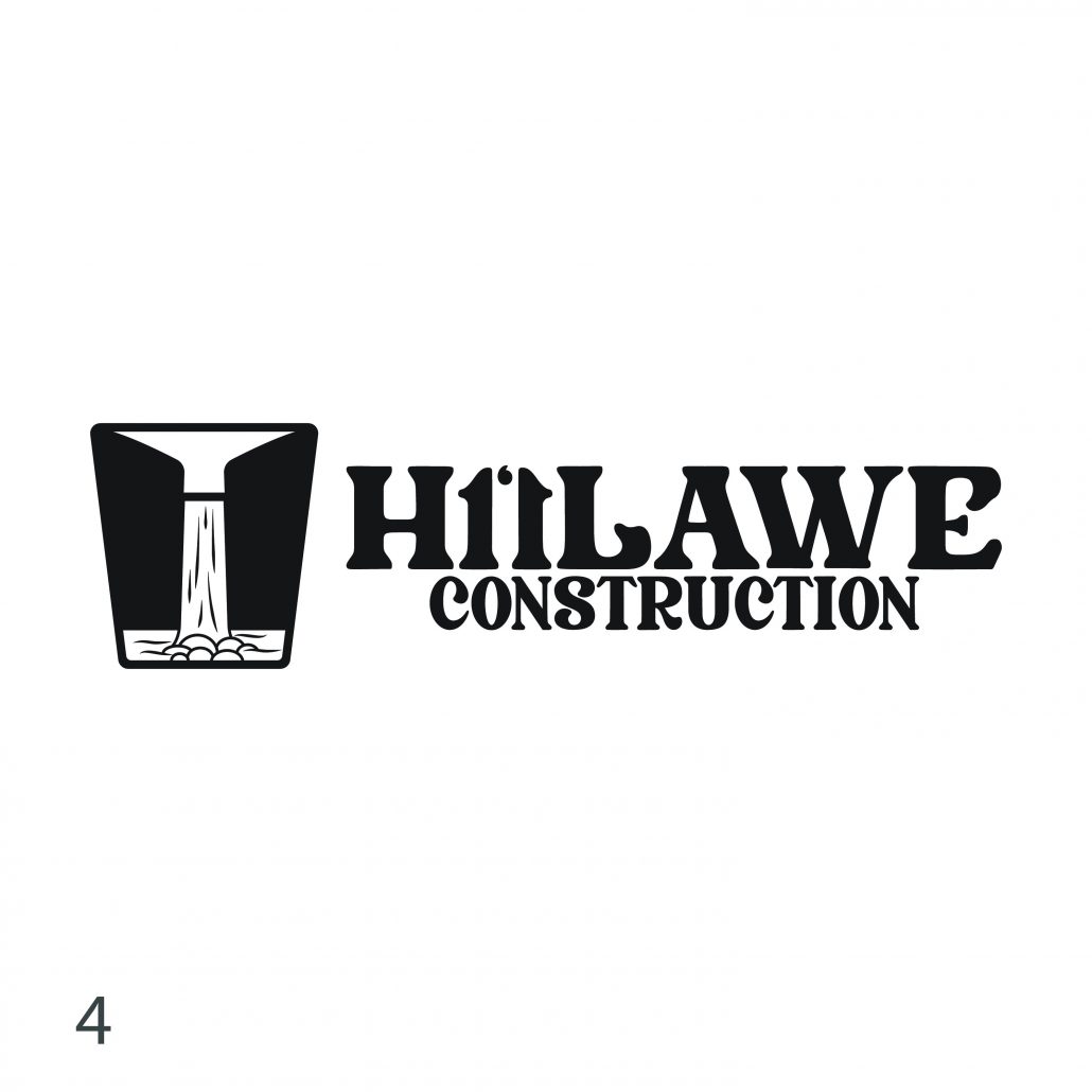
The last logo we presented was a really classic, timeless representation of the Hi’ilawe waterfall. We wanted this logo to feel like it has been around for a long time, making the brand seem established and iconic. This logo has the identity of something traditional. We noticed while doing research that the Hi’ilawe waterfall naturally has an H shape with the valley encompassing it. It felt right to illustrate something that represented that shape. The font in the logo also reinforces that shape with the negative space in between the two “I’s”
Our clients ended up choosing option #2! They fell in love with this design and loved the history behind the logo. They loved the custom typeface, the strong “H” holding up the diamond and the friendliness of the two “i’s” coming together.
Branding Examples
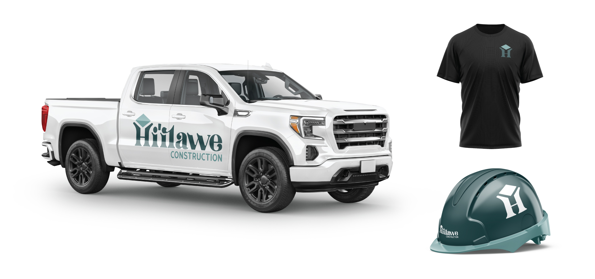
We presented a few concepts to Hiilawe Construction LLC, including a t-shirt design and a construction hard hat. We even showcased their new logo on the side of a truck.
