

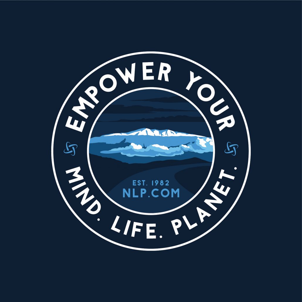
 Two new concepts for Mauna Kea, two different styles to look at
V1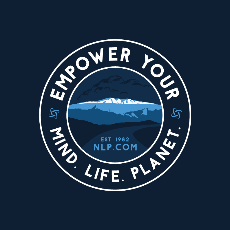
V2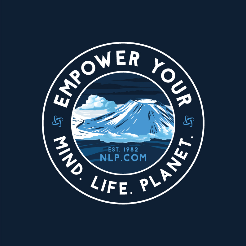
Round4
![]()

Version 2 Edits:
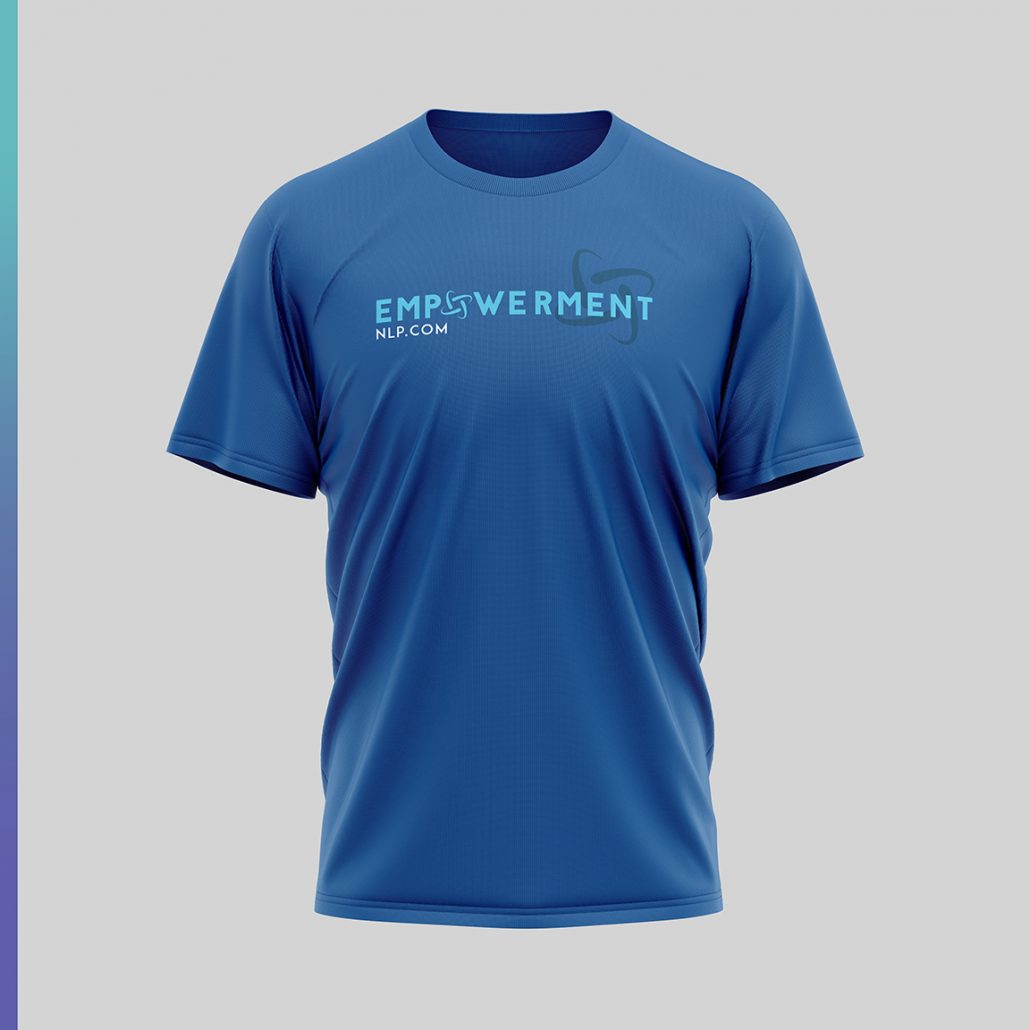
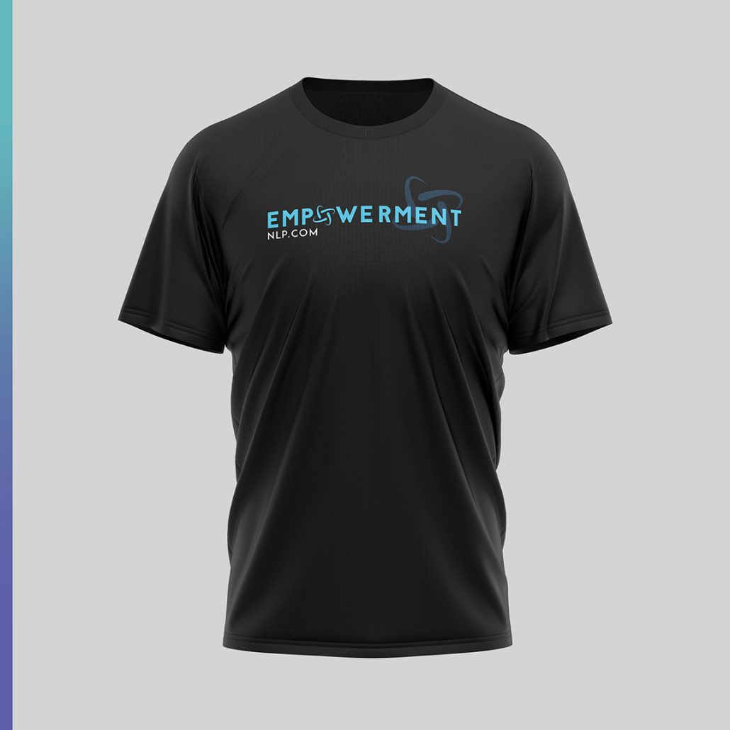
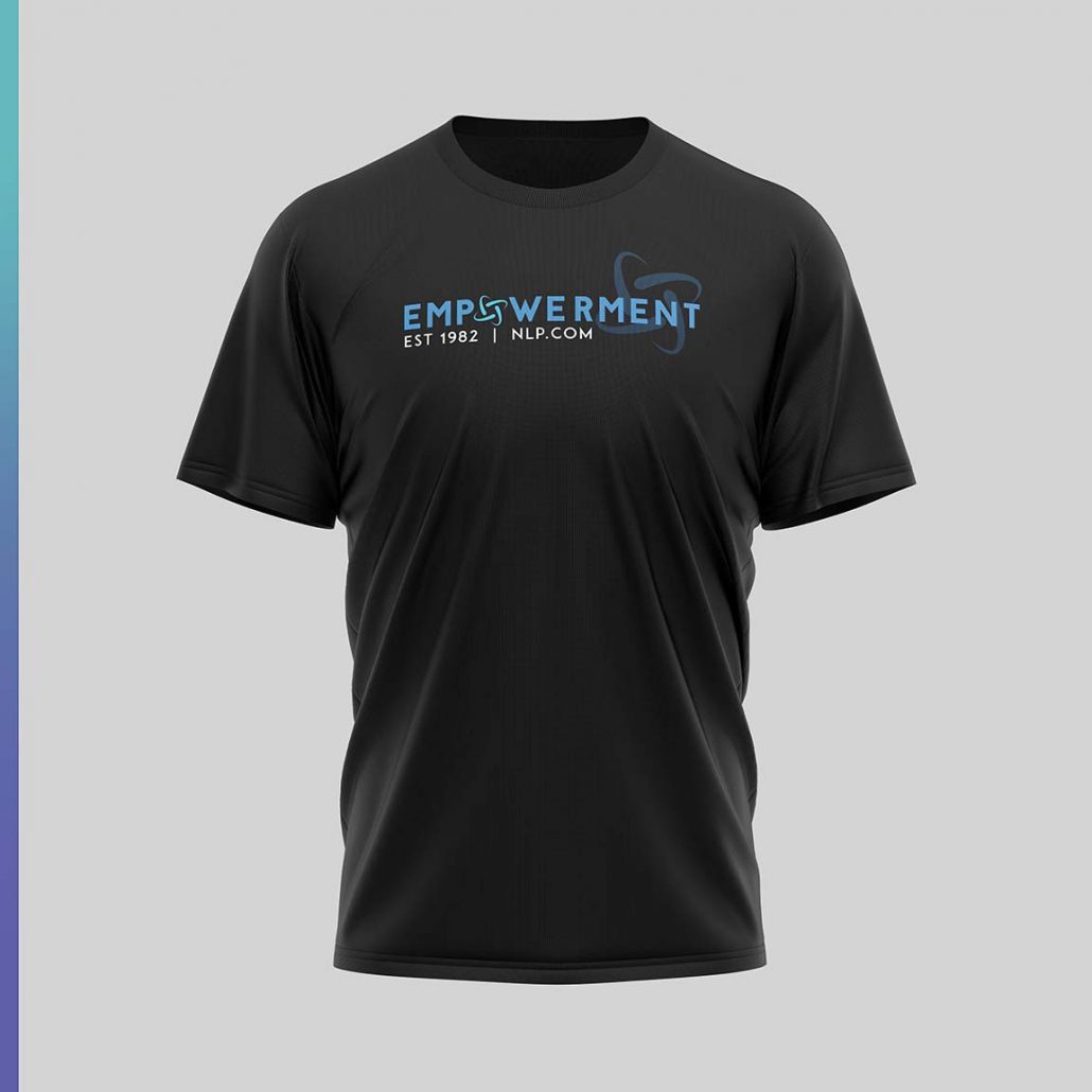
two colorways for the front
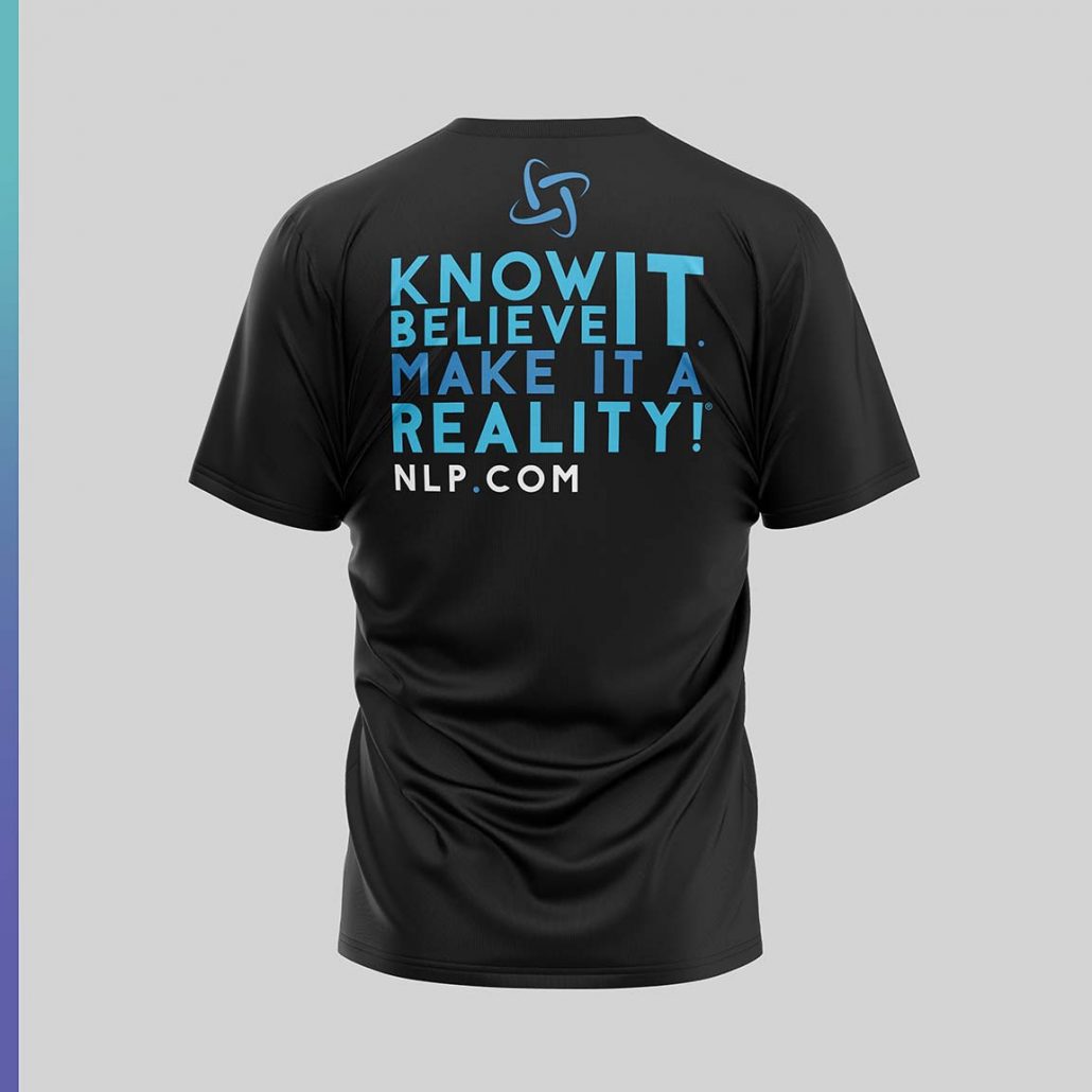
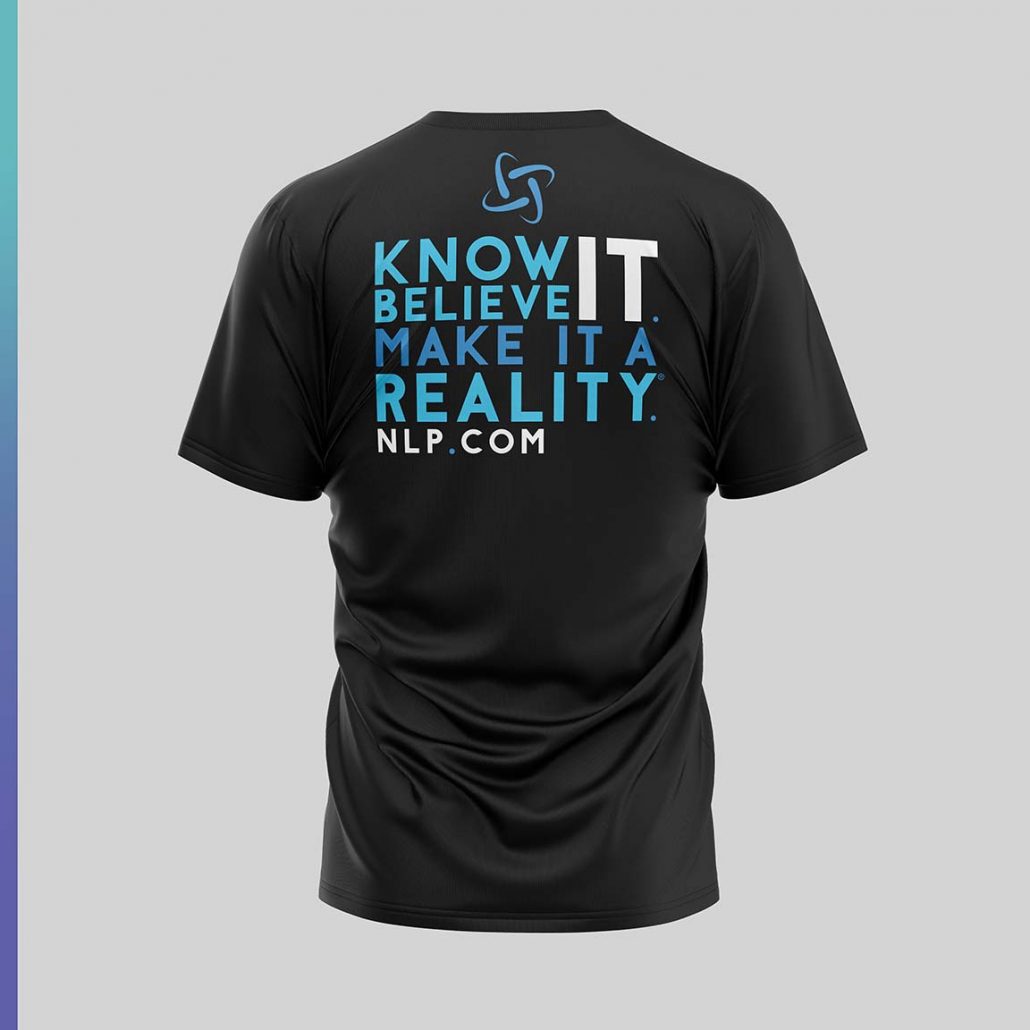
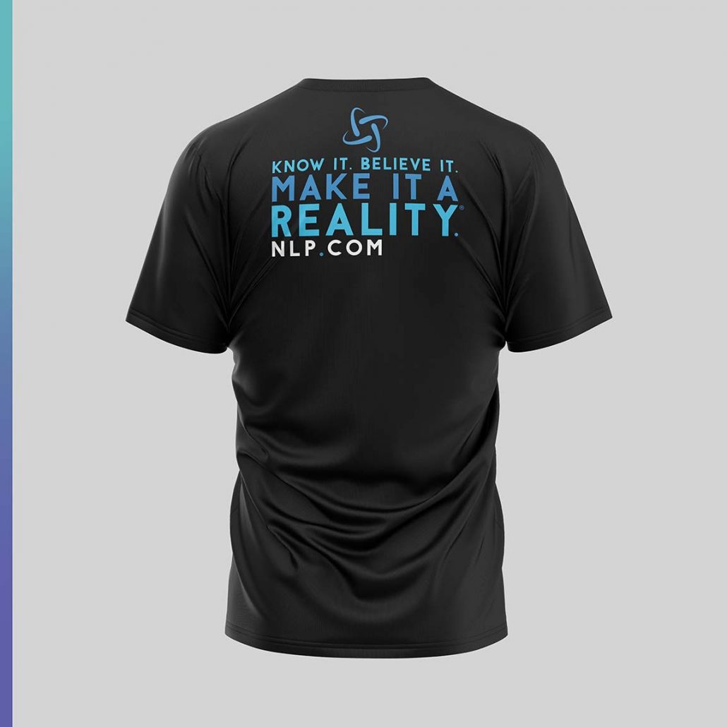
Know it. Believe it. Make it a Reality V1 and V2
new edits based on our conversation regarding the trademarked phrase!
please see both layouts. Let me know what works best!
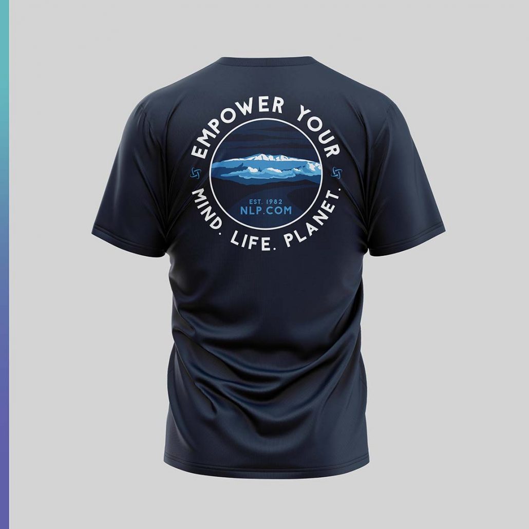
Two new concepts for Mauna Kea, two different styles to look at
V1
V2
Round4
![]()
Version 2 Edits:
two colorways for the front
Know it. Believe it. Make it a Reality V1 and V2
new edits based on our conversation regarding the trademarked phrase!
please see both layouts. Let me know what works best!
 V1
V1
V2
V3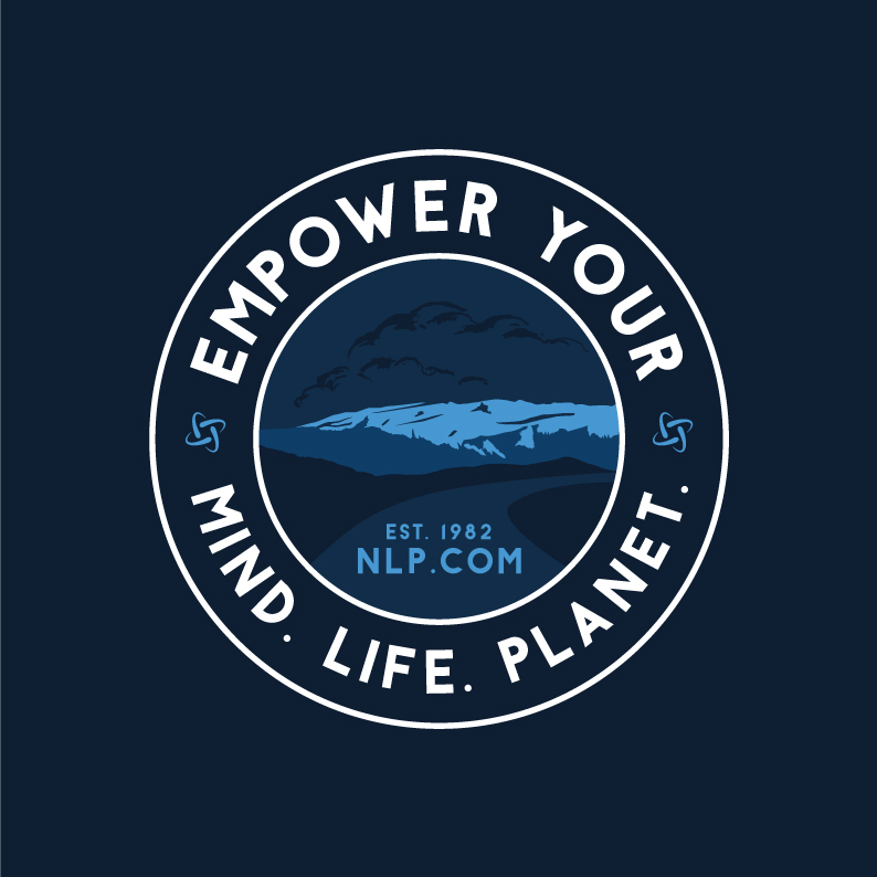
Round4
![]()
Version 2 Edits:
two colorways for the front
Know it. Believe it. Make it a Reality V1 and V2
new edits based on our conversation regarding the trademarked phrase!
please see both layouts. Let me know what works best!
Aloha! We have some new goodness for you to review.
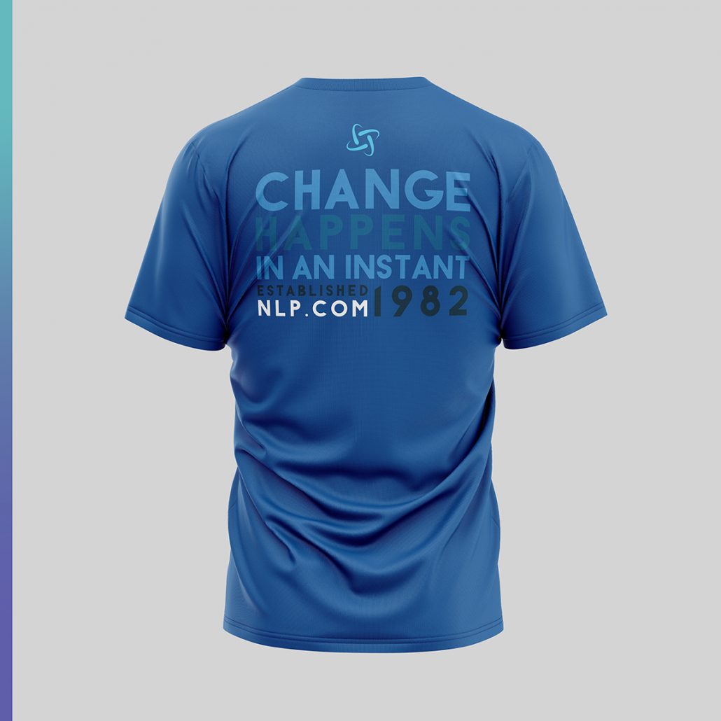
A new design altogether! We wanted this design to be very bold, graphic and have a real visual impact with just type. It has a real modern hip feel yet delivers a strong visual punch
We also edited the previous concept based on the notes provided. Let me know what you think! Hope you like!

![]()
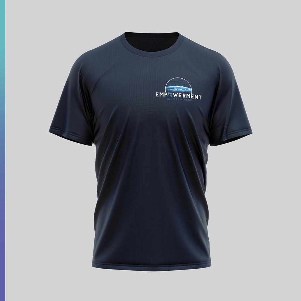
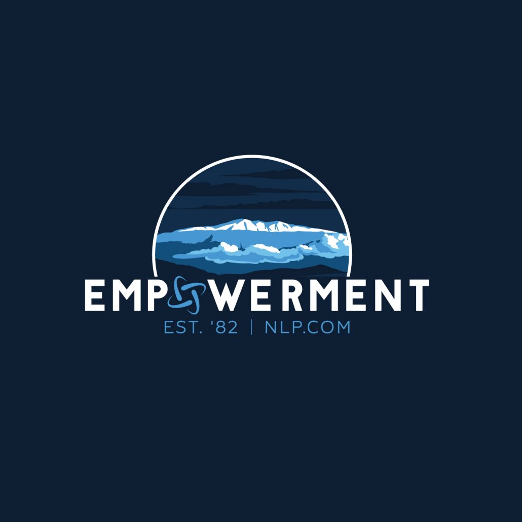
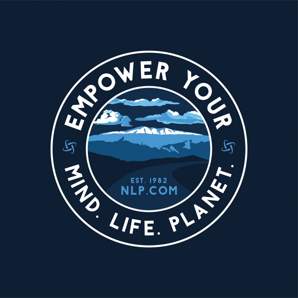
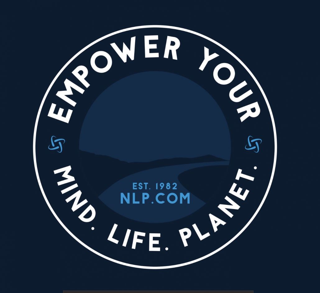
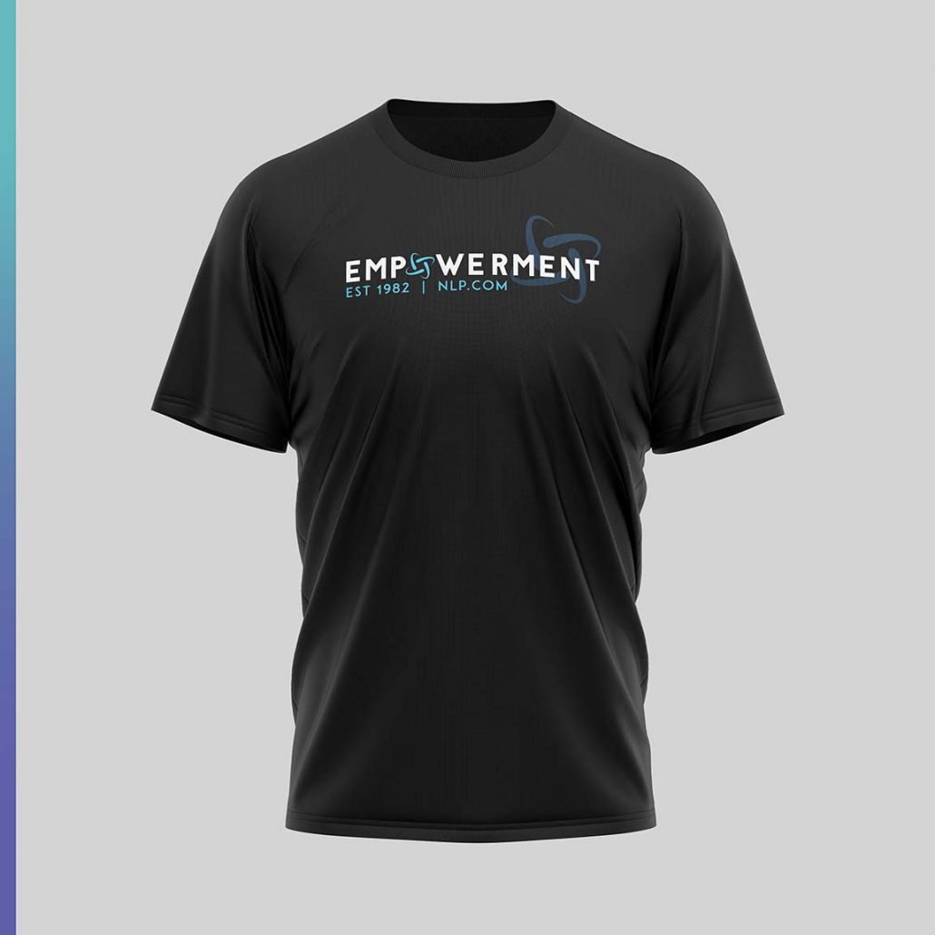
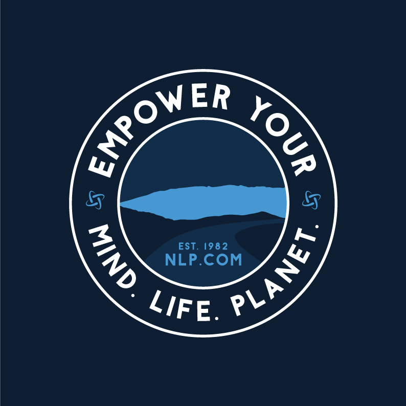
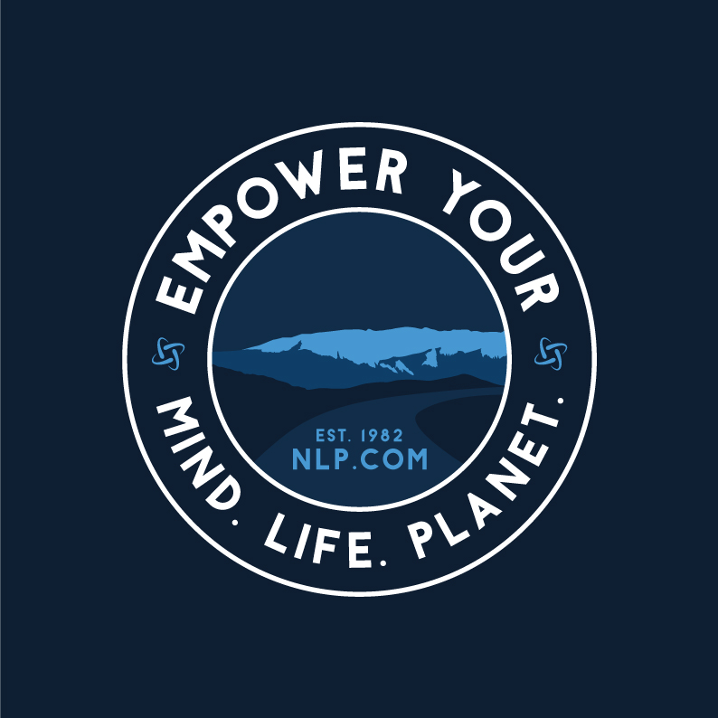
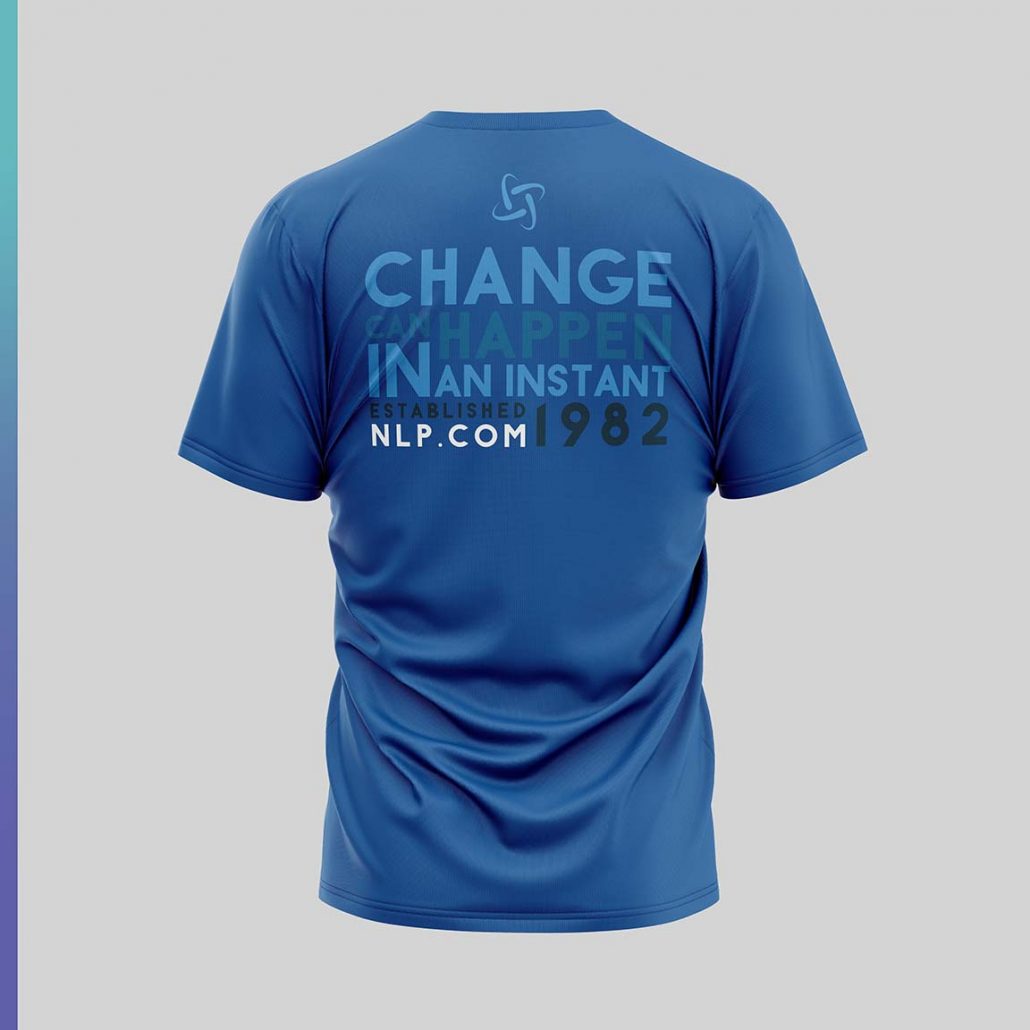
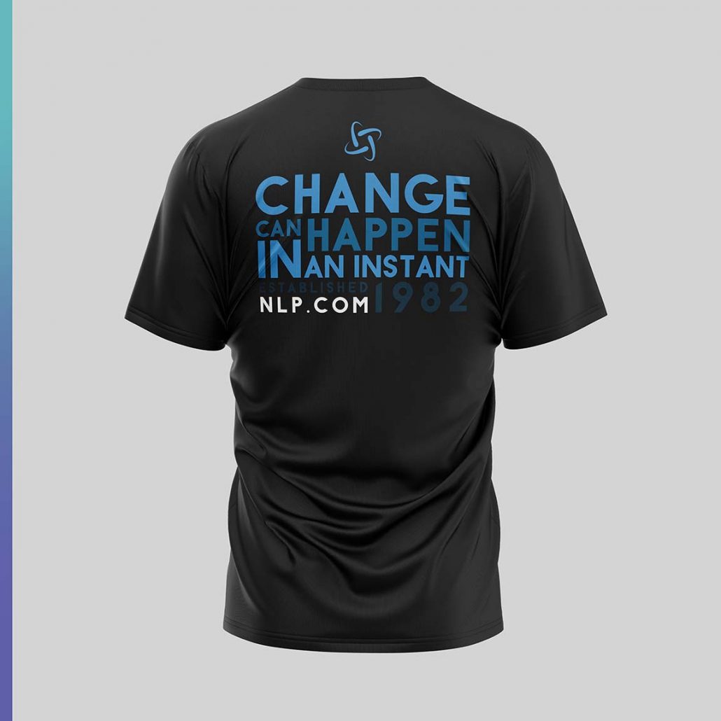
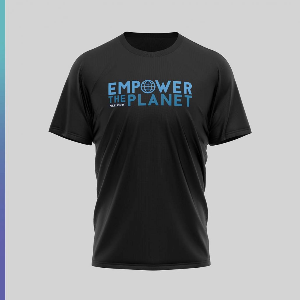
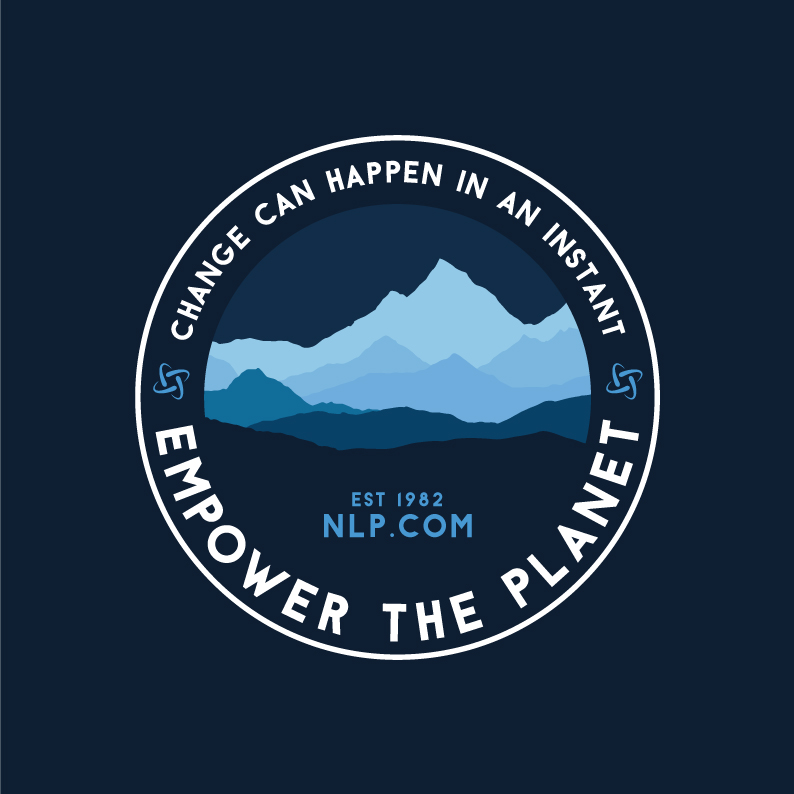
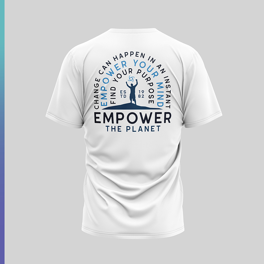
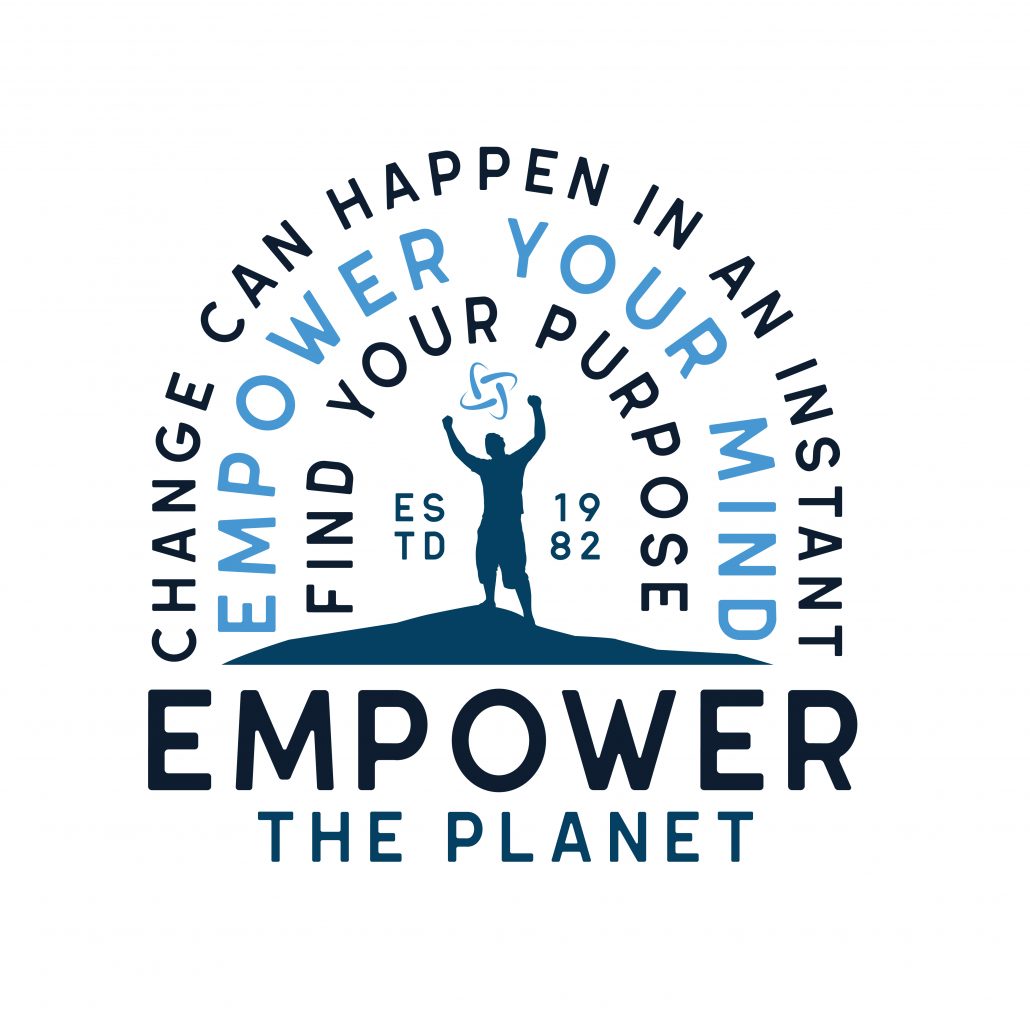
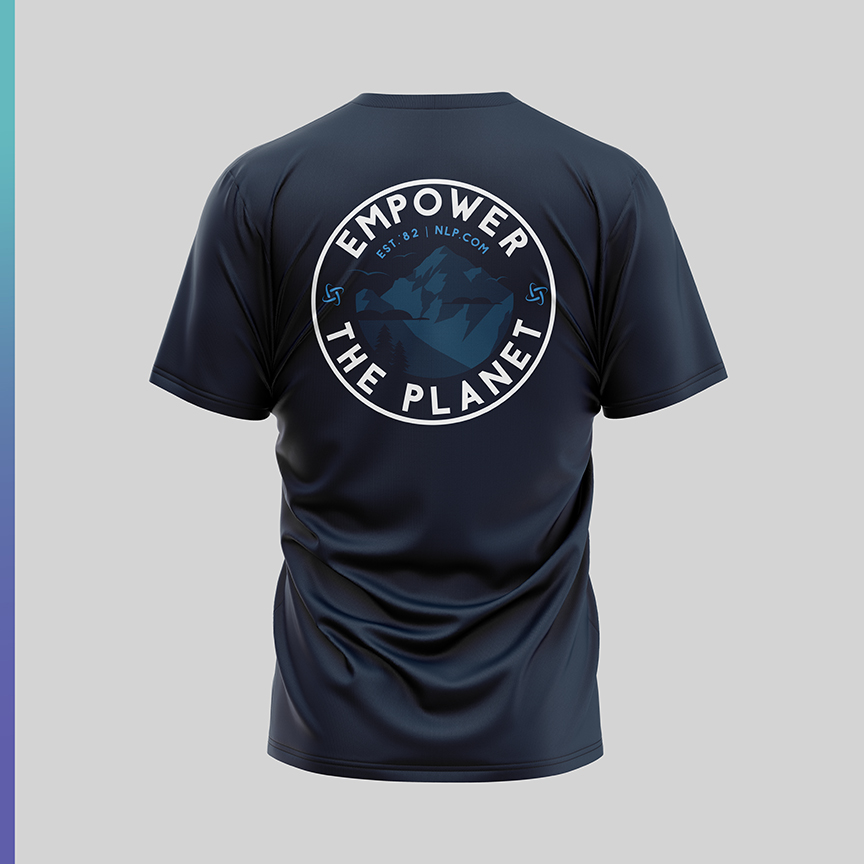
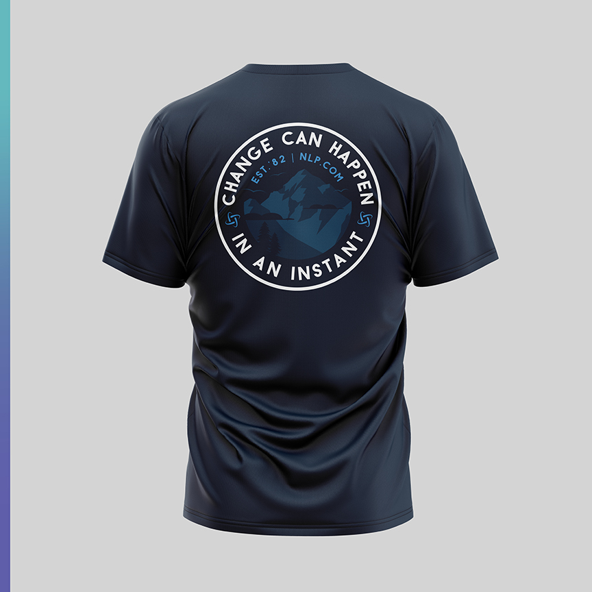
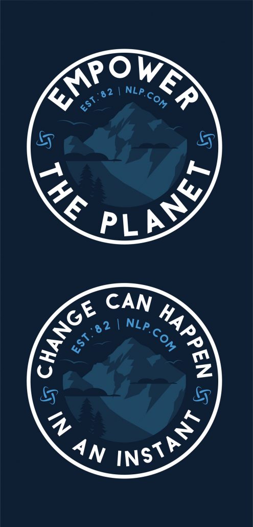
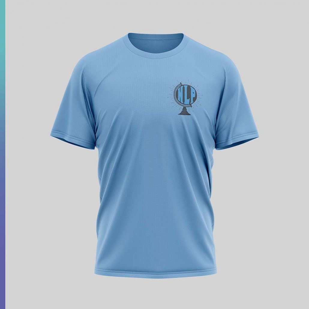
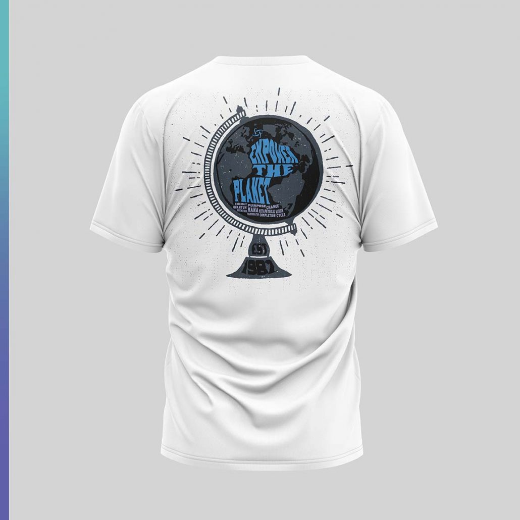
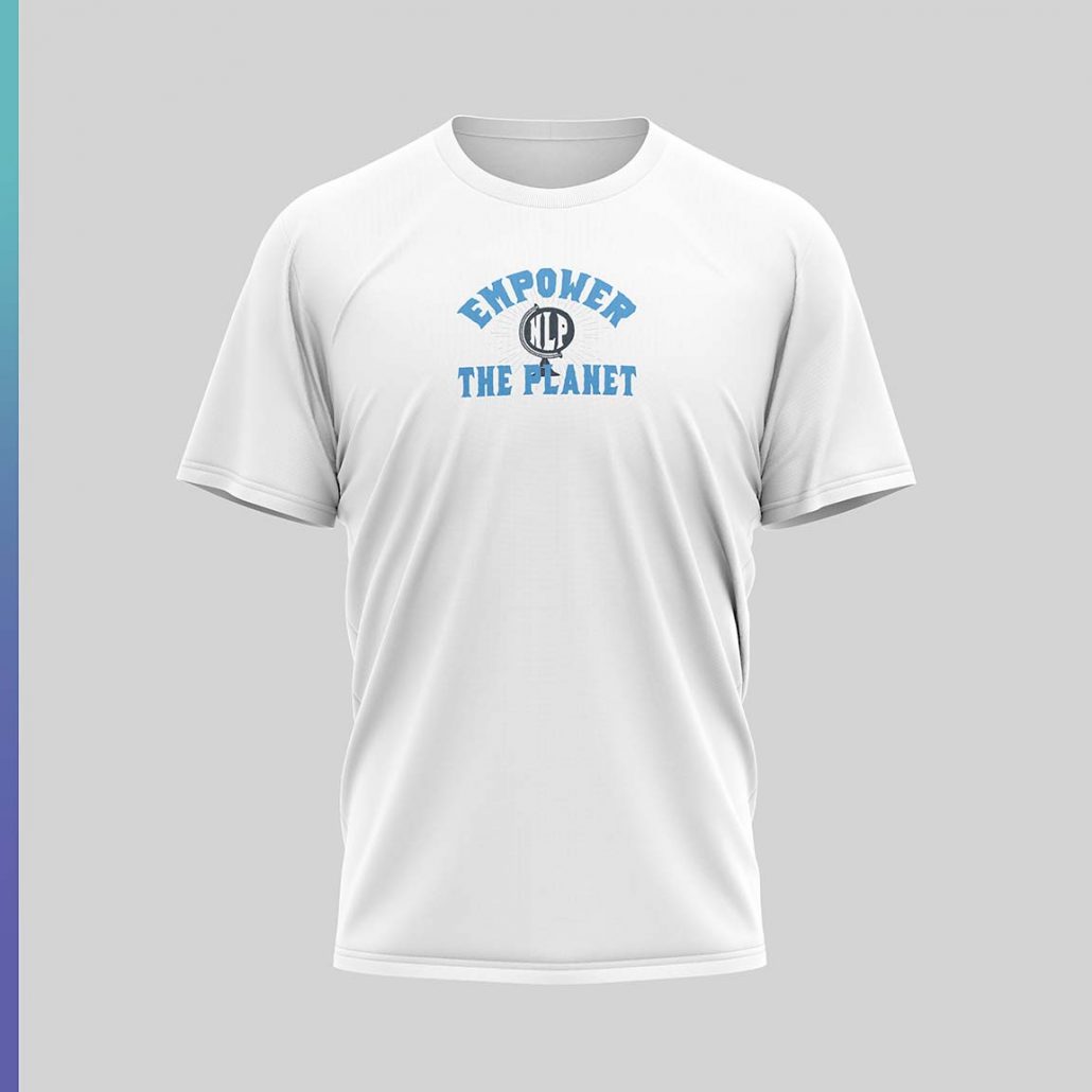
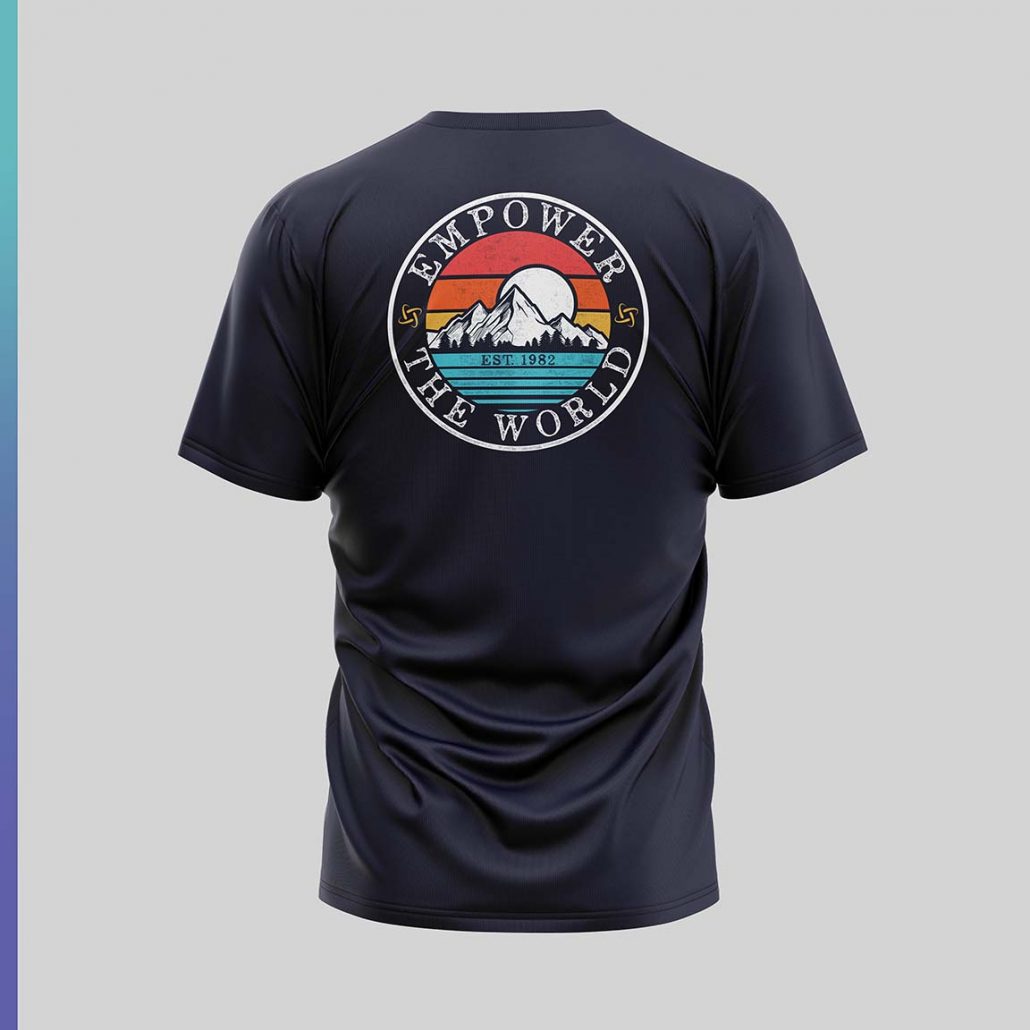
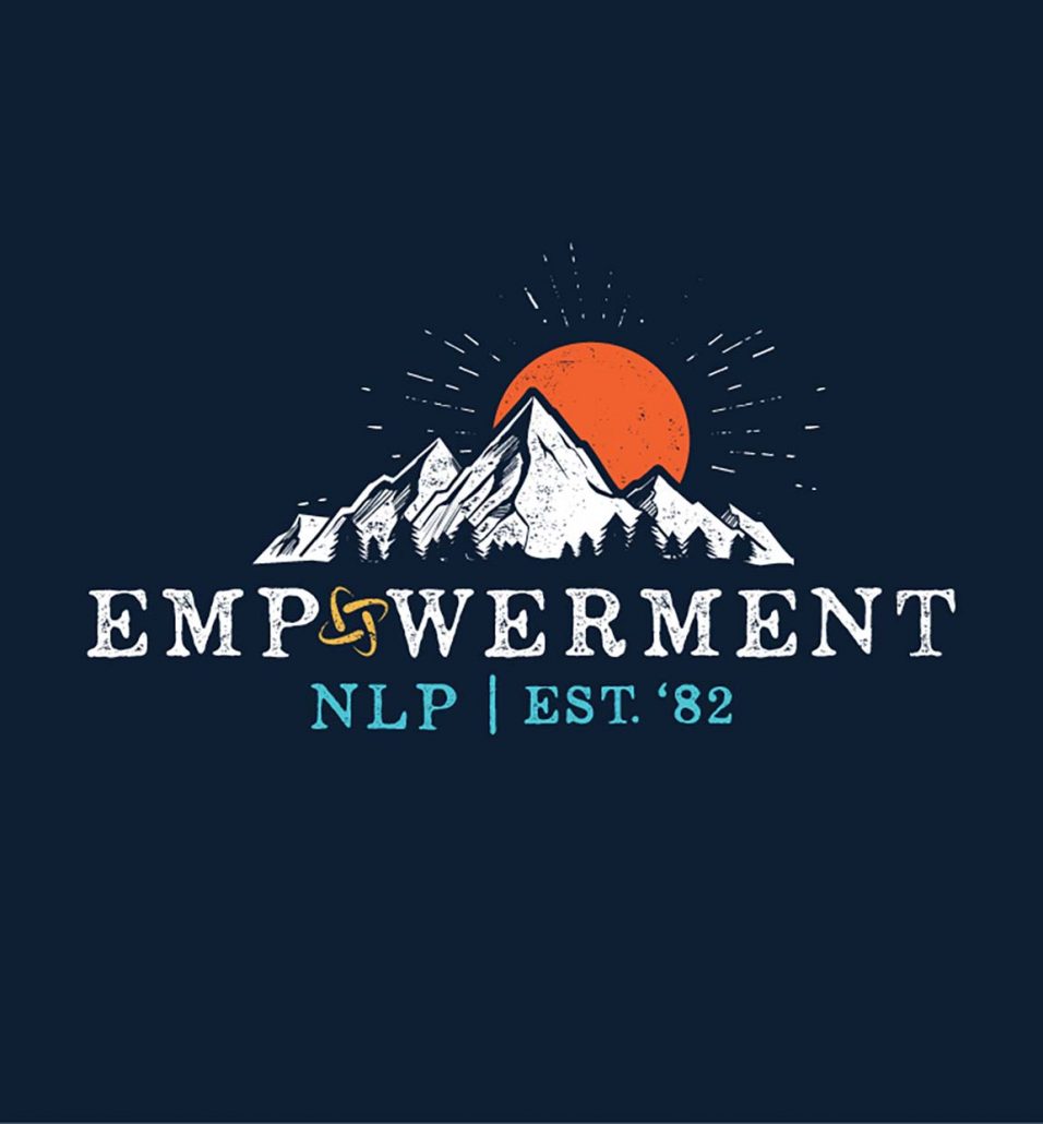
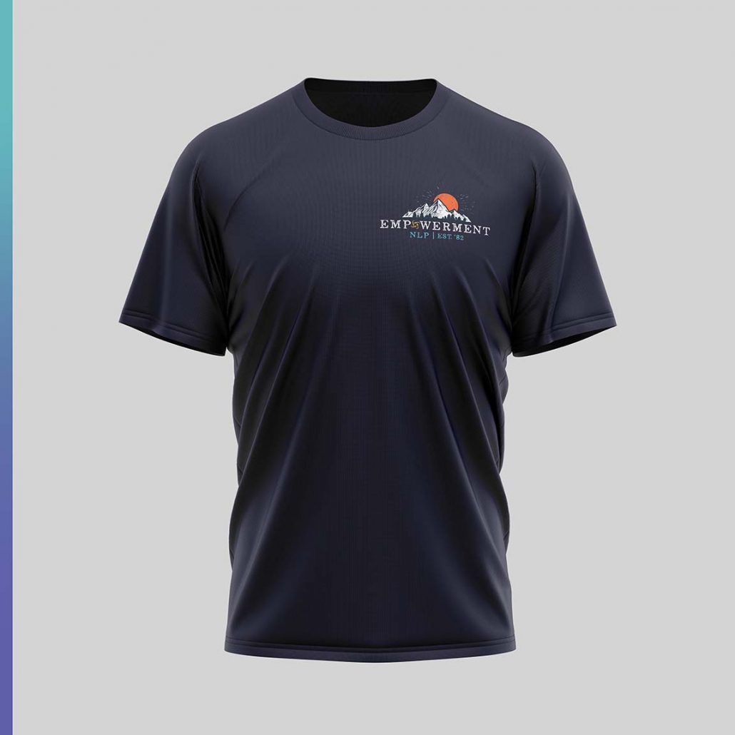
Aloha! Hope you’re having an amazing time at Merrie Monarch! We have some changes to the designs we discussed. We cleaned up a lot of the typefaces and made them more modern and clean. We also tweaked the curved text design with an ode to conquering the mountain top! We worked on a few variations of the logo for the front of the shirt with the symbol, empowerment and nlp.com text that was inspired by the screenshot we talked about. Let me know what you think!
![]()
 Aloha!
We have a few concepts for the NLP tshirt design. We had a lot of fun with these concepts and felt like one wasn’t enough!
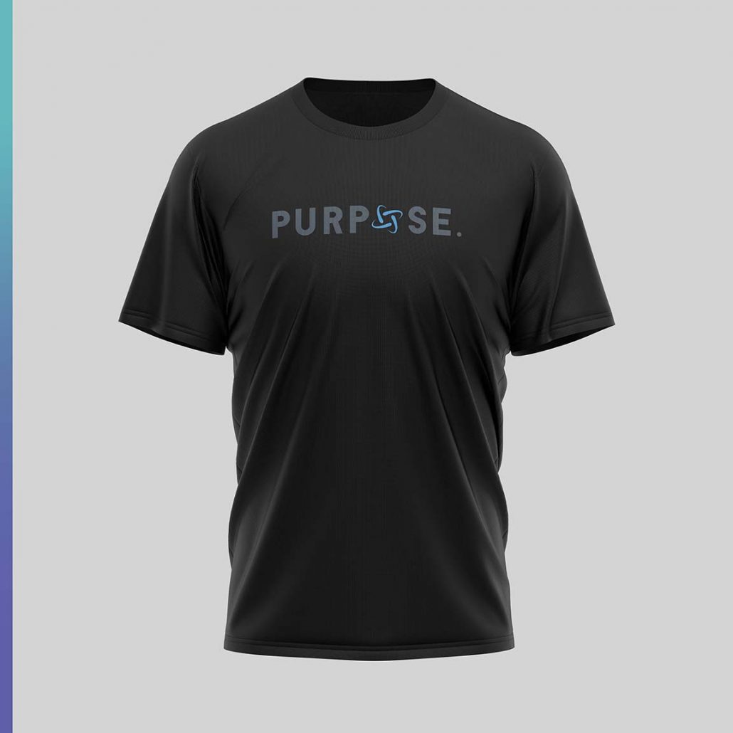
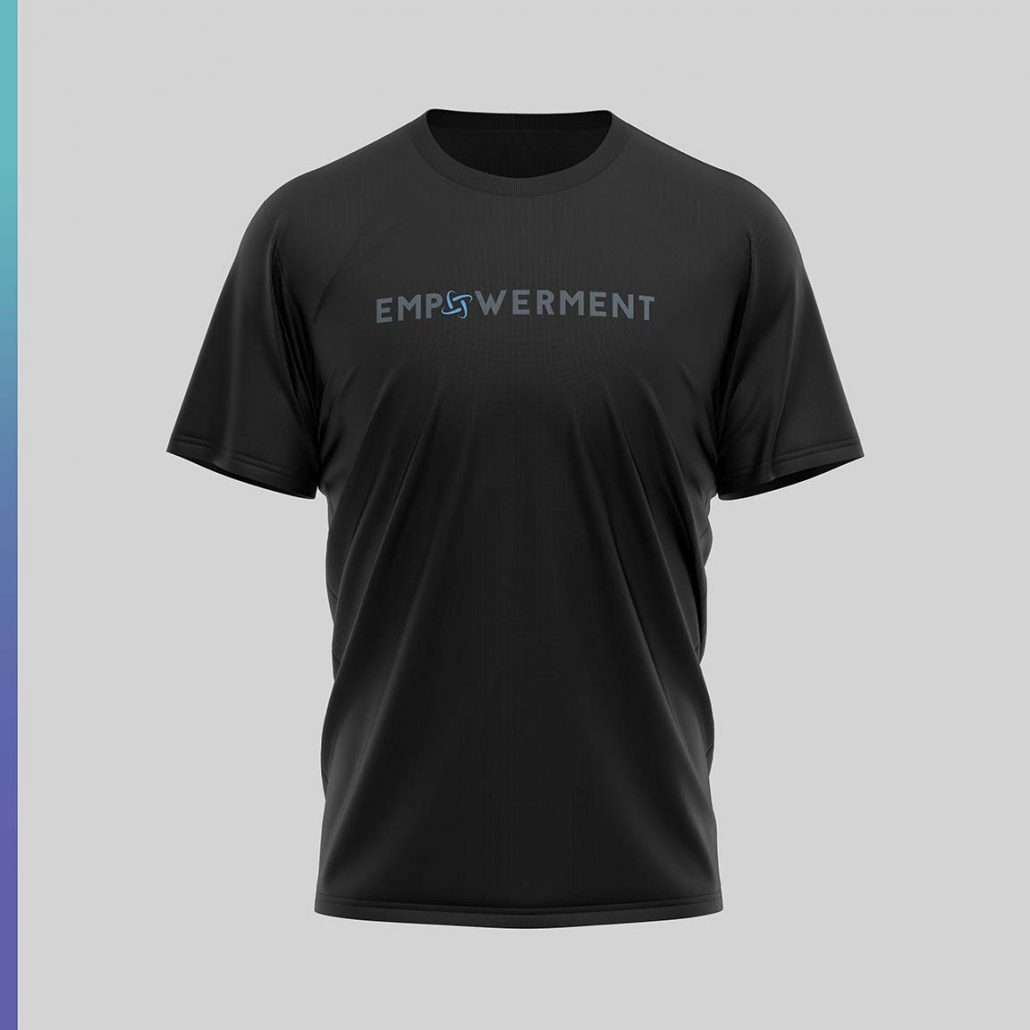
The first design is a Collection that we feel could be very iconic and memorable. Our idea was based on the major key words for NLP. We envision a group of attendees to a seminar taking a big group photo with everyone wearing a different power phrase!
We’re thinking power words like: Passion, Empowerment, Purpose, Powerful, etc..
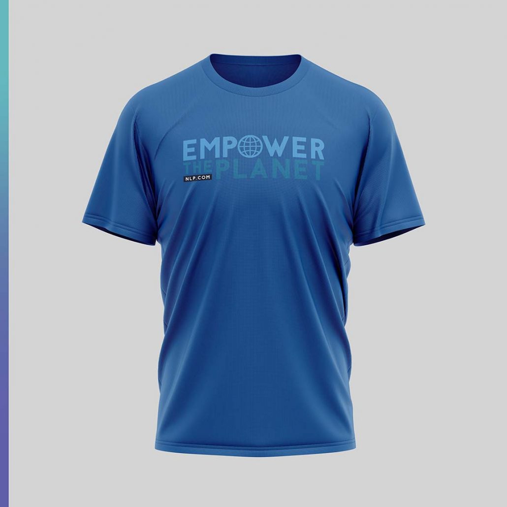
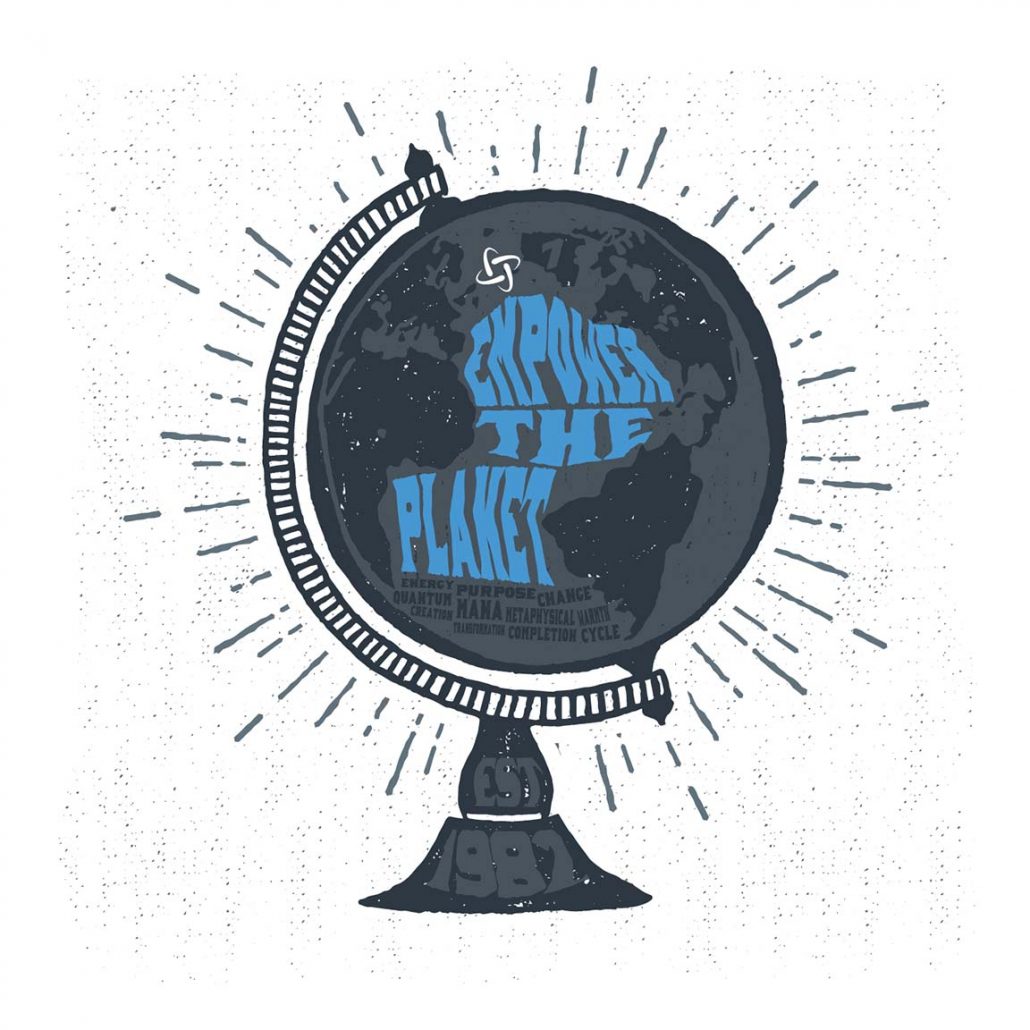
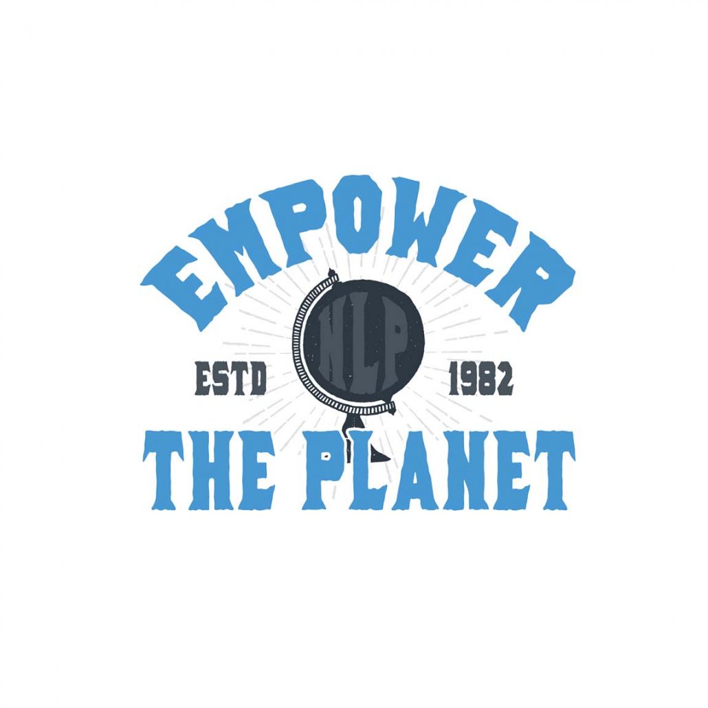
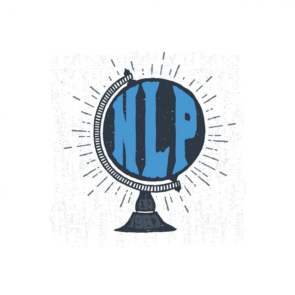
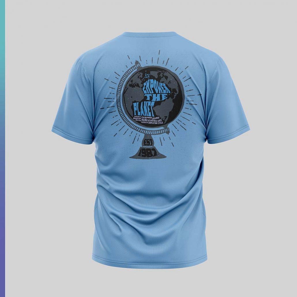
Our second Concept is a real fun one! We wanted to tap into a vintage wood block hand made type of design. The idea behind this concept stems from empowering the entire planet with the teachings of NLP, the EMPOWER THE PLANET text makes up the body of water on earth to represent the importance of water for life. We also included a few of the power words and the ESTABLISHED date which serves as the base and foundation of the company. We have two design ideas for the front to give you a couple of stylistic options
Third Concept:
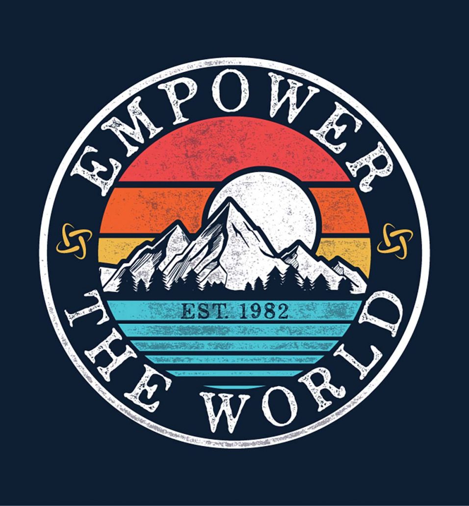
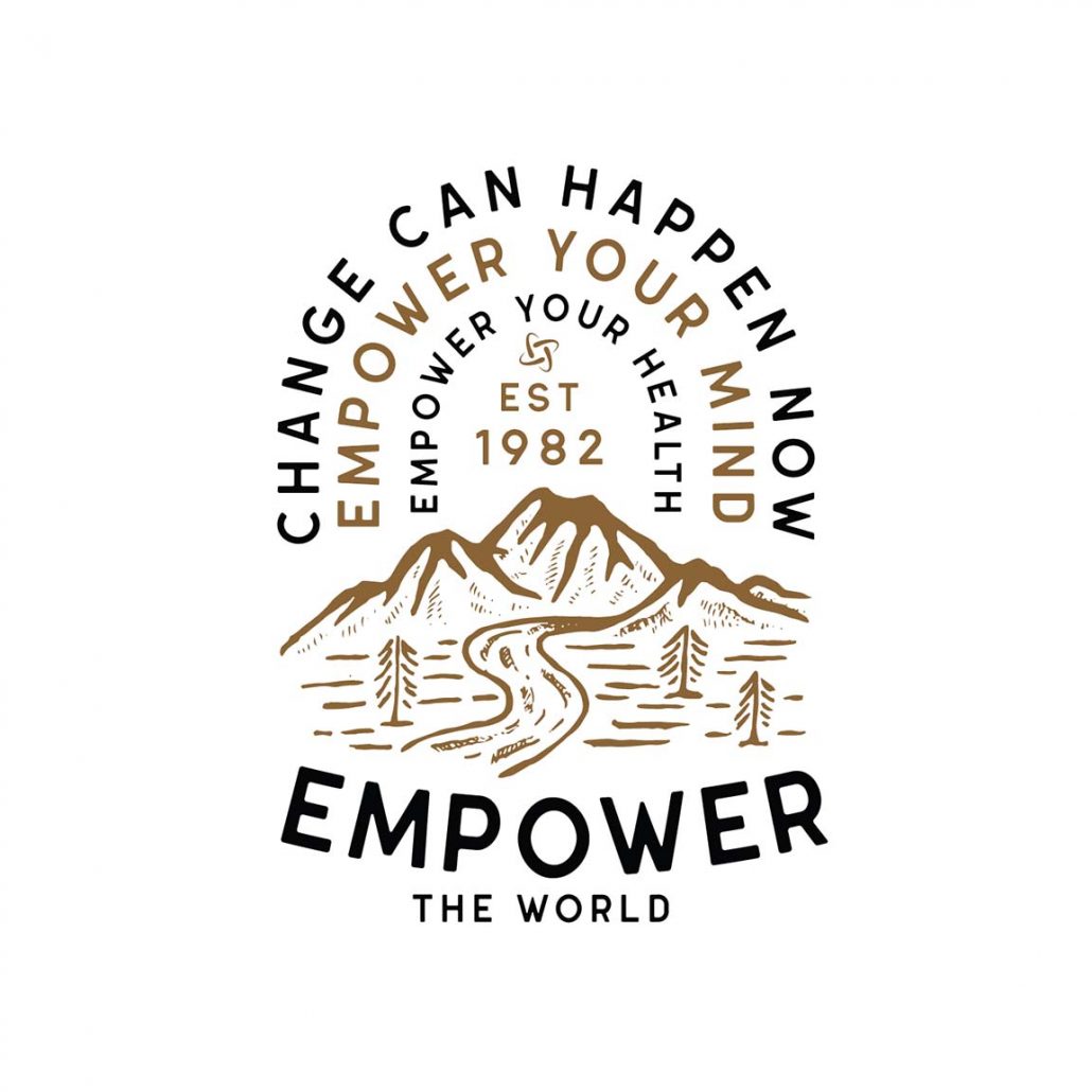
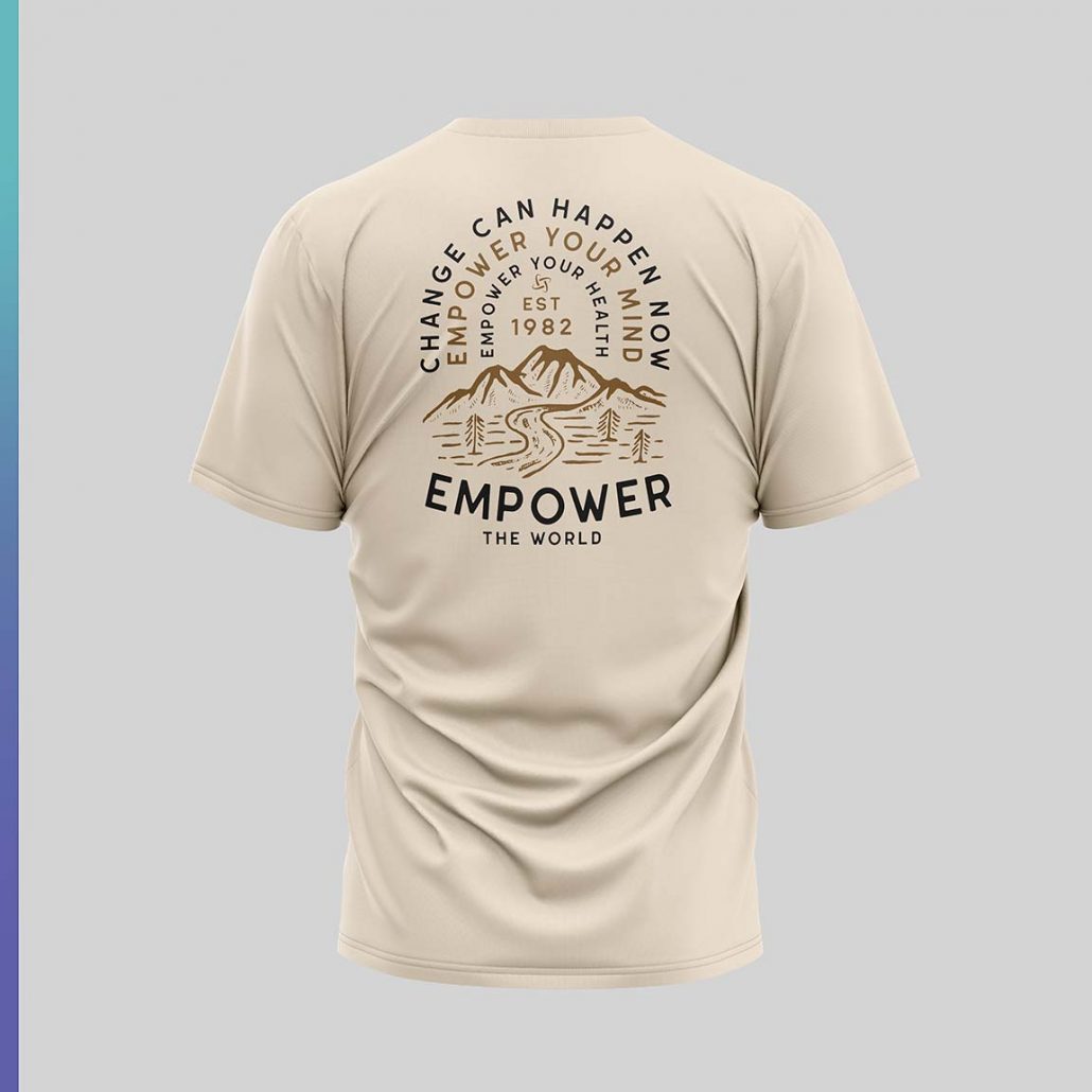
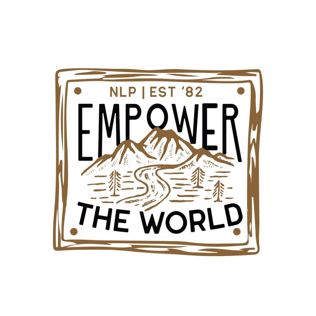
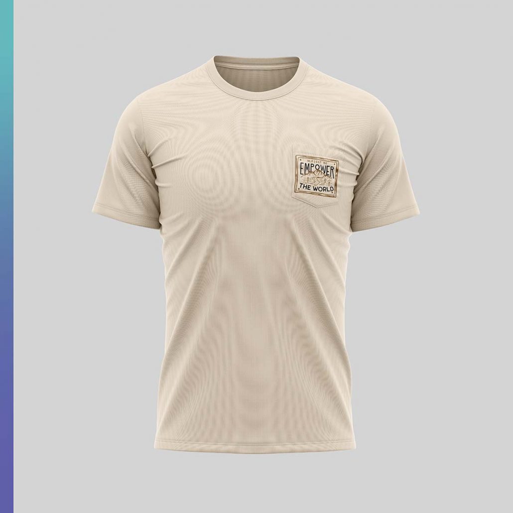
This design is one of our favorites, it pays homage to early 80’s type of artwork. A somewhat retro modern type of design which symbolizes everything beautiful about our world, sky, sun, mountains which represent creation, river which symbolizes water and life and forests which provide oxygen to all living things.
Fourth Concept:
Our final concept is also one of our top choices! We had a lot of fun with this one, we wanted to show a variety of styles that all could potentially equal a really nice collection of tshirts. This idea is based on a universal approach that will appeal to any demographic, modern, with a vintage twist that makes this design feel timeless. This is a very inspirational design with the core teachings in a beautifully rendered graphic representation.
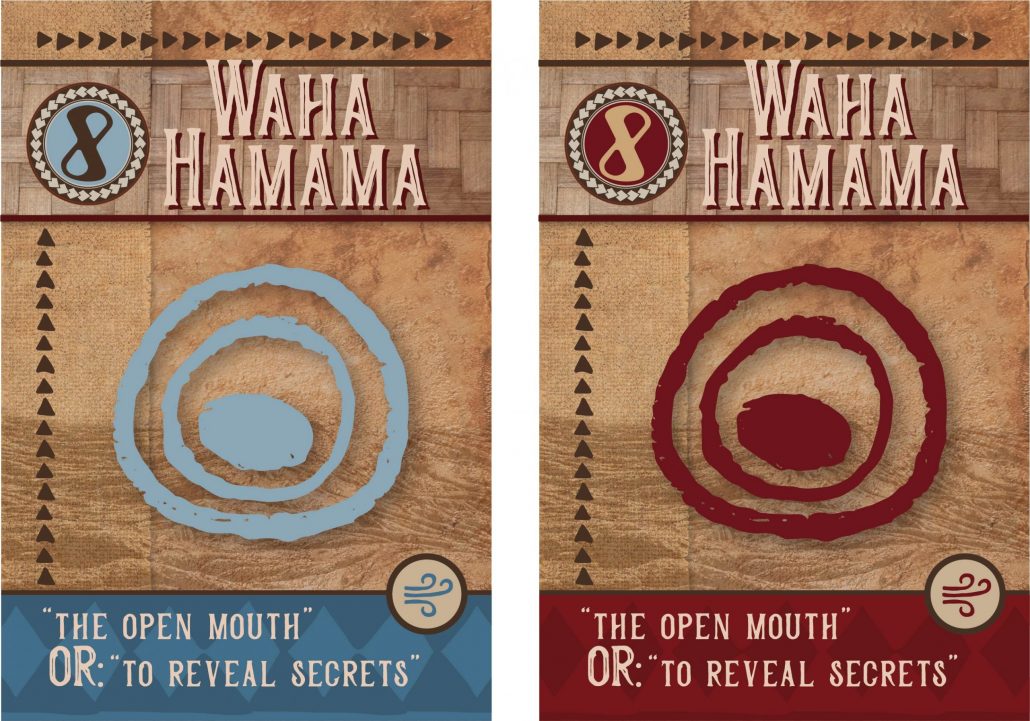
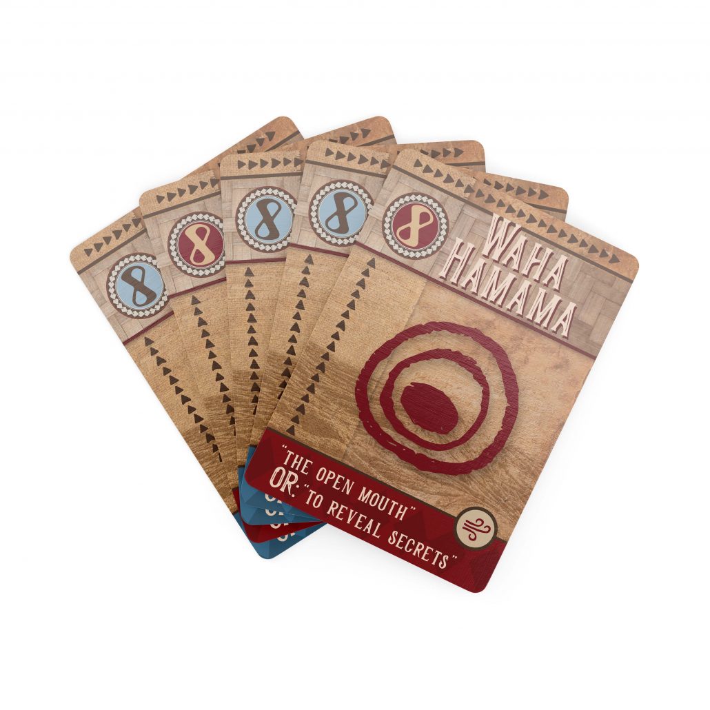
Aloha! We have our first concept ready to present to you. Below is an explanation of our process:
We wanted the Opua cards to have a lot of depth and layers to them which symbolize the different layers of the Manuscript from 1860. There is a lot of meaning behind the design:
- the background texture is one of volcanic stone which is representative of the creation of Hawaii in its essance
- on top of the volcanic stone we also incorporated a subtle pahoehoe lava flow which emphasizes this concept. The pahoehoe lava texture is symbolically placed on the bottom of the design to signify the foundation (quite literally the ground we walk on)
- We incorporated the tapa triangles from the mood board that was presented to us to tie in the family lineage beautifully as a border that embraces the entire design as a whole
- We wanted to give a sense of weight to the cards so every element feels like its contributing to the story, adding onto the legacy of what came before it.
- We had the idea of color coding each element (hence the gorgeous airy blue hue for the air element) For now we just repeated that design but changed the colors for a fire element so you can understand the idea
- The actual symbol is inspired by petroglyph, vintage woodblocks. We wanted to give it that sense of eternity and importance. The symbol has a feel of authenticity and reverence
We hope you like our idea and direction for the cards and welcome any feedback you might have.

 Aloha! We will be using this private web page to keep track of the progress made on your project. All drafts and revisions throughout the process will be posted here. We are looking forward to working with you on this project!
