

1/6/23
12/28/22
V15
 12/21/22
 12/14/22
12/7/22
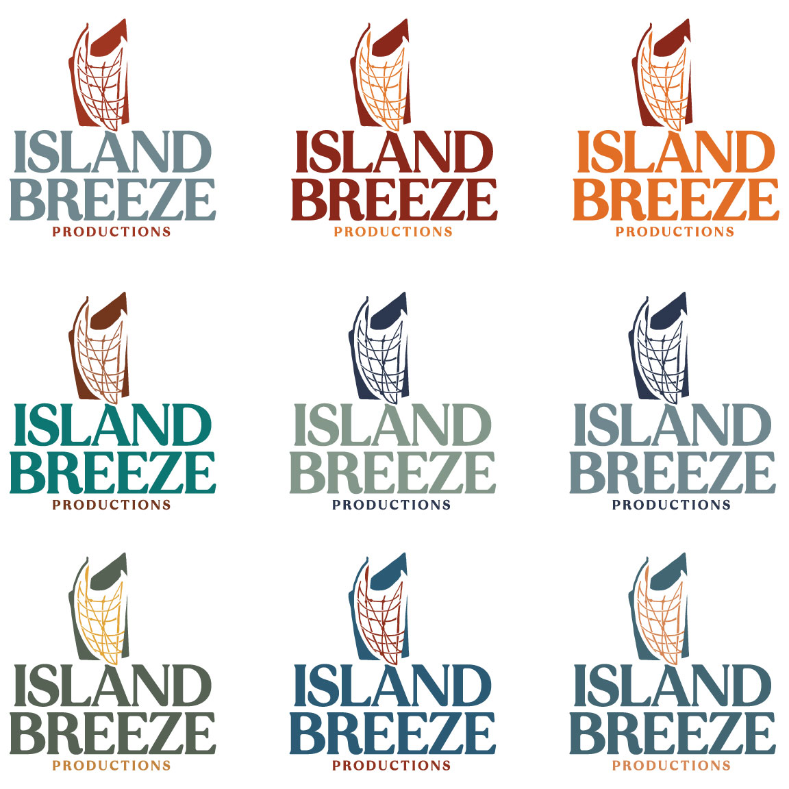
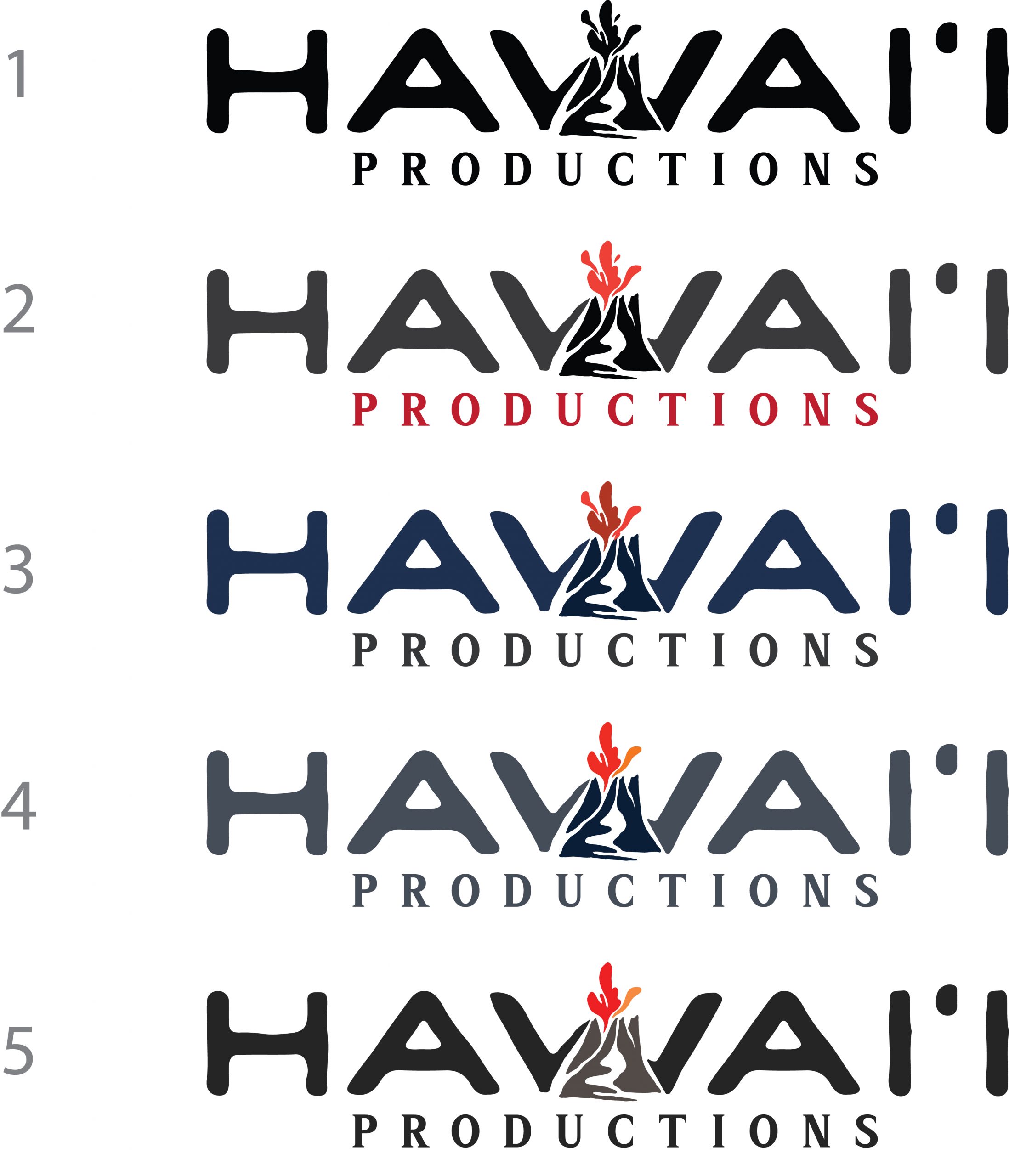
Hawaii Productions Logo Colorways:
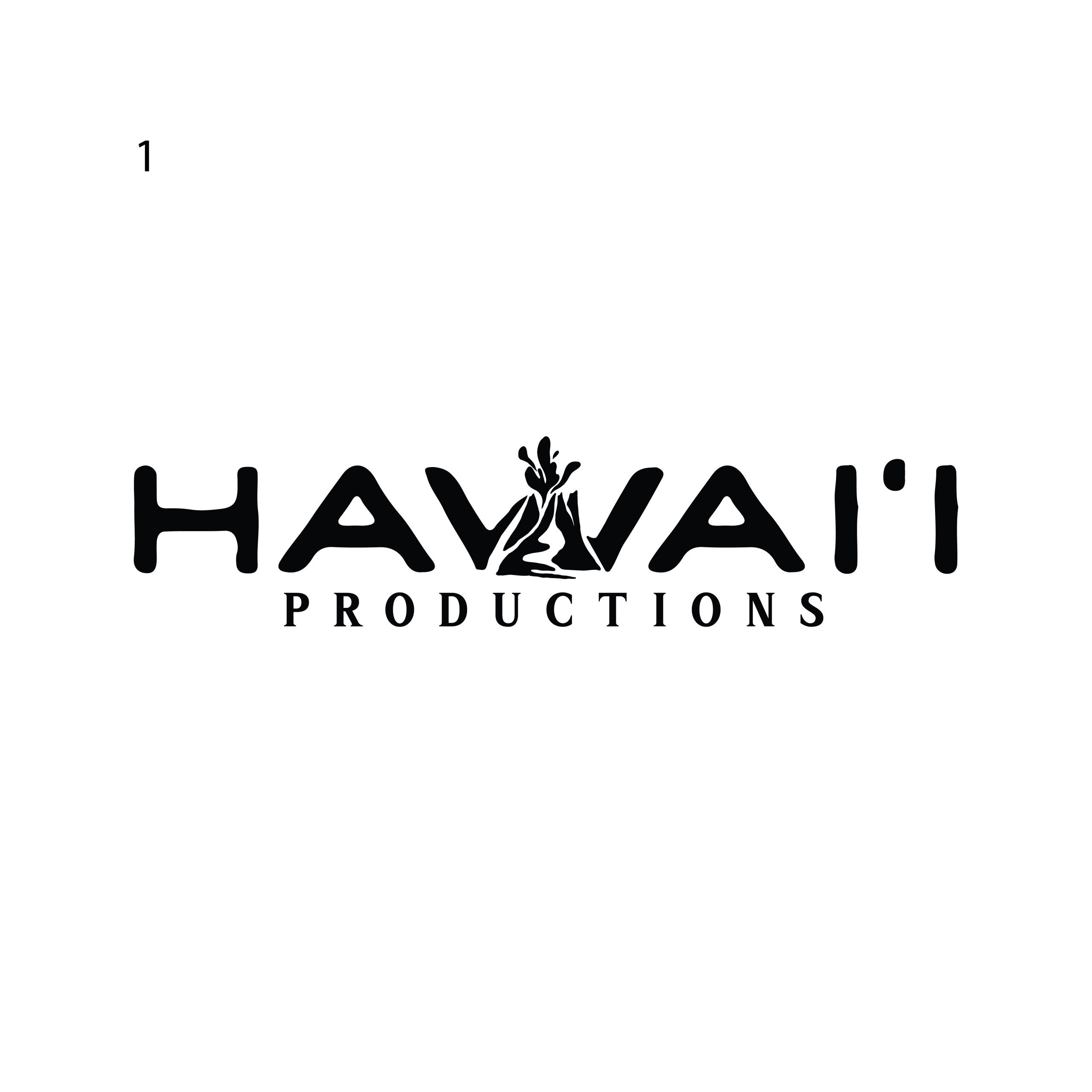
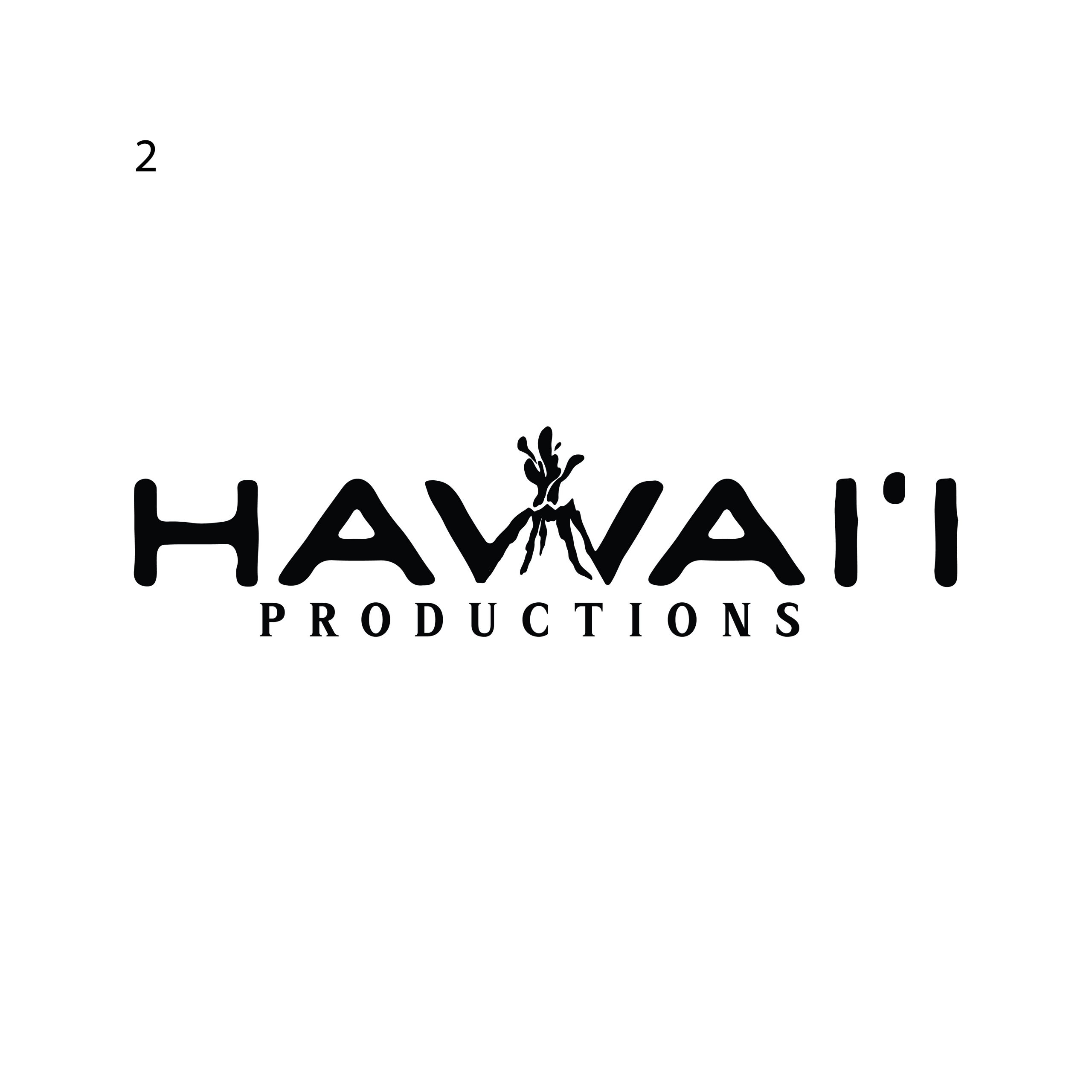
we took inspiration from mauna loa photos of the current eruption from dusk till dawn
11/19/22
Aloha! We have a few concepts for Hawaii Productions. We wanted to explore new creative ways to represent Hawaii Productions. We wanted to give the logo a bit of similar stylistic approach to the others to represent one big umbrella that shows cohesiveness. All icons and graphics are hand drawn and completely unique
9/30/22
Aloha! Thank you for your patience as we explored and researched new directions for the logo. This new round is inspired by a lot of our recent research and field trips to museums and studying Polynesian voyaging history. We hope you enjoy!
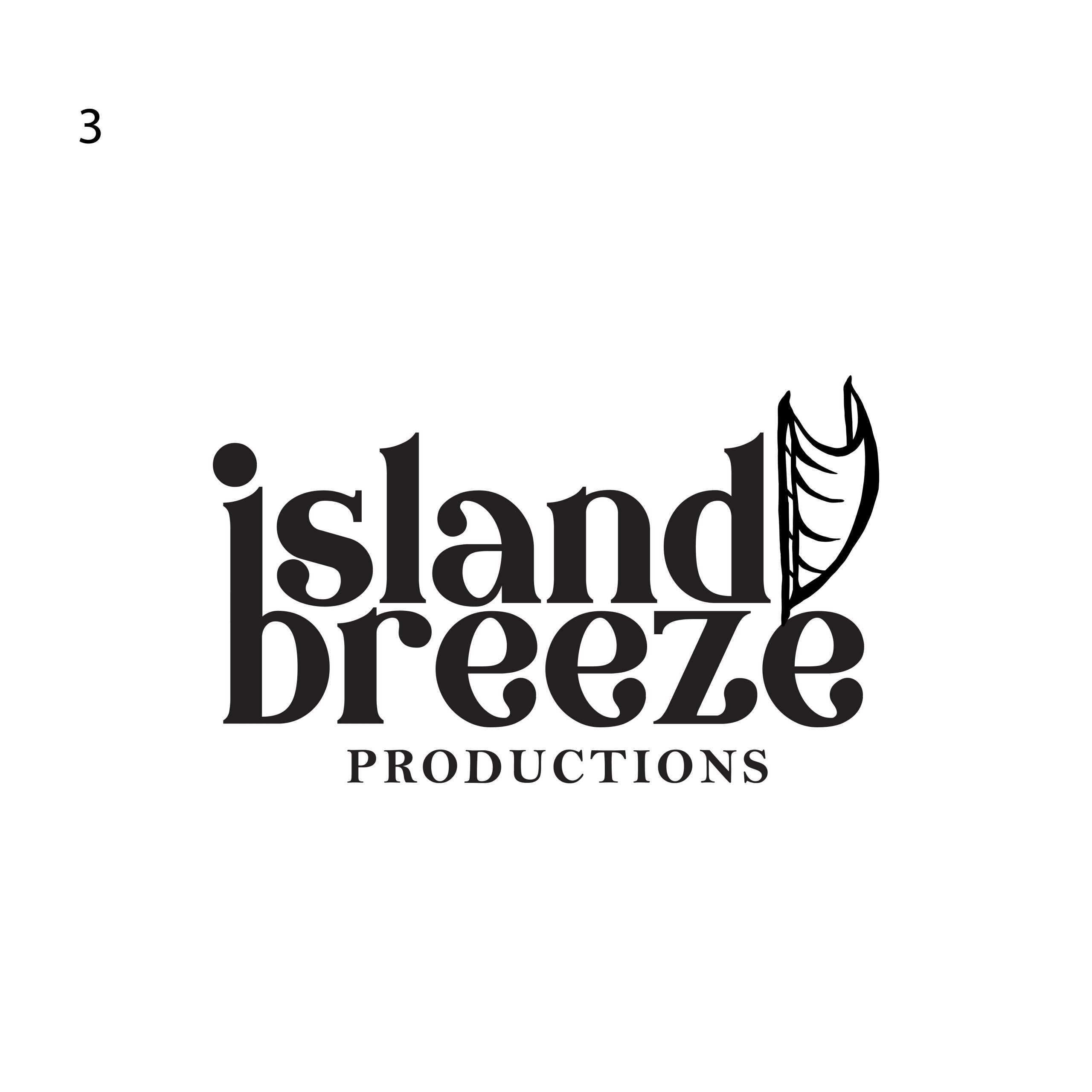
First concept is based on the manta ray (hahalua ) Aumakua. We wanted to give each concept a double and triple entendre, the Manta represents precision, strength, and grace, which is what dancers and performers must have while on stage. They need to represent themselves as performers, but also accurately represent the stories being told through dance. On a deeper meaning, the ray is highly revered in Hawaiian culture as a creature that is a deep diver which can go places where we can’t go. When mantas leap [out of the water], their experience from below transcends into our sphere … Their transcendence speaks to things that we don’t yet know which symbolizes the future of the company and where it will continue to grow into. The ray is also significant to Big Island which adds an additional layer of integration and relevance.
hahalua—can be interpreted as ‘two breaths,’ which has a triple meaning of Island (which gives us life, and Breeze which is the breath (oxygen) that keeps us alive.
With all the meaning attached to the ray, we then began exploring versions of the illustration that tied in with the company and the vision of the brand. We wanted to turn the ray into a Polynesian voyaging canoe with the wings of the ray forming the sails of the canoe that propel the brand forward. We explored a few variations in graphic styles and typography that fit the narrative.
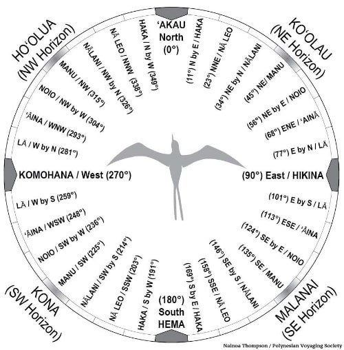
Our second concept [3,4] also has a deep meaning behind it. This design was inspired by the Hawaiian Star Compass that helped ancient voyagers find their way towards different Islands as Polynesians explored and settled different land masses throughout time. “The star compass is a mental construct and not physical like a western compass. The visual horizon is divided into 32 houses, a house being a bearing on the horizon where a celestial body resides. Each of the 32 houses is separated by 11.25˚ of arc for a complete circle of 360˚. – Nainoa Thompson Hokule’a. We added graphic elements to this construct and created two forms of waves, the forward wave represents the voyage forward made by the canoes travelling towards land. The bottom wave is the “wake” which represents the current and wake created by the forward travelling canoe. The wind above the wave carries the voyagers forward, and in line with the “Houses” which directs them towards land. The dichotomy between both the going and coming resonated with us as we cannot go forward in life without tapping into the past, a beautiful juxtaposition which we felt was accurate with the name Island Breeze.. a breeze comes and goes in the same breath. Island Breeze as a company is also represented with the notion of going forward and finding new undiscovered terrain in business and culture.
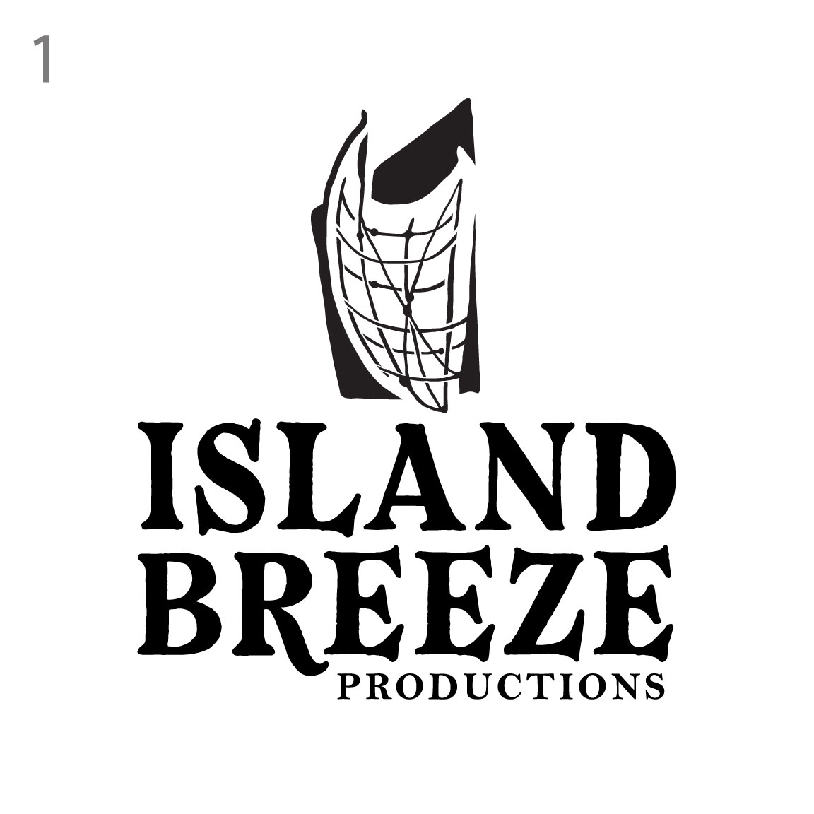
Our Third Concept is a much more abstract approach. During our research we learned about the ancient art of Polynesian stick charting. A practice that is endangered of being lost to time, which we felt was really important to highlight and bring to contemporary knowledge. A way of preserving history in a unique fashion; stick charts identified patterns in ocean conditions such as swells, waves, or wind and also recorded land masses. The stick chart was constructed of materials like palm ribs, coconut fiber, and shells or coral pebbles. The curved palm ribs represented swells; shells or coral pebbles were used to represent islands. The connections between the sticks showed oceanic patterns such as the direction of swells, the way swells curved around islands, and how swells interacted with one another. We wanted to create a very modern graphic that abstractly showcases the Hawaiian Island chain within the graphic. It is very subtle but it creates a great talking point. The chart we designed into the form of a sail which is encompassed by an abstract black shape of a sail which represents the two sails used in voyaging.
We hope you loved the direction we went into and we thank you for challenging us and pushing us to dive deeper into this project. We thank you for the trust and the opportunity to bring Island Breeze into the next chapter of the brands story.
Aloha! Thank you for your patience as we discover approaches and solutions to the Island Breeze logo. We explored various layouts and styles that we think represents the brand.
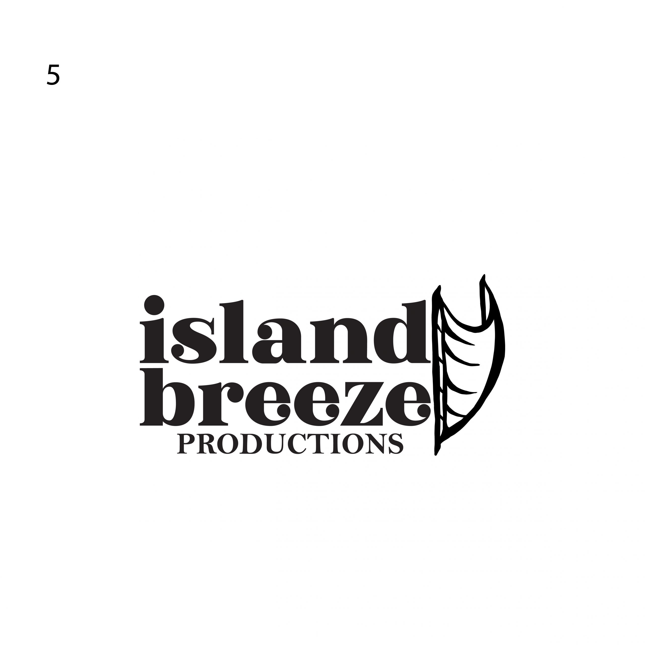
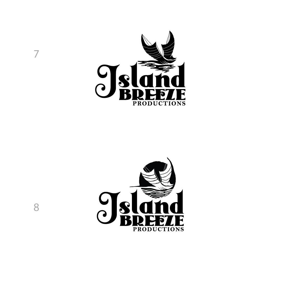
 VERSION #7: Clean stripped down version with no palm tree, simple and classic. Very marketable and recognizable
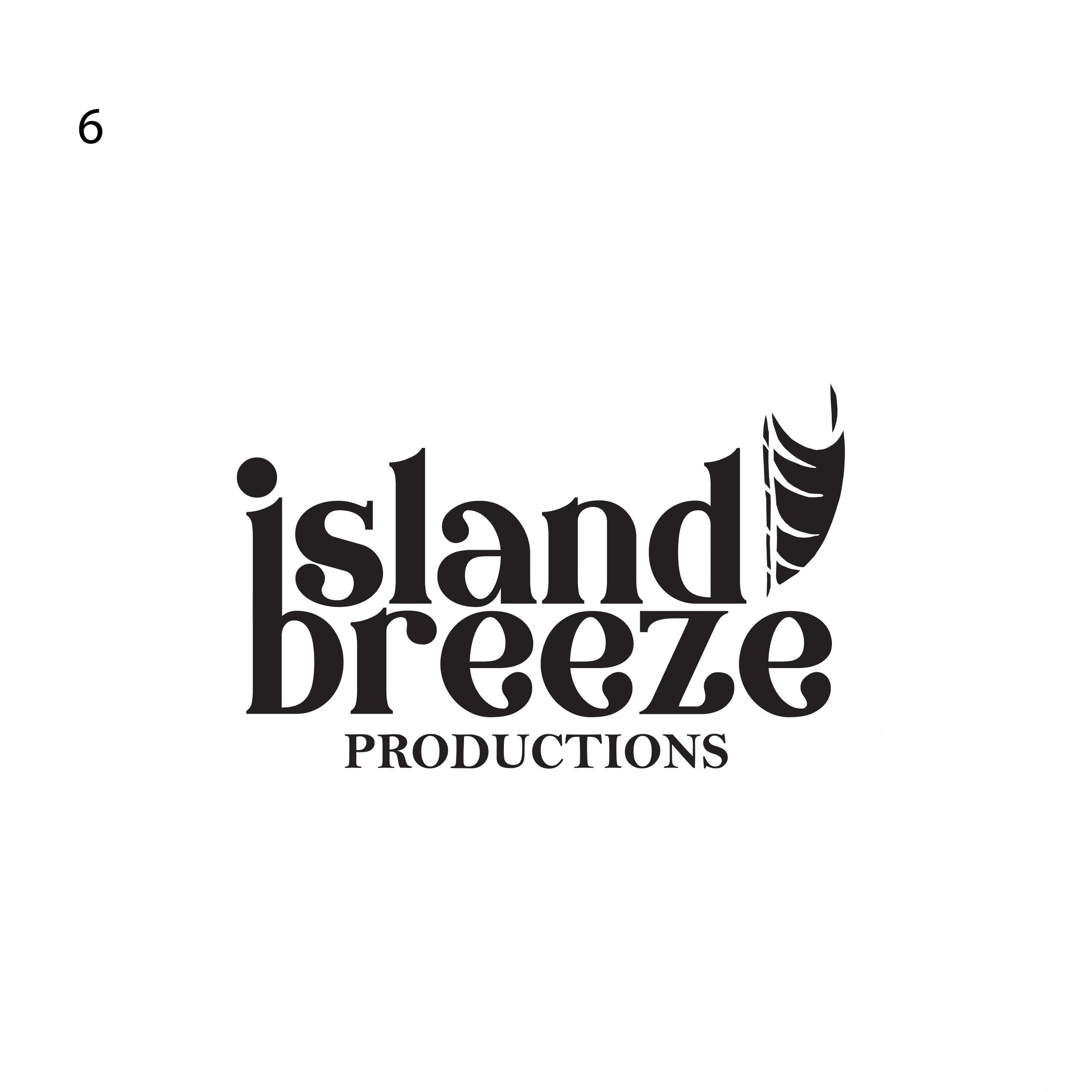
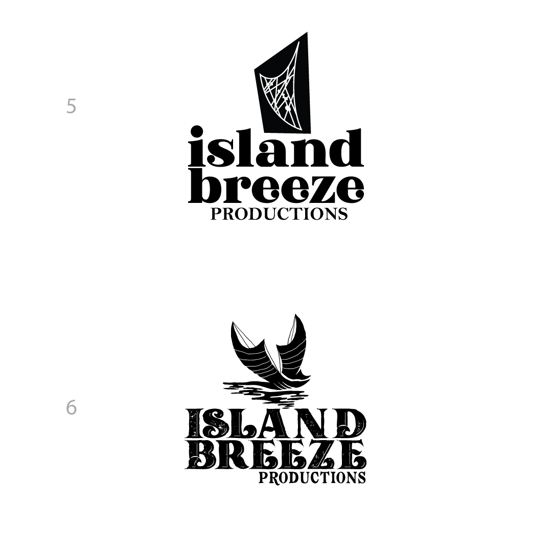
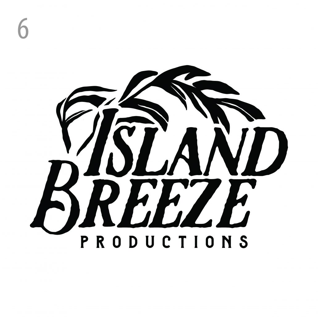 VERSION #6: A new take on the layout and typography that has a more rugged hand drawn feeling to the logo with beautiful flowing palm leaves that cover the island text which embraces the entire logo.
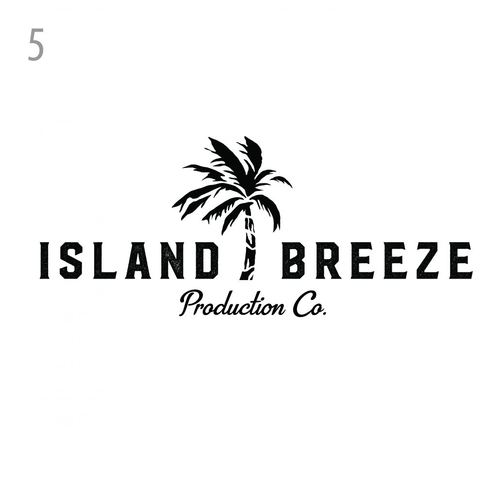 VERSION #5: A very clean and crisp aesthetic that stands out and will withstand the test of time as well.
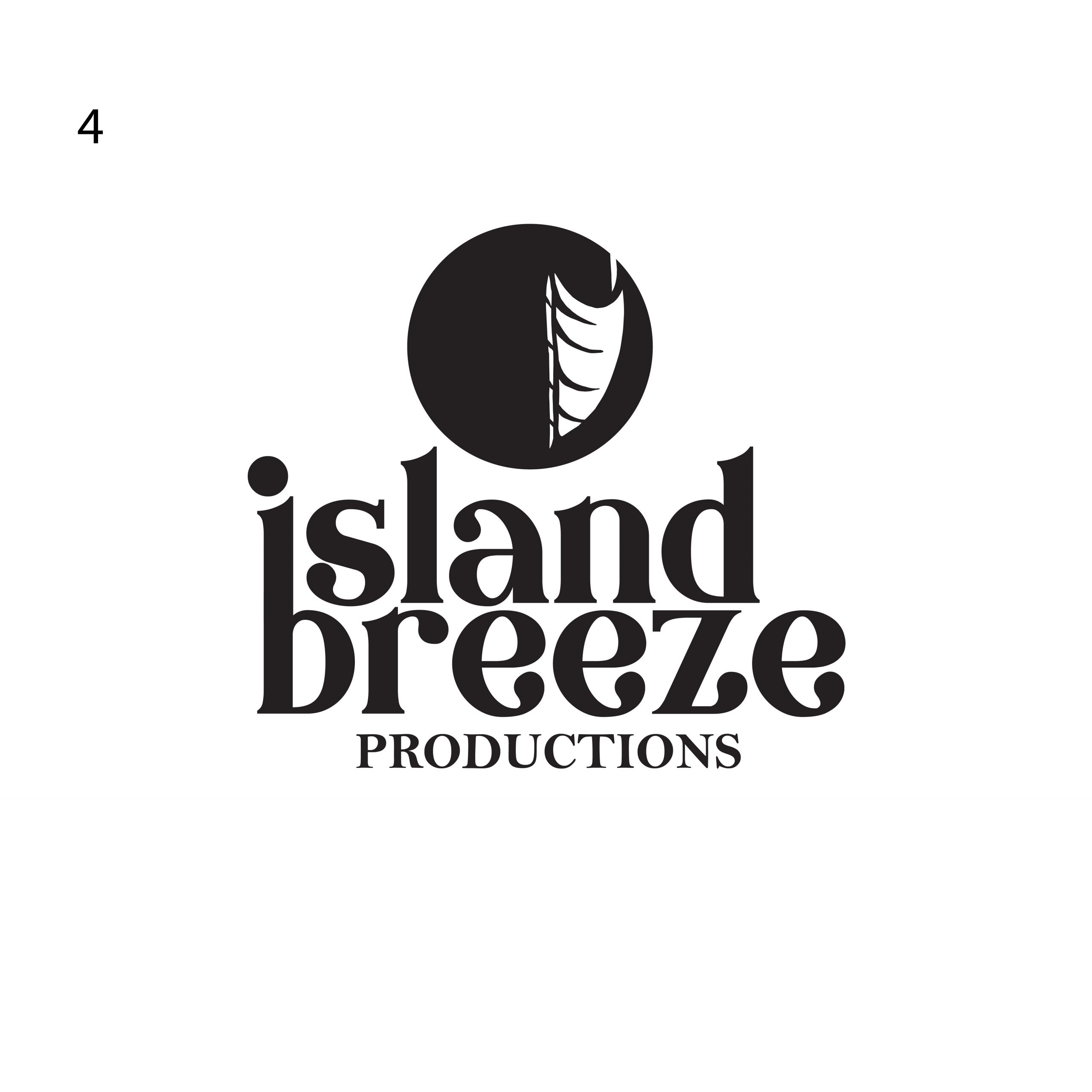
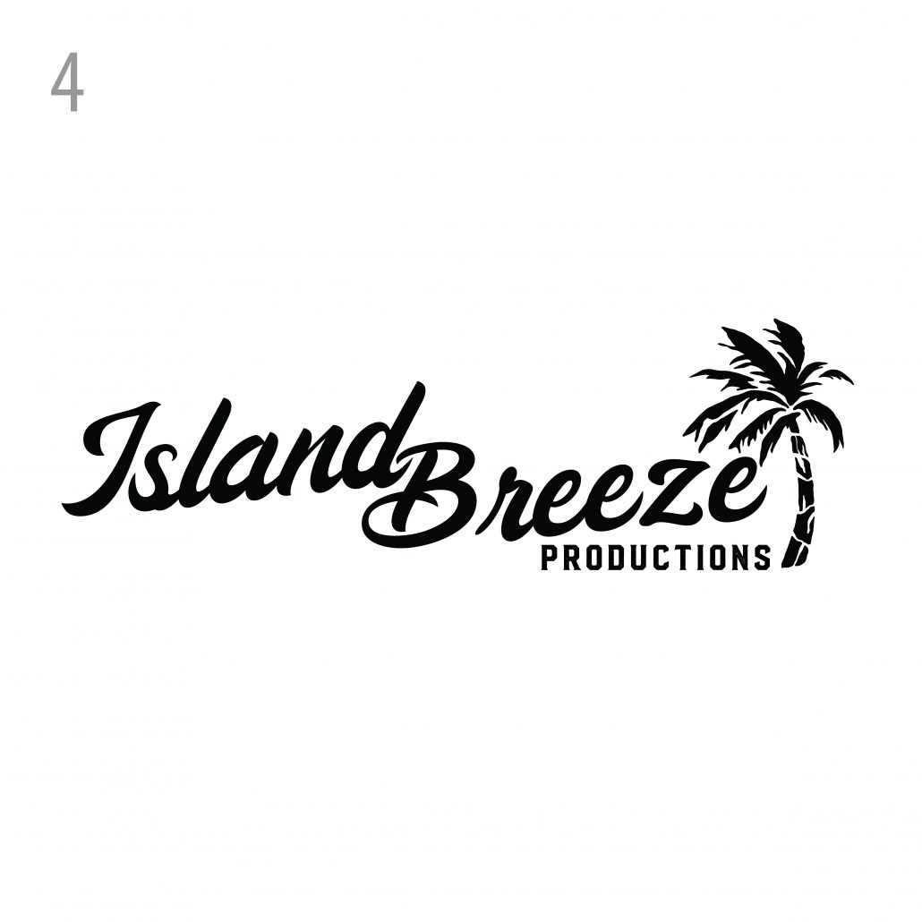 VERSION #4: This logo is an updated and modernized take on the original. We wanted to elevate the original layout with a custom drawn palm tree and updated text with a better flow and cleaner shape. This is a timeless style that will look great decades from now.
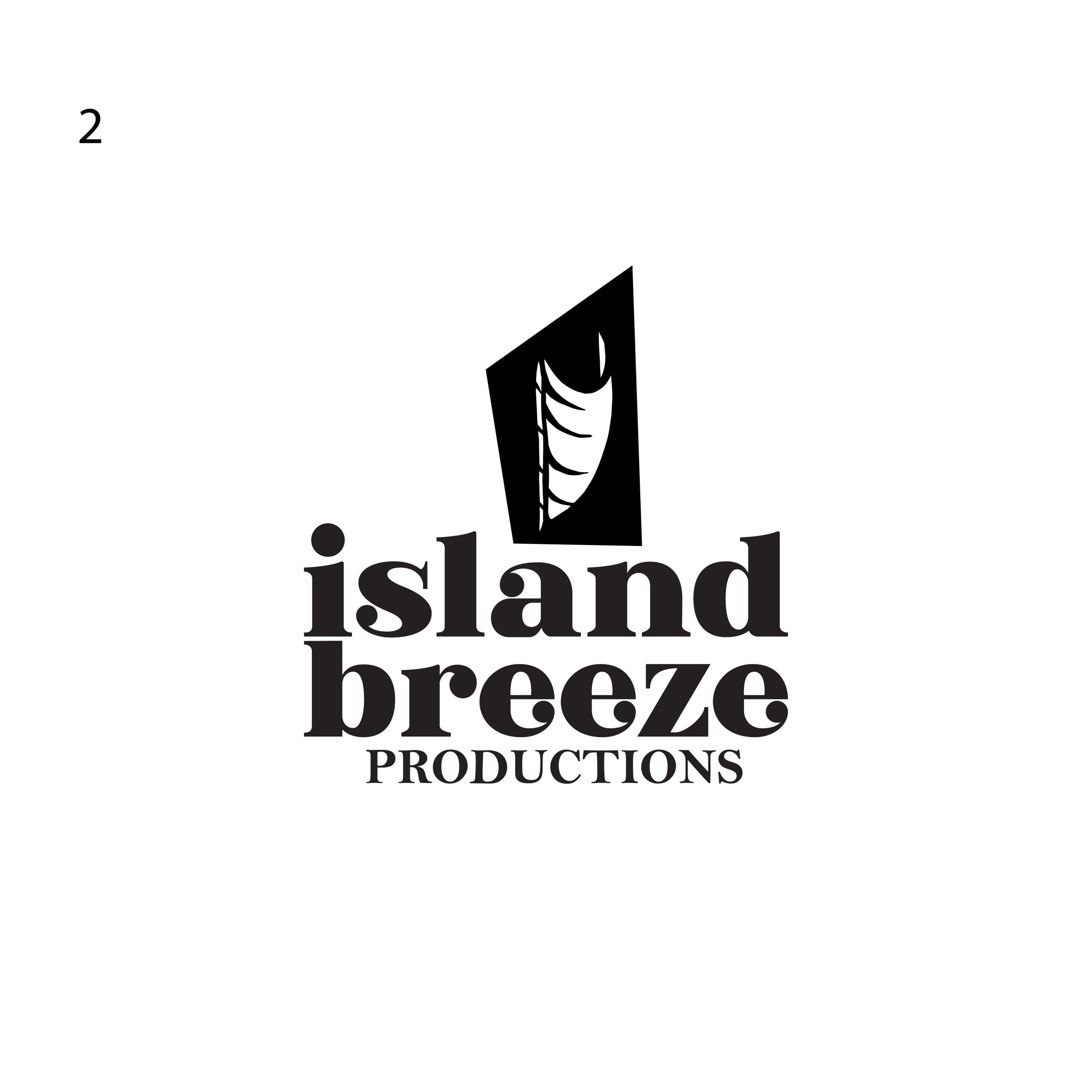
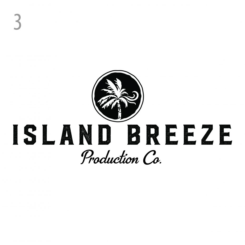 VERSION #3: A clean, simple and elegant approach that has the graphic of the palm tree with the breeze in the form of a wax seal to give the logo a sense of authenticity and officialness.
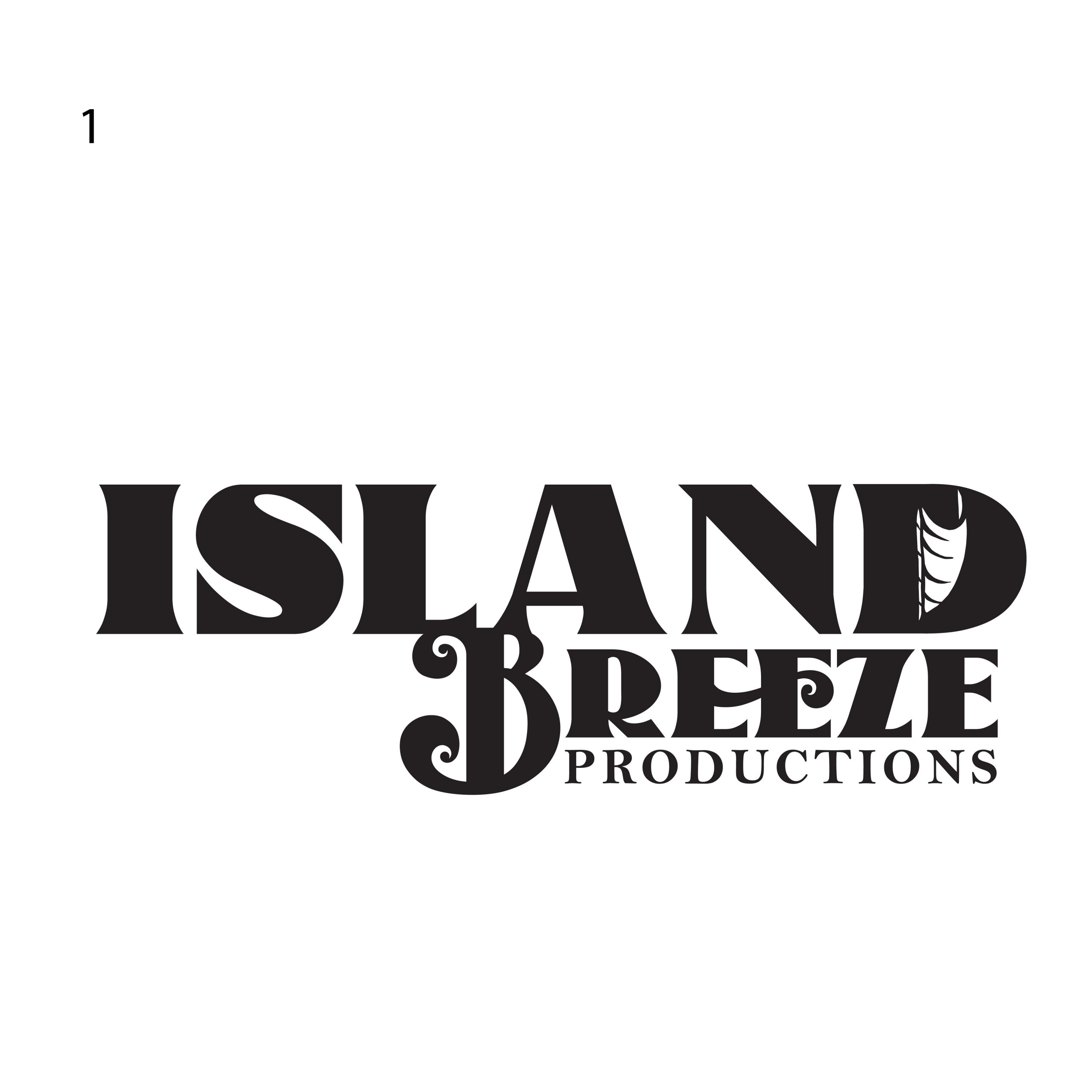
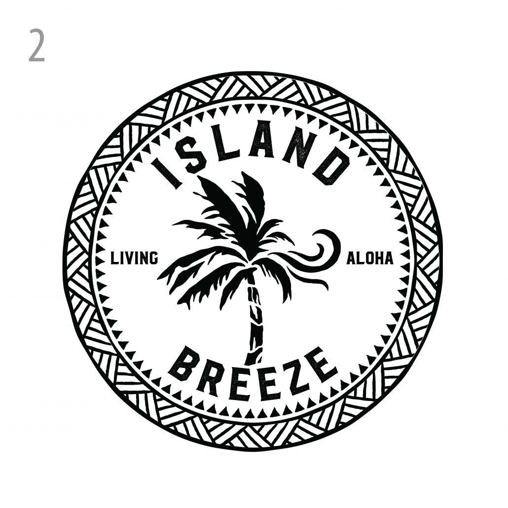 VERSION #2: We really liked this seal approach to the logo that is bold and iconic. We can see this logo being used on a variety of merch and products. We explored the idea of having the leaves of the palm tree swaying in the wind and turning into the breeze. This logo also has a strong Polynesian aspect to it
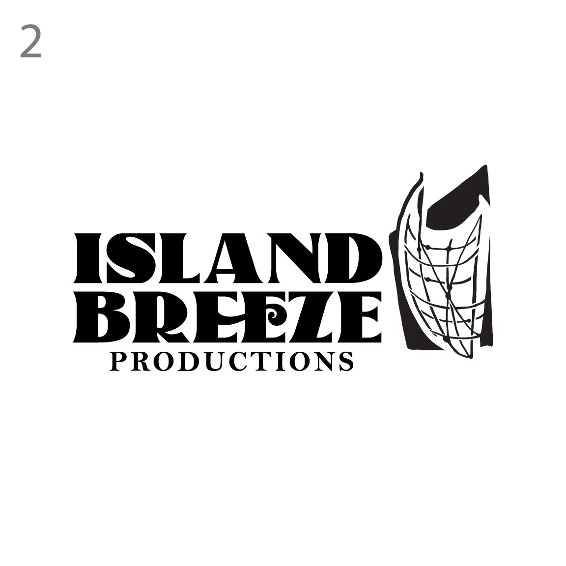
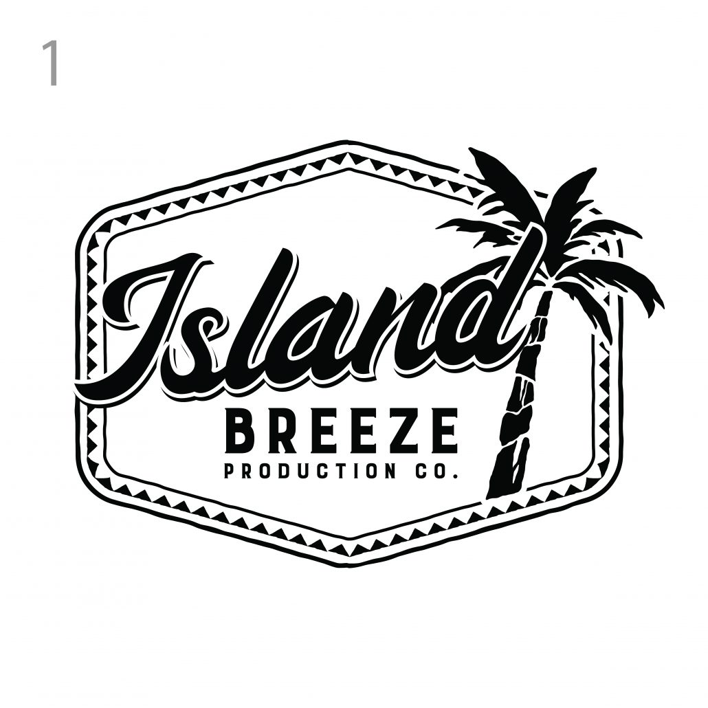 VERSION #1: Our first concept is based on a retro style with Polynesian elements and a custom illustrated palm tree. All elements are custom
I am text block. Click edit button to change this text. Lorem ipsum dolor sit amet, consectetur adipiscing elit. Ut elit tellus, luctus nec ullamcorper mattis, pulvinar dapibus leo.
