Color Exploration:
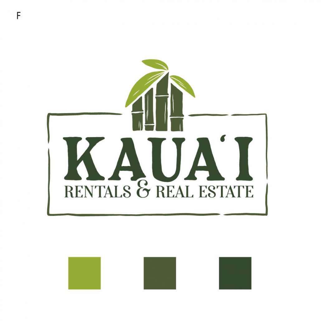
F:
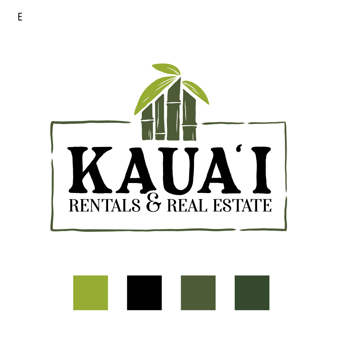
E: black text, 3 leaf icon
new variations based on email notes:
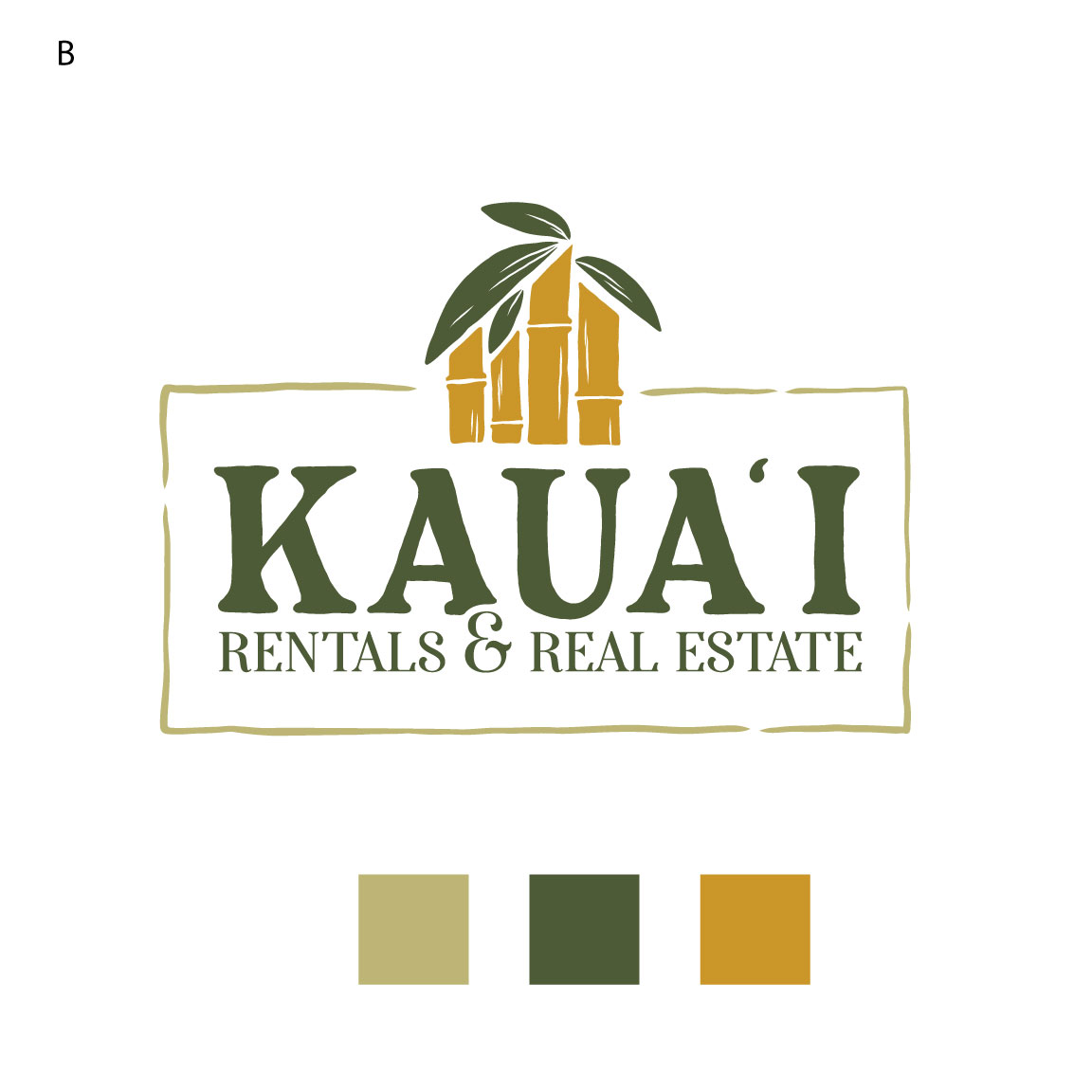
- Variation B: Golden Bamboo color scheme
- Golden/Yellowish stalks
- All leaves a darker green color….the color of the baby leaf works…but not sure how it’ll work with the golden/yellowish stalks
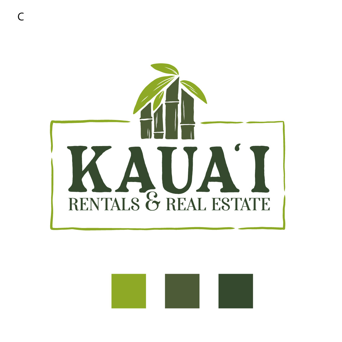
- Variation C: Three color scheme
- Eliminate the light green color
- All leaves the same color….the color of the small leaf is nice, but not sure how it’ll look when all are that color, may need to lighten a little.
- Change “Rentals & Real Estate” to the same color as “Kaua’i”
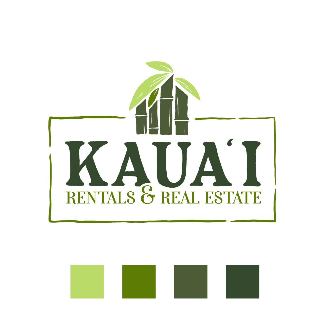
- Variation D: Four color scheme
- All leaves the same color…darken the light green.
- Change “Rentals & Real Estate” to the same color as “Kaua’i”
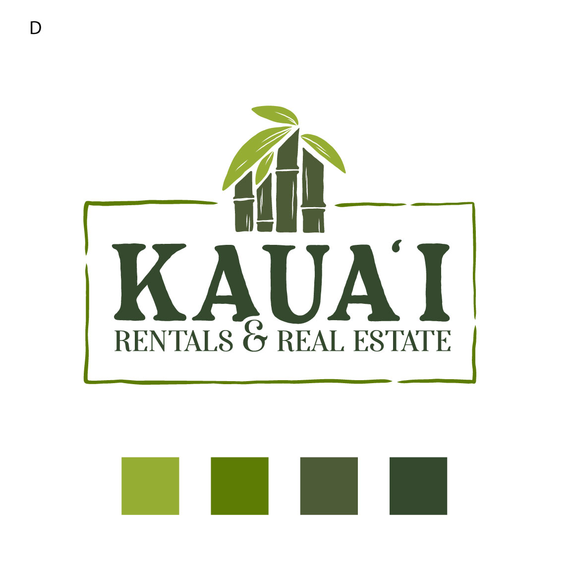
Aloha! We have a very sophisticated, classy modern and fresh color palette for you to review. We wanted the logo to have that lush beautiful Kauai emotion to it so we chose a set of greens that give off a sense of elegance, high end but still earthly approachable and timeless. Hope you like!
Logo Edits Round 3
Aloha! 4th budding leaf added with the capitalized text you liked!
Logo Edits round 2
Aloha! We have edits based on your notes, we also edited the number of leaves to more accurately represent the generations. In the first “house” version we kept the 4 bars to allude to the 4th possible generation with the 3 leaves at the top embracing the idea. New typeface for both!
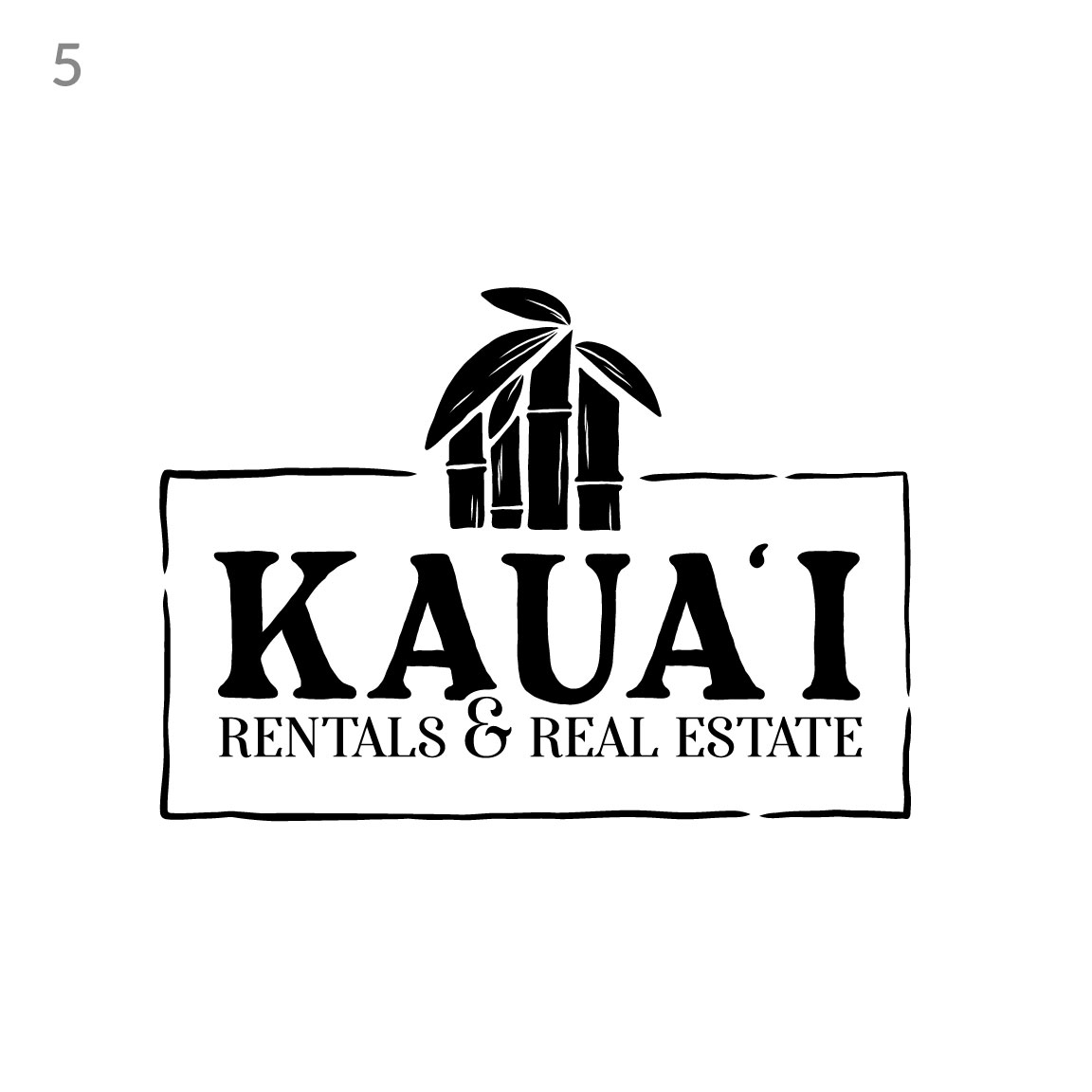
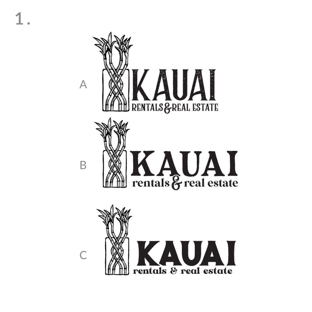
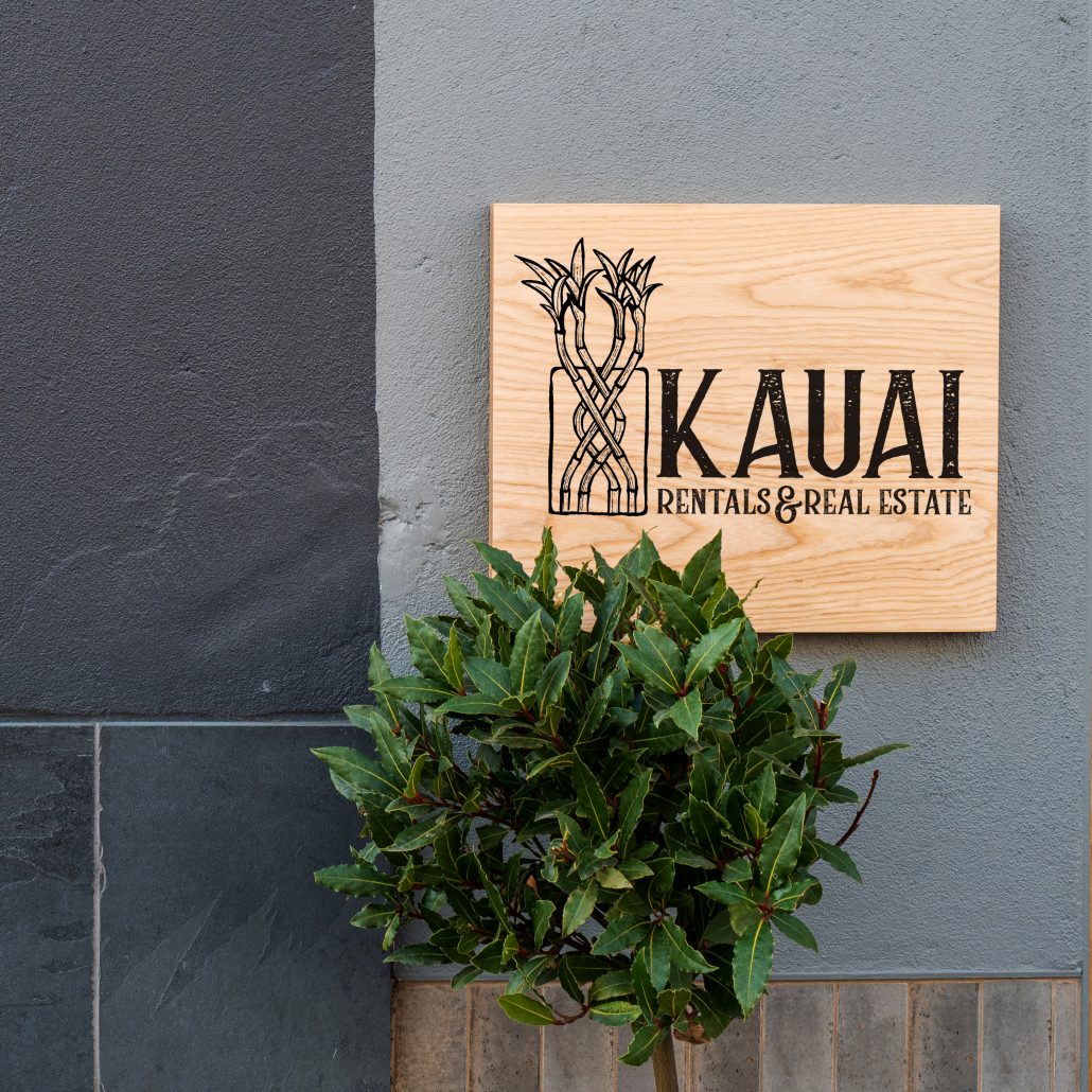
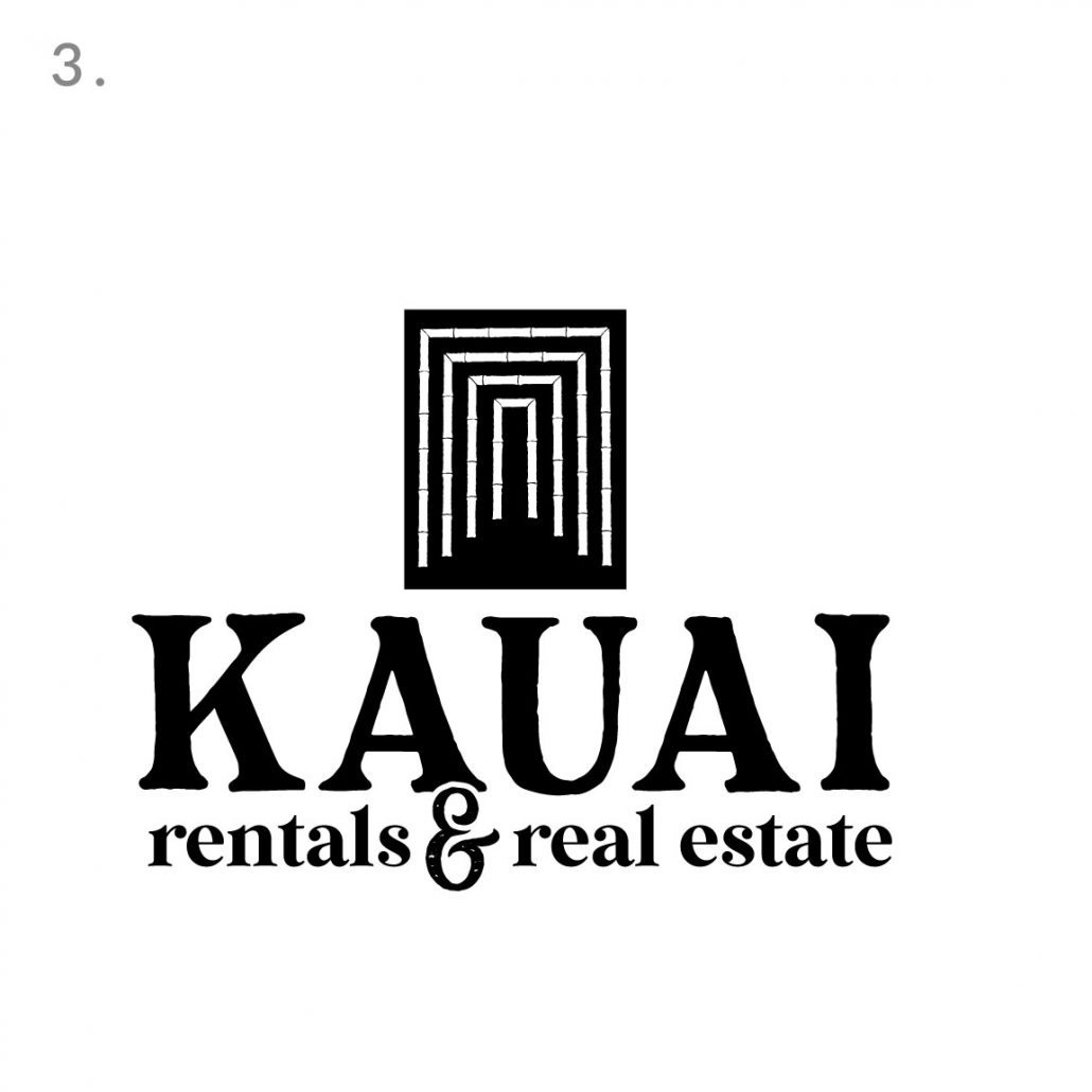
Logo Presentation Round 1
Aloha and thank you for your patience as we dove deep into your project. We wanted to create designs that told a story about the family and the business, combining the history with the future. Our challenge was to design logos that both had an aura of time with the juxtaposition of something new and fresh with a focus on the future. We wanted these logos to look like they’ve been around for a long time establishing the longevity of the brand but still look new, fresh and timeless.
Our main concept was the idea of 4. Four generations, bamboo signifying the longevity, strength and prosperity. Below are 4 concepts that we developed. #2 did not make the cut as I wrote this presentation so I skipped that one.
Our first concept is based around the lucky Bamboo idea. We found during our research that lucky bamboo is a house plant that directly correlates with real estate (Home). The braided nature of this design pays homage to the intertwined stories between your family and the business, 4 distinct plants intertwined into one cohesive unit sprouting new beginnings at the top as they reach towards the sky signifying new goals to be achieved. Custom typography for each which makes all the logos unique to you.
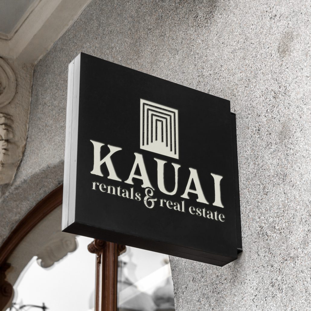
Concept 3 is a really intriguing and nostalgic logo for me. Last time I visited Kauai we stayed in an airbnb and the road to the airbnb was laced with a beautiful bamboo tunnel. This image stuck with me and I knew at one point in life it would come in handy… The opportunity arose, This graphics story is the tunnel. The tunnel signifies the trajectory from one place to another, from the past to the future, the architectural symbolism directly correlates to the real estate industry. We wanted this graphic to have a sense of movement, taking the viewer on a journey into whats unknown.. travelling in towards the future as we reflect on what was and whats next. The typography again custom drawn reflects the nostalgic 70’s style which very beautifully ties in the past with the future giving this logo a very balanced story. The bottom part is nostalgic and gives off a sense of authority while the top graphic alludes to a modern futuristic approach.
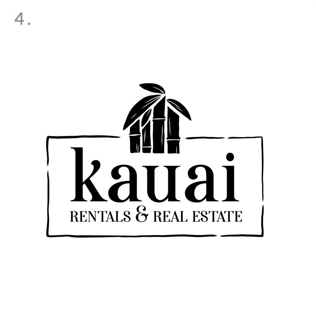
Our fourth concept is a creative approach to the 4 generations and real estate as we tie in the 4 Bamboo pillars with the 4 leaves creating a unique and memorable home graphic. We loved the high end feel this logo has with still having ties to the country laid back nature of Kauai, this logo is a nice representation of classic high end and approachable emotions. We can see this emblem being used beautifully in merchandising and promotion.
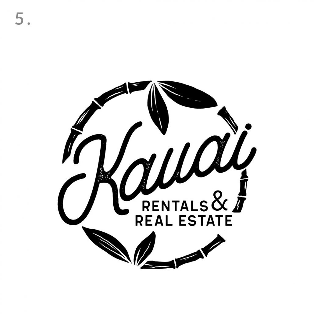
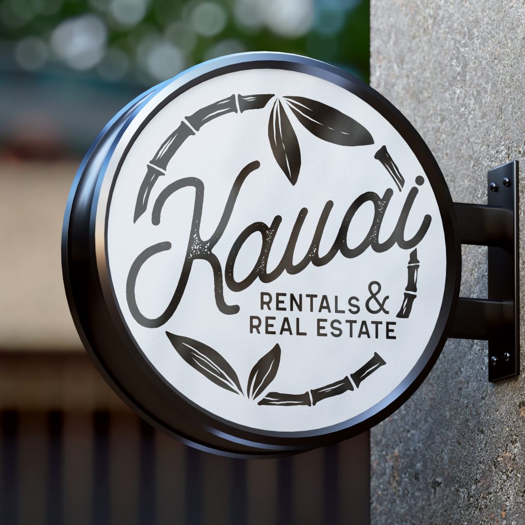
Our last concept! This is our wild card design, we always love to experiment with an idea that seems wild but makes sense. We wanted to introduce a rounded logo, we felt the full circle idea seemed fitting to this story. The bamboo ring on the outside is flanked by the 4 leaves representing the 4 generations and this logo symbolizes the continued story of the brand, as a new generation takes over, the same morals and values are carried through to the next chapter. The circle is a very powerful symbol which is carried through in this design
Aloha and welcome to your project webpage. Here we will track the progress of your branding project so save the url as we will be referencing this site as we work on your branding! We are excited to start this fun process with you