

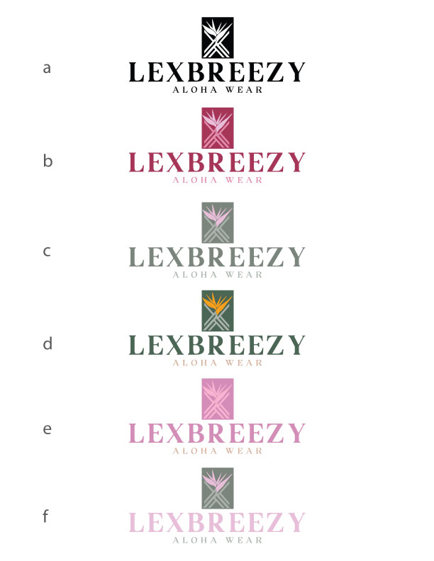
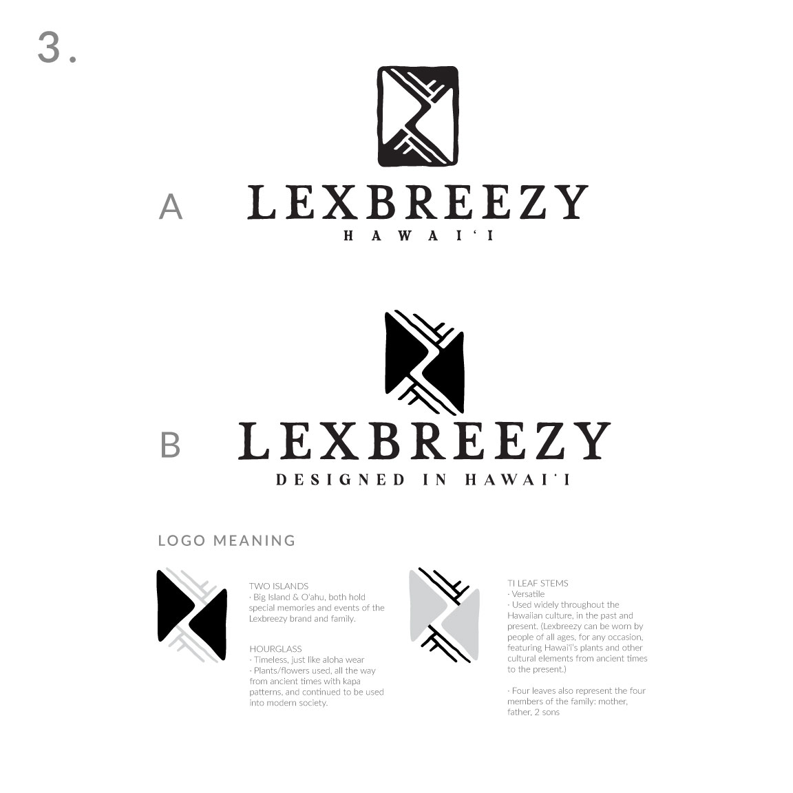
Logo Colorways:
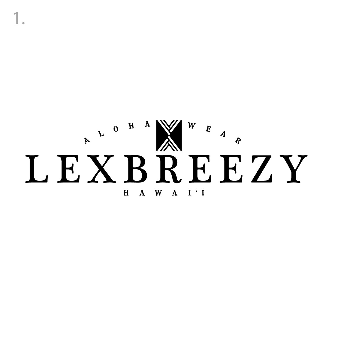
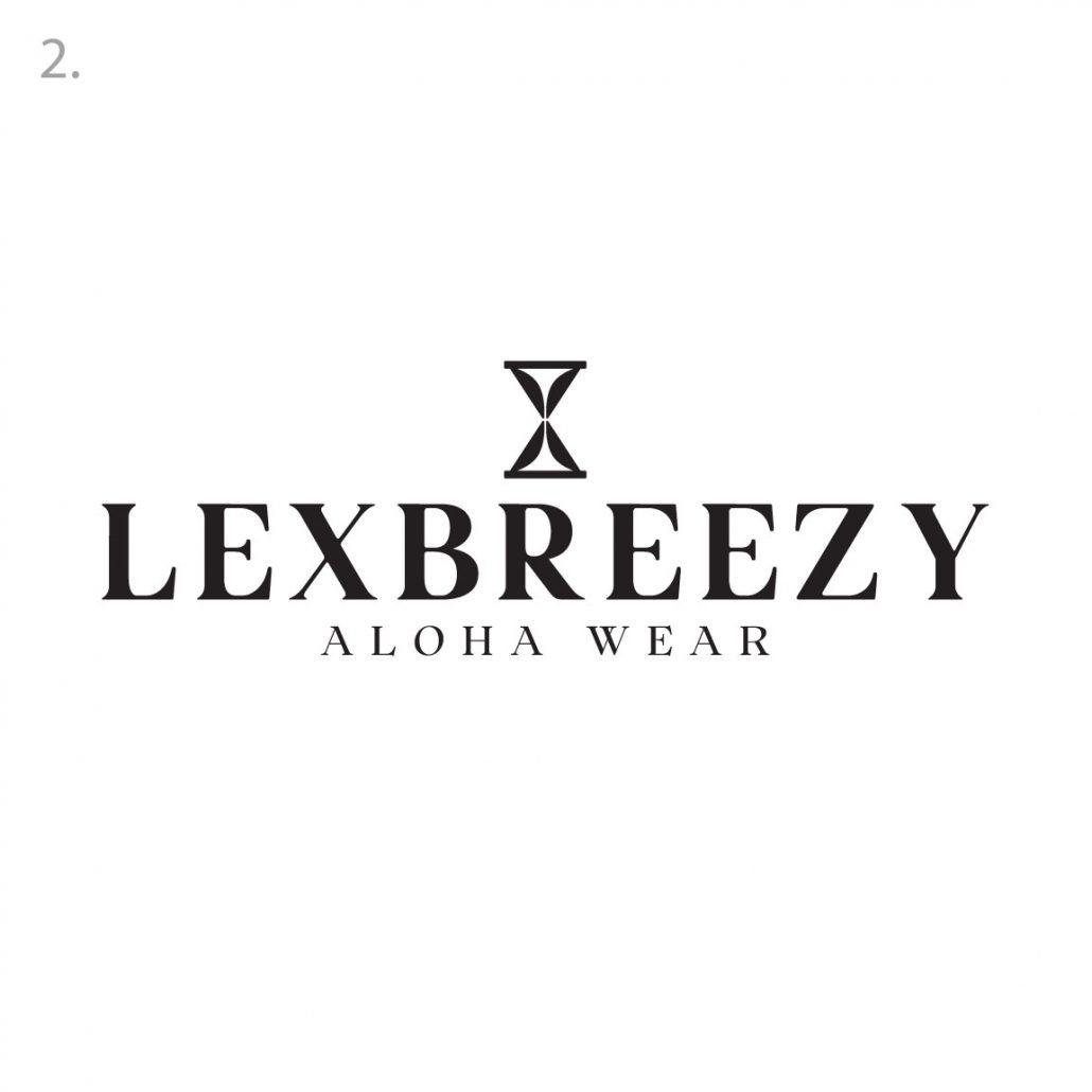
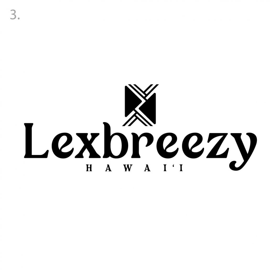
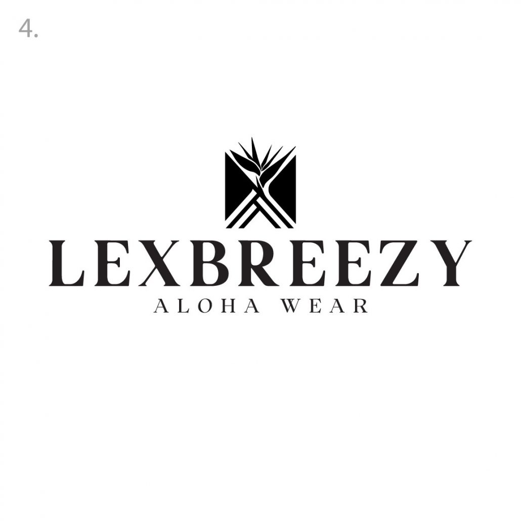
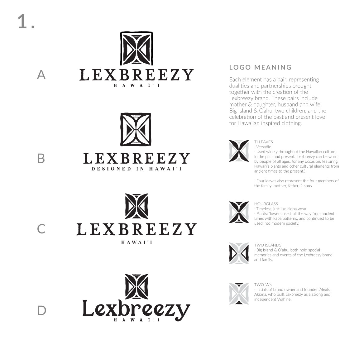
Logo Round “Finalists:
Aloha! below are the final four for you to review. Our personal favorite is #4 to be honest.. We keep coming back to that logo time and time again! Let me know your thoughts!
Logo Round 2:
Aloha! We have a few variations developed. All of these concepts are in the working out process so they’re not 100% fine tuned, I want to get a feel for what you’re leaning towards and according to that we can go in and make everything perfect for the direction you choose.
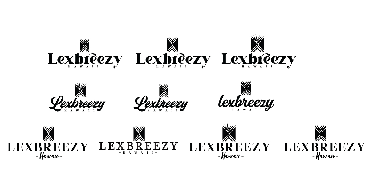
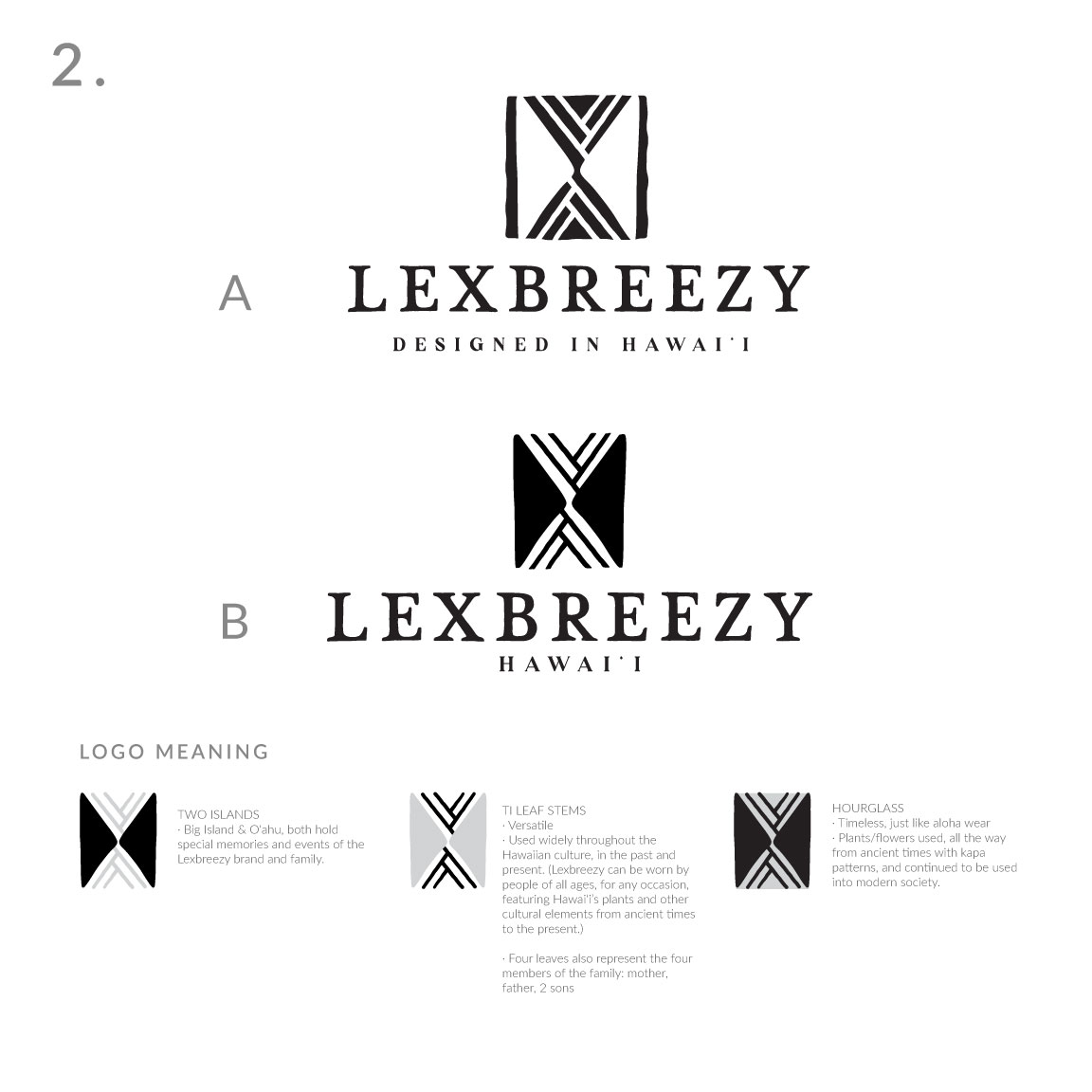
We broke the concepts down to 3 variations of the icon and 3 variations of typeface styles
Icons:
- We kept the original idea in tact but cleaned up the lines and made everything very geometrical, clean and bold and less “cultural” very contemporary and sleek
- We incorporated the idea of the bird of paradise concept in a more abstract and geometrical approach
- Bird of paradise that is a bit more organic and fluid which beautifully compliments the geometrical aspects of the bottom section of the icon
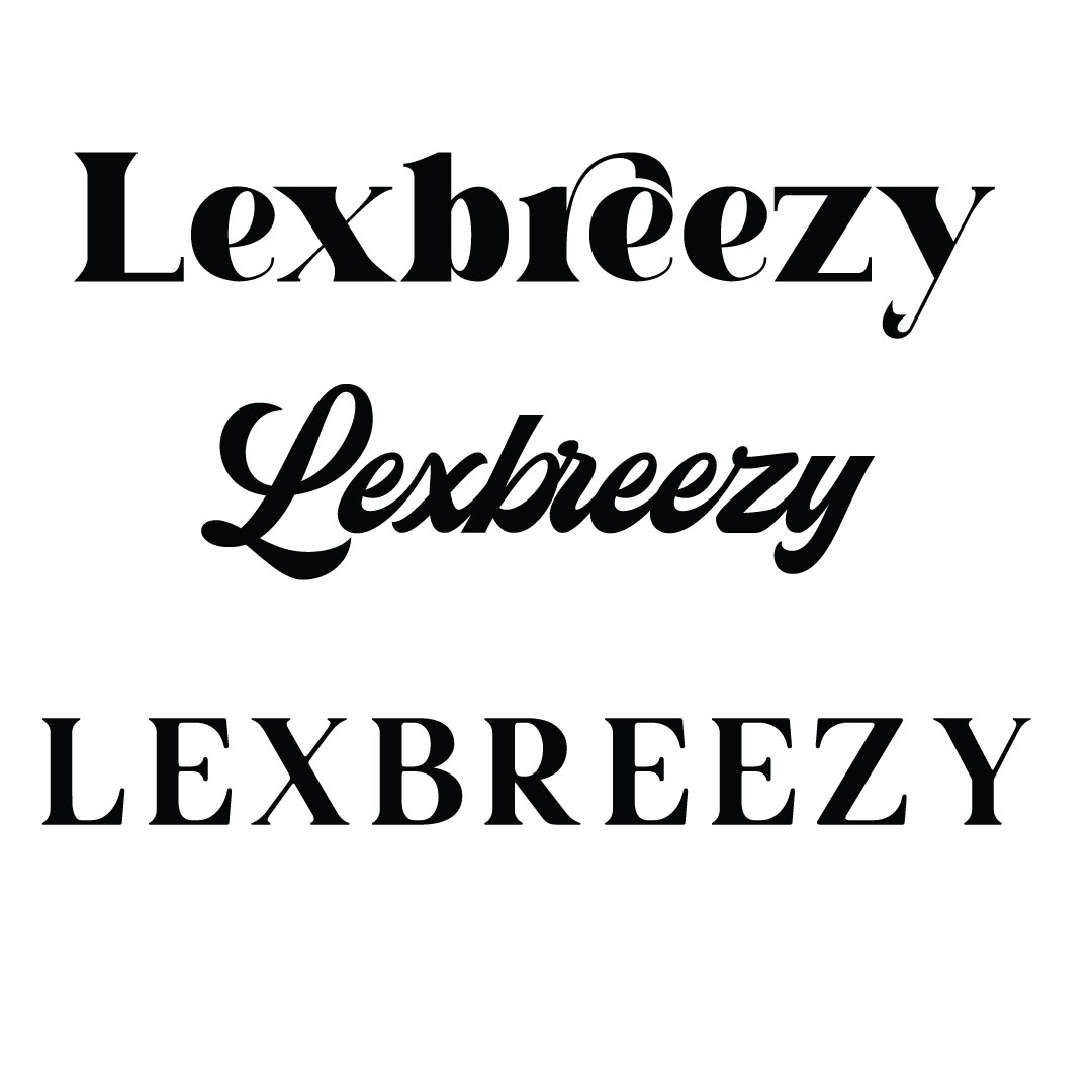
Typefaces:
- We wanted to showcase a typeface that lends itself to the organic and fluid motion of the bird of paradise motif, hence the beautiful interaction of the R stem over the e, almost cradling and drawing your eye from one letter to another, very plant like movement to this typeface
- We wanted to explore a script typeface that seemed a bit softer with motion but not too wild that it becomes distracting and not too thin that it gets lost in the branding. These mid weight scripts evoke a feeling of nostalgia, classiness and elegance yet still feeling fresh and new
- This exploration is more closely associated with the look and feel you have now but updating and fine tuning it a bit more. We wanted to focus on a typeface that wasnt too far removed from the existing look of the brand but give you something that will stand the test of time, bold, beautiful, powerful and iconic look
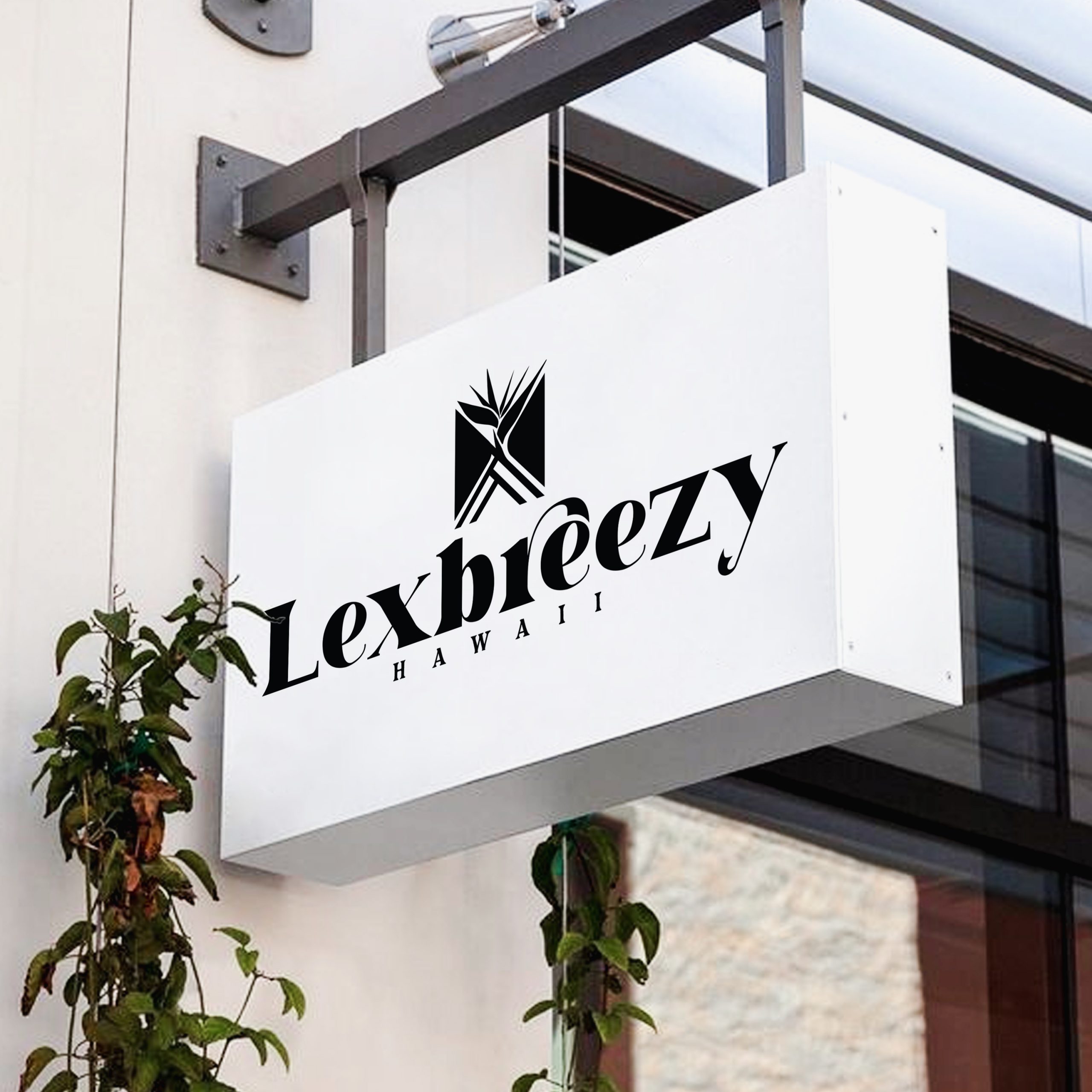
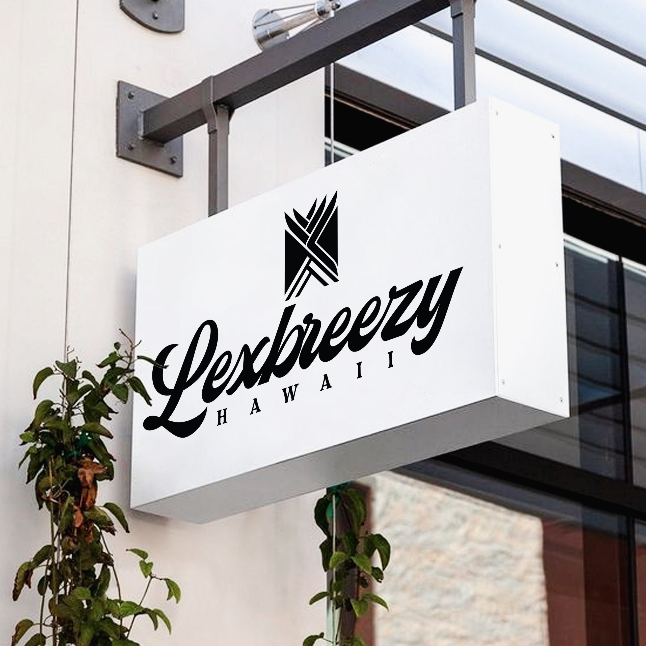
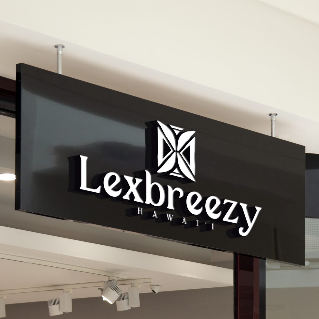
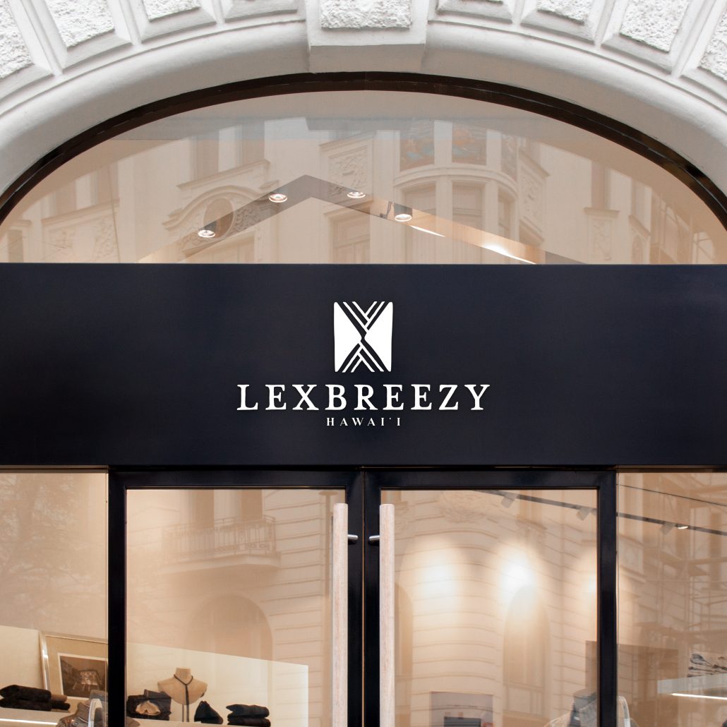
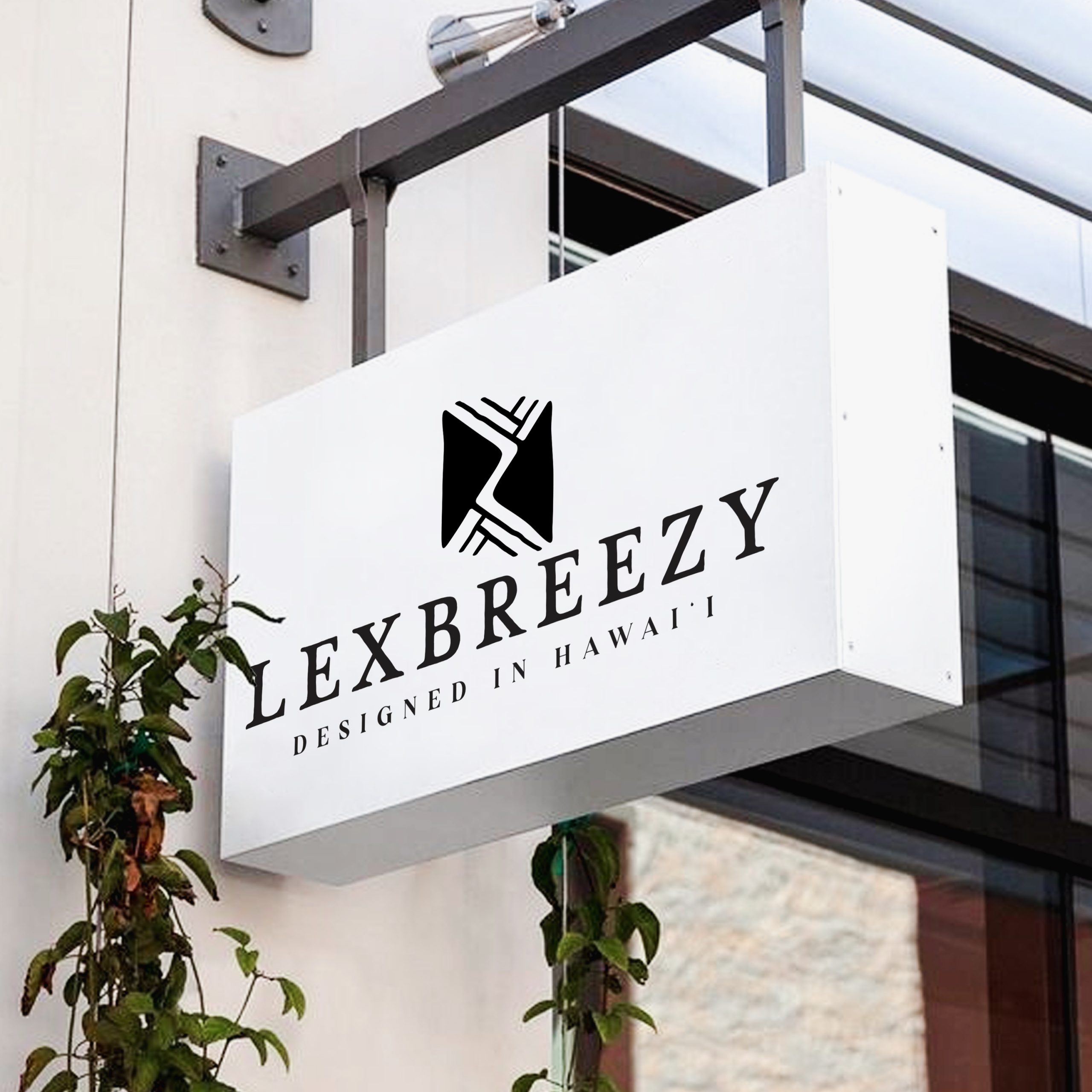
Mockups:

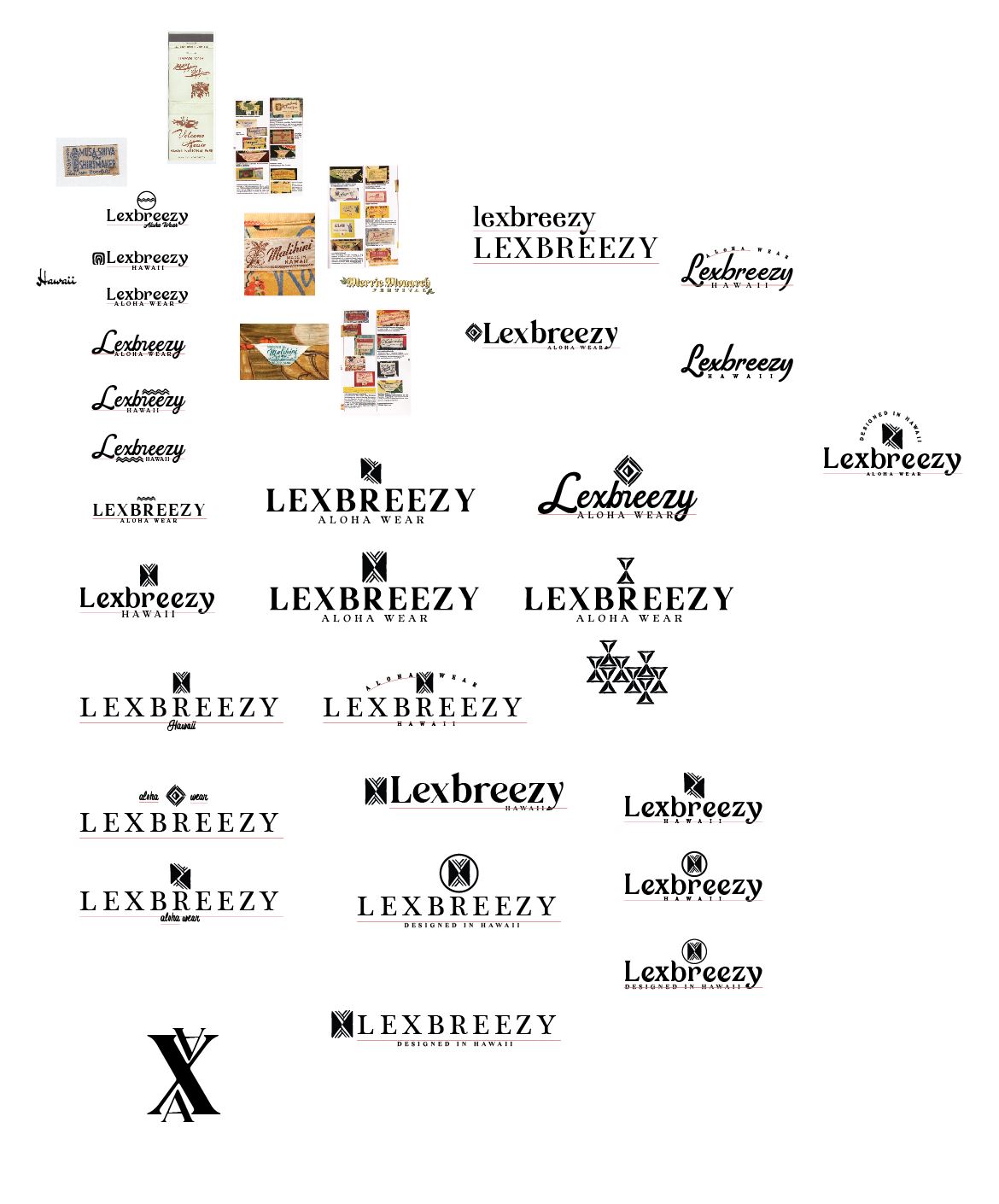
Logo Round 1:
Mahalo for your patience while we did extensive research and brainstorming for your logo project. Our entire approach was based on keeping the overall look and feel of your existing logo as the catalyst for the new design. We wanted to stay true to the brand and not deviate too much as you have worked extremely hard to make this brand recognizable and your audience associates your current mark with your brand so we did not want to introduce a logo that was too far off base. Keeping that in mind we wanted to fine tune your mark and also create a graphic that was unique and personal to you and your story.
Based on our conversations, I wanted to tap into your personal journey that got you to this point. One thing that stood out from our zoom meeting was your recognition of being an Aloha wear brand but not being extremely tied into each specific meaning to each pattern and the new generation which you represent, this mesh of traditional with new. The dichotomy of being a Hawaiian brand with looking forward and being aware of the current trends, fashions, culture shift etc; that being said we decided to create a mark for you that tied in both the classic and the future. We wanted to stay away from specific cultural symbols and design something that was completely new yet looked like it has existed before.
We took elements from your story and incorporated into the mark. I noticed from our talks and your website that the number 2 was very significant. The number 2 kept coming up in all the research I did. You are second generation designer, you have two children, your husband being such an integral part of your brand and you and your mothers story. You launched your brand at Merrie Monarch which has two M’s, your name being Alexis Akiona with 2 A’s, the connection between Hilo and Honolulu (2 H’s) . The duality in Hawaiian culture is also very prominent, Mauka Makai (2 M’s) it just made sense for us to focus our design around that concept.
All the fonts we used were custom drawn so they are completely unique to your project.
Below are 3 main concepts with variations and each concept has a further explanation of the graphic used:
Brainstorm/Sketch
Aloha and welcome to your project web page. We will keep track of all revisions, concepts, sketches and research here. We’re excited to get started! Mahalo
original logo:

