Colorways:
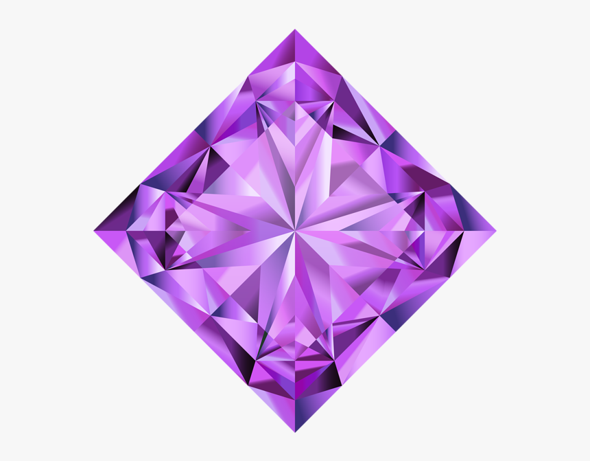
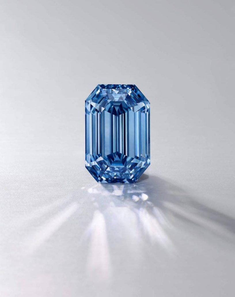
Aloha! We have color options for you to review. The ravens colorways also represent the purple diamond, which is an extremely rare diamond that is very valuable. We wanted to play with the 3d effect of the diamond pattern using the original purple from the Ravens team. We also wanted to explore a beautiful blue colorway which ties in with the original diamond colors and also incorporating the water aspect of your business. We thought the blue options made a lot of sense considering the nature of the industry. Let us know what you think! Mahalo
Concepts:
We want to always present logo designs that tell a story.. we want to give you a design you won’t find on any stock image search. Every logo we create is unique and completely tailored to your business and your journey. What we took away from your story and our conversation on the phone is the strength of your relationship and your determination to make this brand a successful company that represents your marriage and your desires to succeed.
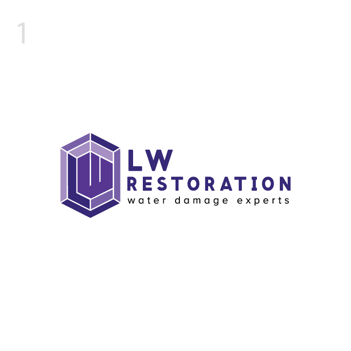
Our first concept is based on a wedding ring diamond. You mentioned on our call that you both are in this company together and your interaction as a team was clearly apparent through our phone call. We wanted to show the LW inside an abstract diamond shape which also represents high quality, rare and precious. You mentioned your customer service is top notch which the diamond concept represents perfectly. The slogan aims to make a statement to your customers putting the company at the top of the industry.
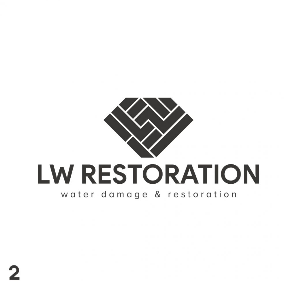
This concept also plays on the diamond idea however we incorporated a more local flavor with a beautiful and clever lau hala pattern. The L and W are interwoven to symbolize your marriage and the interconnectedness of your relationship. We all need a strong partner by our side to support us. The typography is clean, elegant, modern and bold. We loved the Roundess of the O’s in the text, its a perfect fit for the ring concept
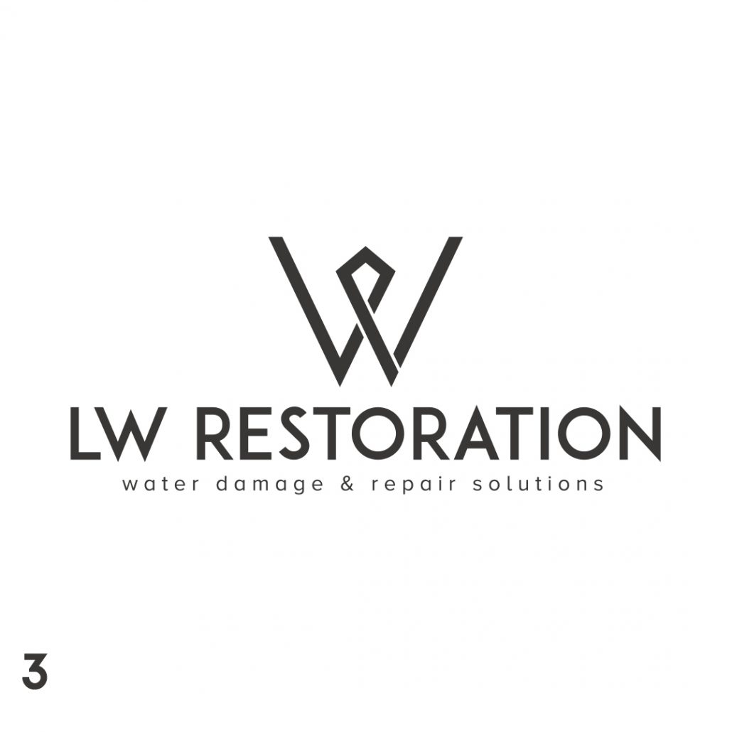
Our final concept is a more abstract and modern take on the story. We love the simplicity of this logo and the subtle homage to our story. The L and W are two arms holding hands in the center and the hands form the diamond in the center. It’s a really abstract interpretation that most people will not get but that idea is there in the background which we always love to have in our designs. It’s a bit of an optical illusion which is a good talking point for the brand.
We put a lot of energy and emotion into these designs and we hope you like the outcome. Please let me know if you have any feedback and revisions. Mahalo for your trust!
Aloha and welcome to our project page. This web page will be used to keep track of the branding project from start to finish. We will upload concepts, mood boards, sketches and inspiration on here to keep everything nice and organized.
Inspiration:
Images provided for inspiration are below:
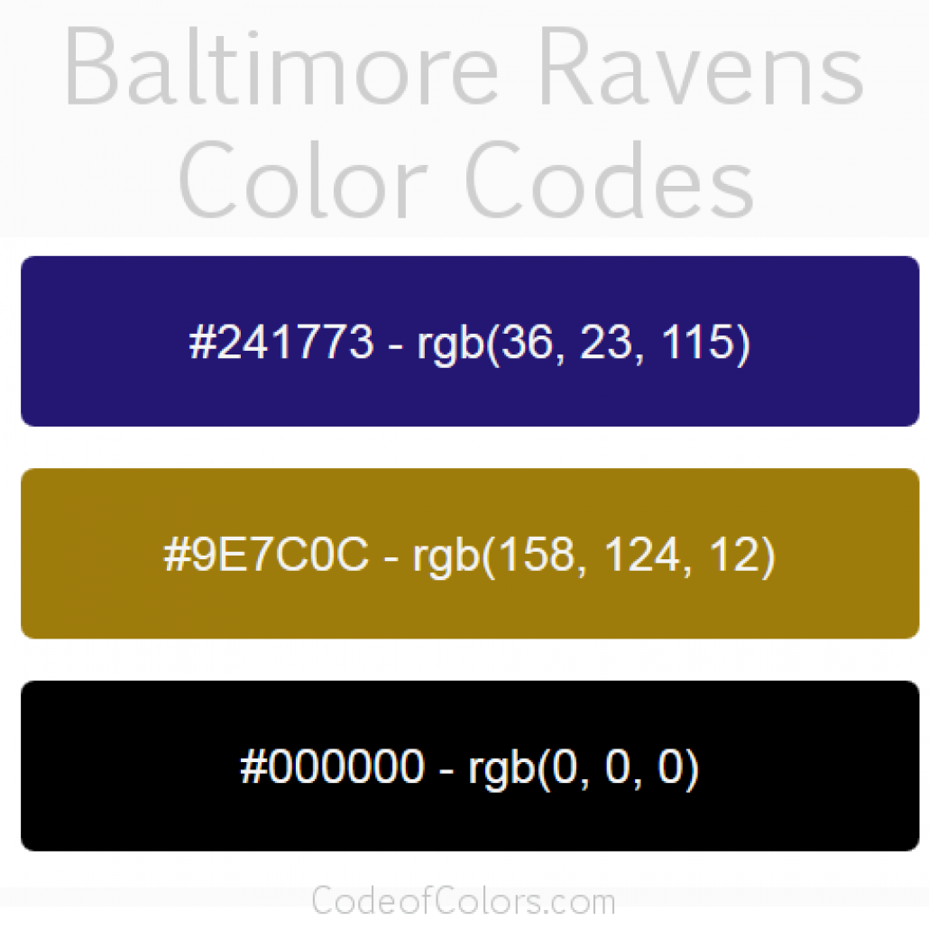
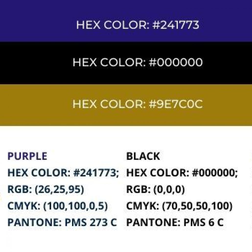
Color Ideas for branding will be based on Ravens football team colorways which are below:
