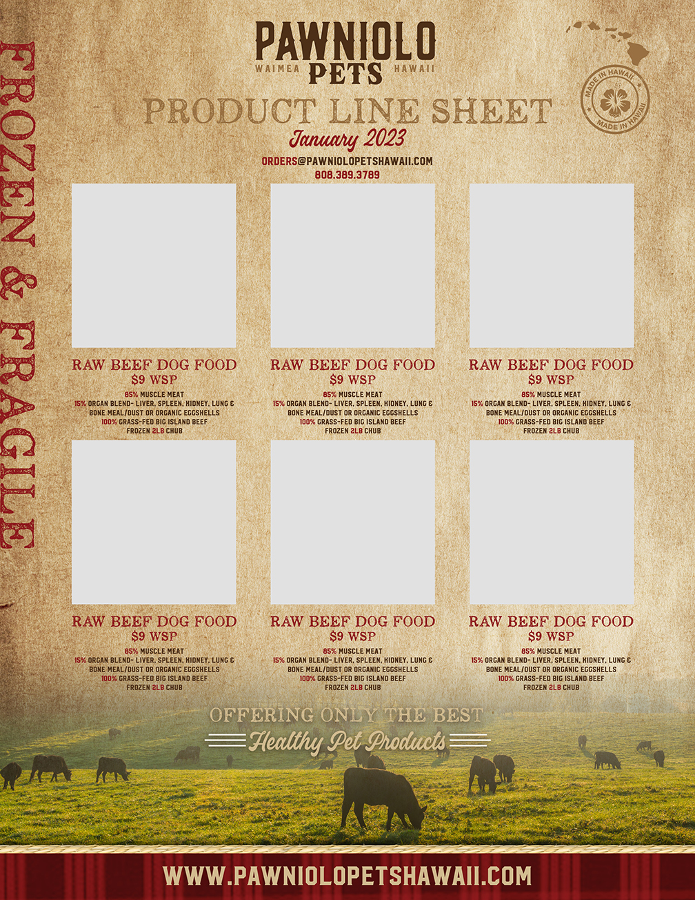
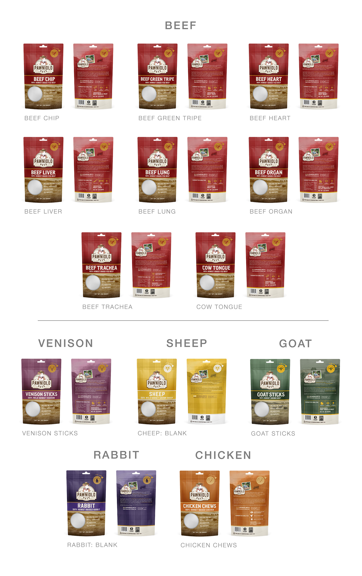
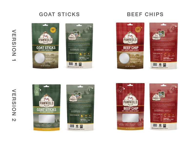
Catalogue:
Concept V1:
We wanted to remain true to the bags and the brochure so its a combination of both
Let me know what you think! We will need individual photos for each product if possible
whole set together!
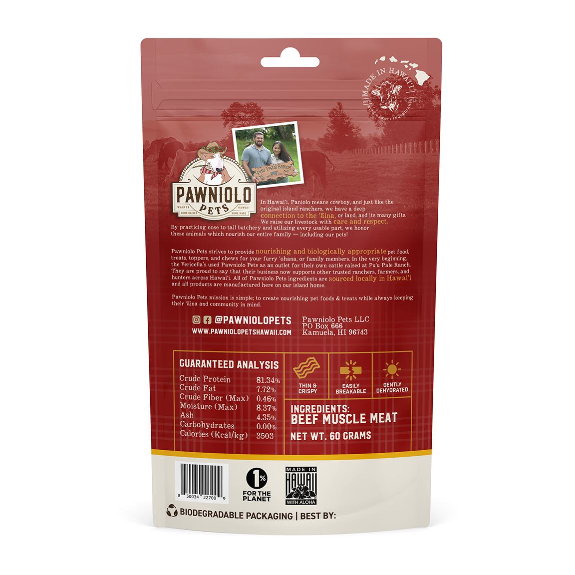
Treat Bags Aug 8
Edits made:
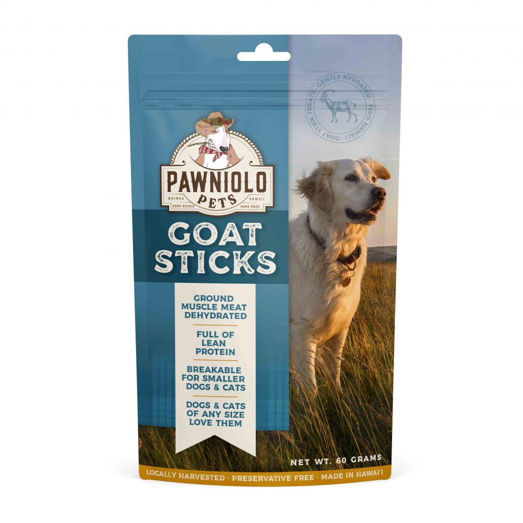
Palaka Pattern
Guaranteed Analysis
Ranch photos
Story
etc
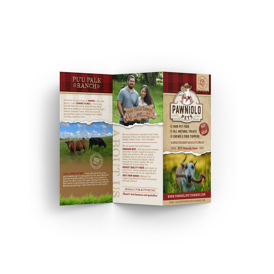
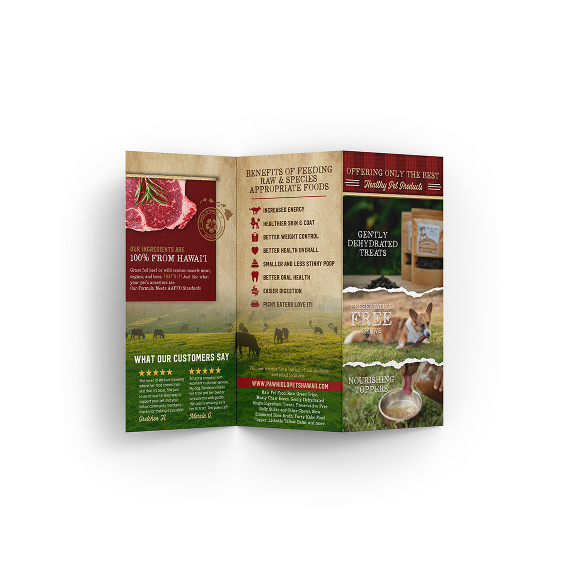
Brochure:
new brochure rework!
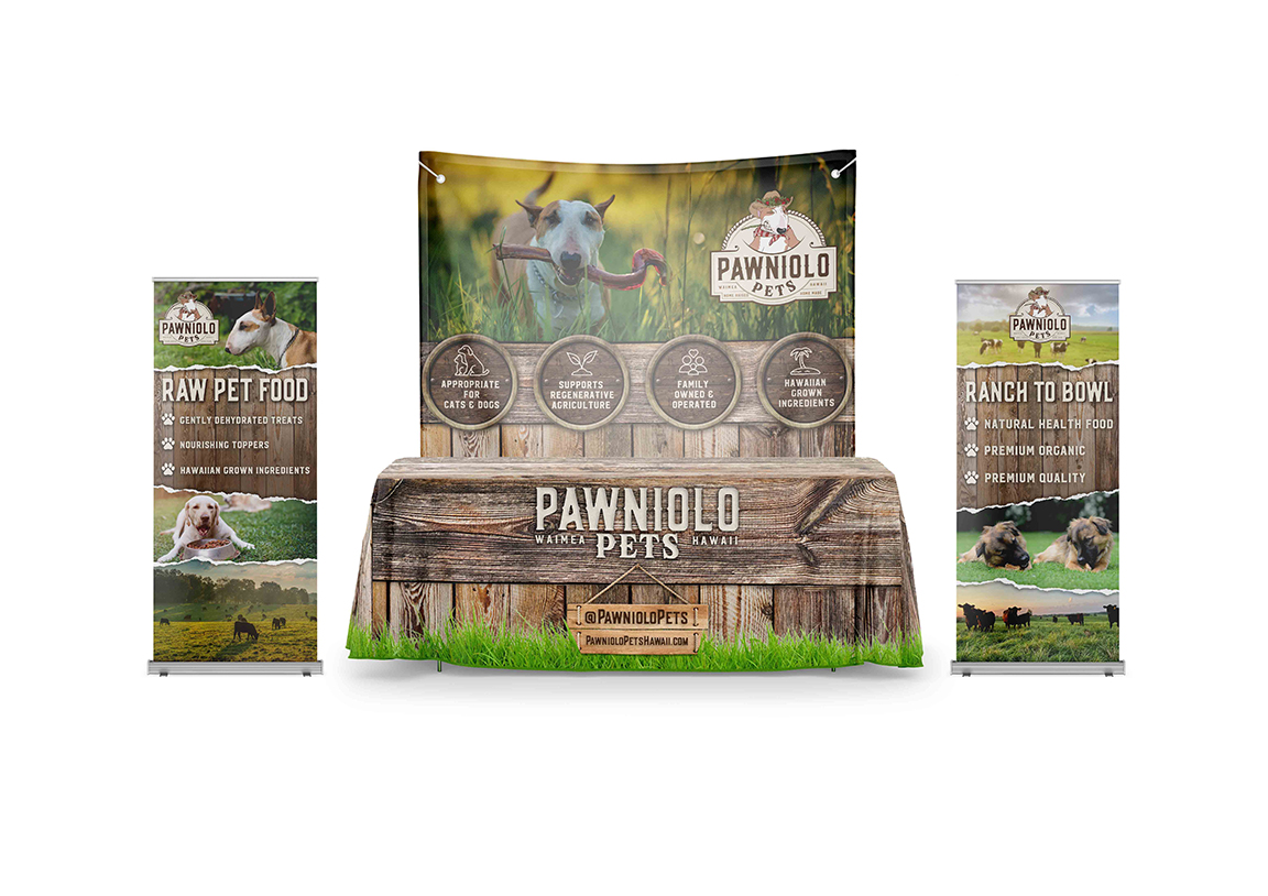
Tradeshow booth:
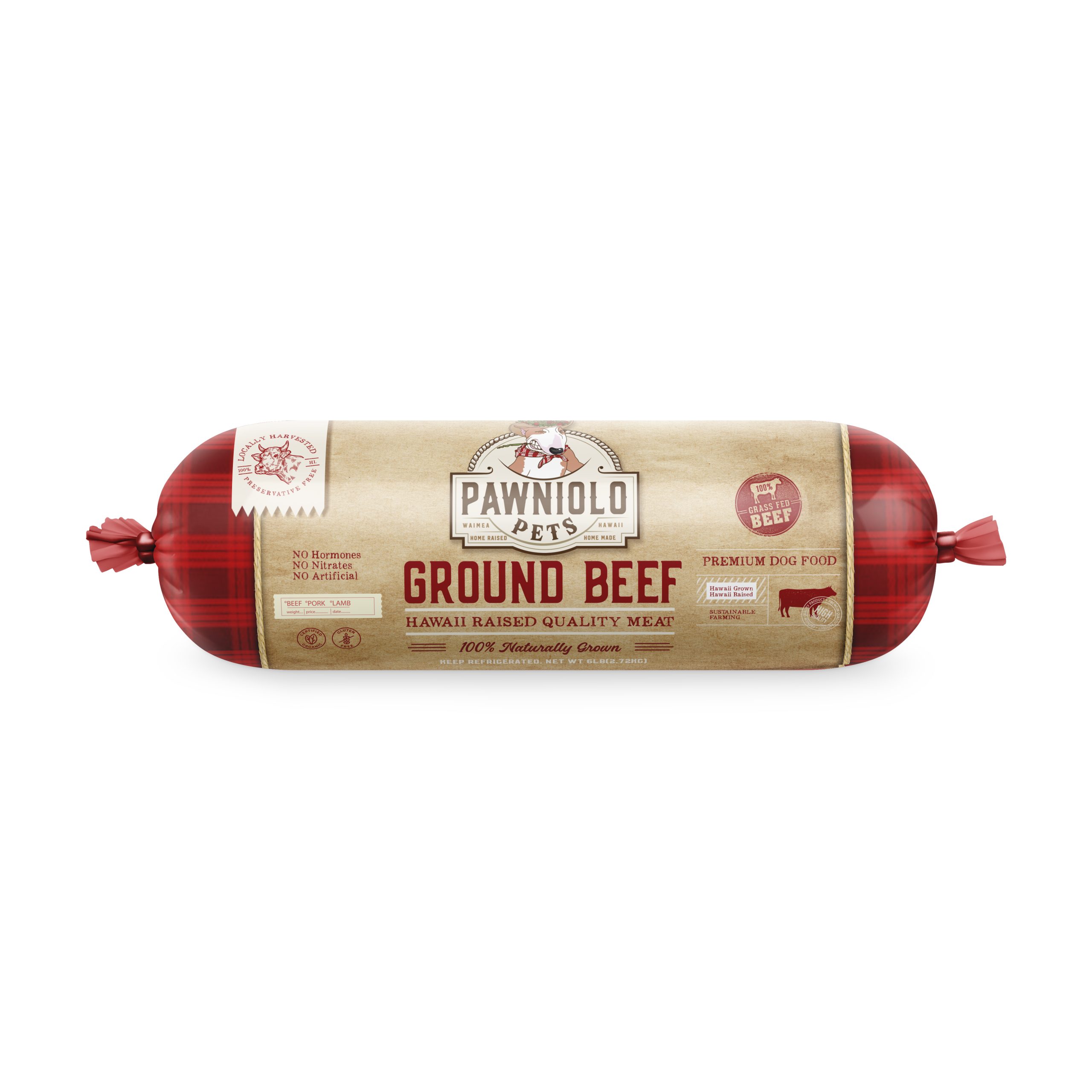
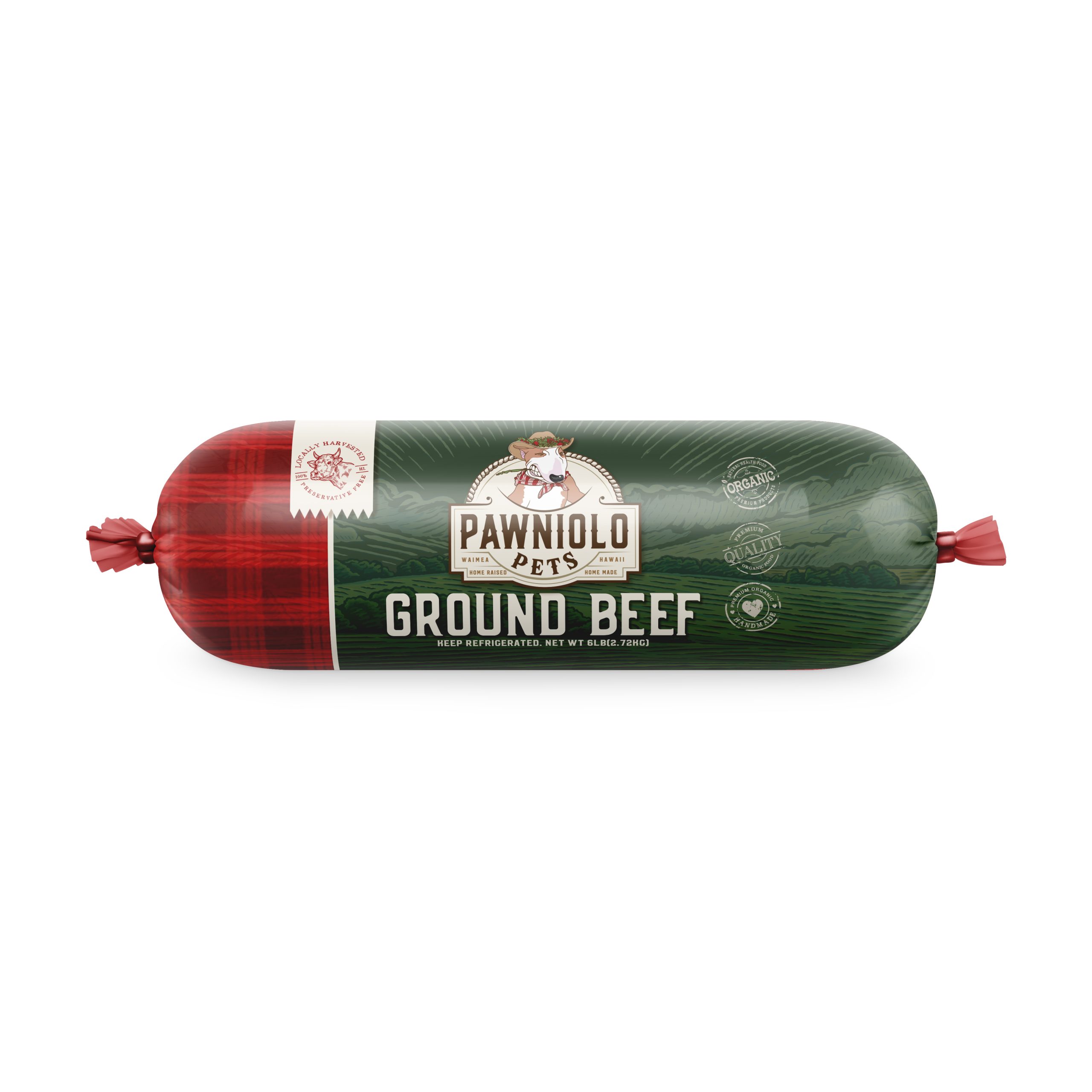
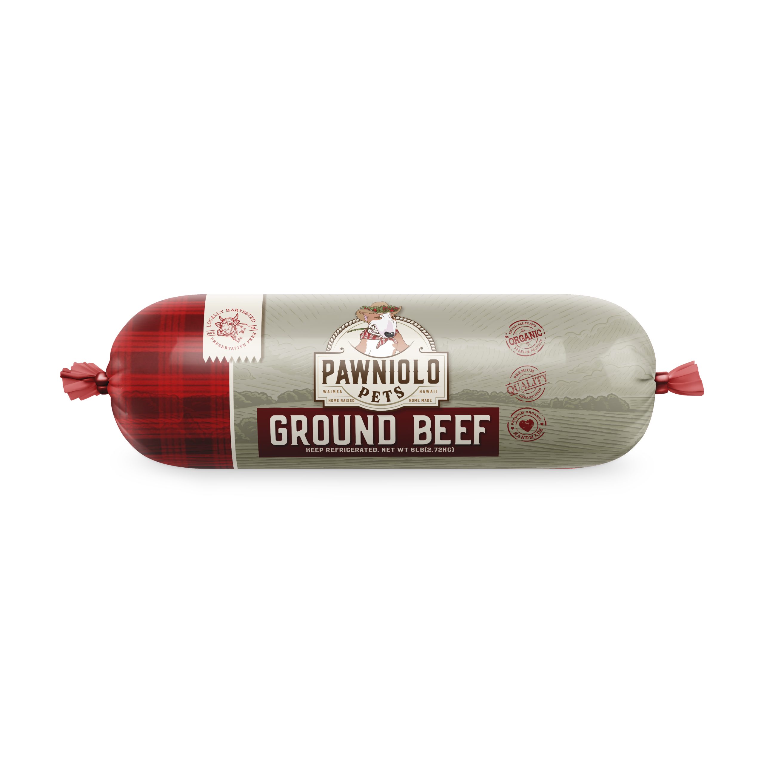
Chub Packaging Focus:
Aloha!
We made a couple of little tweaks to the front including this nice rope texture that makes it look like a vintage butcher meat packaging which we were inspired by. We are still using the placeholder information until we get all the assets setup. Let me know what you think!
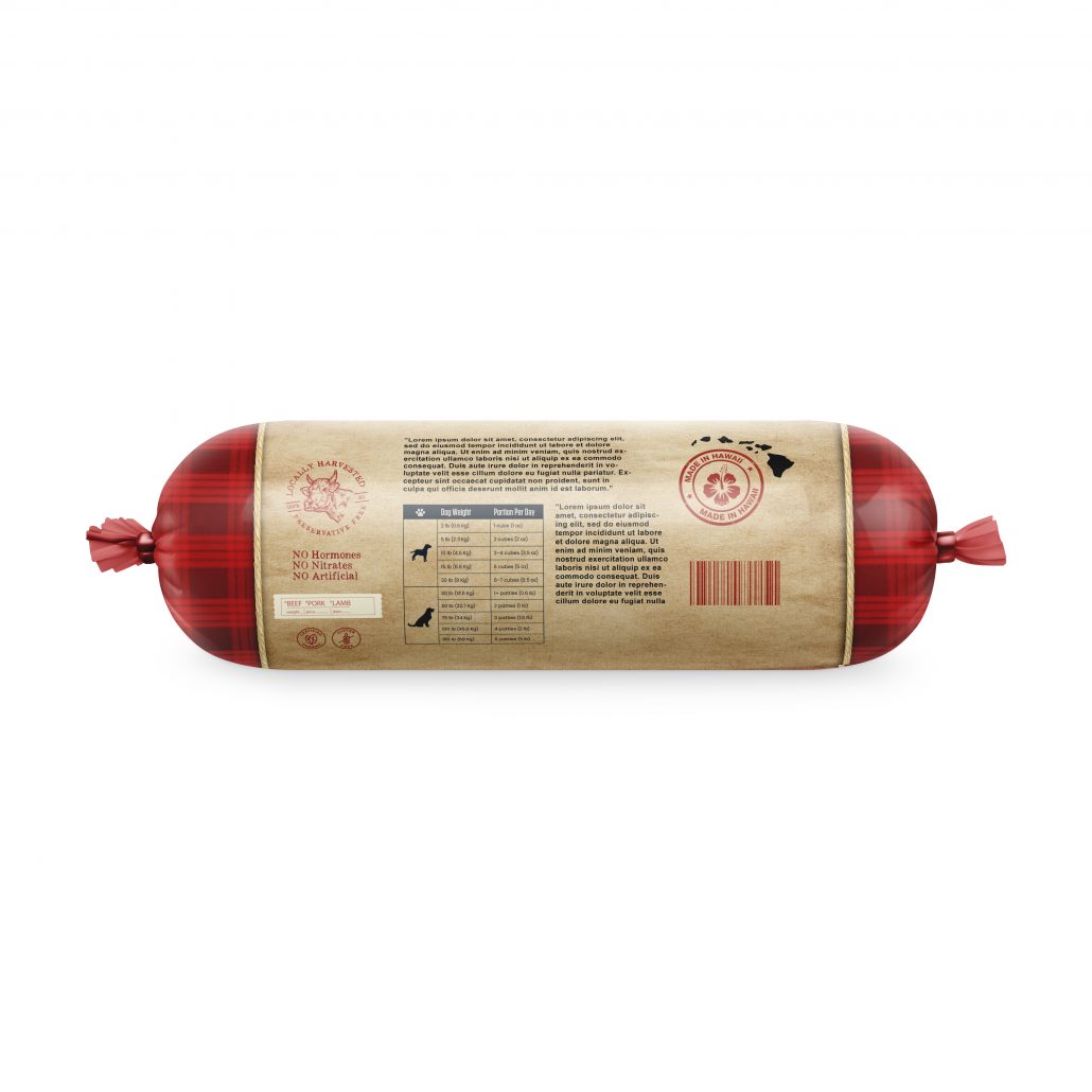
Chub Packaging/Treat Bag edit:
Aloha and thank you for your patience as we explore concept ideas for your packaging. This week we focused on chub packaging designs. We did a little homework took a nice field trip to the pet store which is always enjoyable and looked to see what the industry is doing.
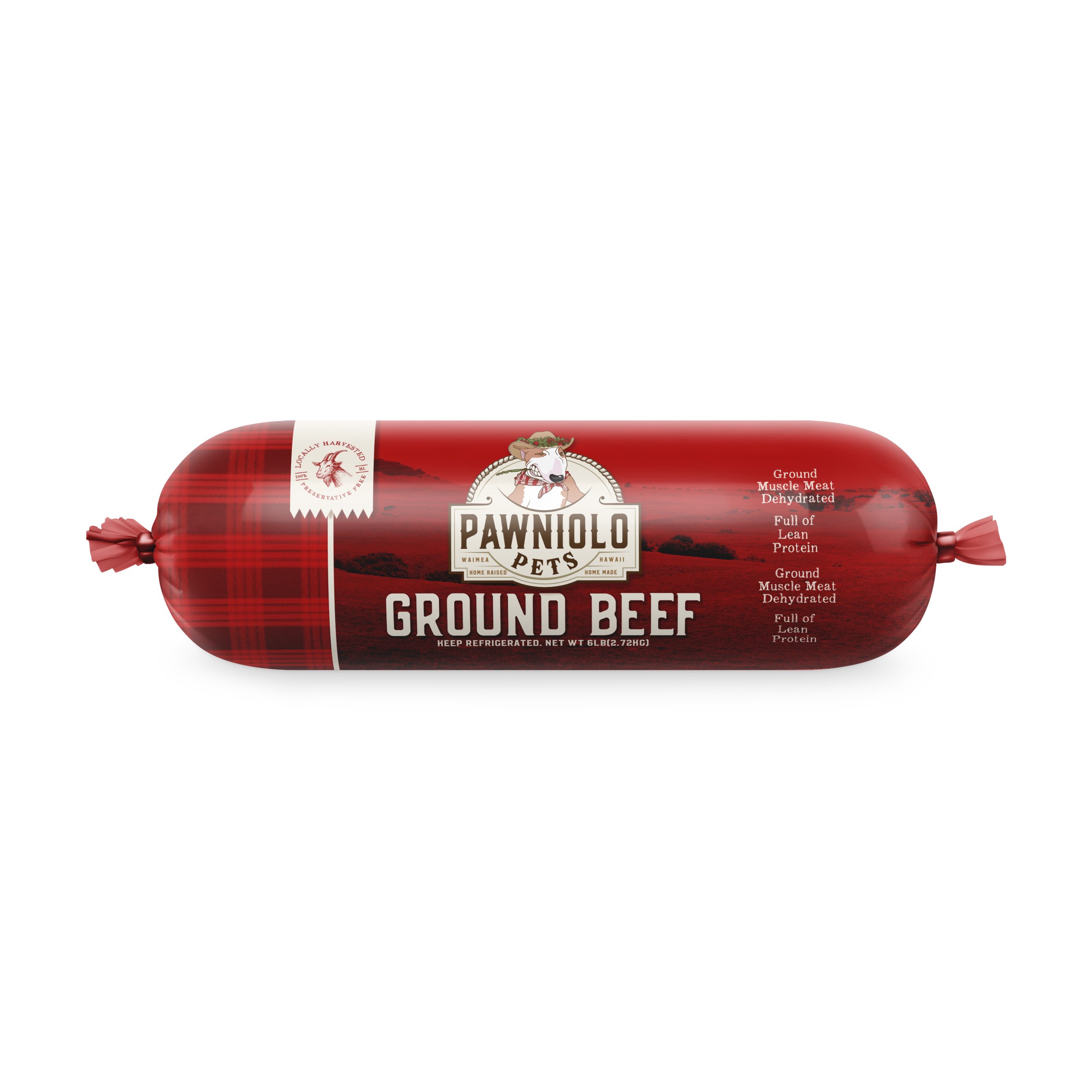
Our thought process is laid out below in sequential order, we began with a red packaging and the idea was that each flavor would be color blocked ie.. venison would be orange. etc etc. All the text and icons are placeholders for now until we decide on a direction then we can fill everything in with the correct information and selling points. Ideally we would love to use your custom photography for any packaging if needed but for now we use placeholder stock images to get the “feel” This packaging is so bold that it is guaranteed to stand out on shelves
Idea 2 is a more earthy organic feel, we loved the idea of adding some sort of “rustic” vibe to this one with the woodblock illustration of a farm in the background. This is a very contemporary commercial approach, only reservation we had was making it too xmas looking with the red and green so were open to suggestion too if you like the direction. Again, if we do like this idea we would create a custom unique illustration that is personal to your brand. We love the premium look to this packaging
Idea #3! We explored the same concept in a different colorway to get away from the xmas feel which eventually lead us to our final idea!
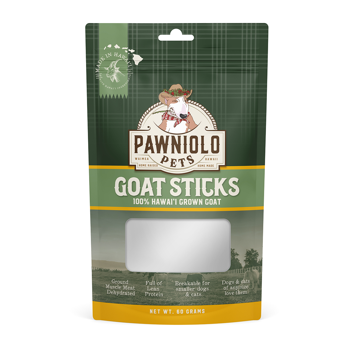
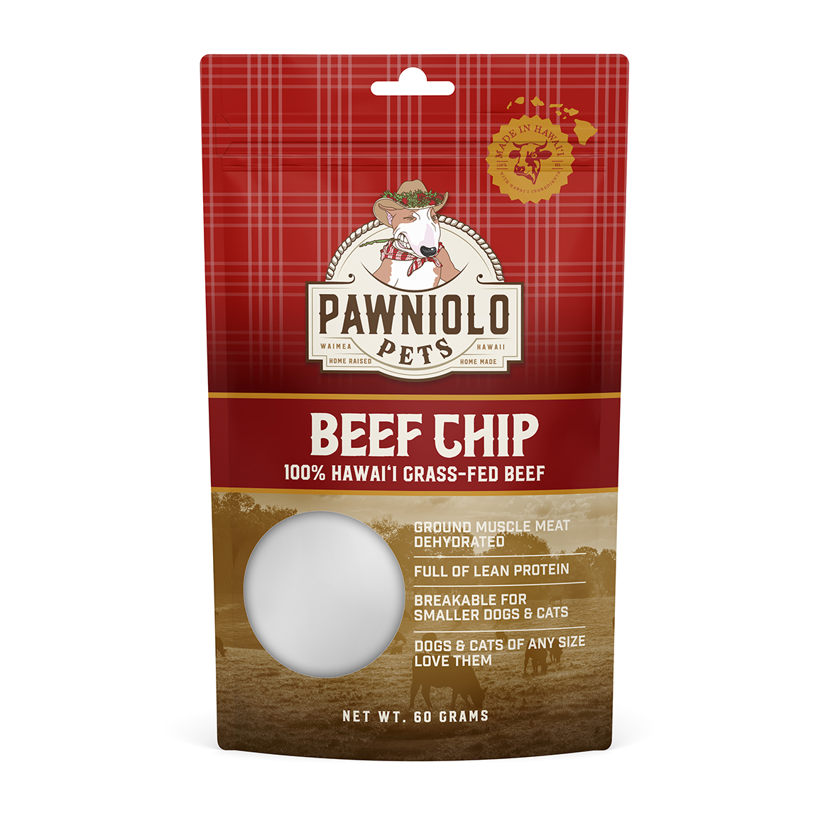
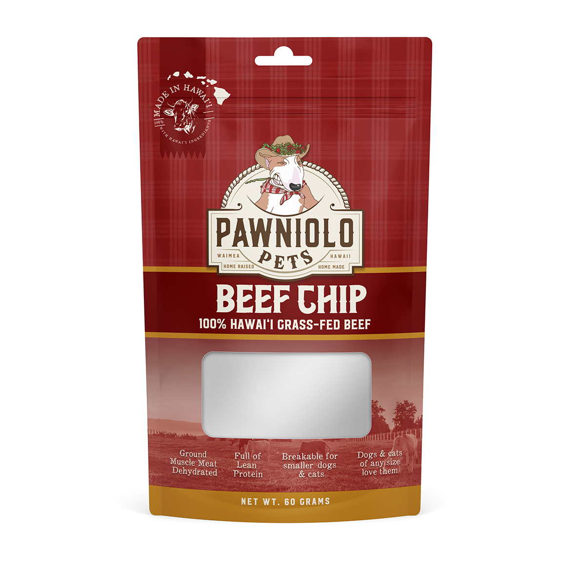
Idea #4! This is the idea we feel is the best fleshed out and most complete. All the previous concepts feel like they brought us to this design. The inspiration behind this was vintage butcher paper and butcher meat stickers that had the price, weight etc printed on them when they placed the sticker on the piece of meat you purchased. We wanted this entire packaging to really have a sense of exclusivity, high end, premium, organic and sustainable aspects to it. We loved the idea of the hand written type of selling points and it gives a nostalgic feel while still being fresh and modern and eye catchy! You won’t find this anywhere on any shelf!

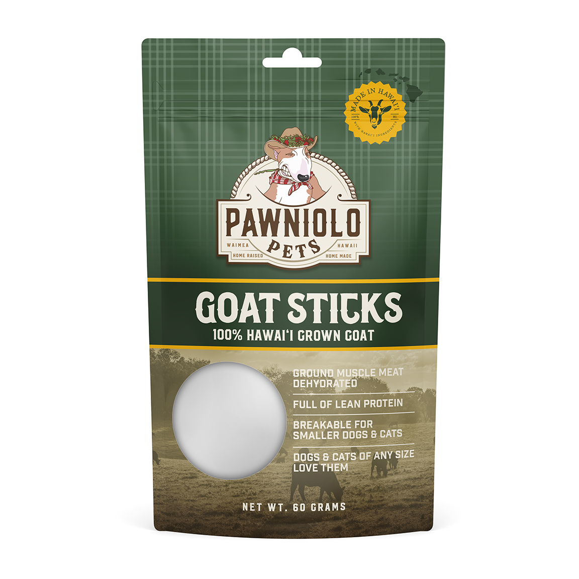
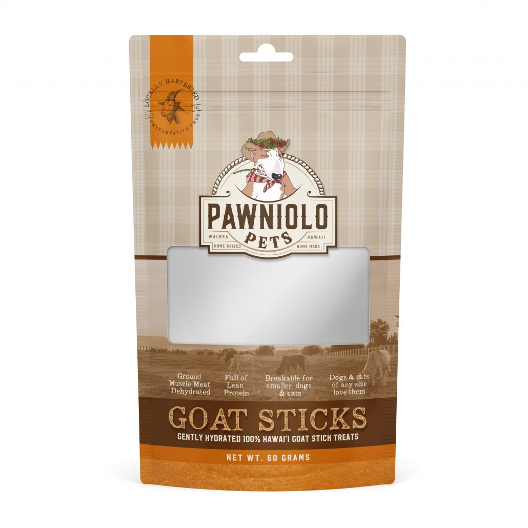
Updated treat packaging based on notes and feedback! moved window down a smidge, flipped font from previous version
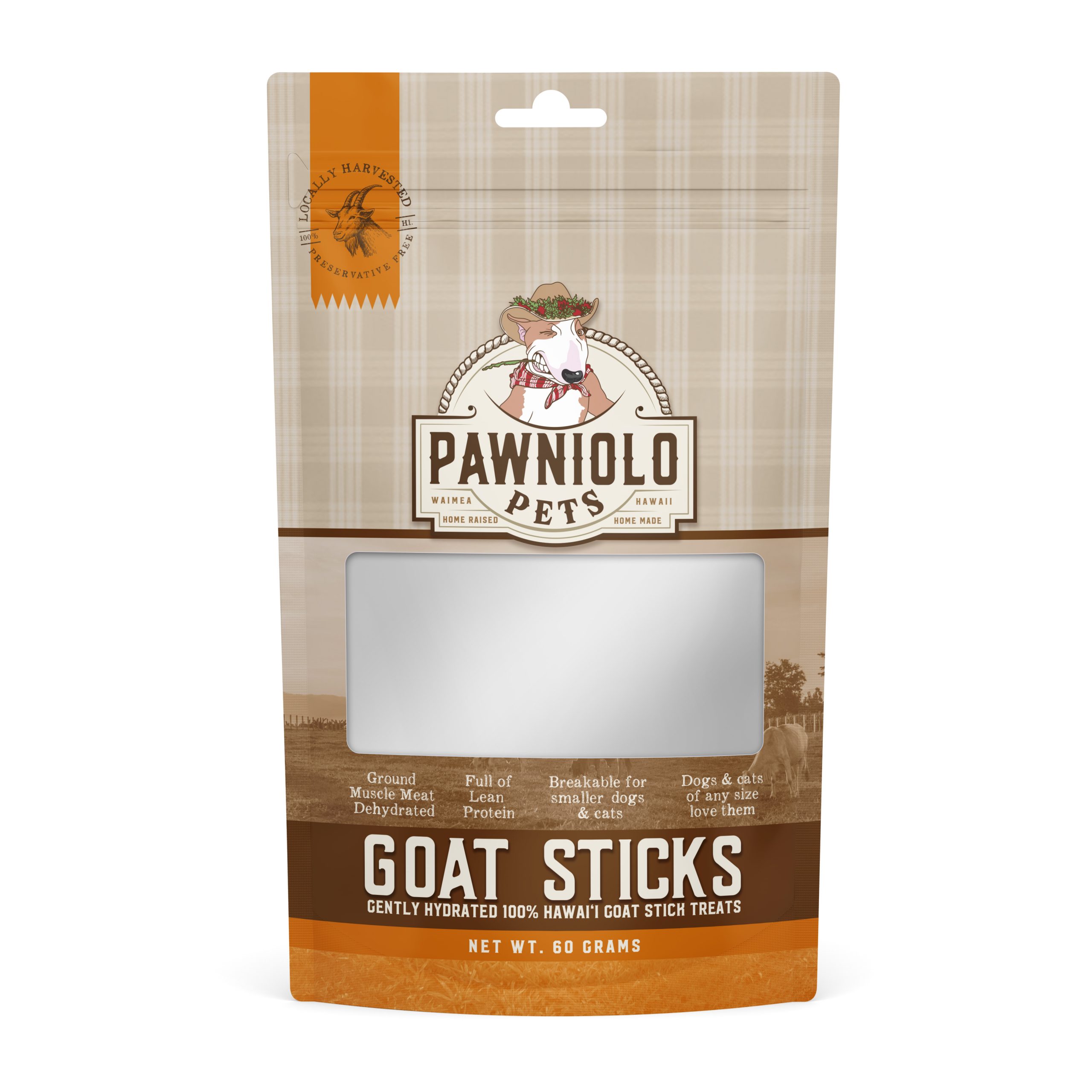
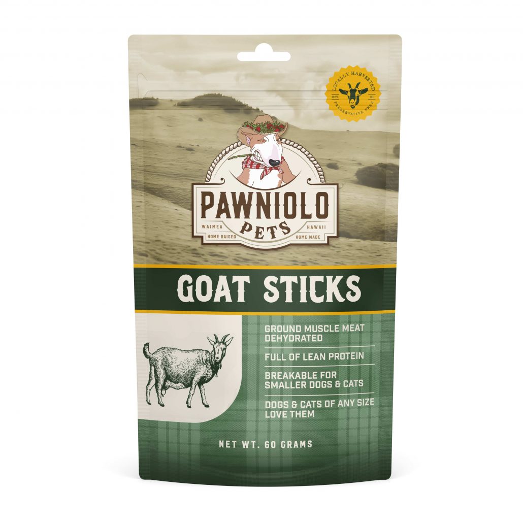
Treat Bags:
Aloha and welcome to a new project! We have 3 completely different concepts for your overall bag design. More so then the bag we are thinking about the entire line of products as a whole and how we can translate some of these design elements into the rest of the branding moving forward (if you like one of them of course!) For the time being we’ve used placeholder graphics for the “goat illustrations” and photos; depending on which layout you like we will gather real photos and create custom illustrations. I will explain our thought process on each below:
1: Our first concept takes into consideration manufacturing costs (without window) as well as laying the foundation for our vision for the brand. We want the brand to have a sense of “artisanal” high end natural products which it is based from. This concept allows us to have the opportunity to showcase some of the actual farm in the photo section, it is also easily interchangeable with other flavors in the future. We wanted to present natural color pallet with the greens and golds which tie in the farm, nature vibe were going after. Color blocking can be easily changed for other flavors as well.
2: Our second concept utilizes color blocking beautifully and creates an emotion of a high end product you might see at any retail location across the world. We wanted this packaging to have a universal appeal that you can envision becoming a household brand. With this modern and sleek look we also wanted to have that emotional tie to the essence of the brand with the palaka pattern subtly incorporated and the photo section also allows us to showcase “home”
3: Our final concept is the more ambitious approach. The packaging would include a custom window treatment which were not sure if it can be pulled off but we always like to push the boundaries and see what’s possible! This color scheme and approach is a much more earthy, natural, raw ingredients idea. This concept is extremely elegant and sophisticated yet still having some of the natural elements and homage to the farmland in which these products are made in. The typography lends itself to a more gritty, blue collar, hands in the mud type of vibe but still looking very polished professional and high end which is a hard thing to pull off!
Color Exploration
Aloha! and thank you for your patience as we dialed in the right colors we felt would convey your branding the best. Let us know what you think! We worked on various formats depending on printing requirements and limitations.
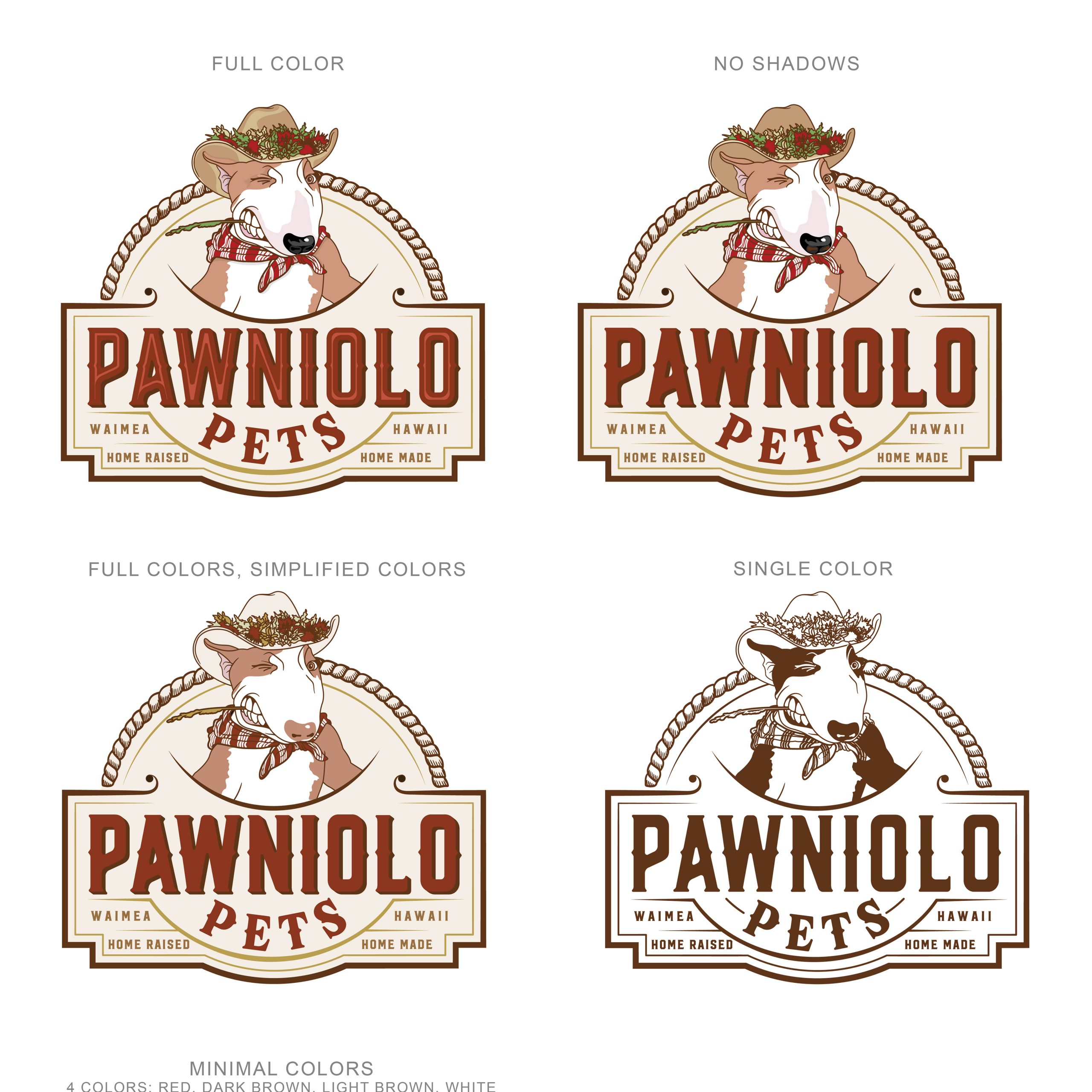
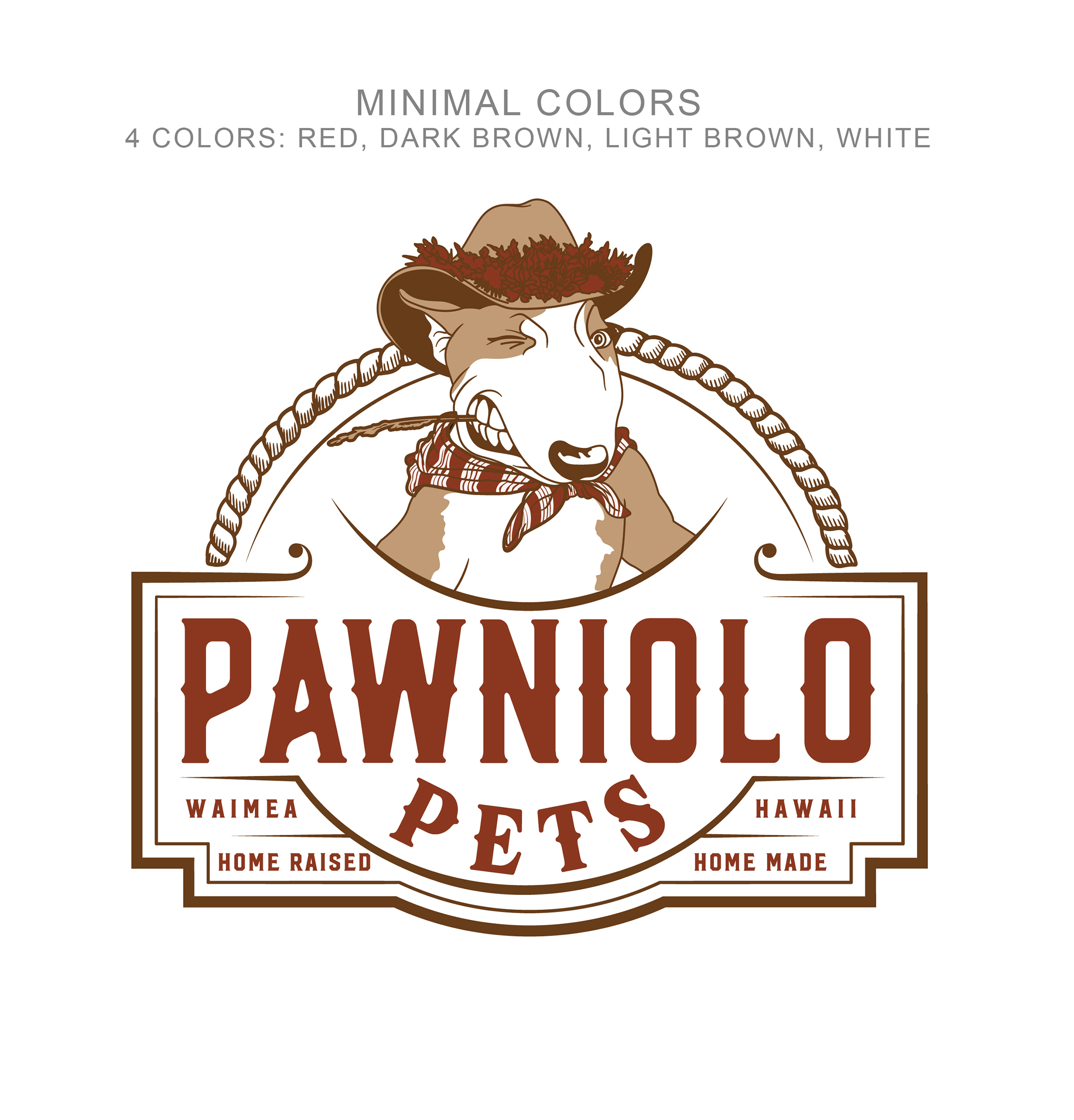
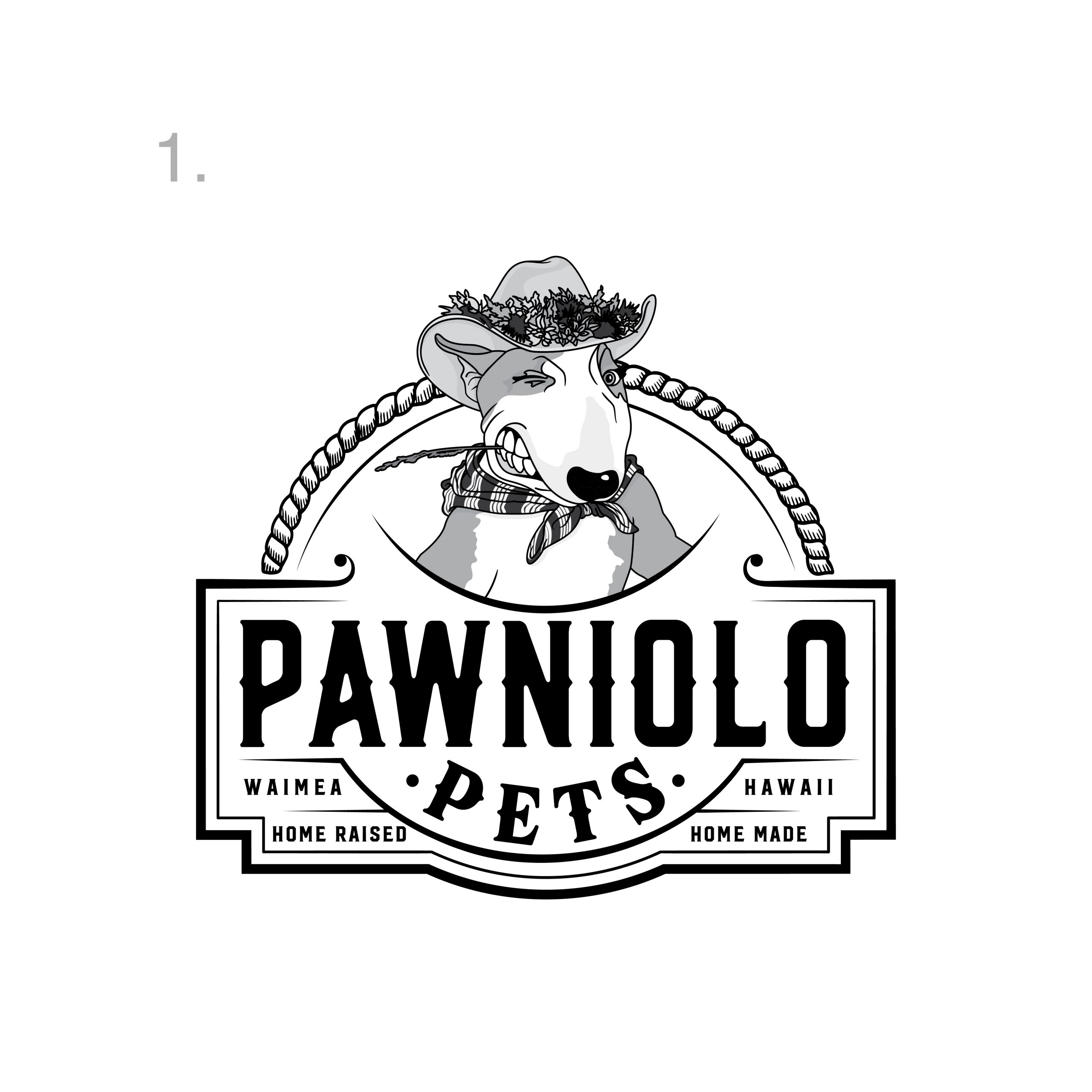
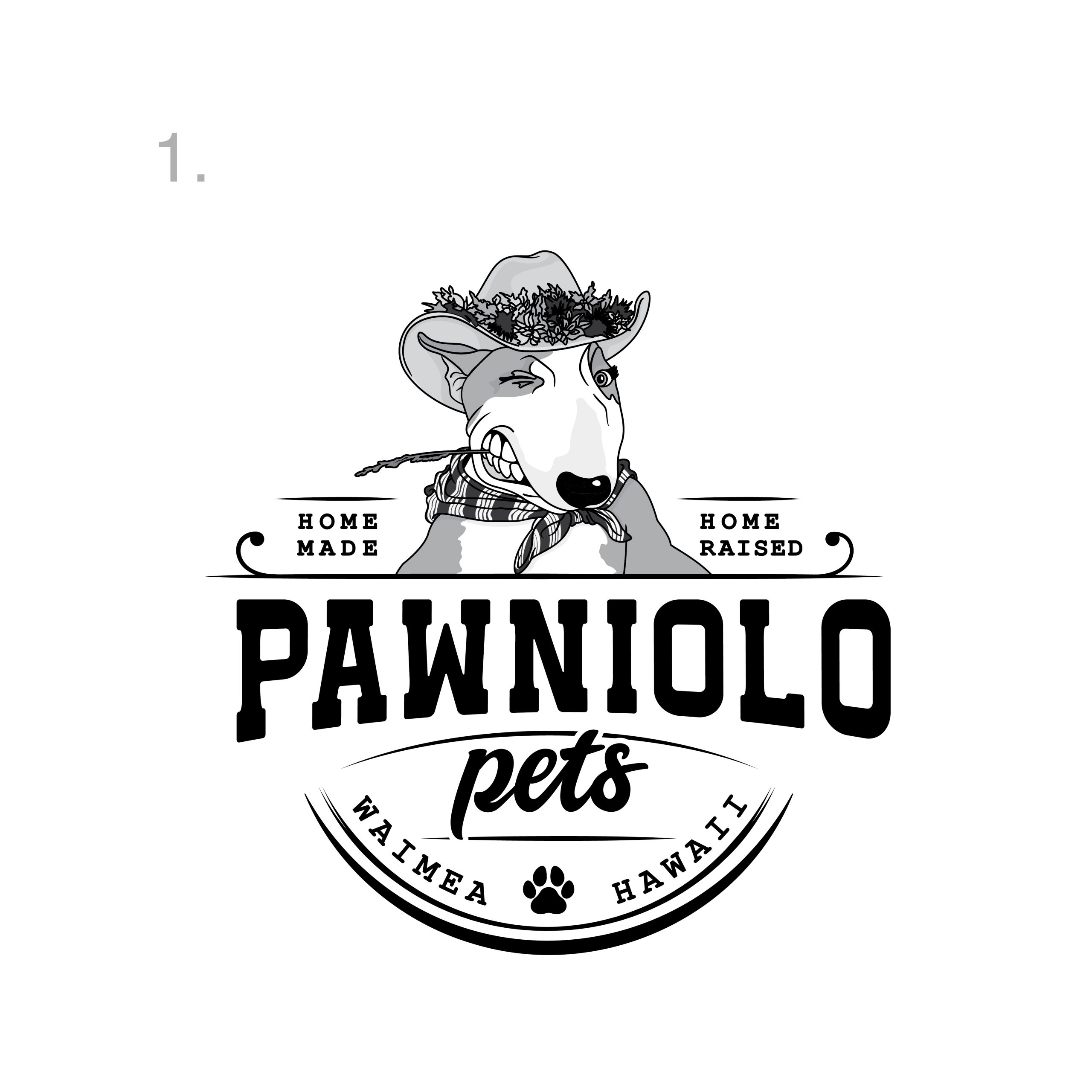
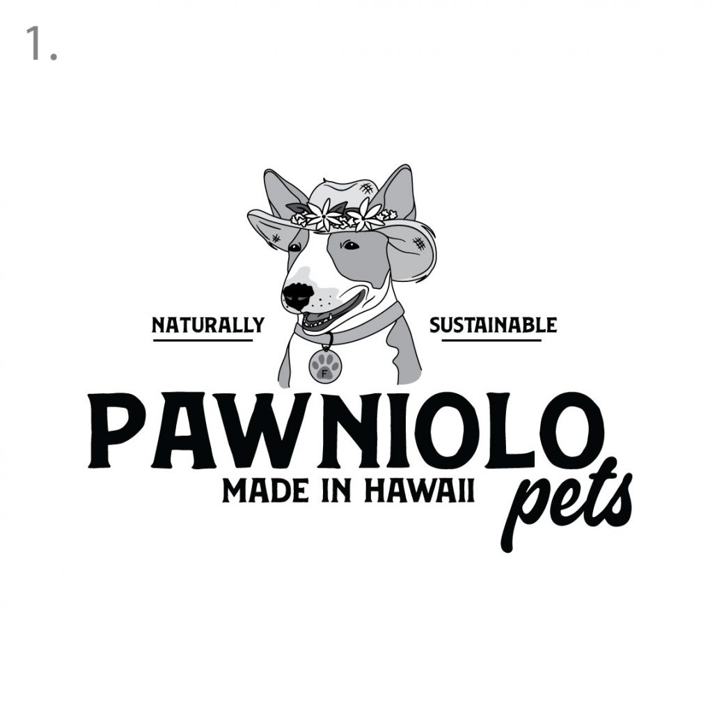
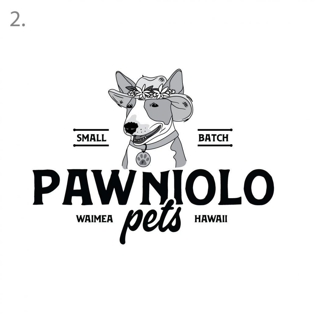
3rd Round Edit:
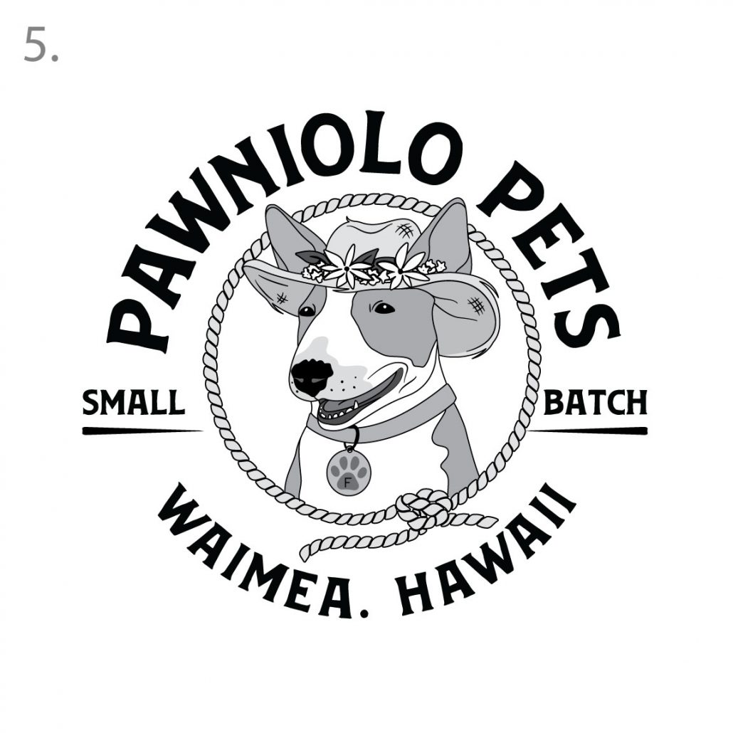
Aloha! We took your edits and comments and compiled two new versions according to your wishes. We love the completeness of this logo now and think the edits were great and added to the design beautifully so thank you for that input. The two ideas differ in the tag lines.

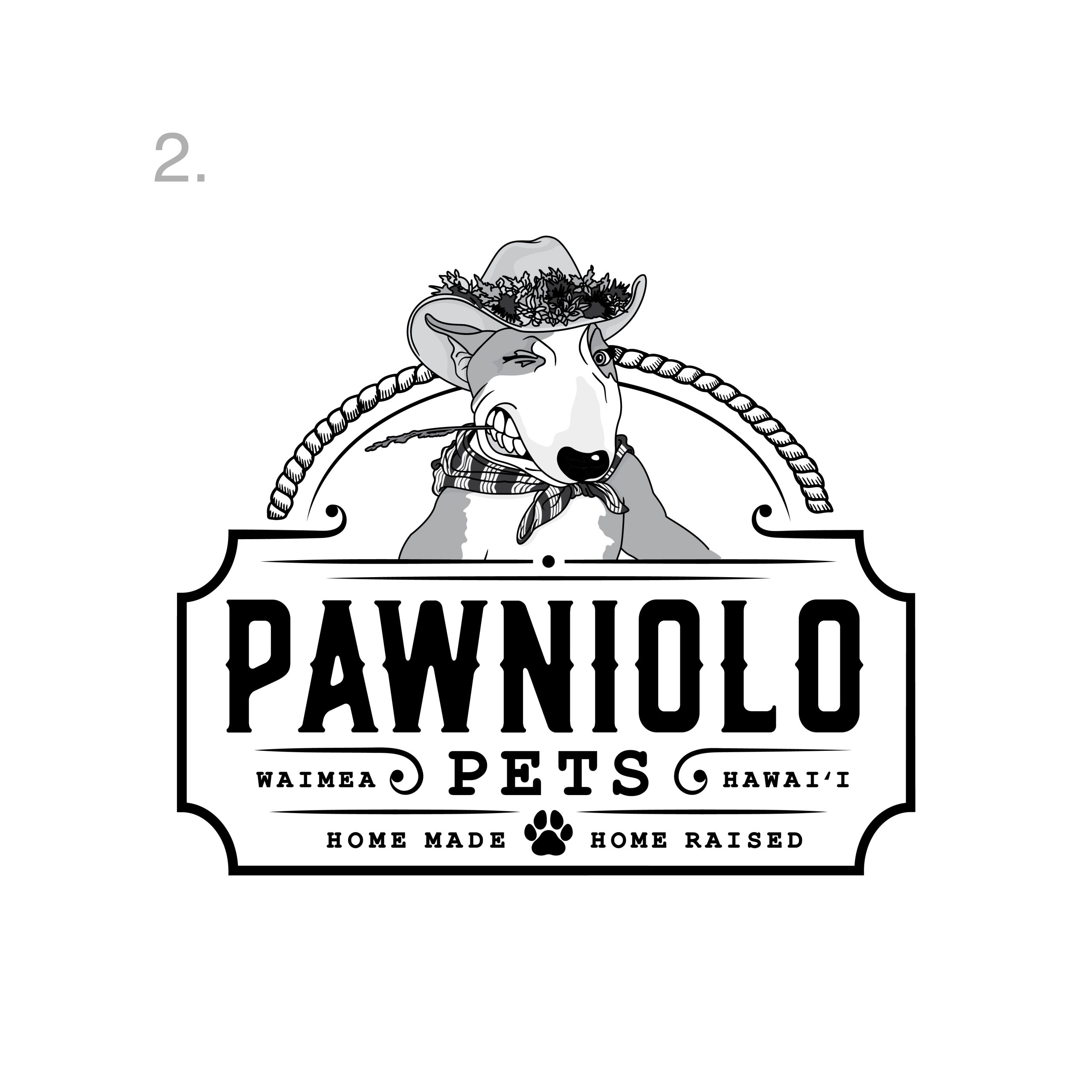
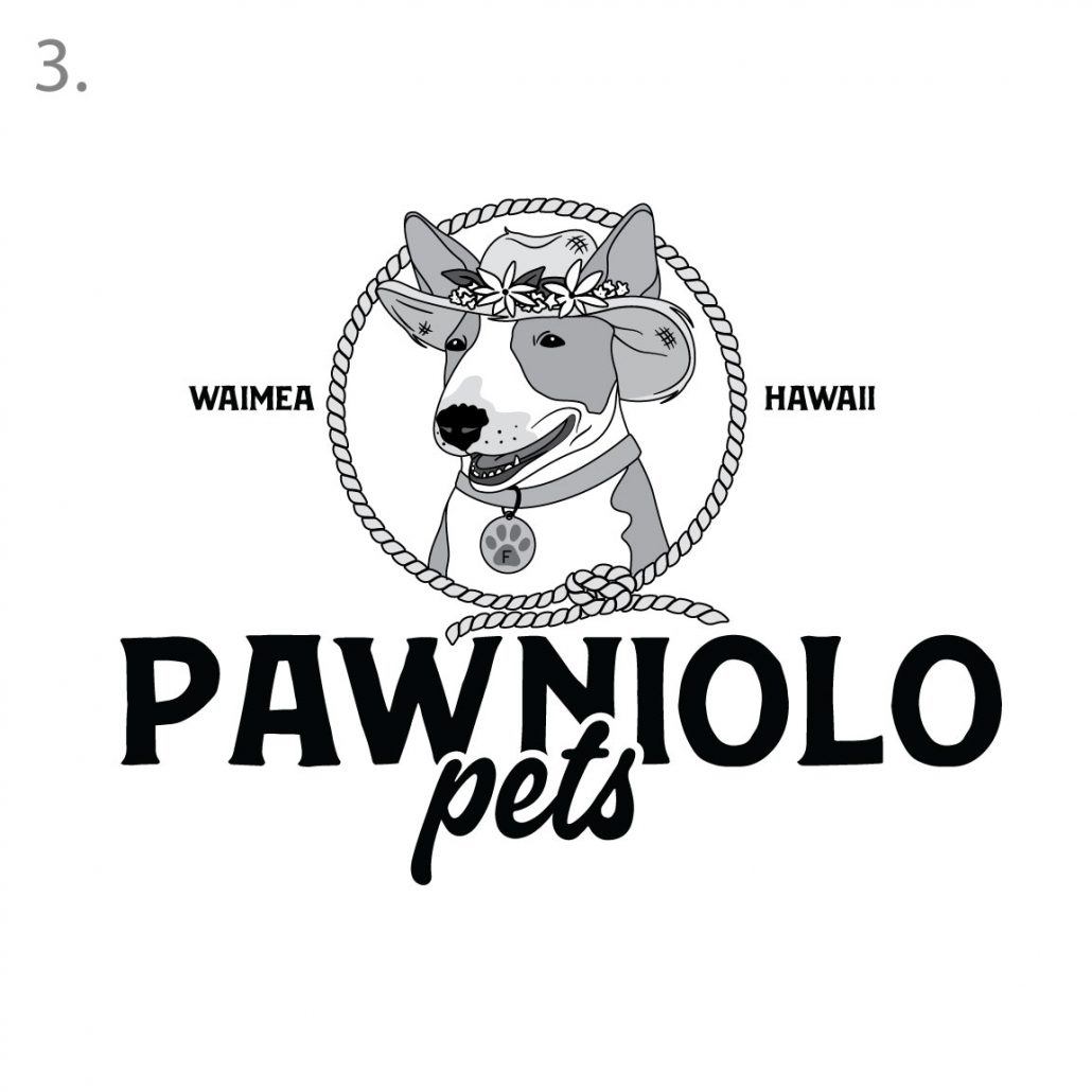
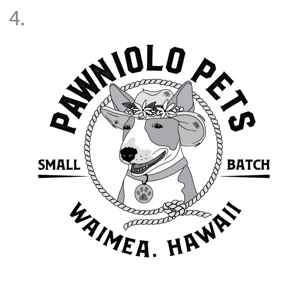
2nd Round Concepts:
Aloha and thank you for patience always. We revised and went back to the drawing board to give you something that is more aligned with your expectations. Below are a few new ideas for you to review!
#1 is a new logo that showcases Freya in its original state with updated typography and layout. We wanted to bring the logo up to date with modern typography that still showcases the core western aesthetic of the brand.
#2 * our personal favorite; our second concept is a bit more traditional with the SALOON type of design with very modern approach that will make the brand feel fresh and new as well as staying true to the essence. We loved the lasso aspect that ties in the graphic of Freya with the logo layout below making this a nice cohesive logo.
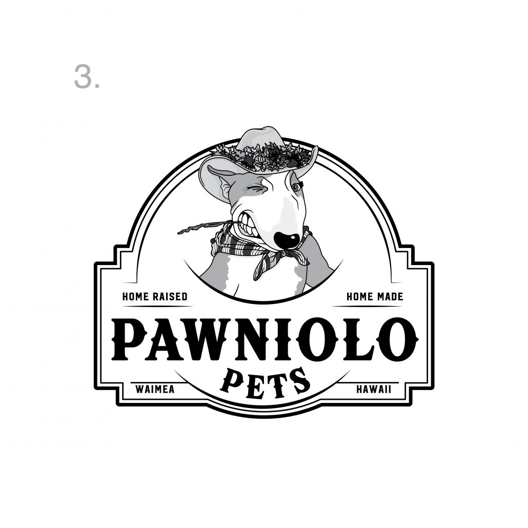
#3 A more classical western ranch type of signage that is a bit more closer in look to your original logo with modern and updated tweaks.
1st Round Concepts:
Aloha and thank you for your patience as we explored various approaches to your logo! We wanted to bring your logo into its new chapter of life and give you a brand that will compete with the biggest of the brands in the industry! We always present logos in black and white first then once we nail down a layout we explore colorways. We wanted to give you something iconic, timeless and modern at the same time, hope you enjoy!
Our first concept focuses on the made in hawaii tag line as we felt it was a very special component to your brand. Custom illustration of Freya that pays homage to the original drawing with updated styling that will make it easier for you to reproduce. We kept iconic aspects of her while adding a few new little touches like the dog collar with the PAW icon and her first initial. We wanted to soften her image up a bit and make her smile to be a bit more inviting. The two “selling points” are placeholders for now as I will let you decide what you want to focus on for marketing purposes. We wanted the typeface to feel organic, with still a bit of the western feel but it has a bit of character as none of the letters are perfect
Similar approach with a new layout, and focus on the more niche geographical area instead of general Hawaii. Really clean, impactful logo that stands out amongst the crowd!
This version we explored adding an encompassing graphic element that will tie in the entire layout and also creating a focal point to the “mascot” which we can use in various branding by itself. The lasso is an homage to the paniolo lifestyle and brings your eye down towards the main name.
Exploring a more circular approach that lends itself to packaging, new typeface that has more of a distressed rugged feel yet feeling very established as if this brand has existed for a long time giving it credibility and coolness! This logo lends itself perfectly for merch
Closed in, version that has a stamp like feel
- What is the story behind the brand, how and why did you decide to start this company? We started Pawniolo Pets because we were already eating this way. Nick was managing his family cattle operations and we enjoyed homesteading and raising our own food to feed our family. In doing that we decided we needed to give our pets a better diet too and started making our dog Freya raw food. We researched a ton and started really small. We had a few friends and family memberʻs friends ask us to purchase but we werent selling at the time. We thought about it and came up with a name and there it is.
- What is the ultimate goal? for example, stay local, get into every walmart in the nation etc.. Our ultimate goal is to try and provide nourishing food for pets while also supporting other small, local ranchers like ourselves in Hawaii. We know for sure that all of our main ingredients will always be 100% local and traceable, direct from trusted ranchers and farmers. We would love to scale to other pet shops out of Hawaii and in the continental US. Stores that align with our values and our mission. We also want to also eventually be able to ship our frozen foods direct to our customers. I donʻt think Walmart would be the customer base we are trying to reach.
- Who would you consider your main demographic is? ummmmm, woke pet owners who give a shit. LOL Nah, pet parents who understand the benefits of feeding raw and bilogically appropriate foods and hawaii pet owners who value supporting local.
- If you were to describe your brand as a person who and how would they be? ie… funny, sad, goofy etc Ohh, good question!! Very passionate, pono, and maybe a little goofy and funny and playful. Kinda boujie but still country and rustic. LOL Good luck with that! LOL
- Who is your main direct competition in your industry? Locally in Hawaii I would say 808 Raw but I try not to mind his business. LOL We are different. Theres also Lava Paws who is more small scale like us and she is doing a great job being a source for our community. In the US theres a few that I wouldnt call competition as much as inspiration. Primal Pet Food, Farmerʻs Dog, Darwinʻs, BJʻs Pet Food
- Who is the biggest in this industry? Fresh Pet (Owned by Purina I think)
- What are your favorite colors? Green is my personal favorite color. For our brand I like greens and browns like kinda ranchy, rustic
- Who has a great logo that you love in this industry Not in our industry but Nick likes Newmanʻs Own. We had a big argument, i mean… conversation about changing our logo. He used Newmanʻs own as an example. There is a ranch in california who I love their branding and logo(s). Their ranch is called 5 Maryʻs Farm and I think its super cute. As far as other pet brands maybe Farm Hounds. Their stuff is super similar to ours but i love their branding. Im not like super impressed by their logo but its cute.
- Tell me the story about your pet Whachu mean? Like any story?
Questions for initial interview
these are a few questions to think about for our conversation next week. We will discuss these so its just more of a way to get the ideas going..
- What is the story behind the brand, how and why did you decide to start this company?
- What is the ultimate goal? for example, stay local, get into every walmart in the nation etc..
- Who would you consider your main demographic is?
- If you were to describe your brand as a person who and how would they be? ie… funny, sad, goofy etc
- Who is your main direct competition in your industry?
- Who is the biggest in this industry?
- What are your favorite colors?
- Who has a great logo that you love in this industry
- Tell me the story about your pet
- Can you send me pics of her!
Welcome to your project page! We will use this web page to track the progress of your new branding project! We are excited to start this journey with you!
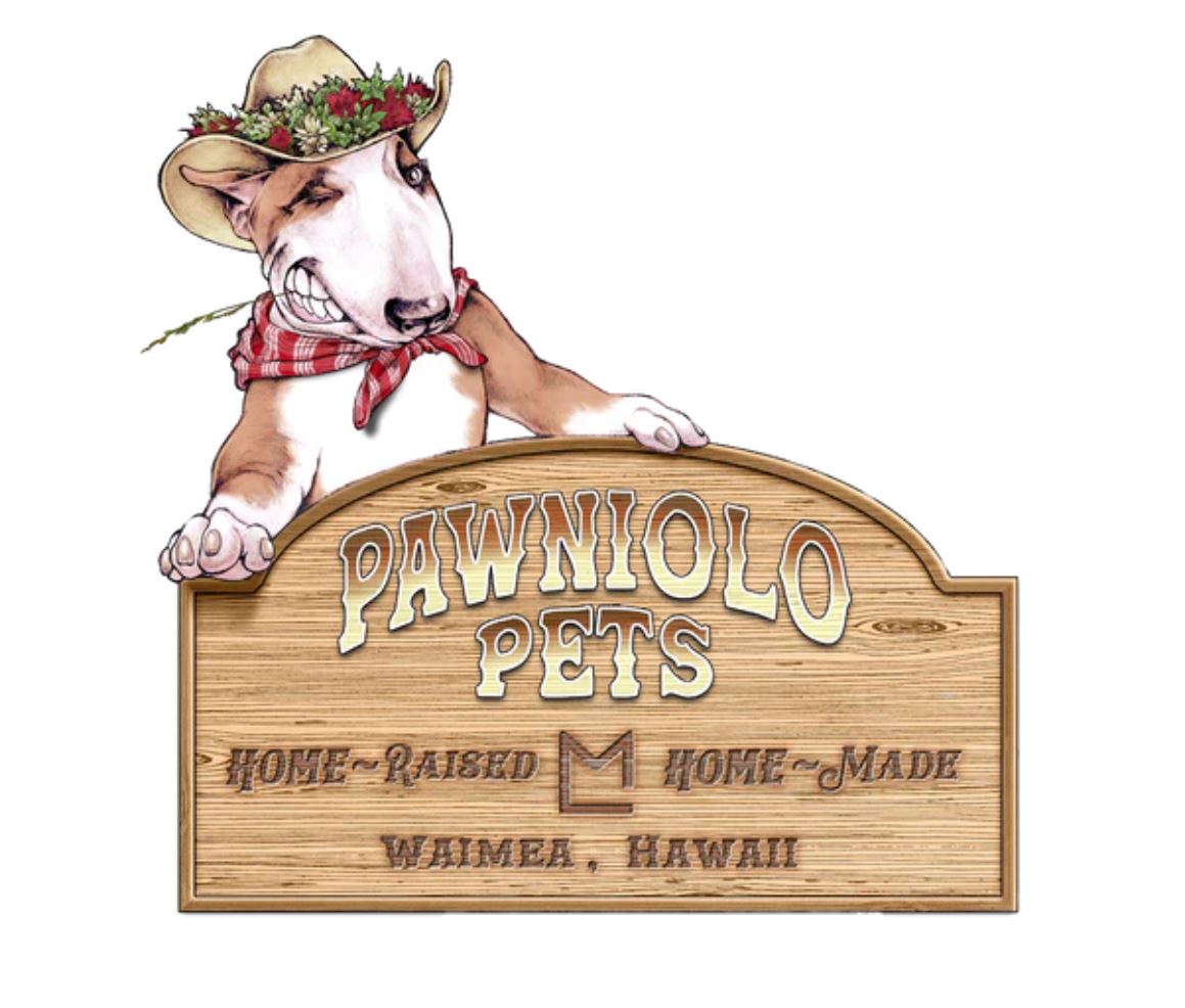
Original Logo: