

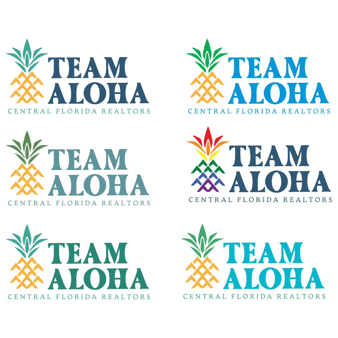
Colorway options
Revisit:
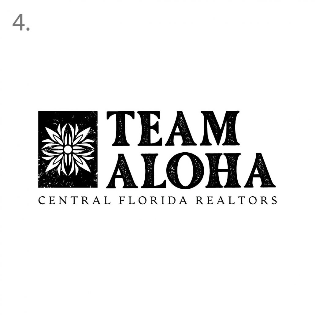
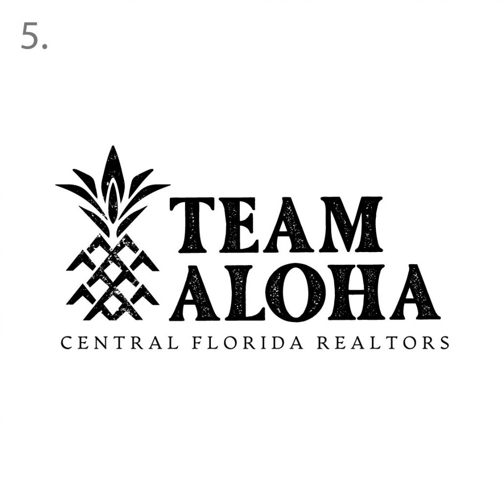
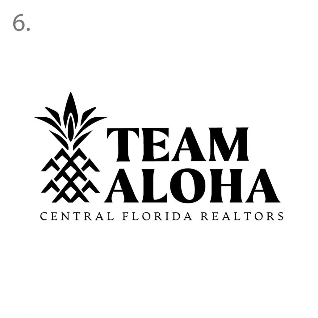
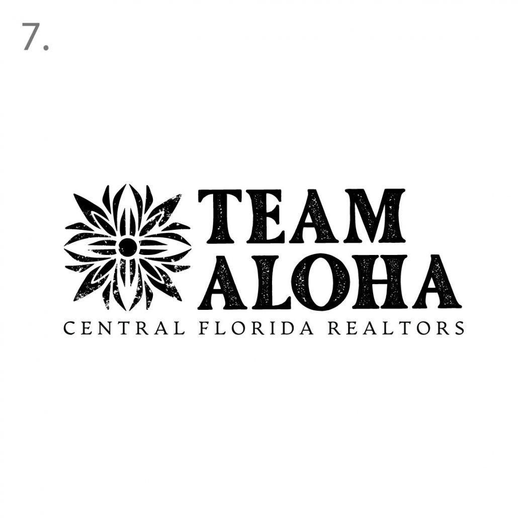
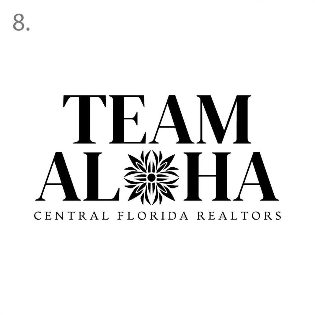
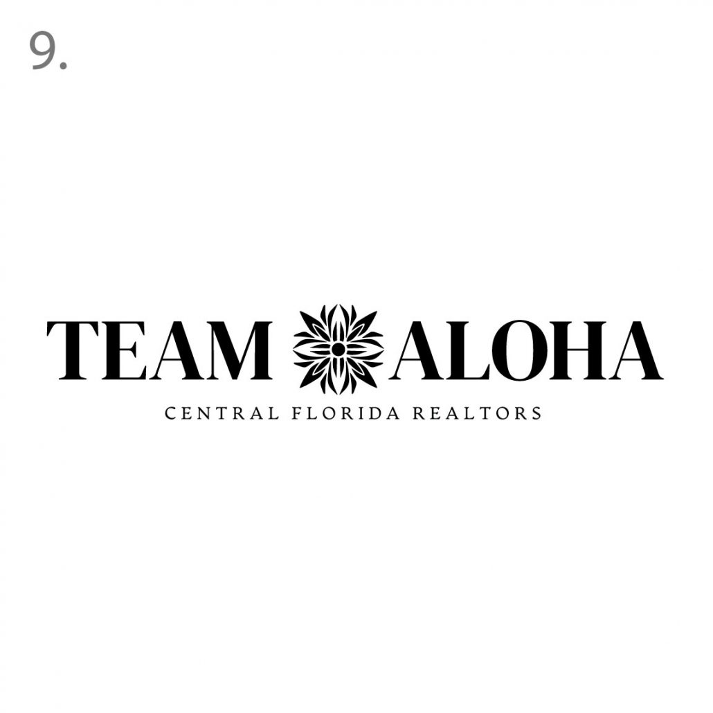
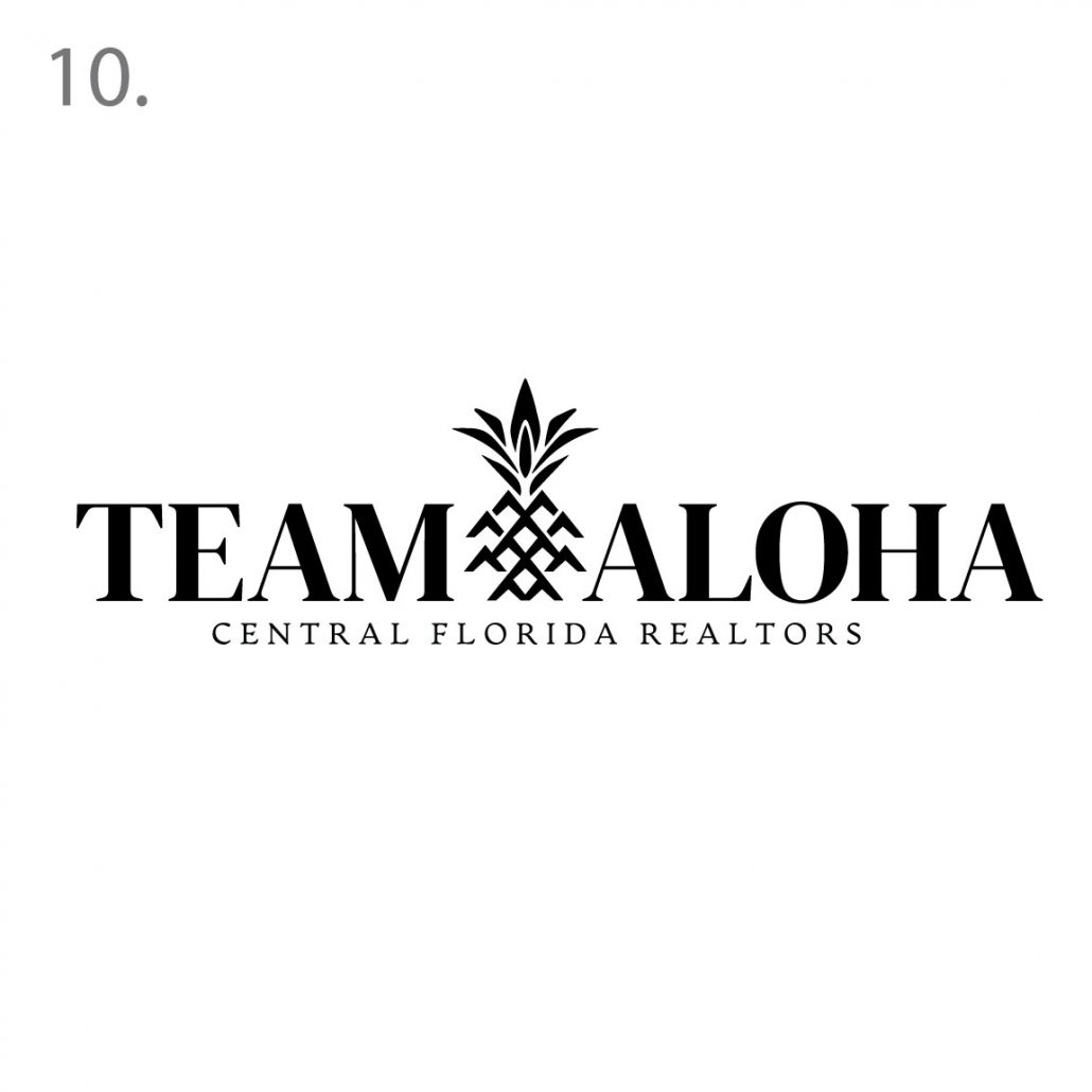
Aloha gentlemen, we have a few new ideas based on your notes. We spent a long time reimagining the pineapple graphic. We illustrated the pineapple in a manner that has an ode to the original lokahi idea we had into a more recognizable graphic. The other graphic is based on the hawaiian quilt with pineapple leafs into the motif. We also explored new styles of typography that felt a bit more upscale and a little more corporate feel with exceptions to 4,5,6 which are more illustrative but still have a beautiful emotion to them. Let me know which option you like! Mahalo

Initial Concepts: As I explained earlier, most of our logos have multiple layers of meanings. I will explain and breakdown each concept below:
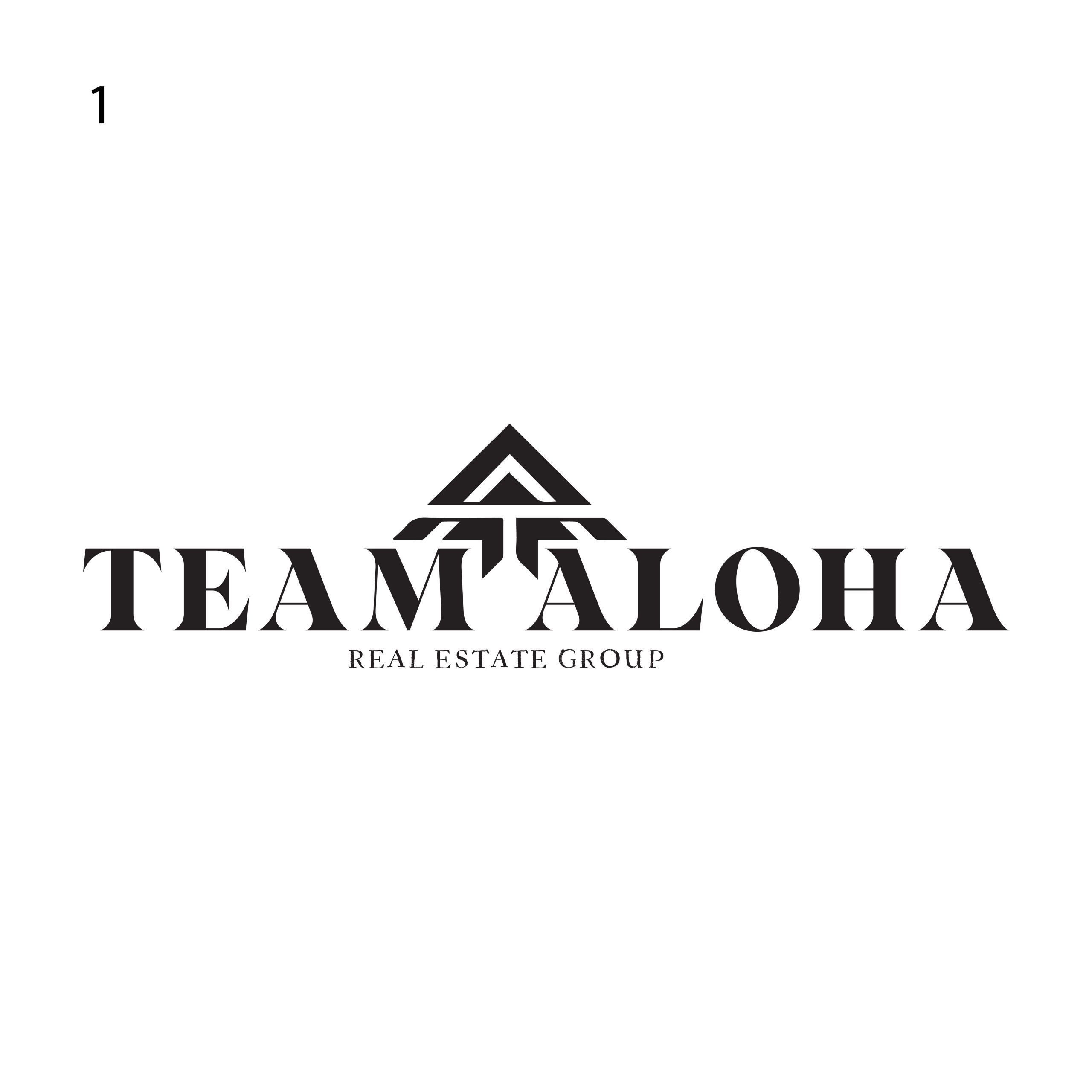
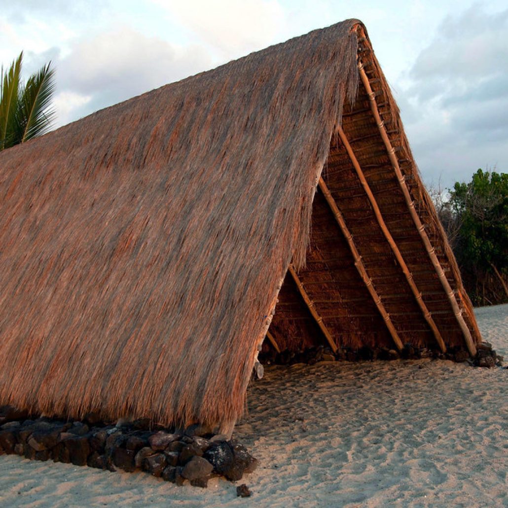
1: Our first concept is derived from the traditional Hale design. The A frame of the structure inspired this idea. If you notice the top of the T represents the ground, our foundation and the bottom of the T is meant to represent our roots. There is a hidden image of A and T in the graphic. The graphic as mentioned is a symbol of a house, which ties in with the real estate market. The graphic is also an upward arrow that signifies the growth of your brand and of the market. We all want our real estate to go “UP” in value.
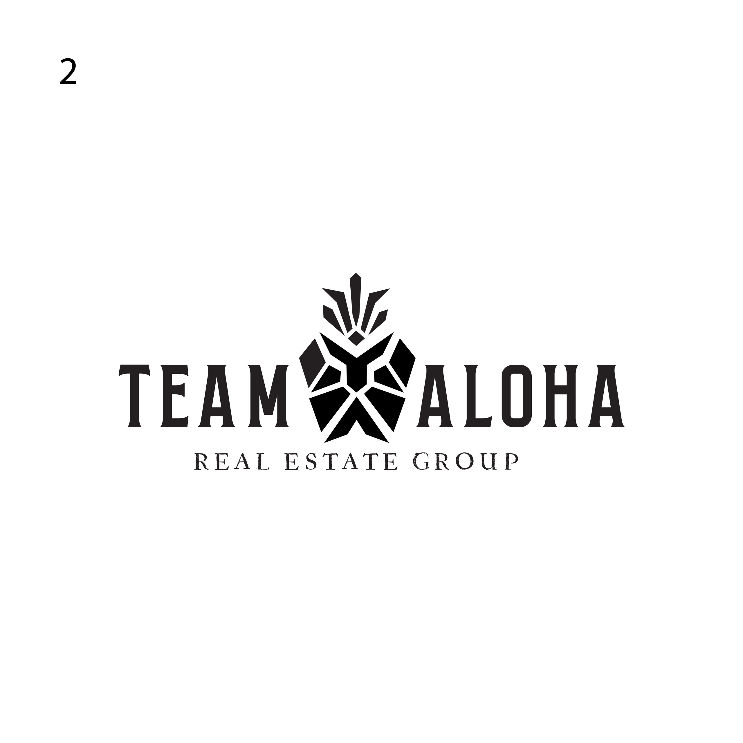
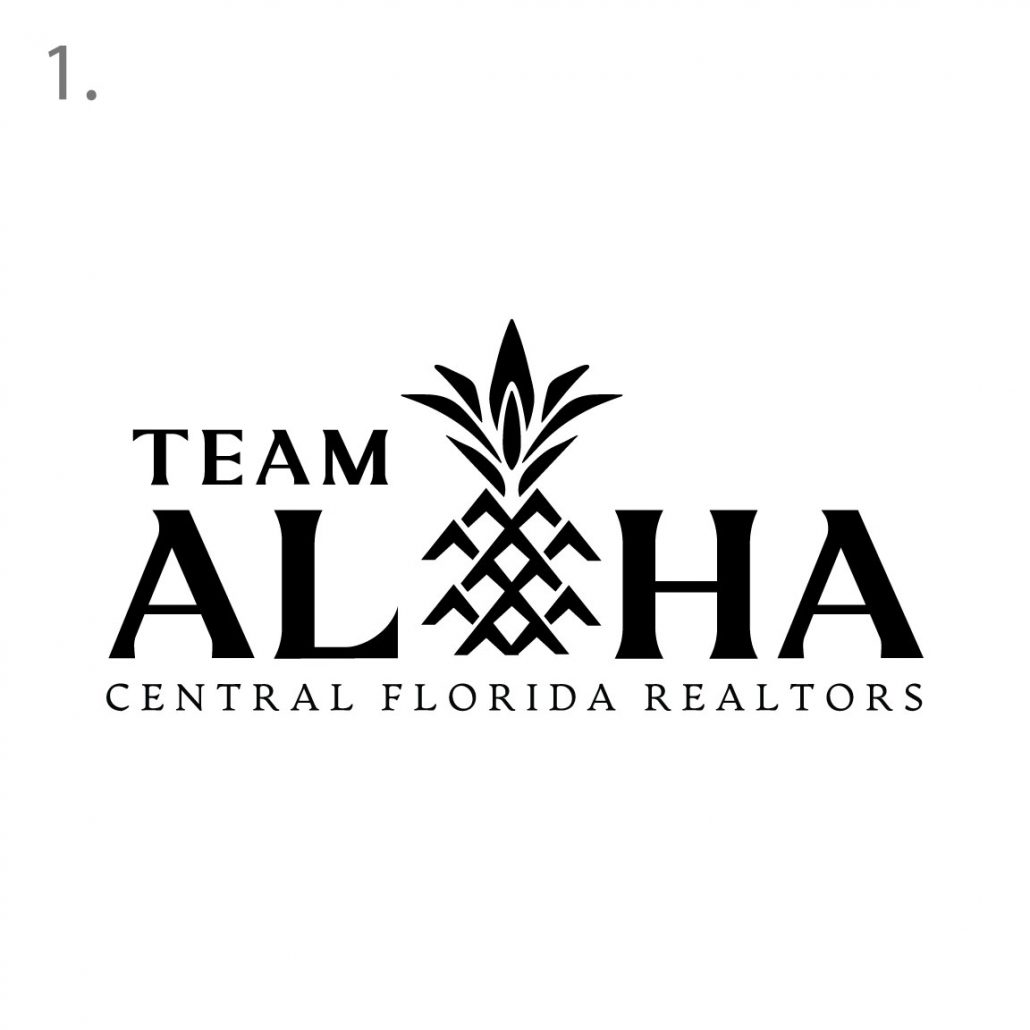
Our second concept is a fun unique approach to the classic pineapple graphic you had previously. We wanted to give an homage to the original logo but elevate and make it more complex with deeper meanings. We always love to take a clients idea and look into ways to explore it further. We incorporated a T and an A into the pineapple form. The T also creates a human figure at the top with arms opened as in welcoming the family into a new place (Home). The shape of the pineapple is also meant to symbolize a home structure with a peek in the roof and a strong foundation.
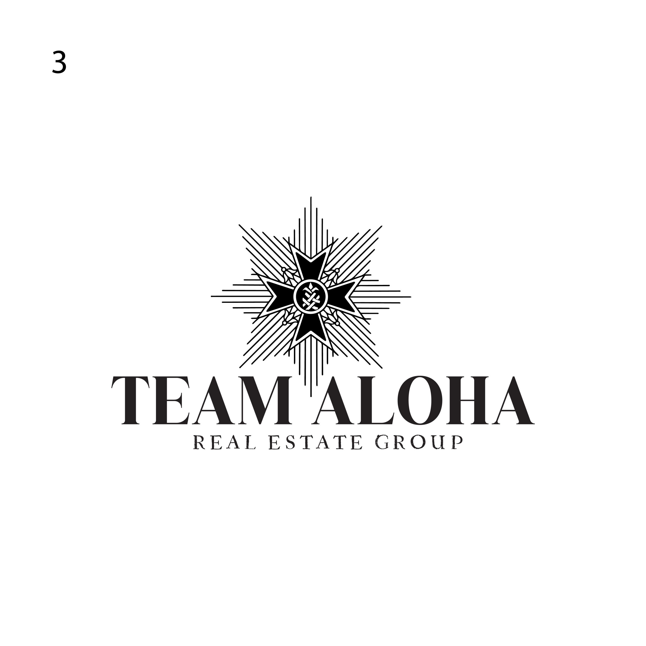
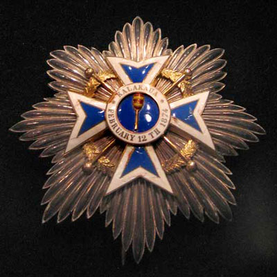
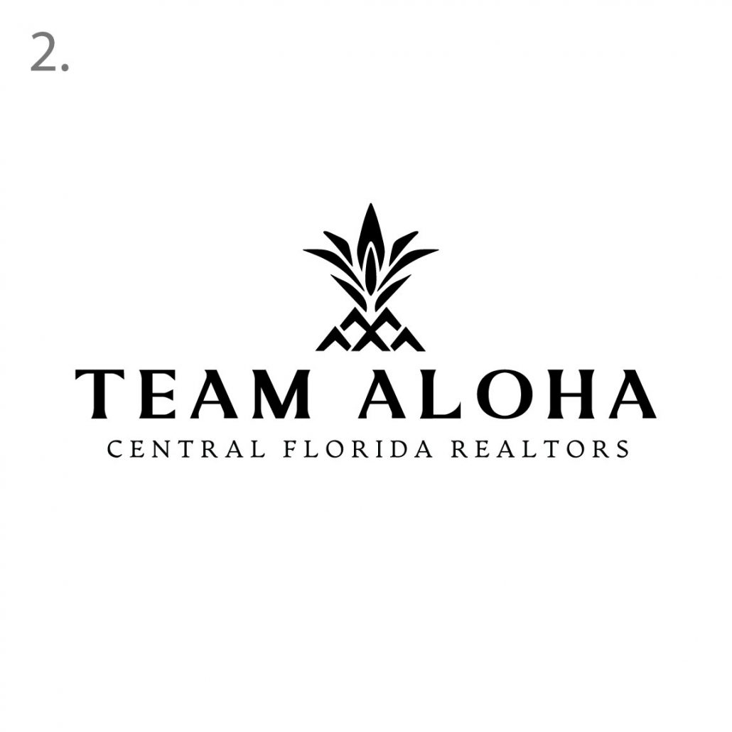
Our third concept is based directly on the royal order badges I saw during my visit to Iolani Palace. We wanted to incorporate a clever lau hala pineapple graphic we designed that also symbolizes a home. All homes here have some sort of lau hala mat in their possession.
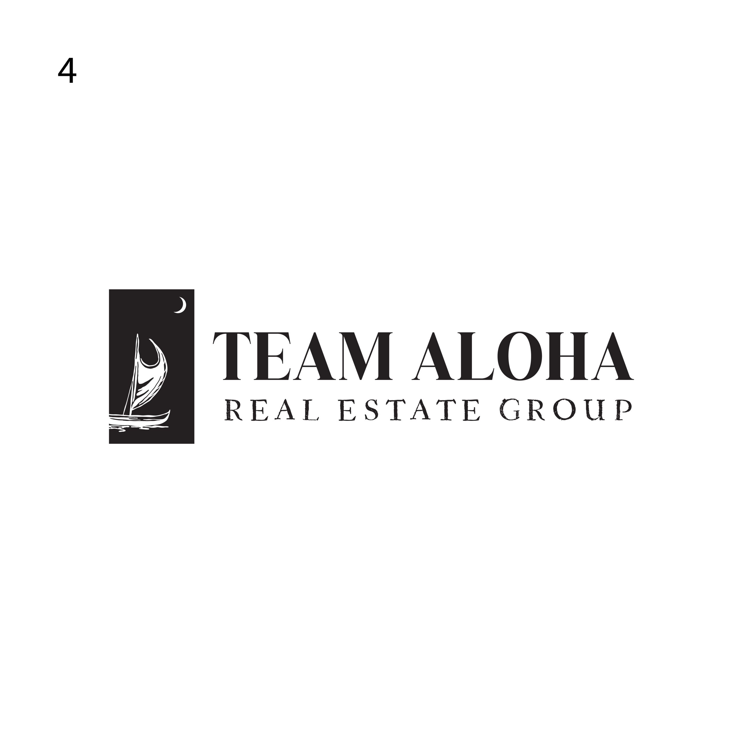
This concept is a bold take on a more corporate style of logo with a bit of out of the box approach. The Polynesian canoe is meant to be coming in from the west headed towards the east which is an ode to Florida being on the east of the country. If you notice there is a crescent moon in the sky. There is a deep significance behind that: The 3rd through 6th moon phases correspond with the first four nights of Ku. The end of the first moon, Kūkahi ends the kapu (forbidden) period of Ku and marks a period where typically taro was planted (Kū means ‘erect’, thus the meaning here is for plants to grow strong and erect). This series of four days also indicates good fishing. This would be a symbol for planting roots as in building a home with your family.
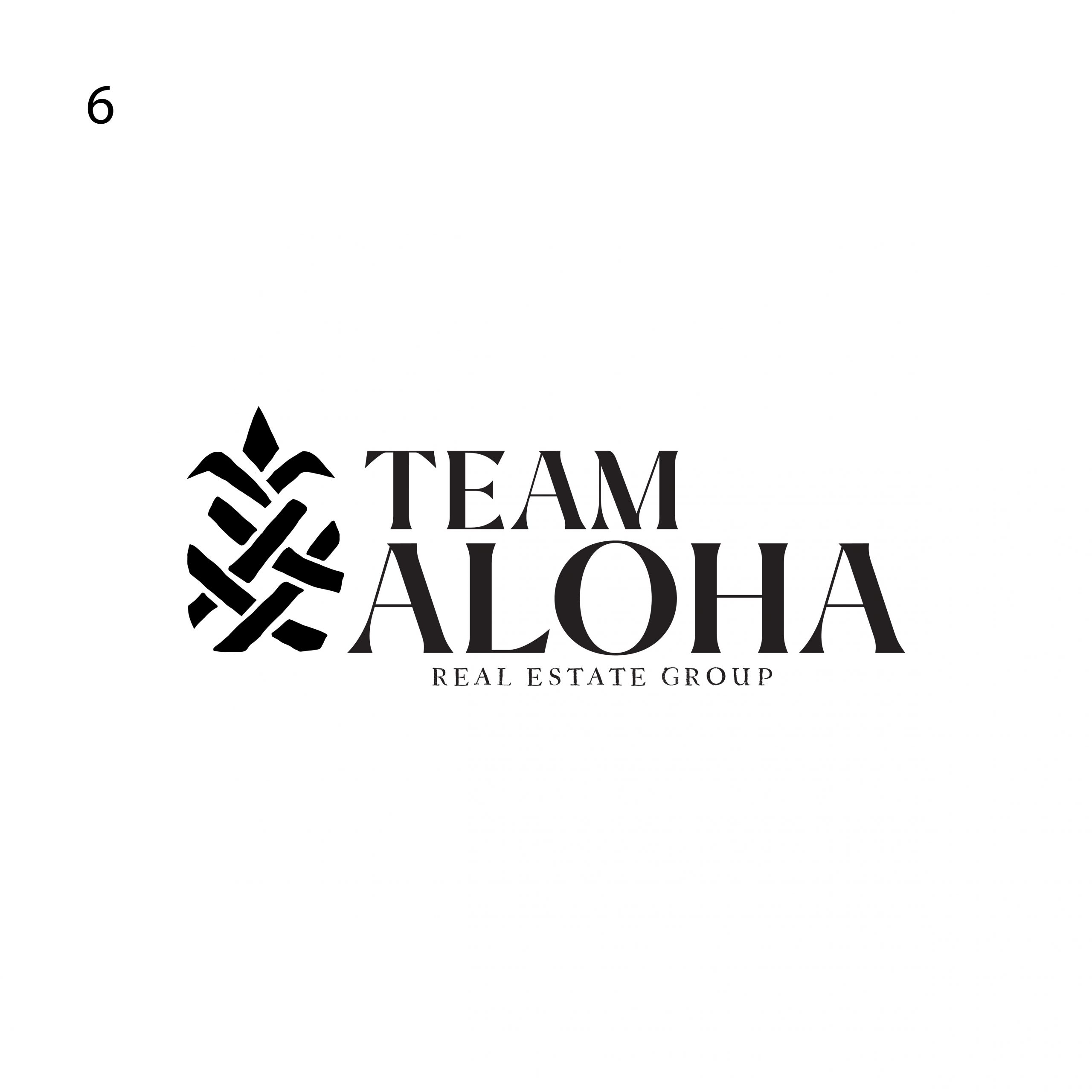
This concept is the lau hala graphic I mentioned earlier but with this one its the hero. We took the idea of the pineapple and created a unique graphic that can be utilized as a pattern, stand alone graphic and symbol. We like the interaction of text and graphic into this concept
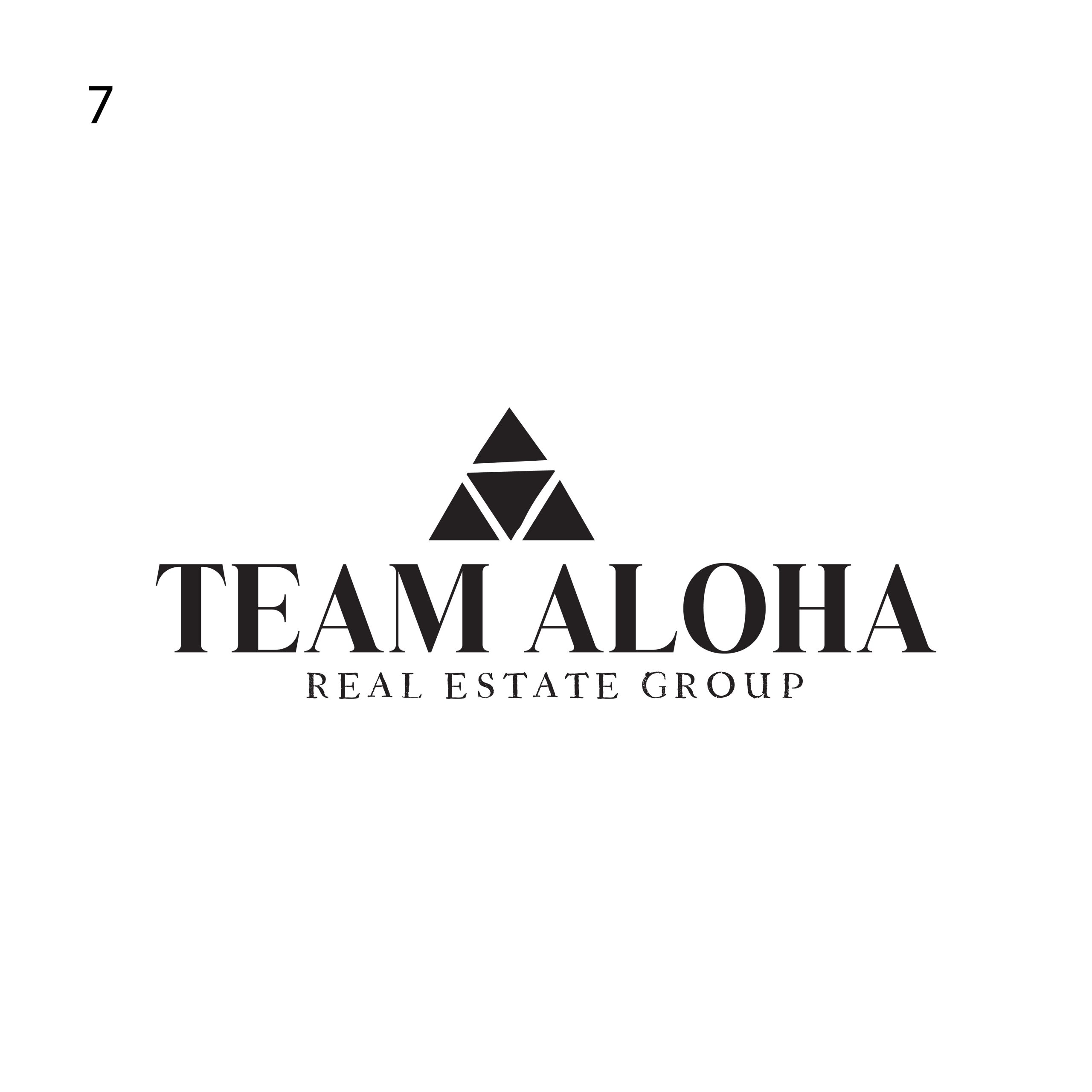
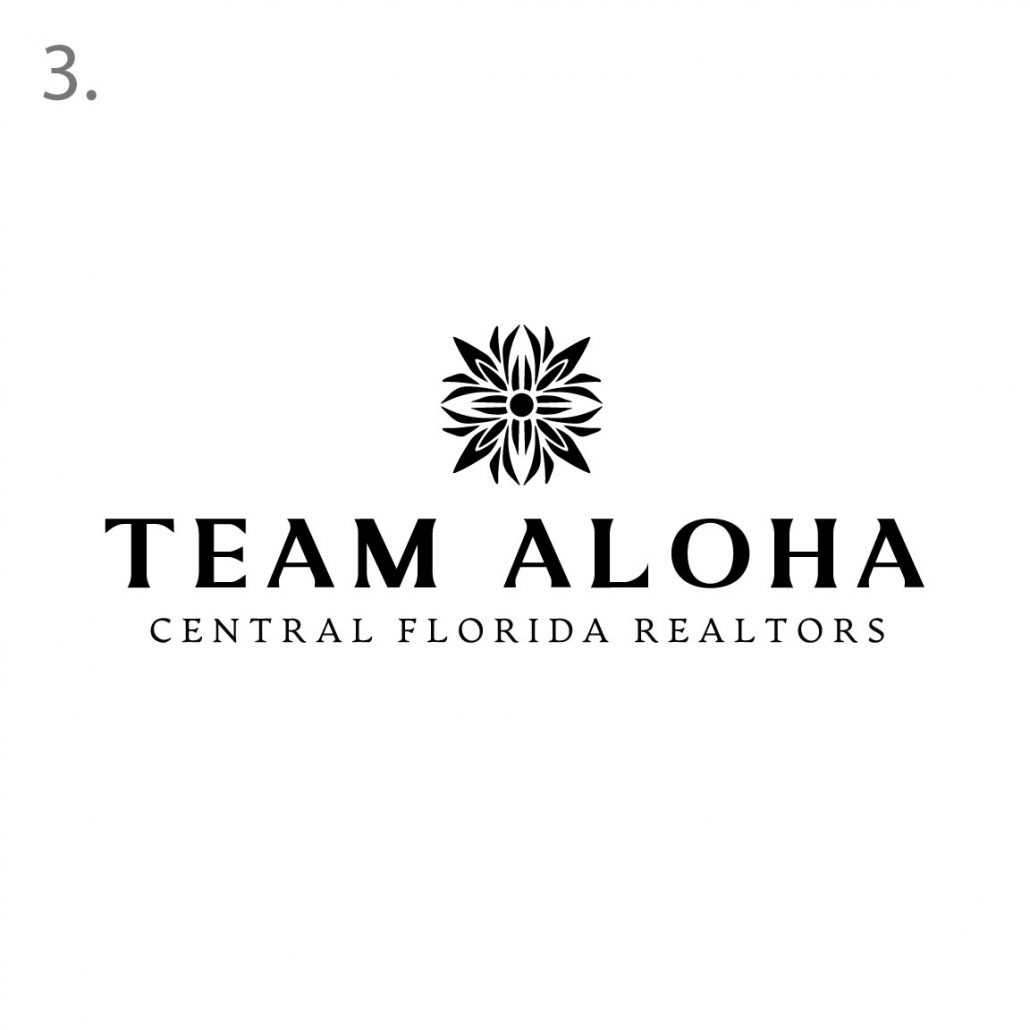
This idea is a new take on the powerful Lokahi symbol which is prevalent in Hawaiian culture. The literal definition of lokahi is unity, agreement or accord. In traditional Hawaiian healing, the Lokahi Triangle is about achieving harmony in three areas: mentally, physically and spiritually. If you notice, we did not draw the lokahi symbols perfectly, we felt that slight hand drawn feel represented the imperfections which make life great. The triangle symbol is the strongest shape, it signifies eternity and longevity.
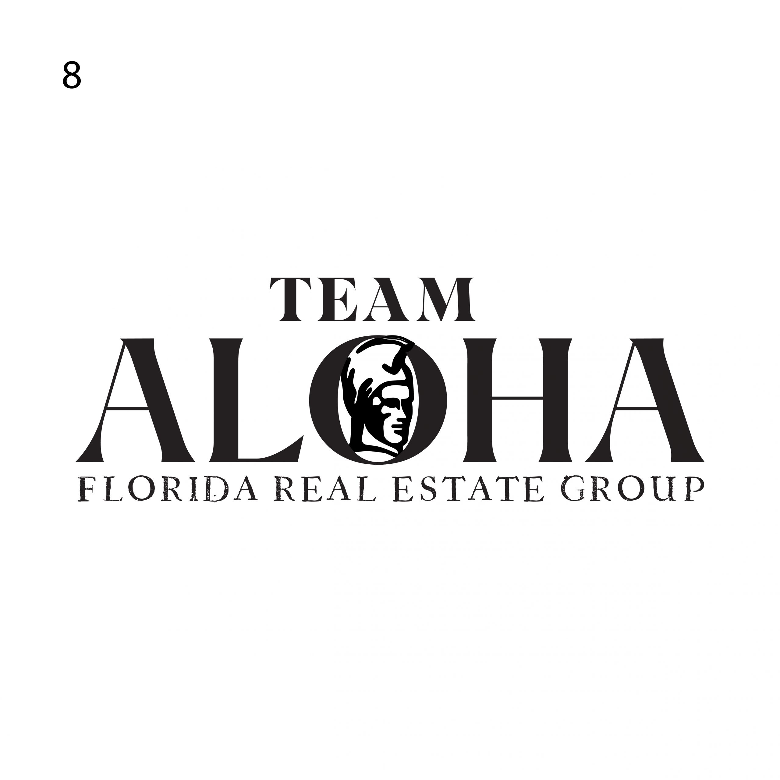
This logo we wanted to try a really clean powerful approach. This is on the more corporate side of design, we did want to give it a little bit of edge with the rough florida real estate group text underneath. It adds a bit of griminess which we really love
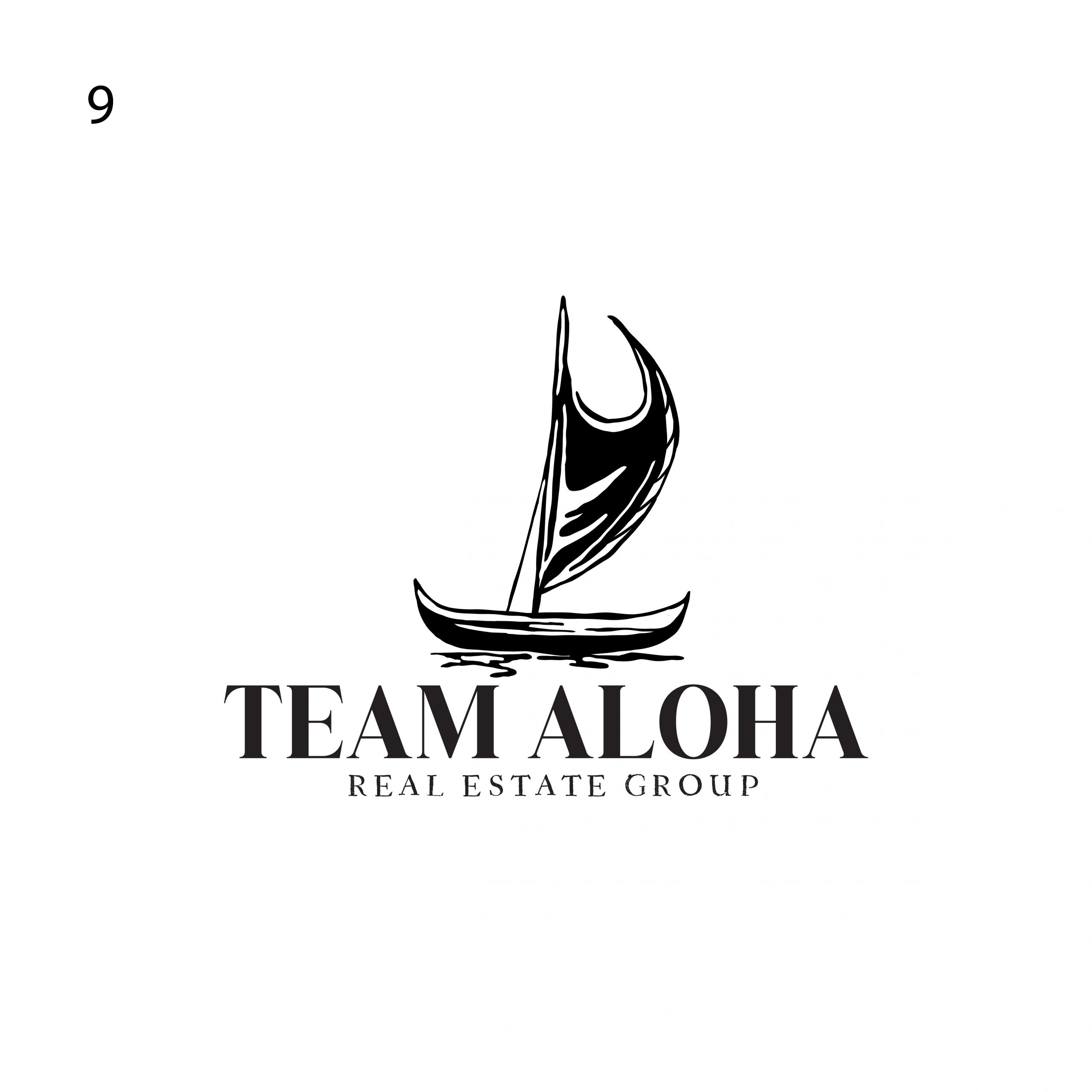
We brought in the canoe idea by itself which we really liked the graphic element of this drawing. The flow fits pretty nicely with the text and we thought it was a nice strong logo that can stand alone.
Competitor Logo Research
Aloha! Mahalo for placing your trust in us, we are excited to begin this journey with you. This will be our webpage to keep track of the project and progress. All revisions and concepts will be uploaded here.
