

Color Exploration V3
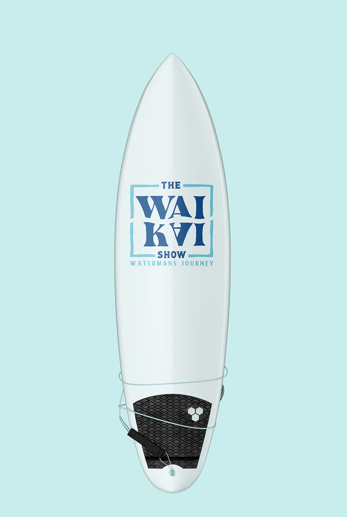
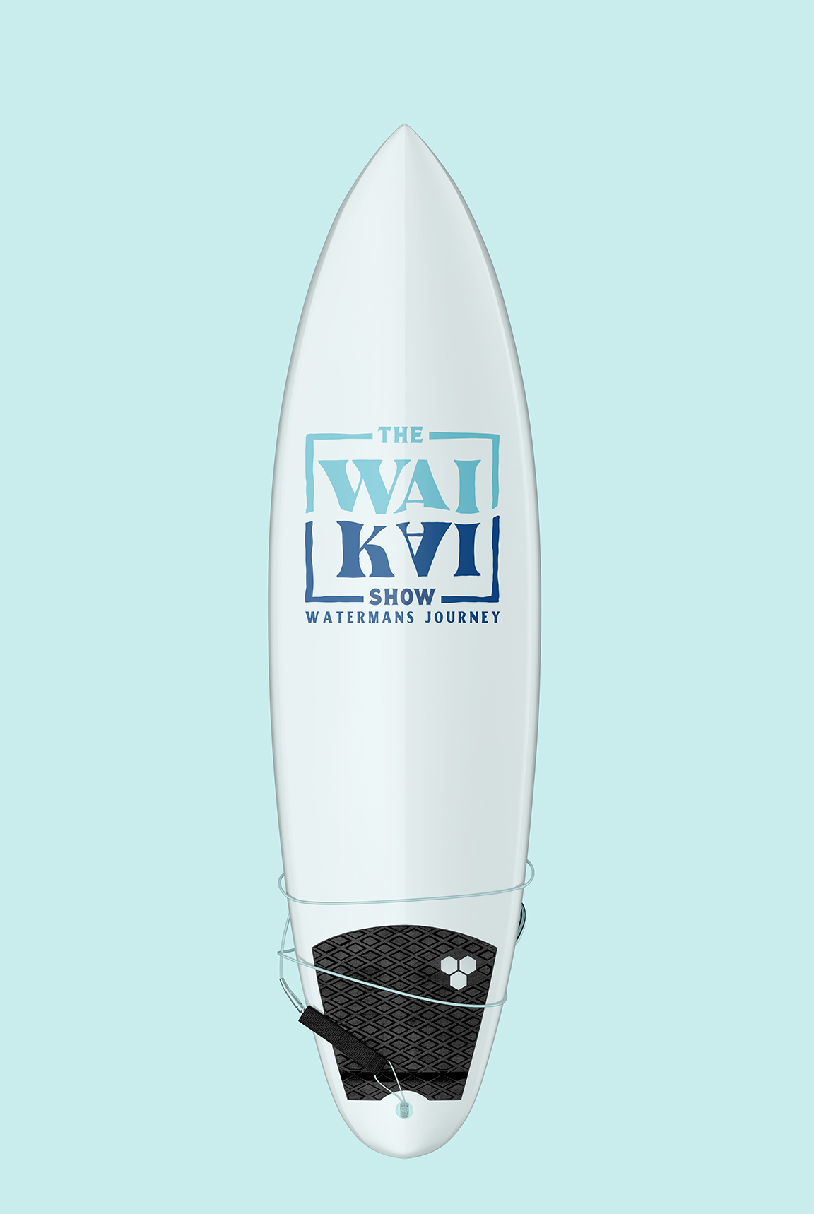
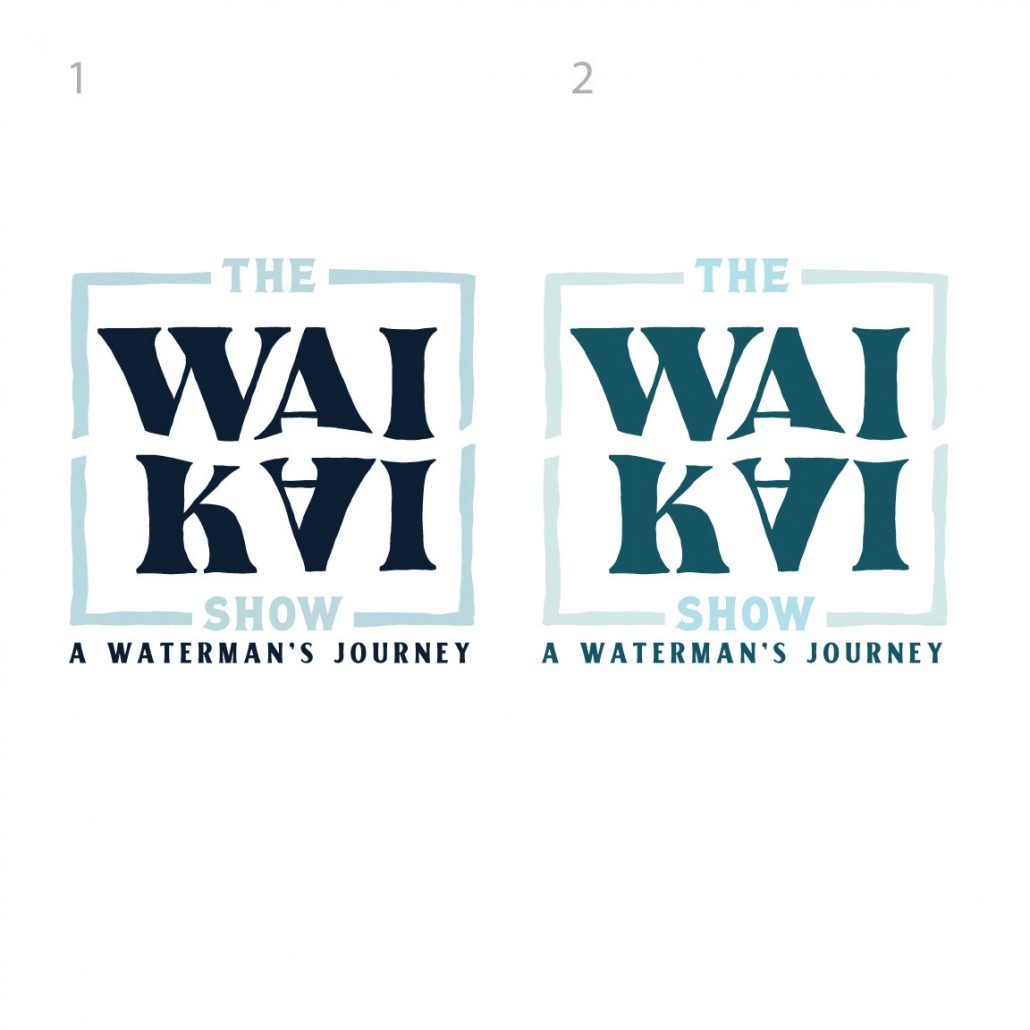
Aloha team, it was great seeing everyone tonight. Thank you all for inviting me out. We have new colorways based on conversations I had with a few of you at the event tonight and also from the notes from the previous email. We wanted to make the logo pop a bit more and give it a really nice sense of excitement. Colors were inspired by tonight’s show and hues I noticed shining on the water and on the color of the pool mats.
Let me know what we think!
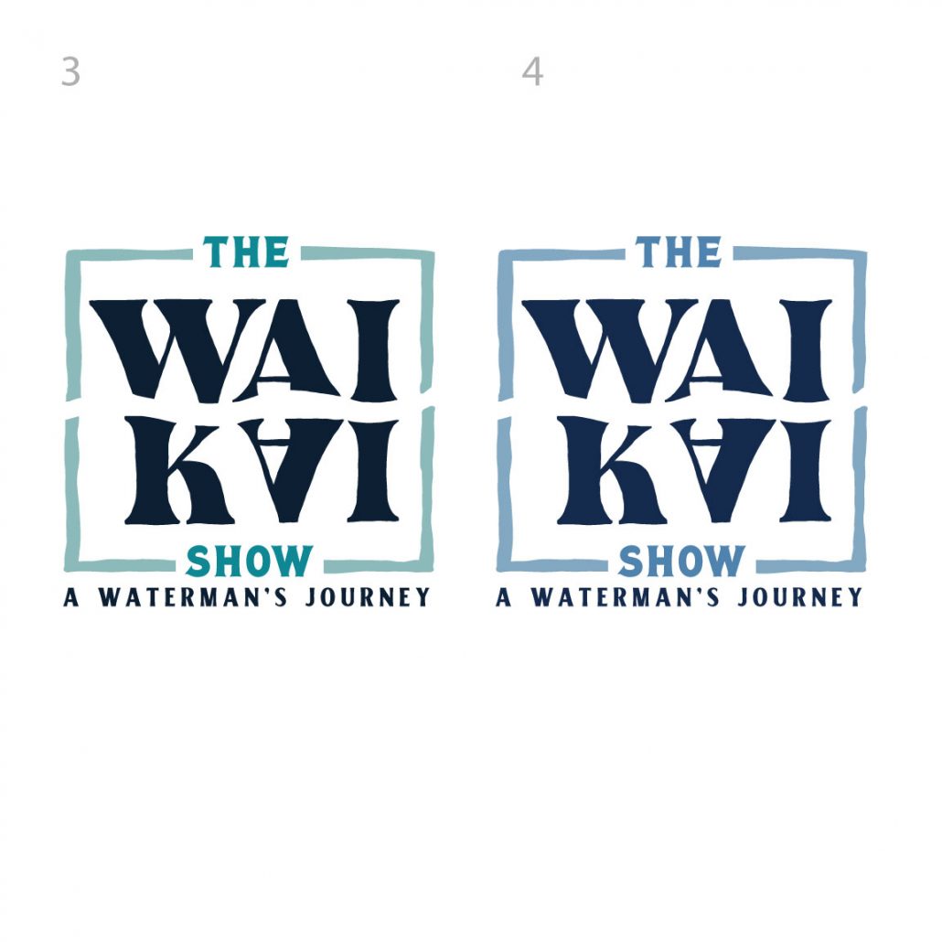
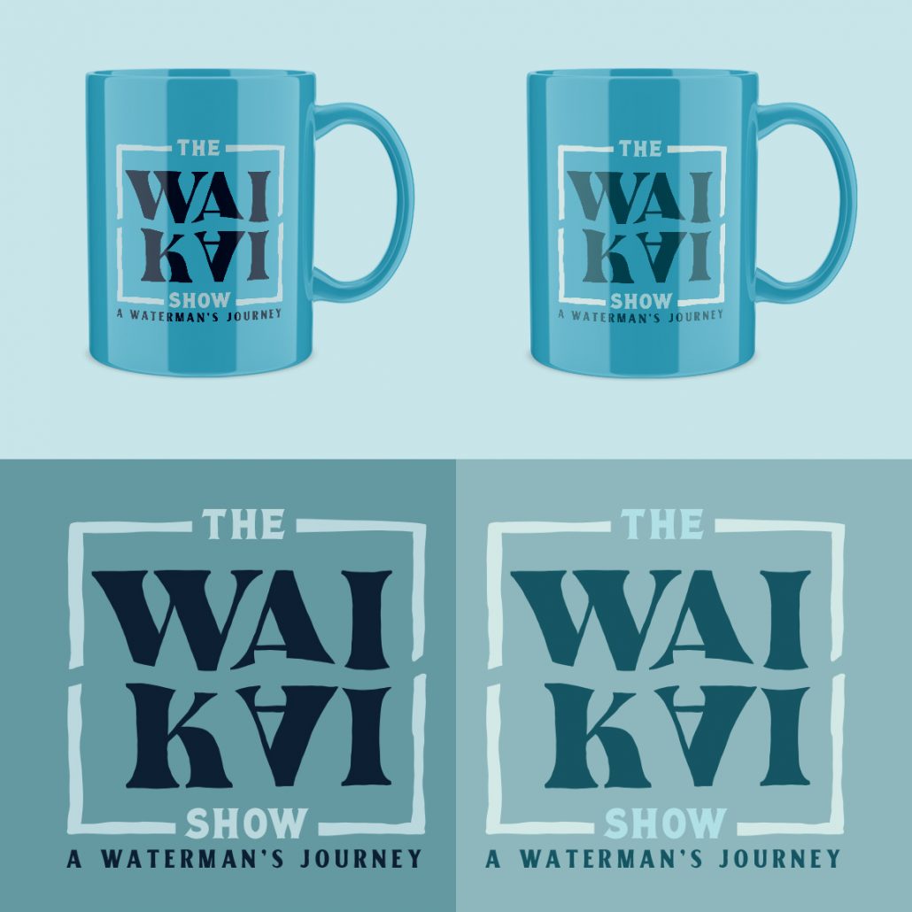
Color Exploration V2
Aloha! We have a few varieties to consider, we created a more sophisticated and softer blue feel. Let me know what you think! We wanted to elevate the color pallet a bit
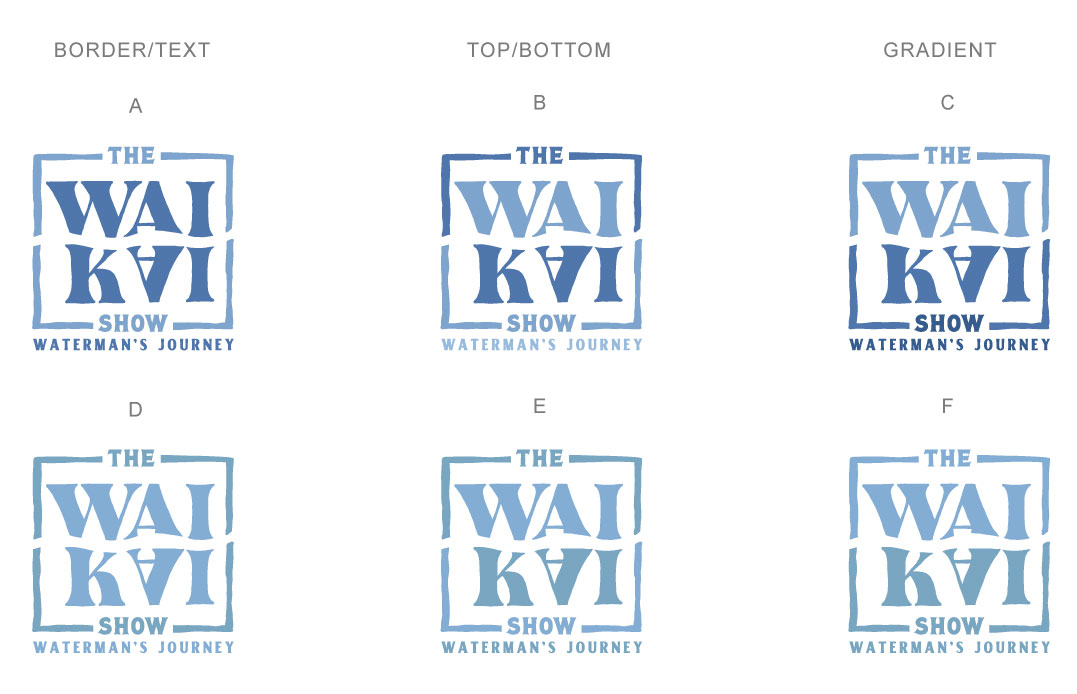
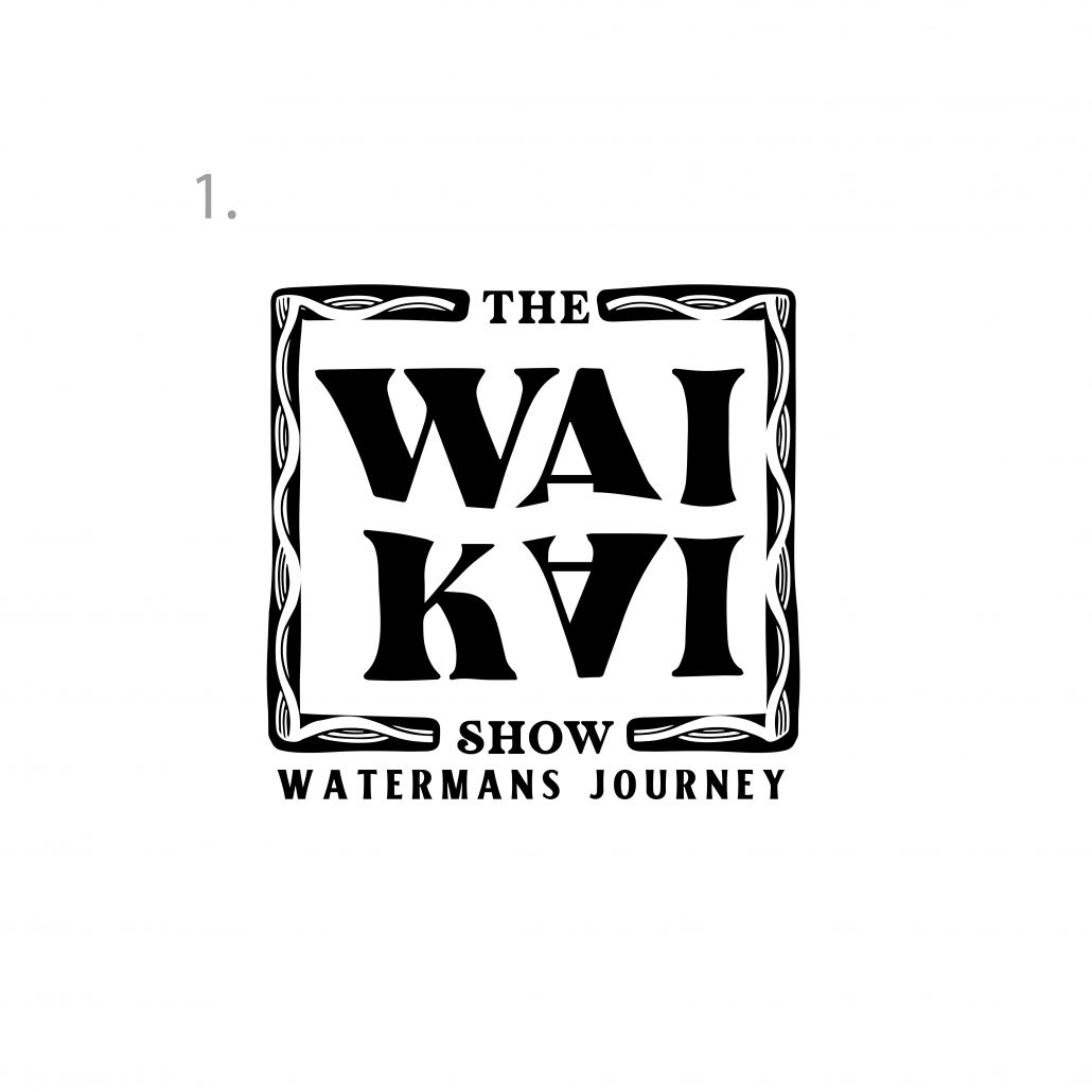
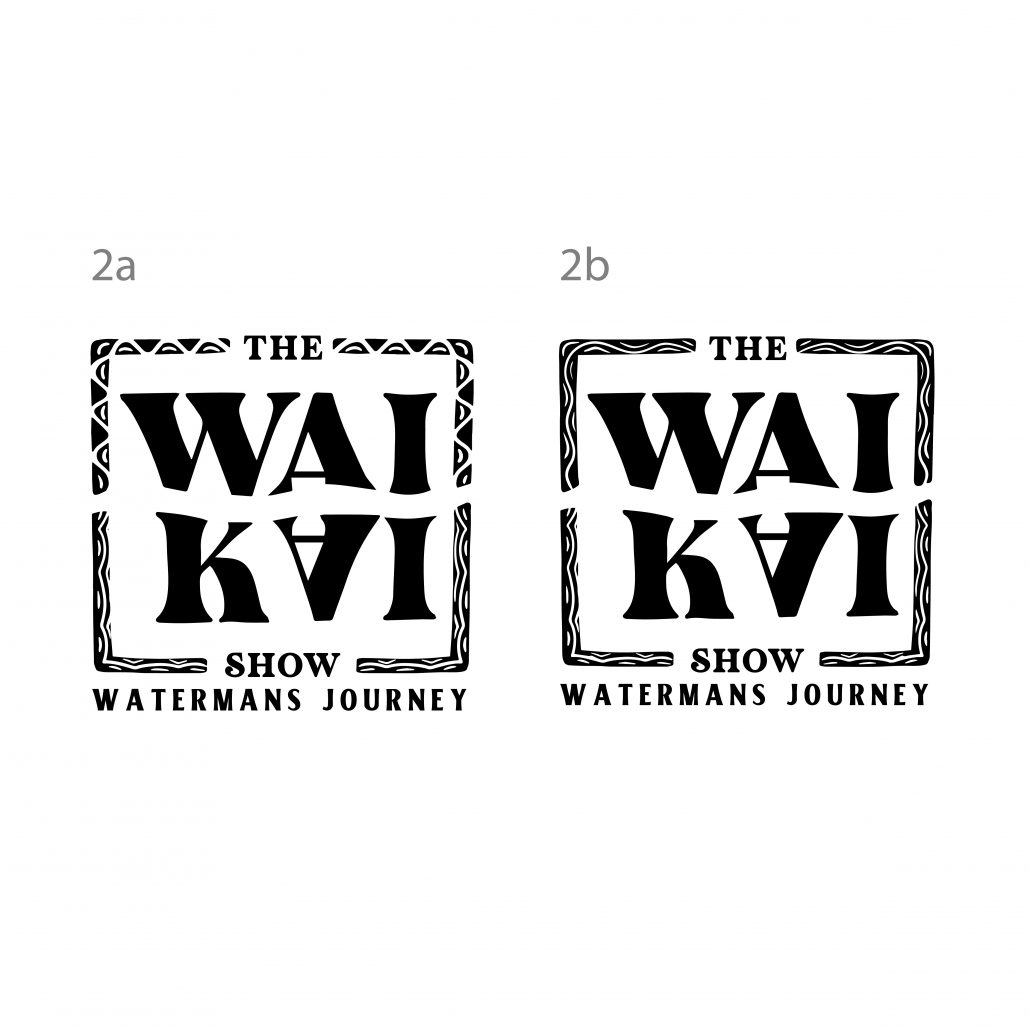
Border Exploration 2:
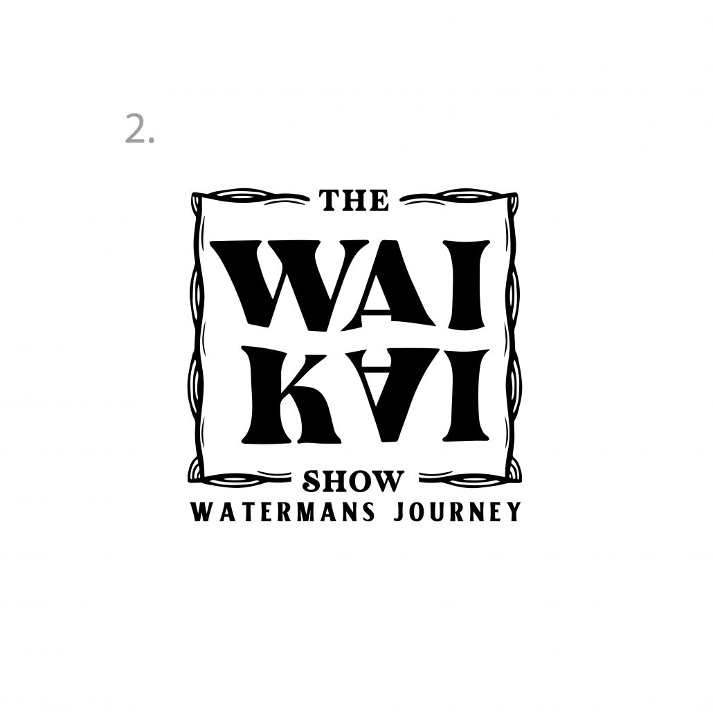
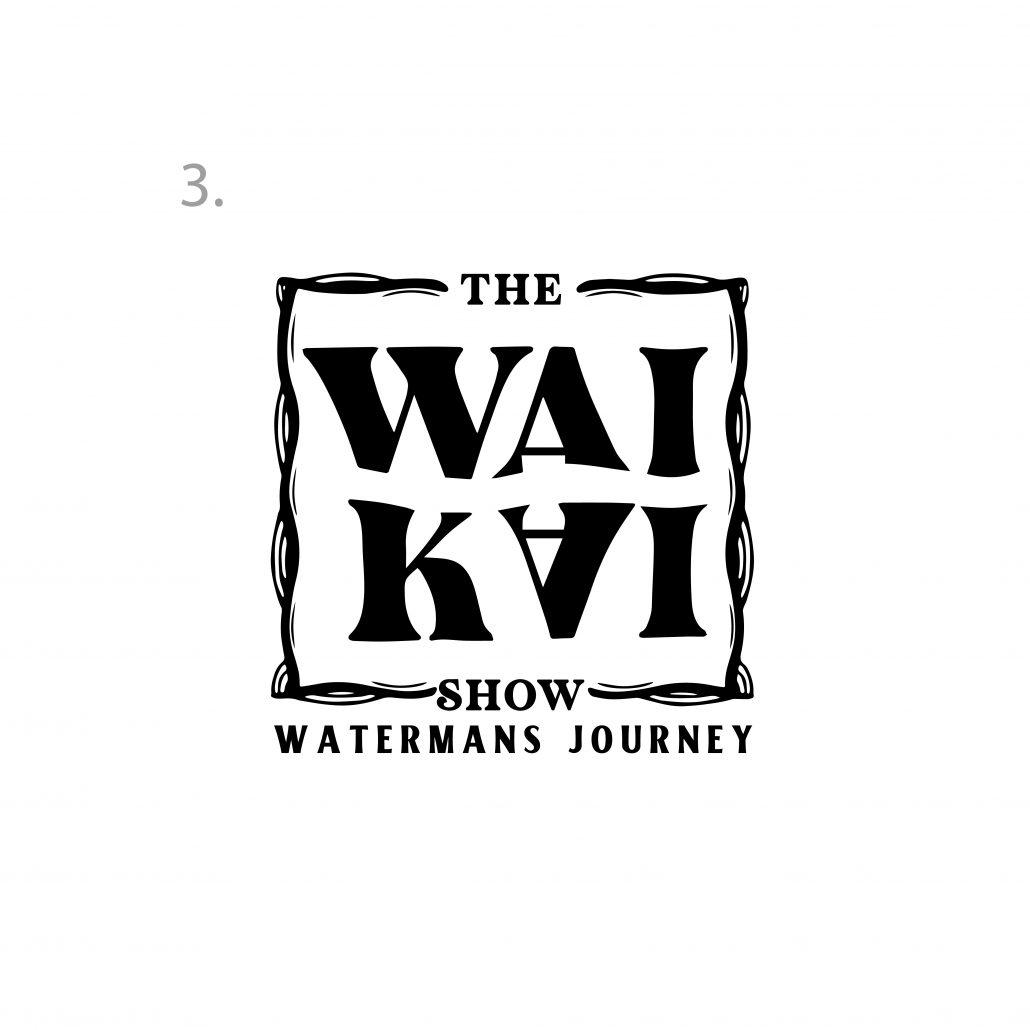
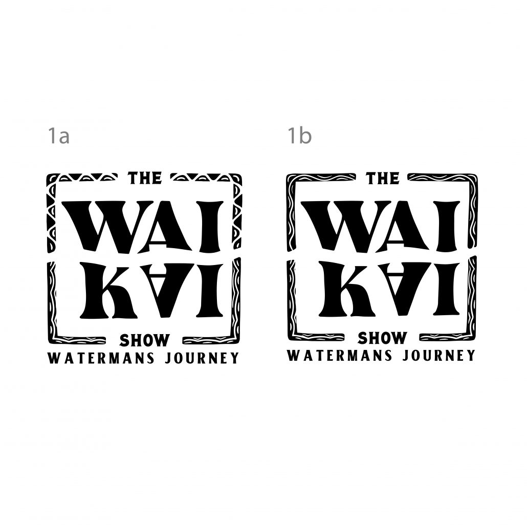
Border Exploration:

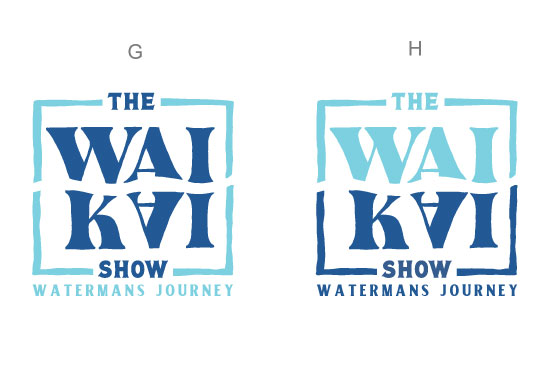
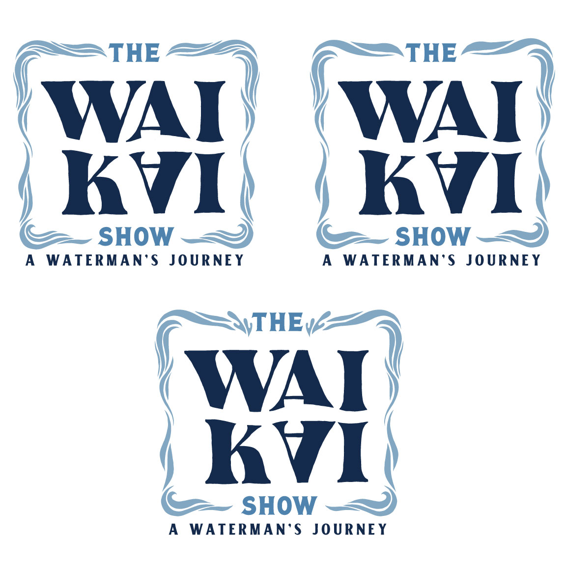
Color Explorations:
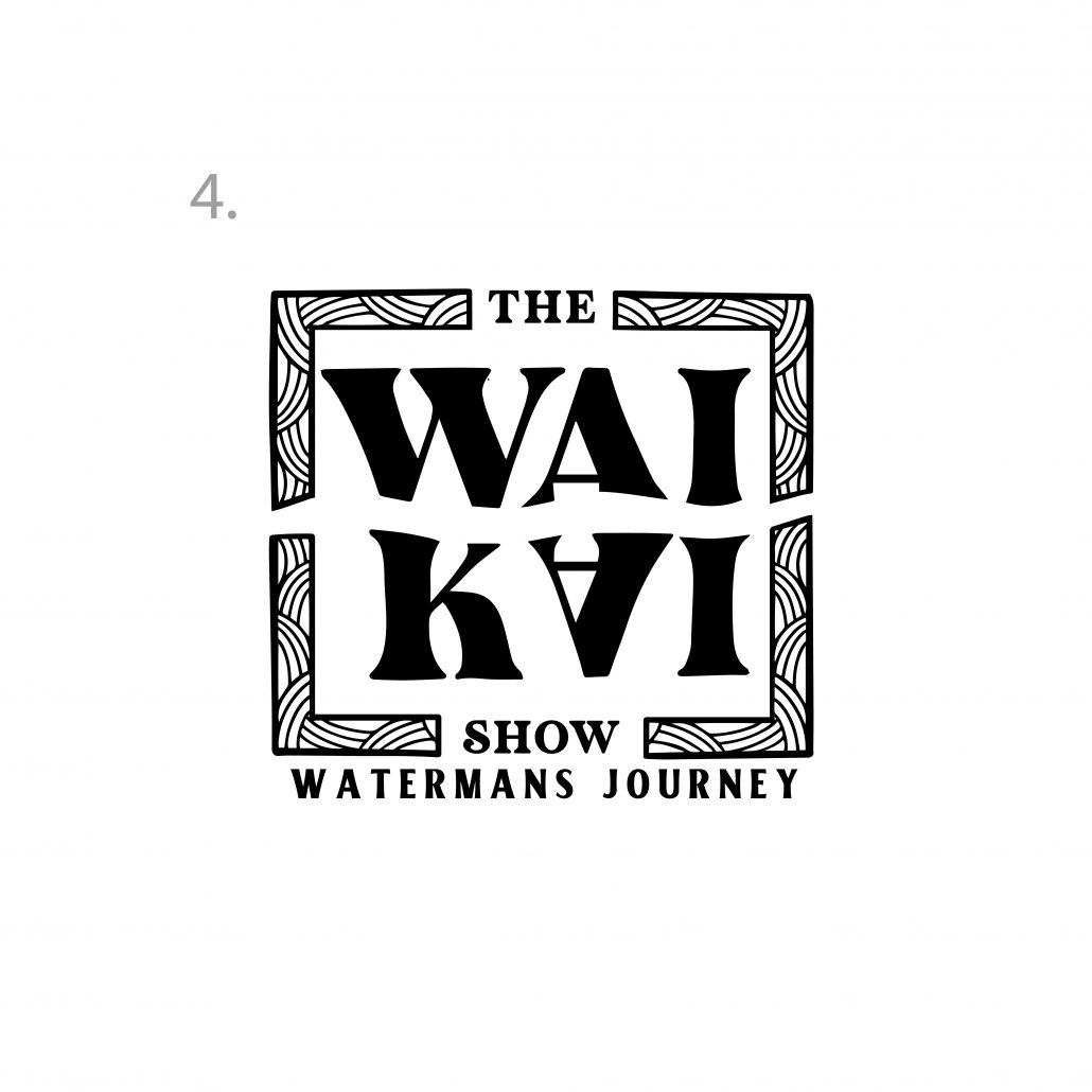
Border Concept:
Aloha, we wanted to explore a different idea for the border that incorporates a bit of the water aspect without it being cheesy and busy with the canoes. Let me know what you think
v2
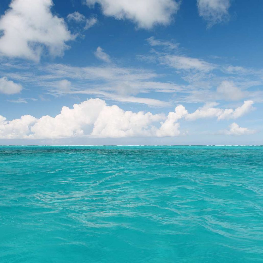
We wanted to explore water inspired colors without being obvious, we chose hues that were uncommon and unique. We focused on hues that were seen in the ever changing colors of our oceans according to cloud coverage, sunlight, water clarity and depth. Hope you enjoy!
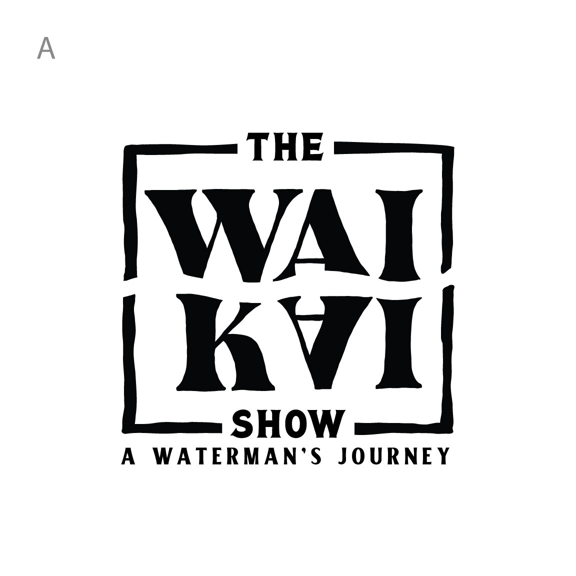
First Round of Revisions:
based on notes, V7 and V1 are front runners for possible logo with edits which have been made below:
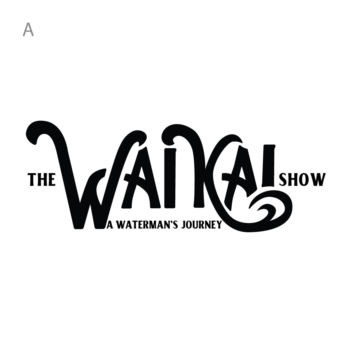
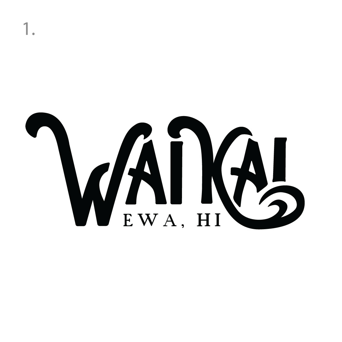
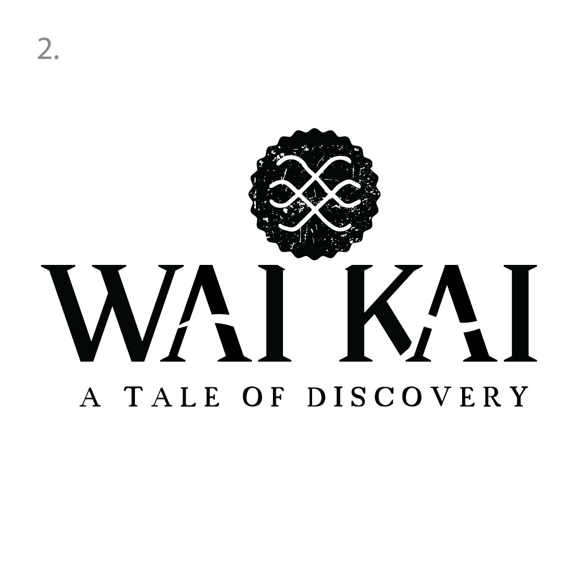
Our personal favorite would be the wai kai text logo below, we feel this would lend itself perfectly to merch and could become an iconic design
Aloha! Thank you for your patience during this process! We have a few options for you to review and I will explain our idea behind each concept! Taglines are placeholders for now
Our first concept is based on the literal meaning of wai and kai, freshwater and saltwater. We wanted to give this logo a feel of water movement. Below you will see the sketches of how we wanted to incorporate two methods of waves into one symbol. All our ideas utilize custom typography which has been manipulated to achieve our ideas
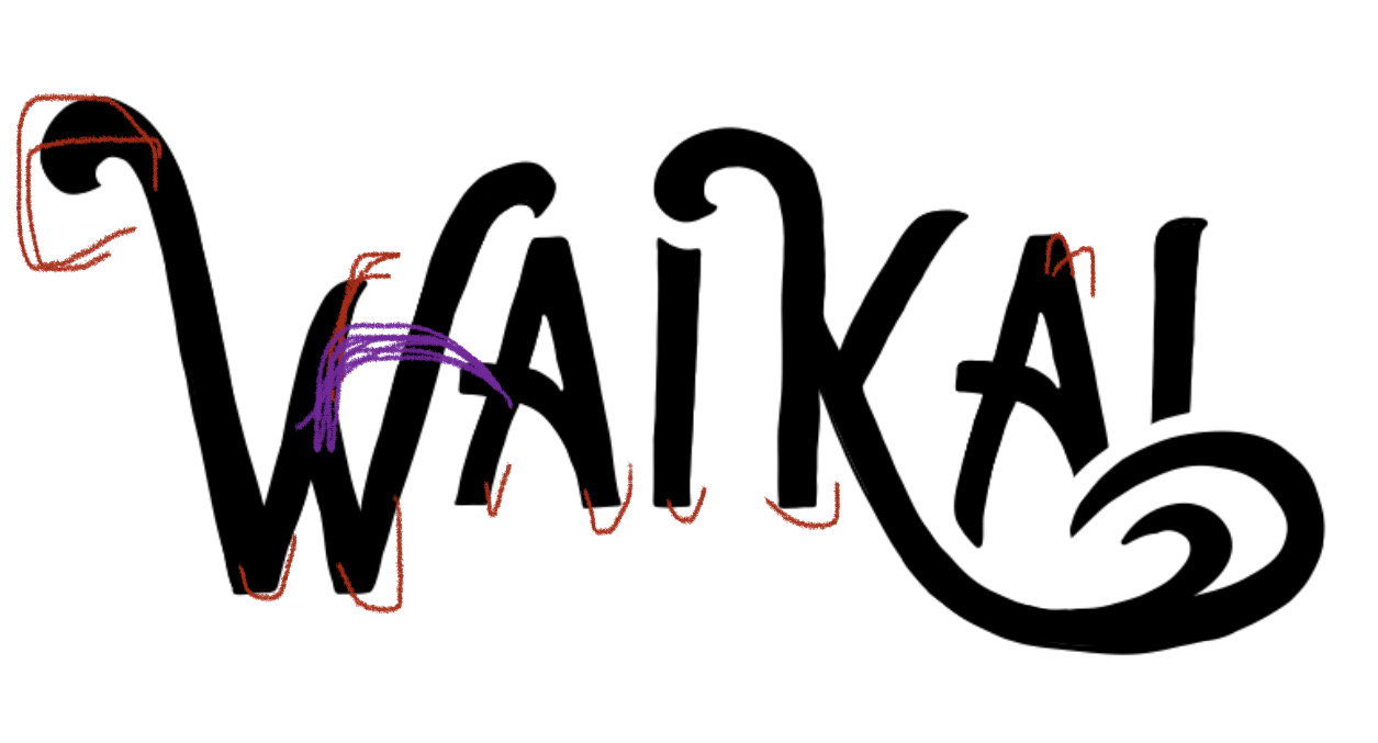
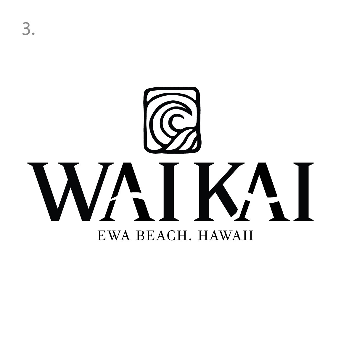
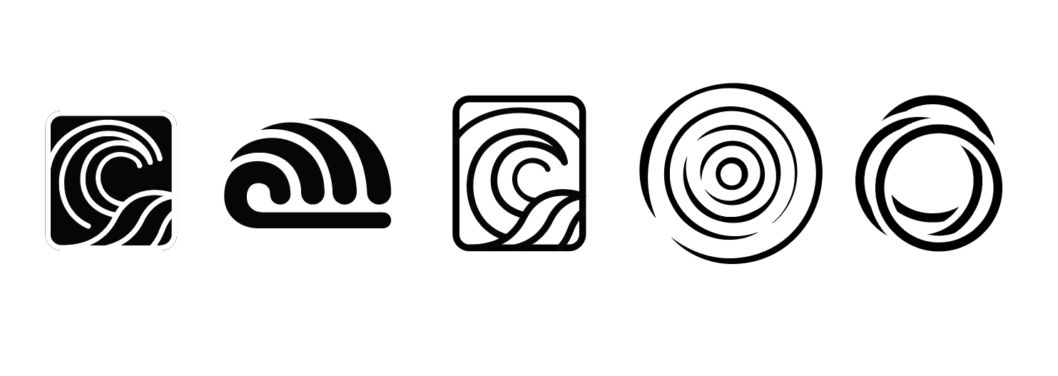
Our second concept is also based on the two idea of having the two waterways interacting and incorporating into one united symbol. We wanted to give this idea a very vintage style, almost giving the graphic a sense of petroglyph, something that could have existed years ago. The typography has clever takes on the wave idea that pays homage to the original Wai Kai logo wave through the cross bars of the A’s. The serif font gives the logo a presentation of class and upscale. There is a subtle cut out in the bottom of the K serif that ties in beautifully with the A to keep the feeling of movement and connectivity going. Below are explorations and edits we made before deciding on the mark above
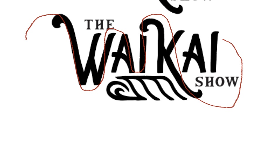
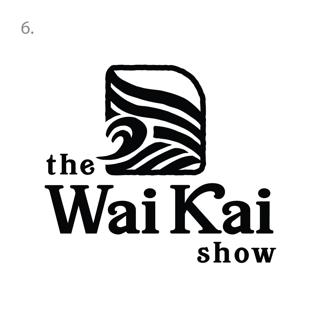
This idea borrows the same main typography as above with a new graphic. Similar idea with the hand drawn style but we wanted to showcase the perfect wave! We wanted to show the perfect tubes you can get on each wave to bring the show aspect to life.
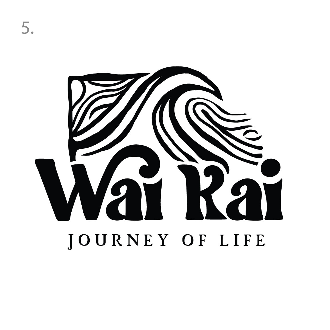
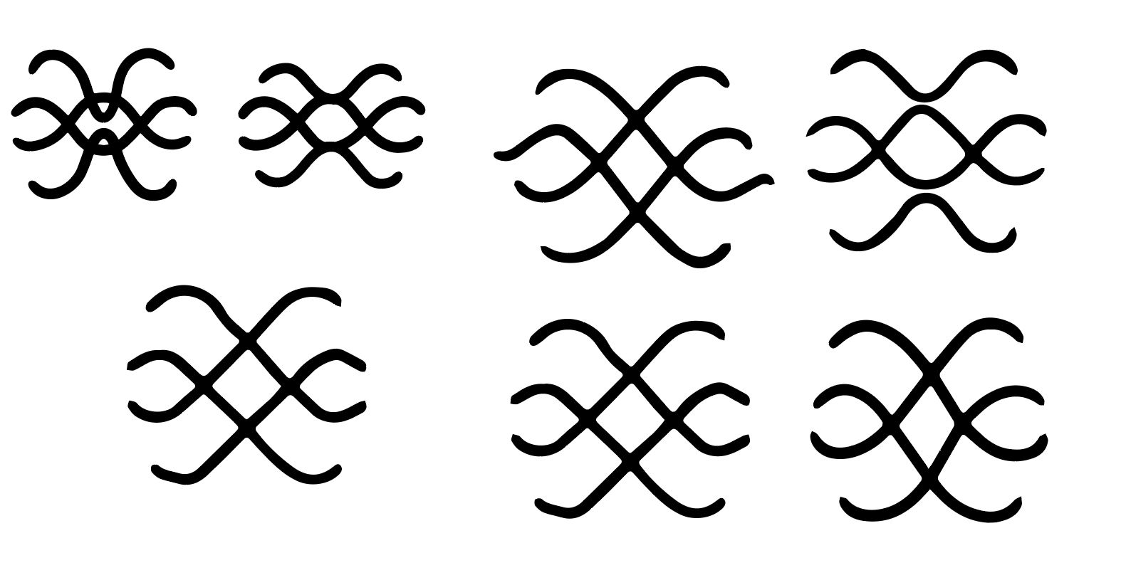
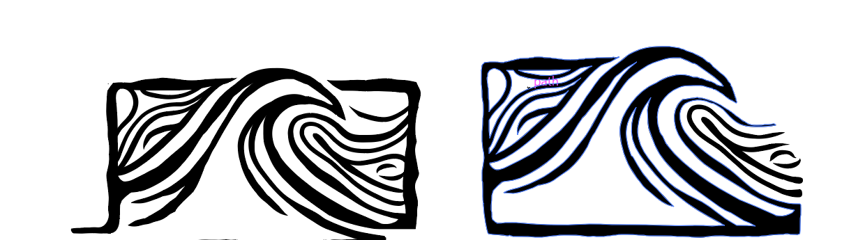
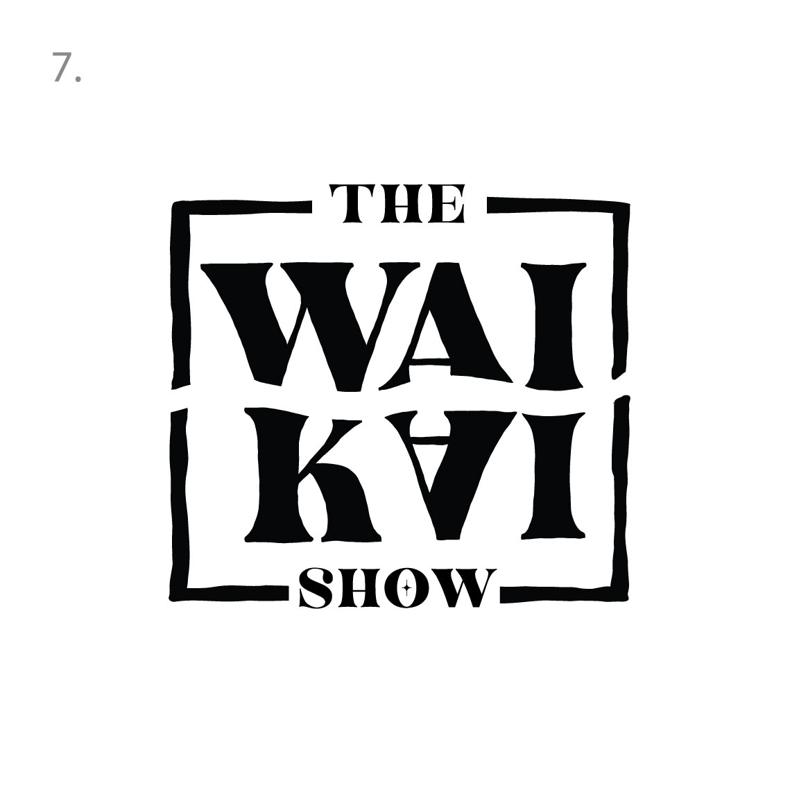
Number 5! A new take on the approach, this graphic lends itself beautifully to merch and the concept of water flow. We kept the idea of the perfect wave and carried it throughout the text, as one set carries into the next set.
This idea lends itself to a more vintage retro style of logo. We wanted this logo to seem like it has been around for decades with still having it a fresh take with the creative wave icon.
Our last option is a complete departure from the previous, its our wildcard presentation. We took the idea of the two methods of water and explored it in a more abstract manner. We flipped the Kai and used the wave through both that represents the two forms of waves. Really lends itself to merch and gives it a cool modern style with a sense of elegance as well
