11/10/22
11/4/22
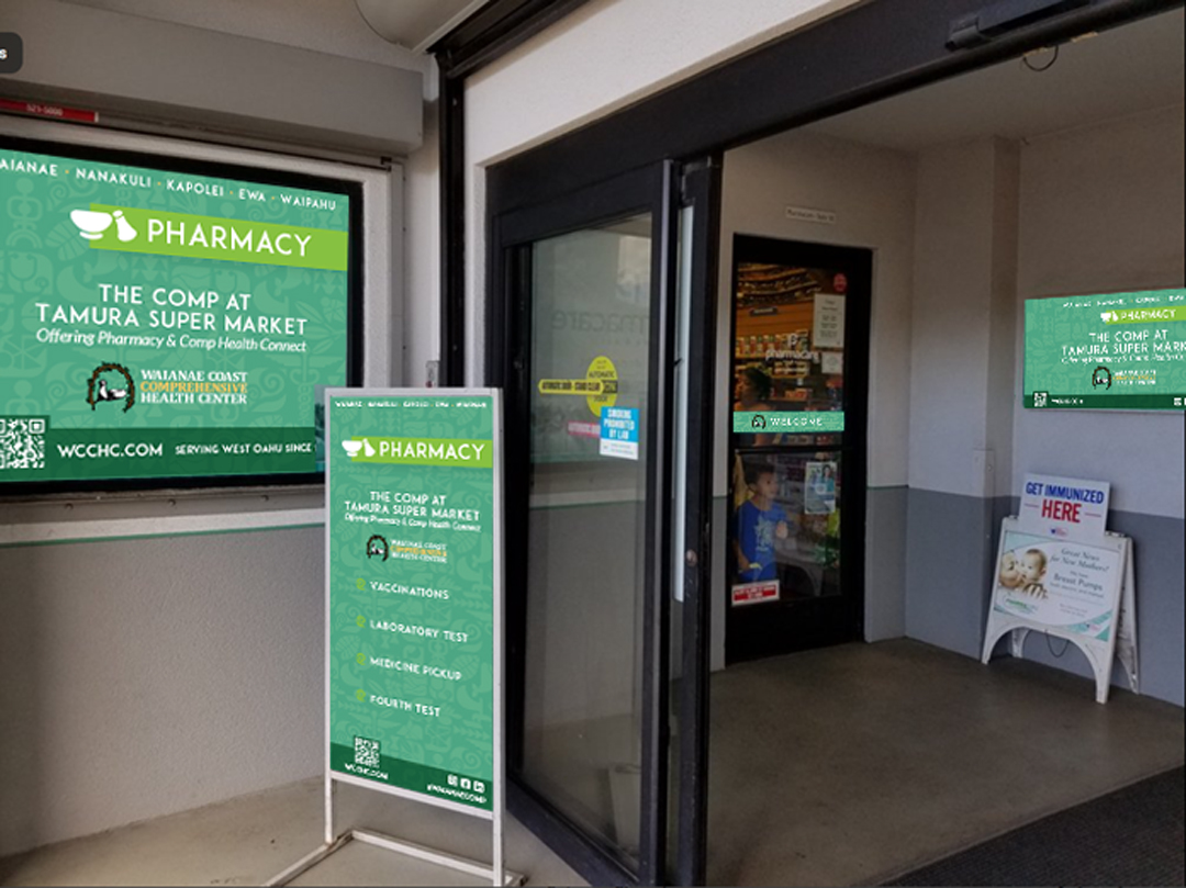
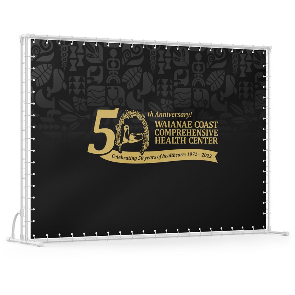
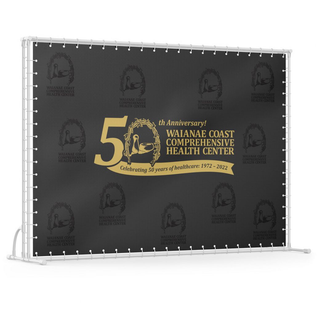
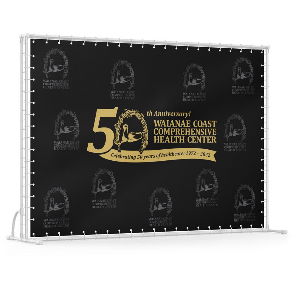
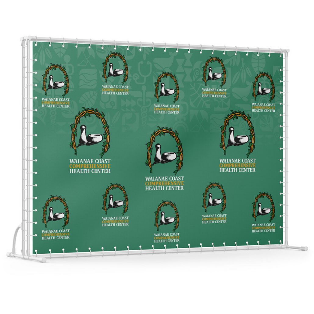
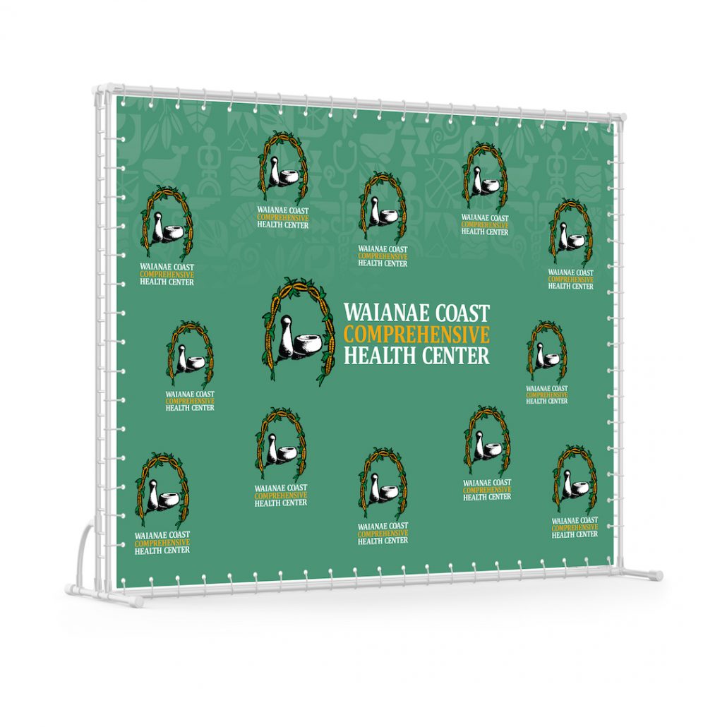
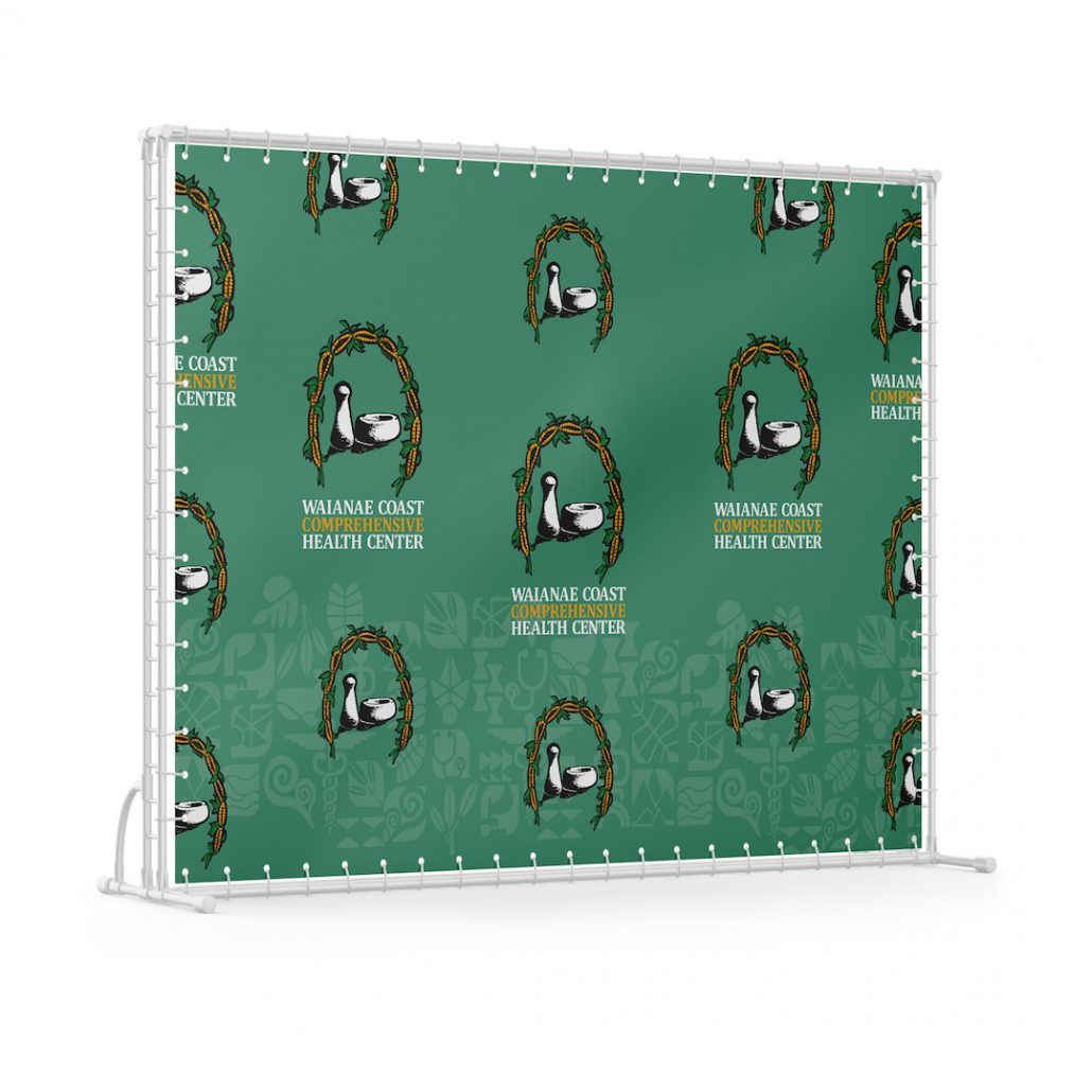
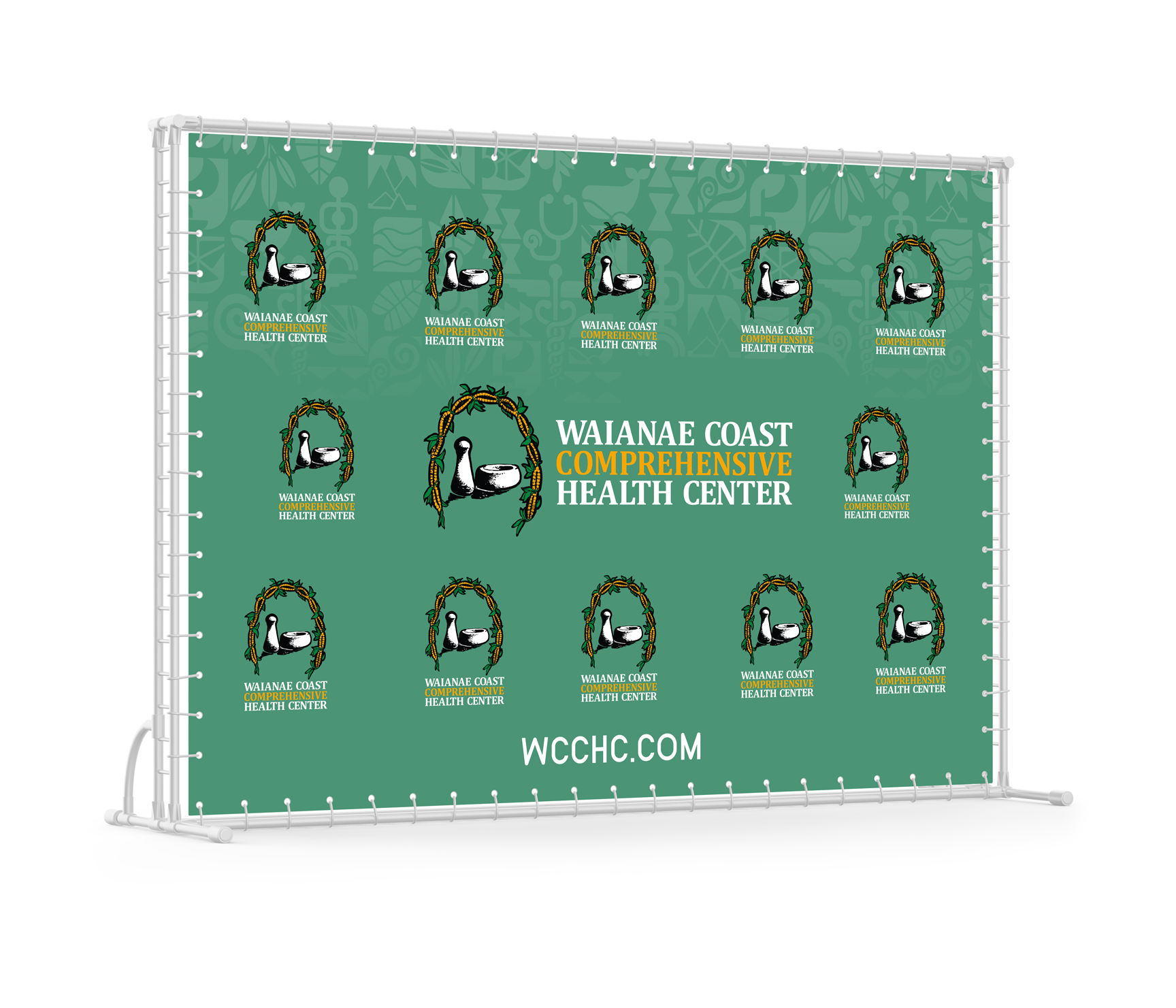
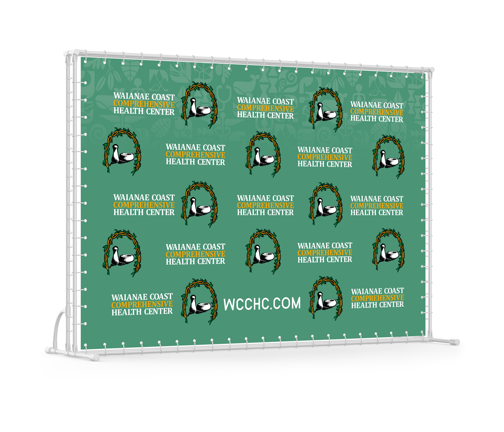
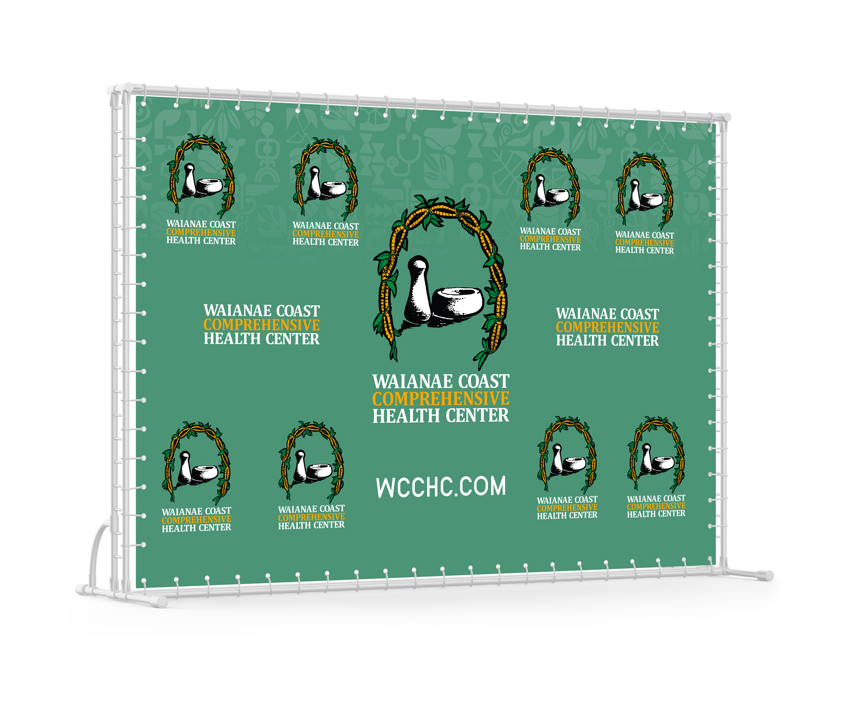
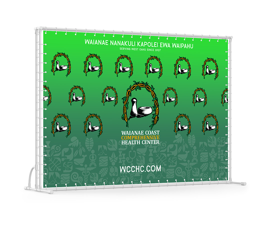
step and repeat new version
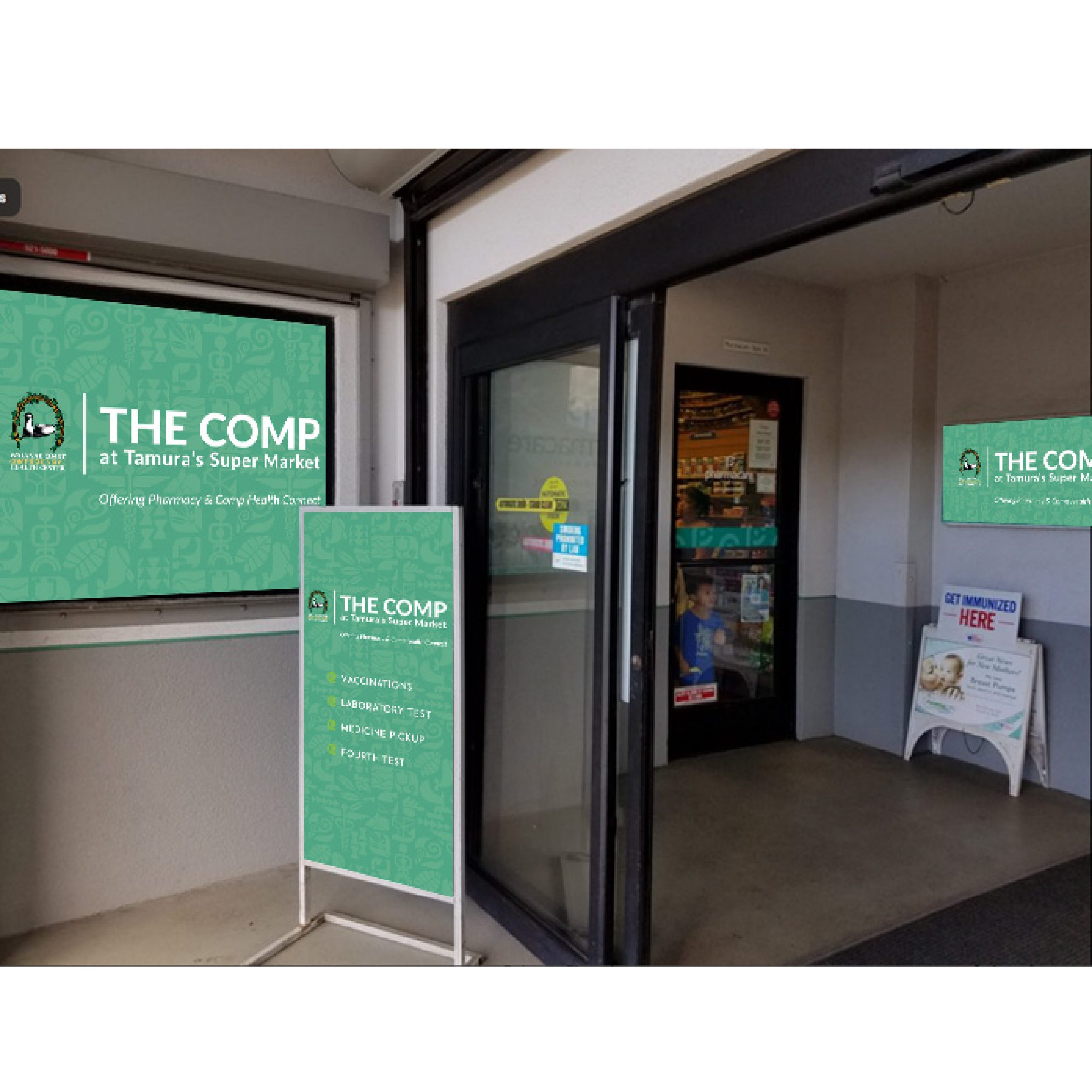
11/3/22
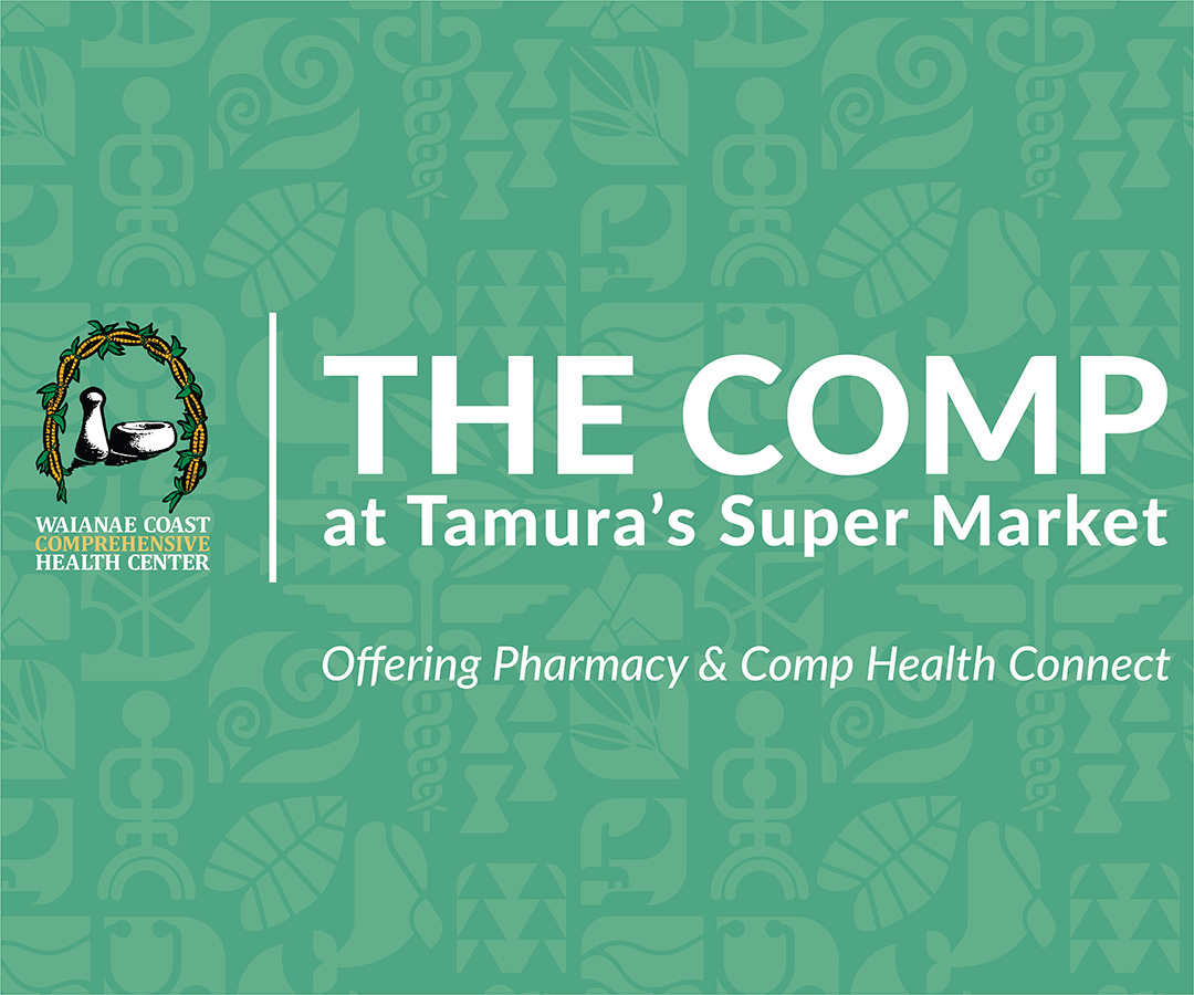
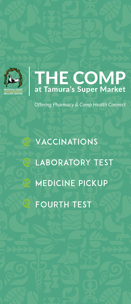
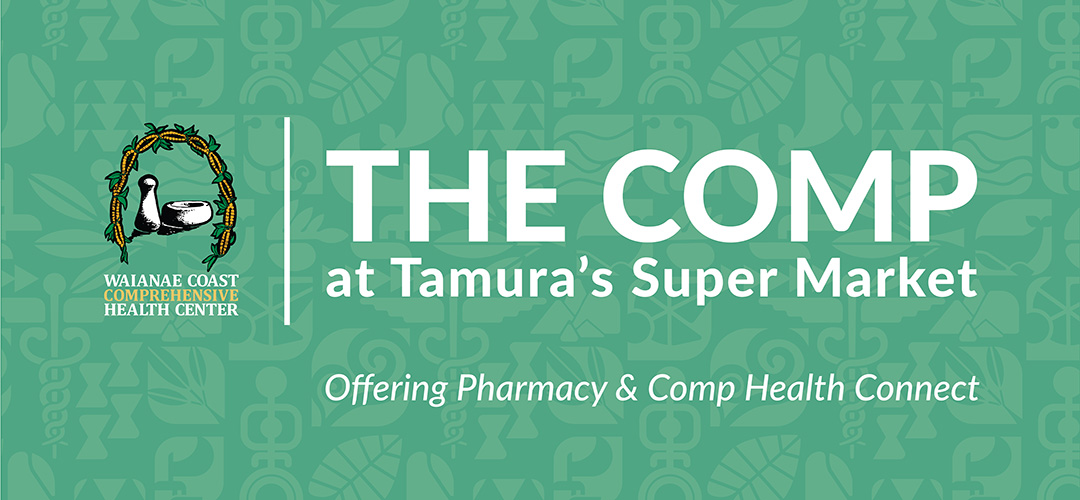
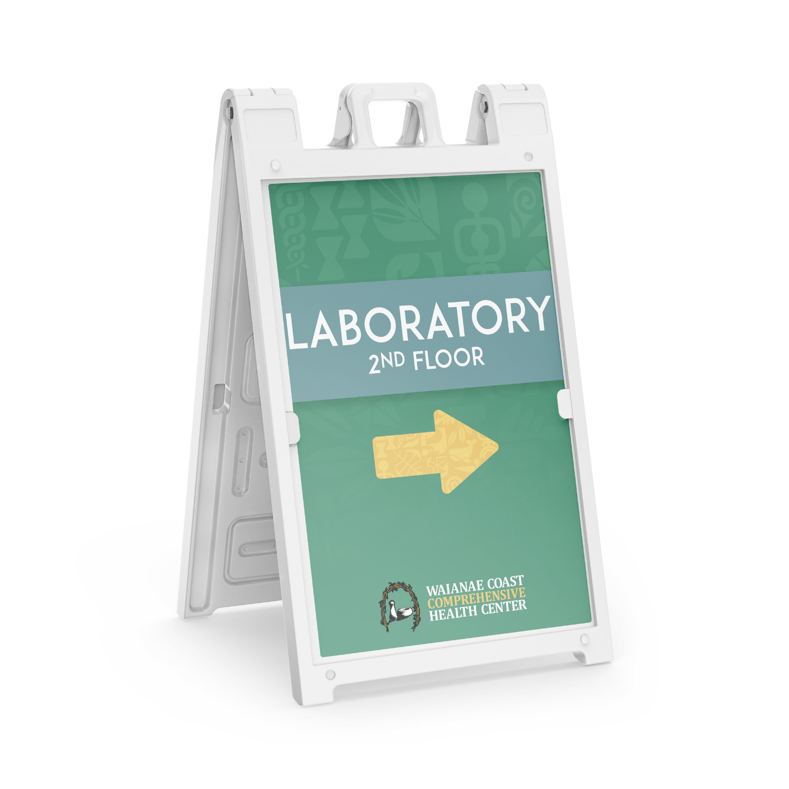
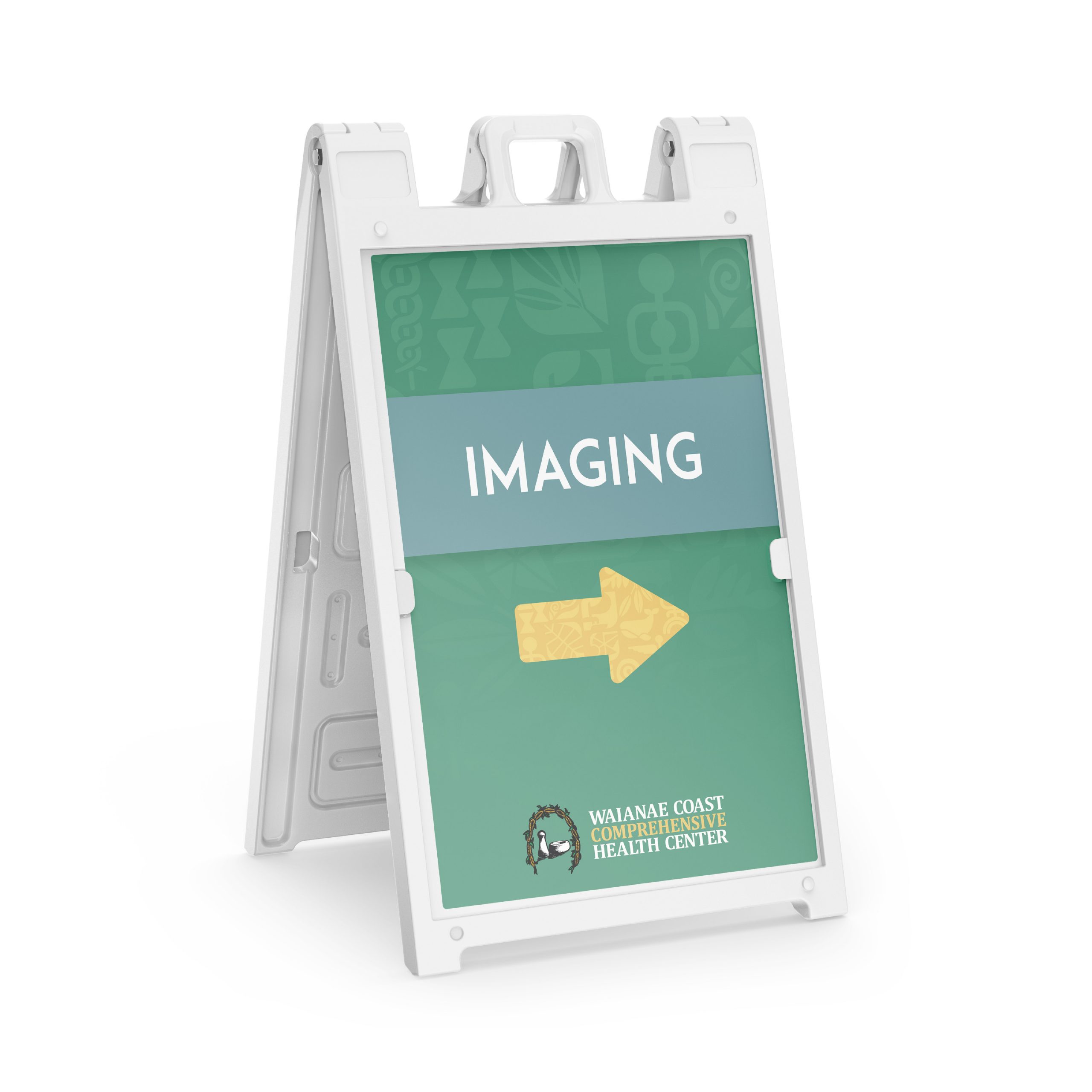
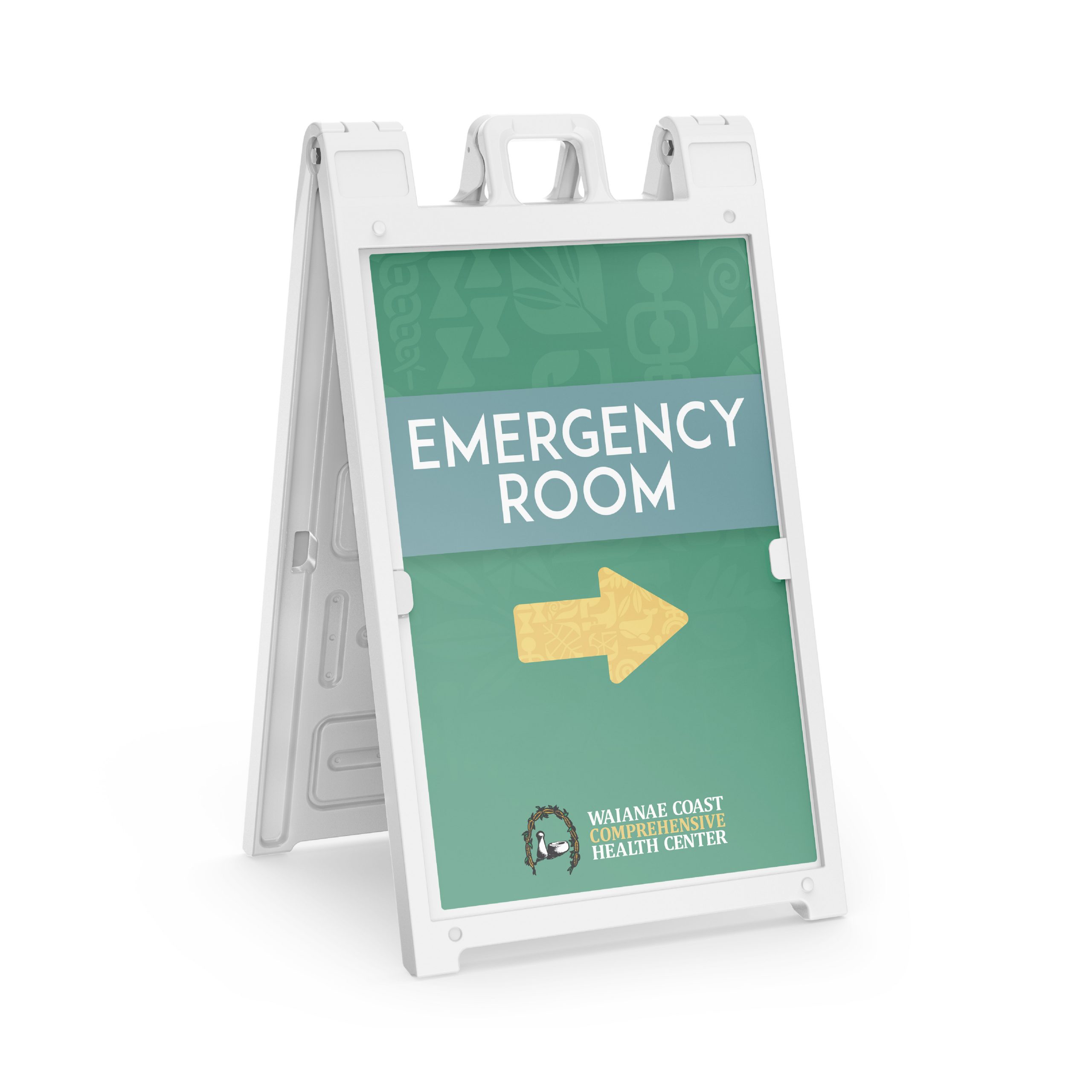
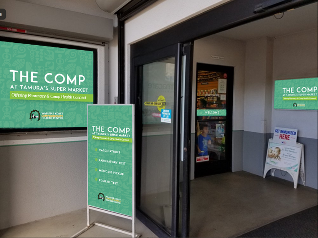
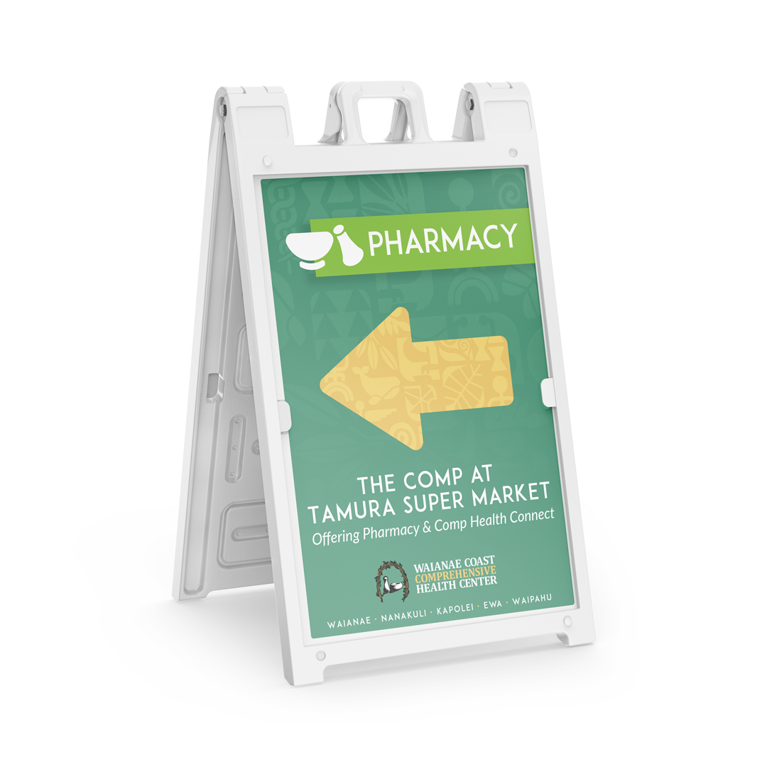
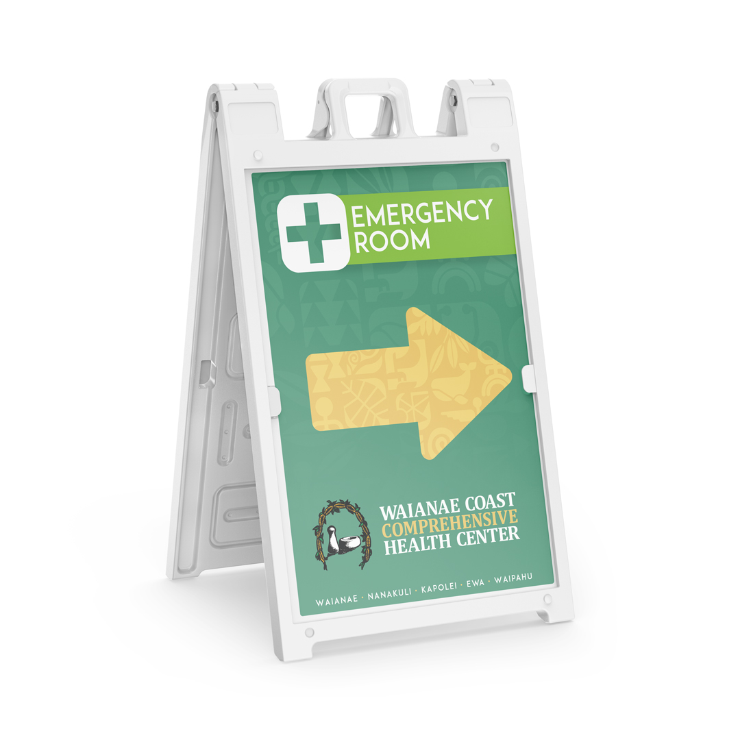
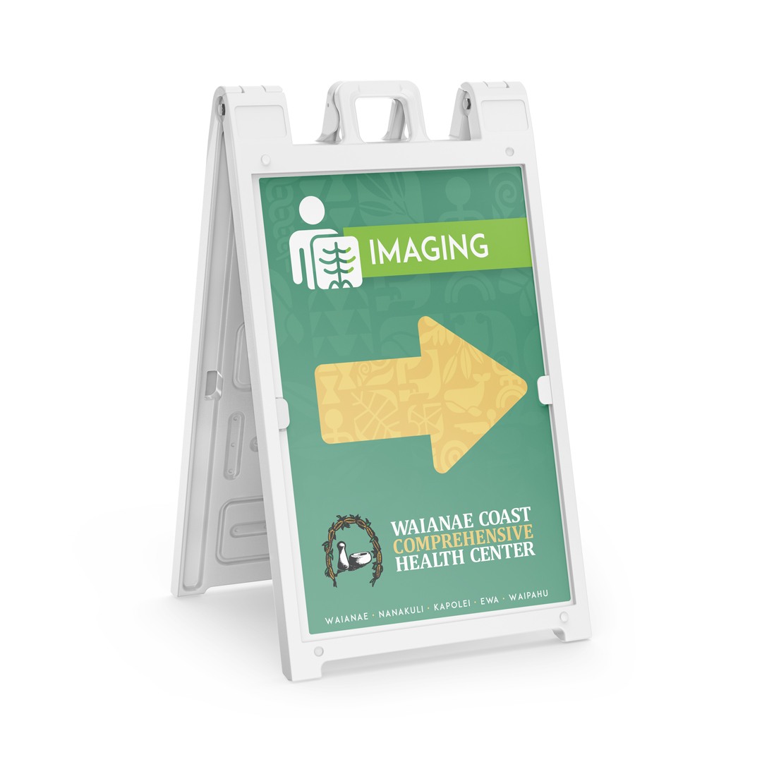
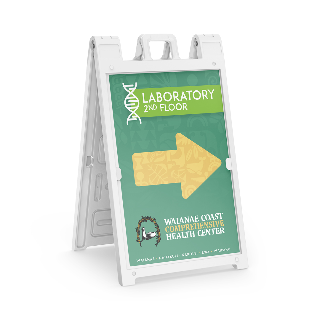
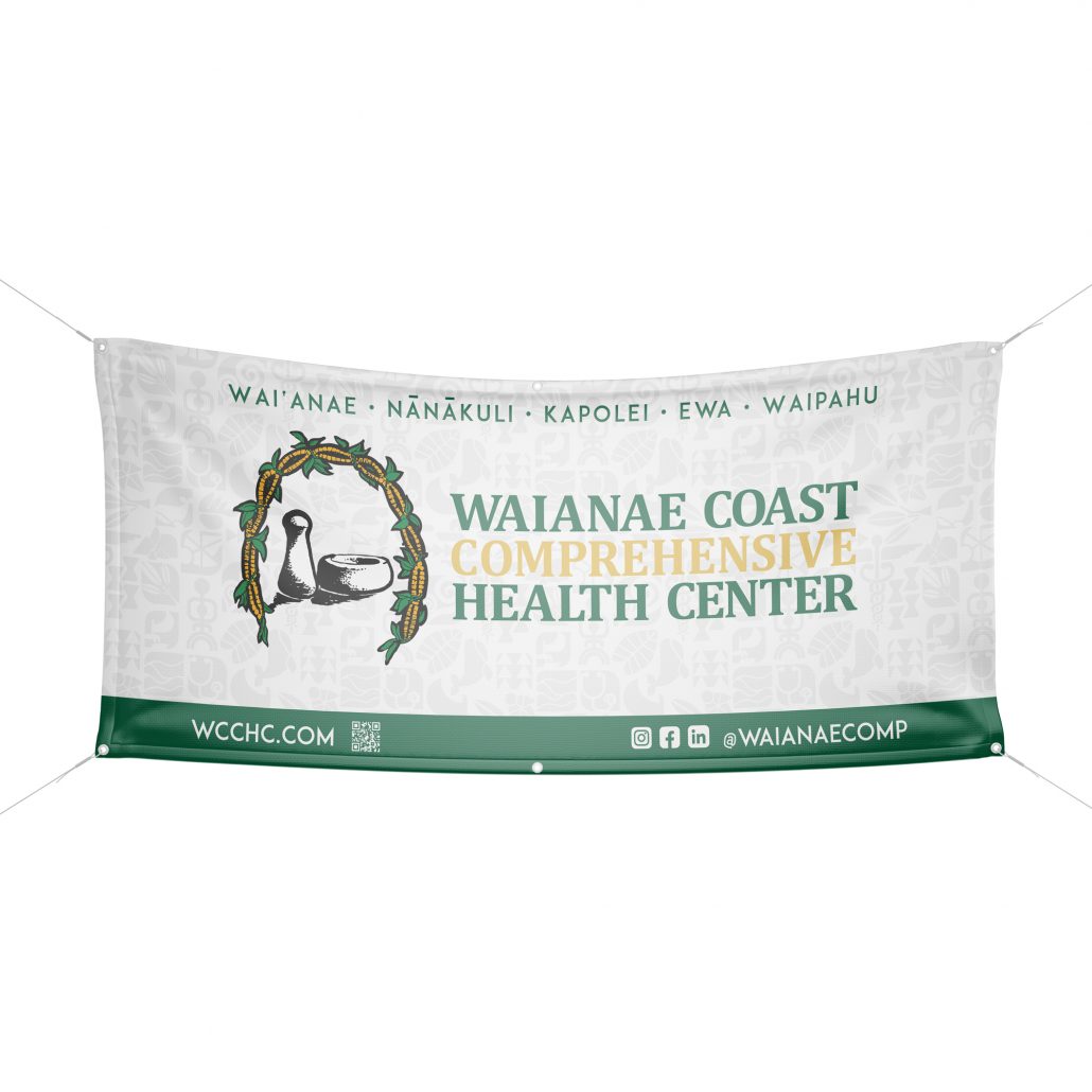
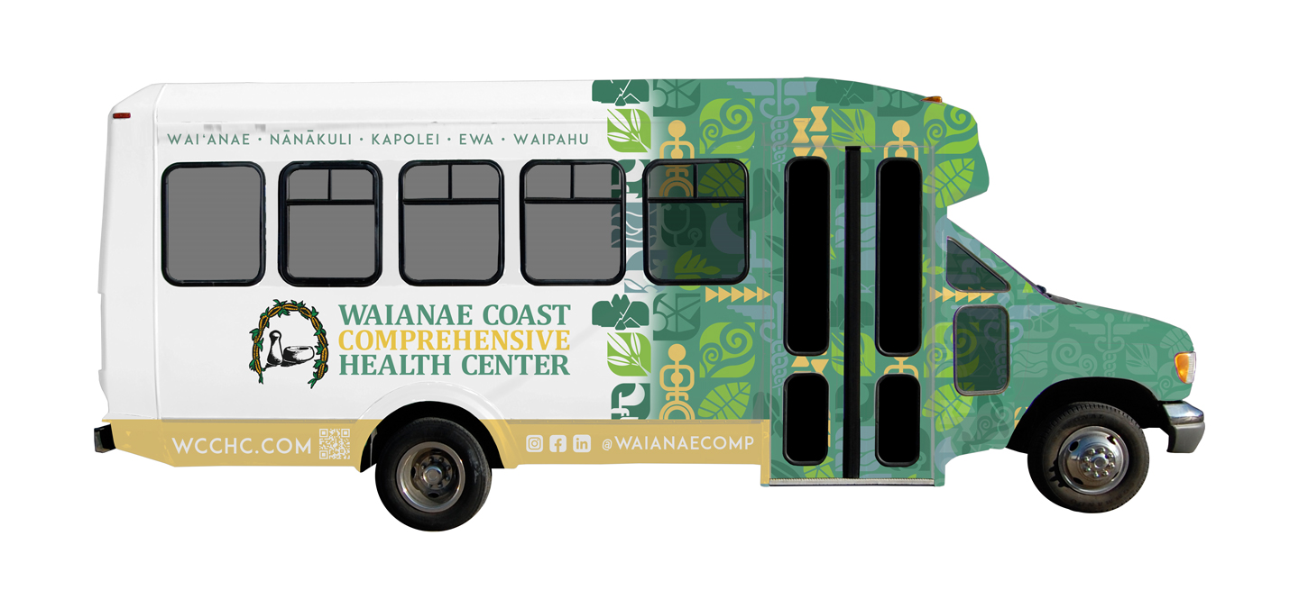
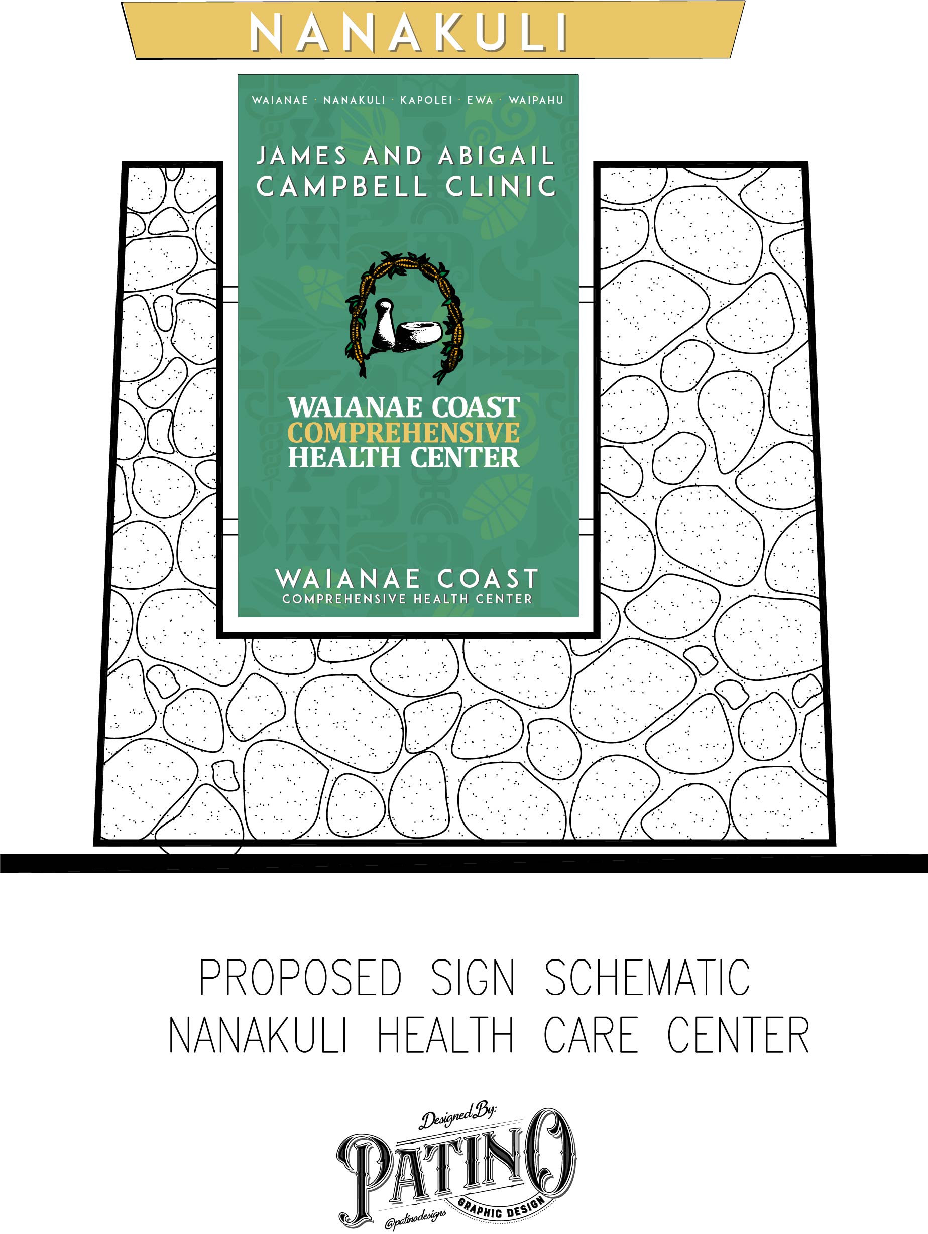
A-Sign
social media block
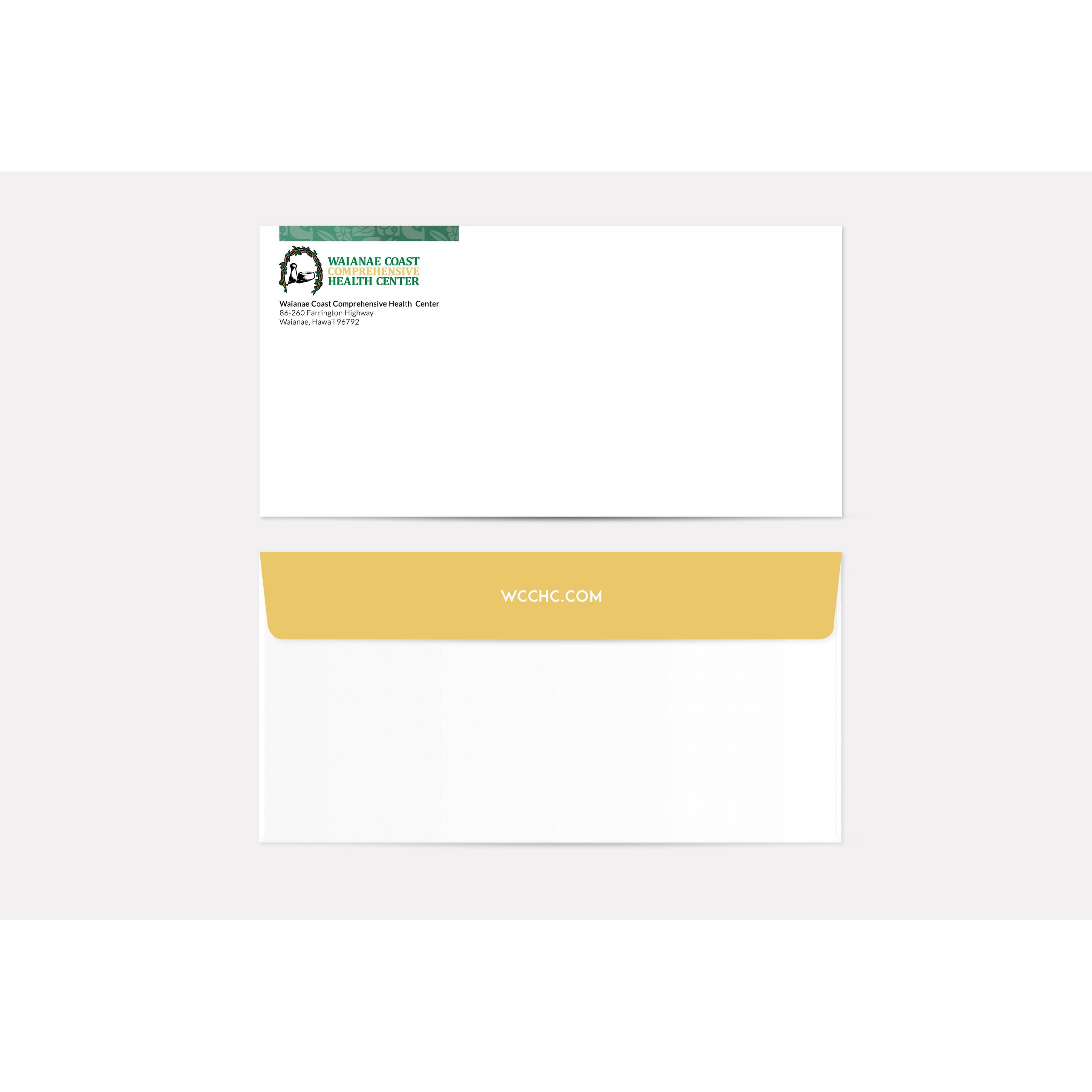
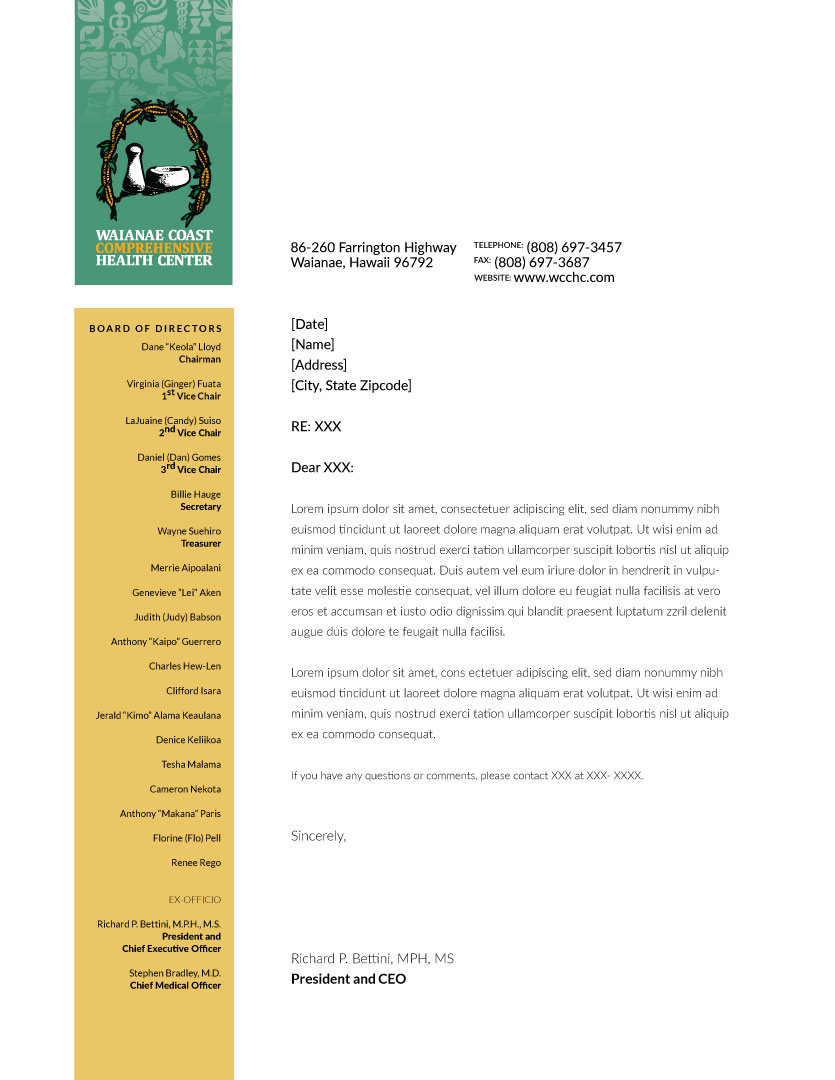
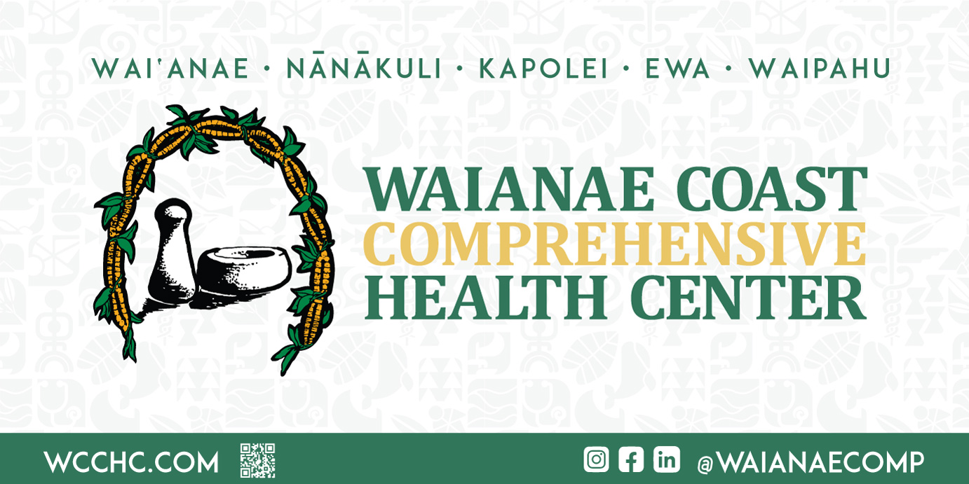
email footer
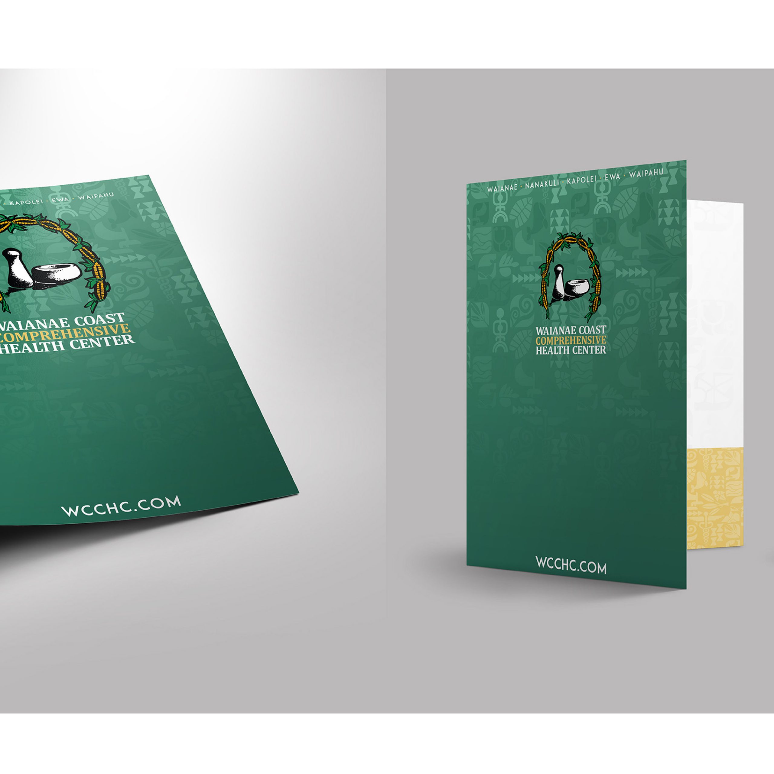
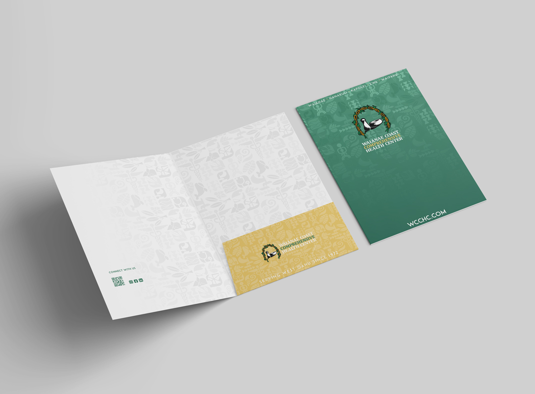
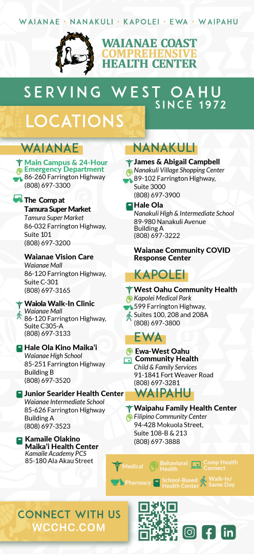
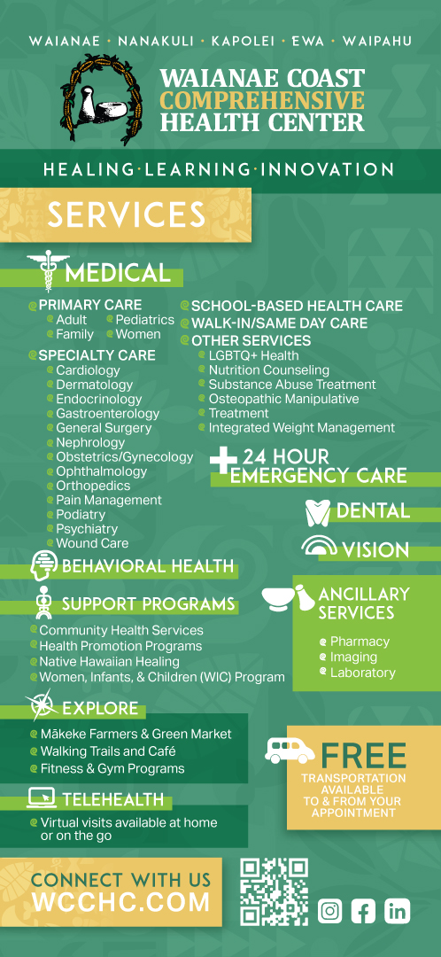
Folder
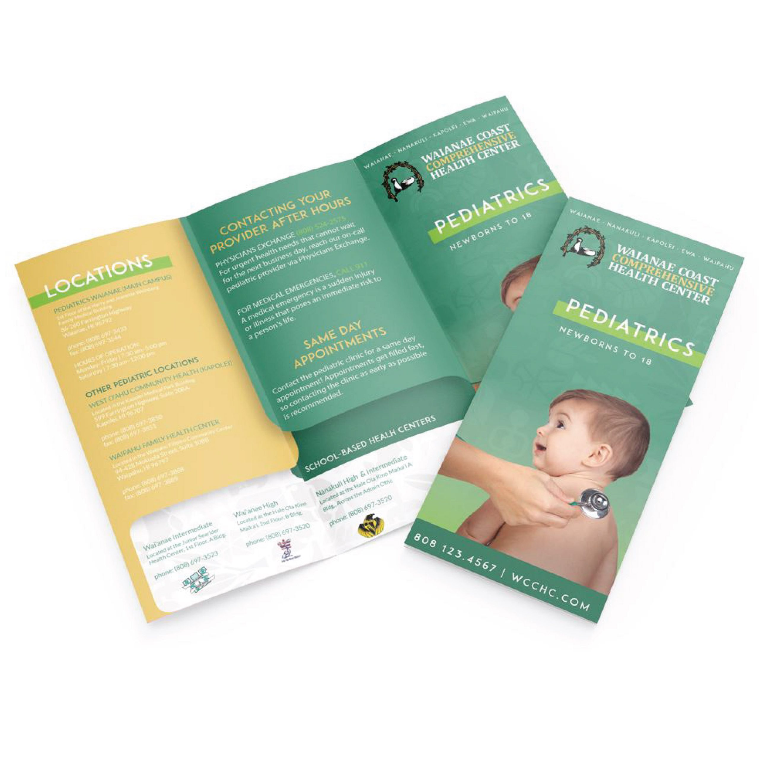
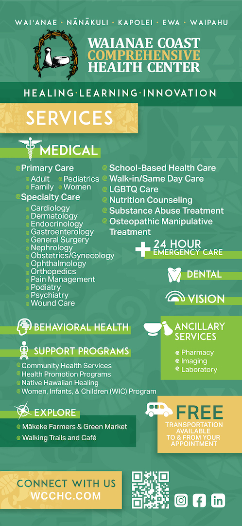
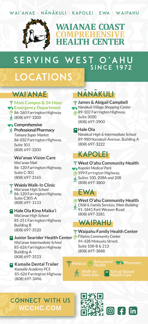
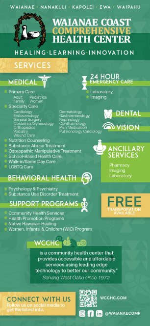
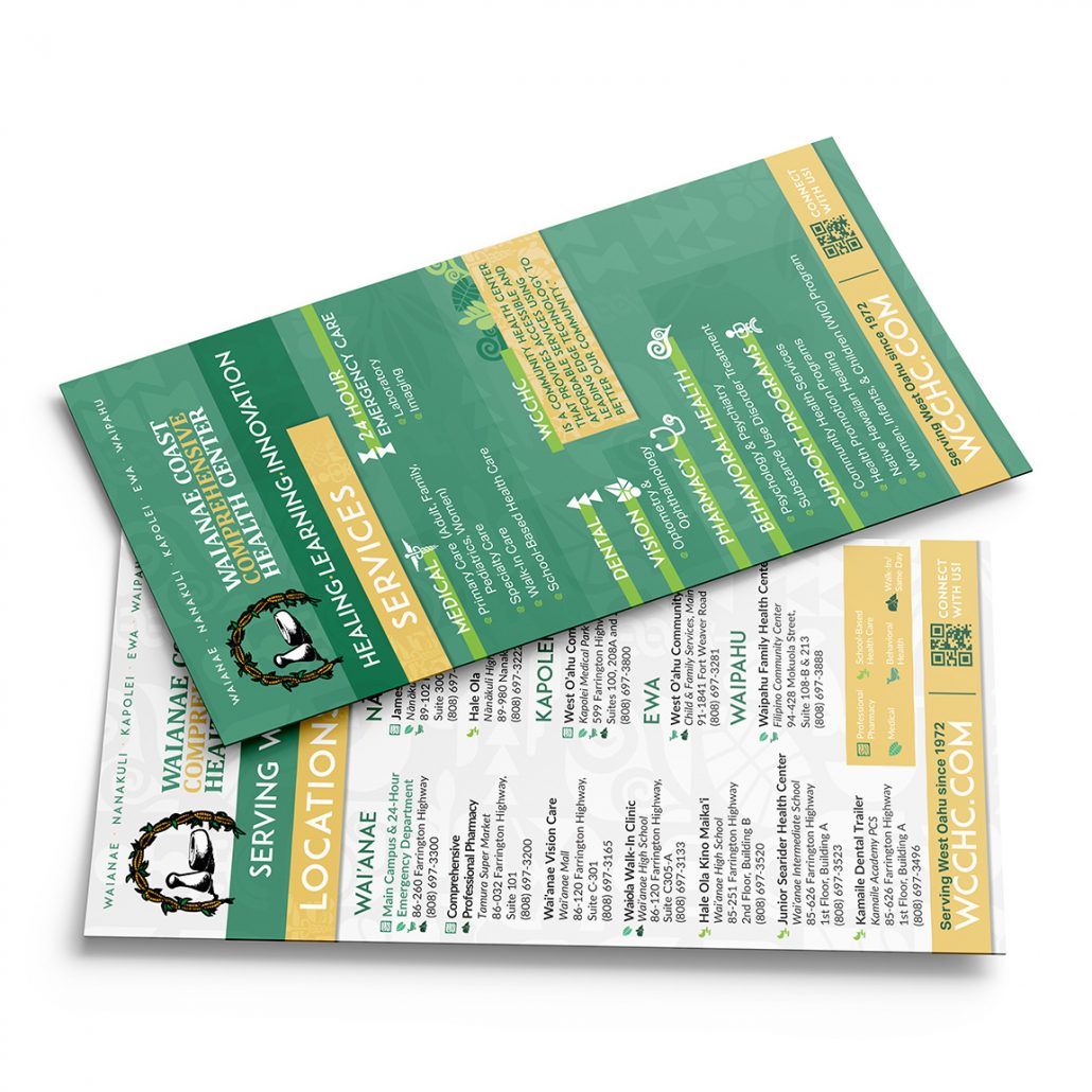
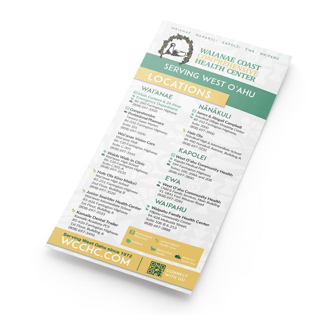
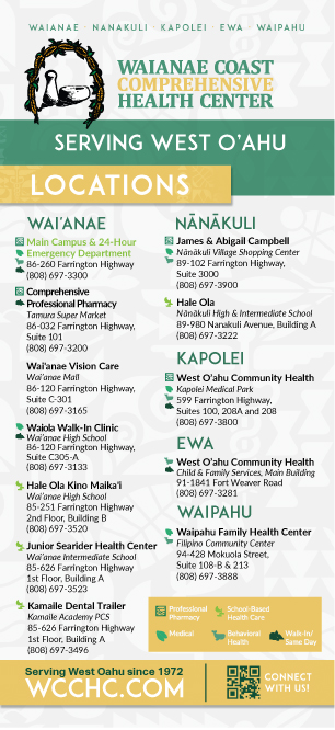
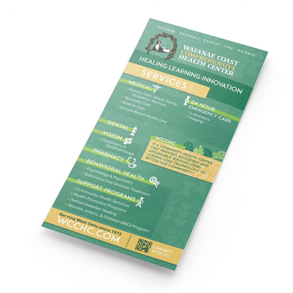
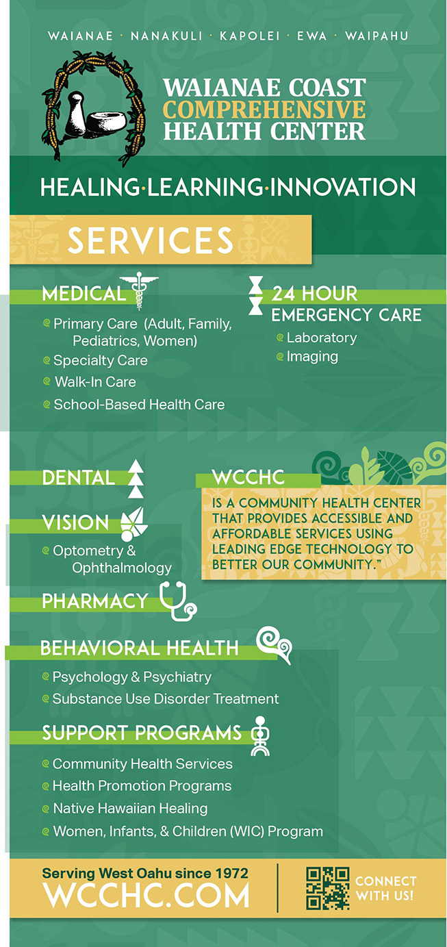
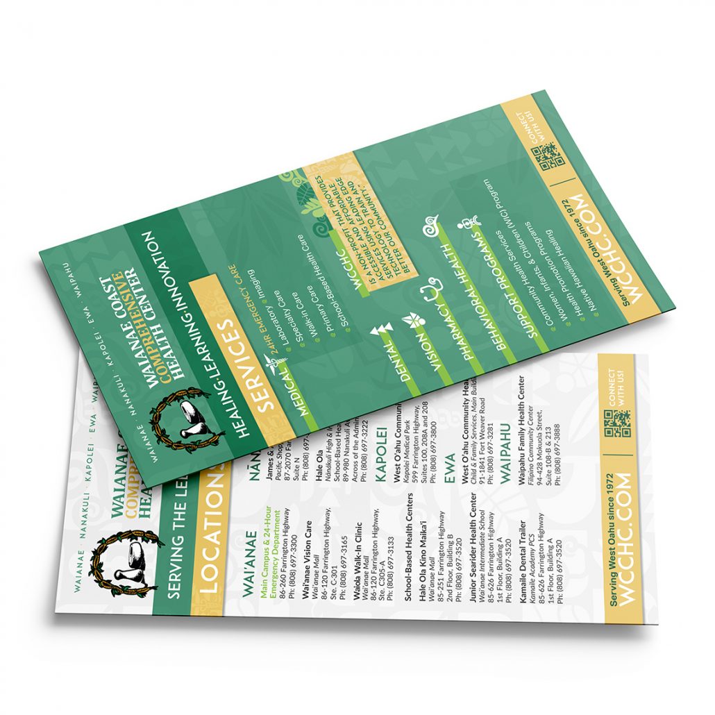
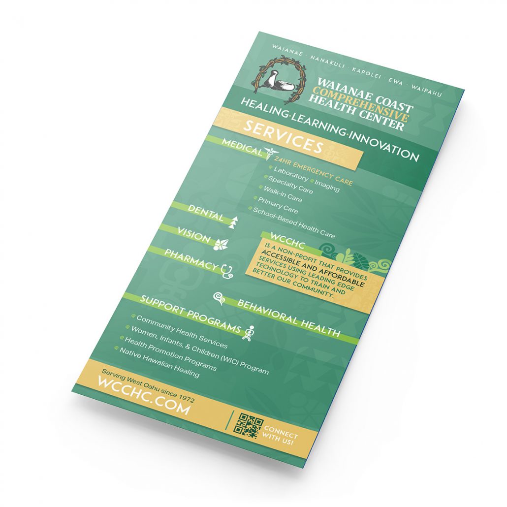
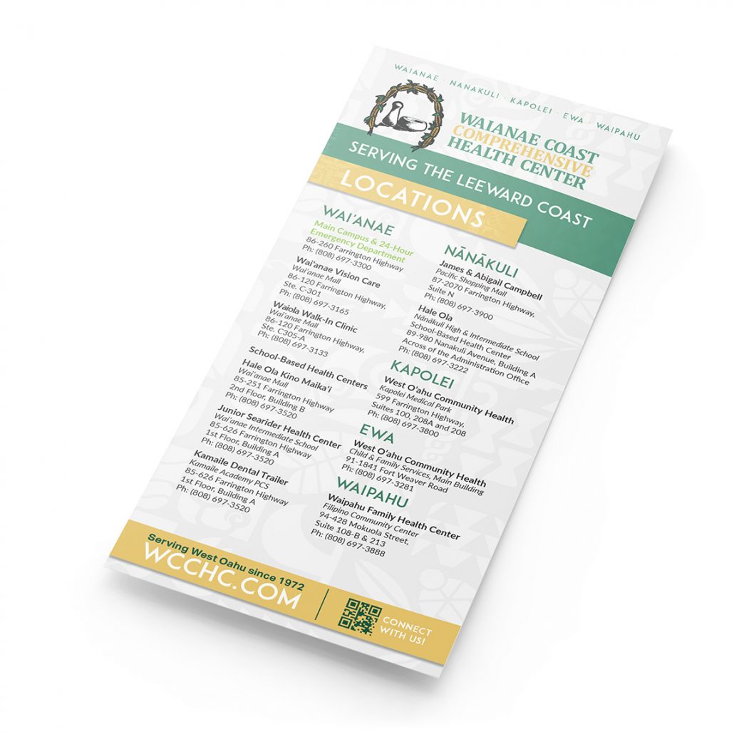
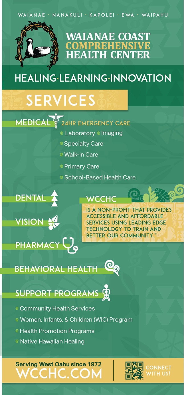
Brochure Concept 2
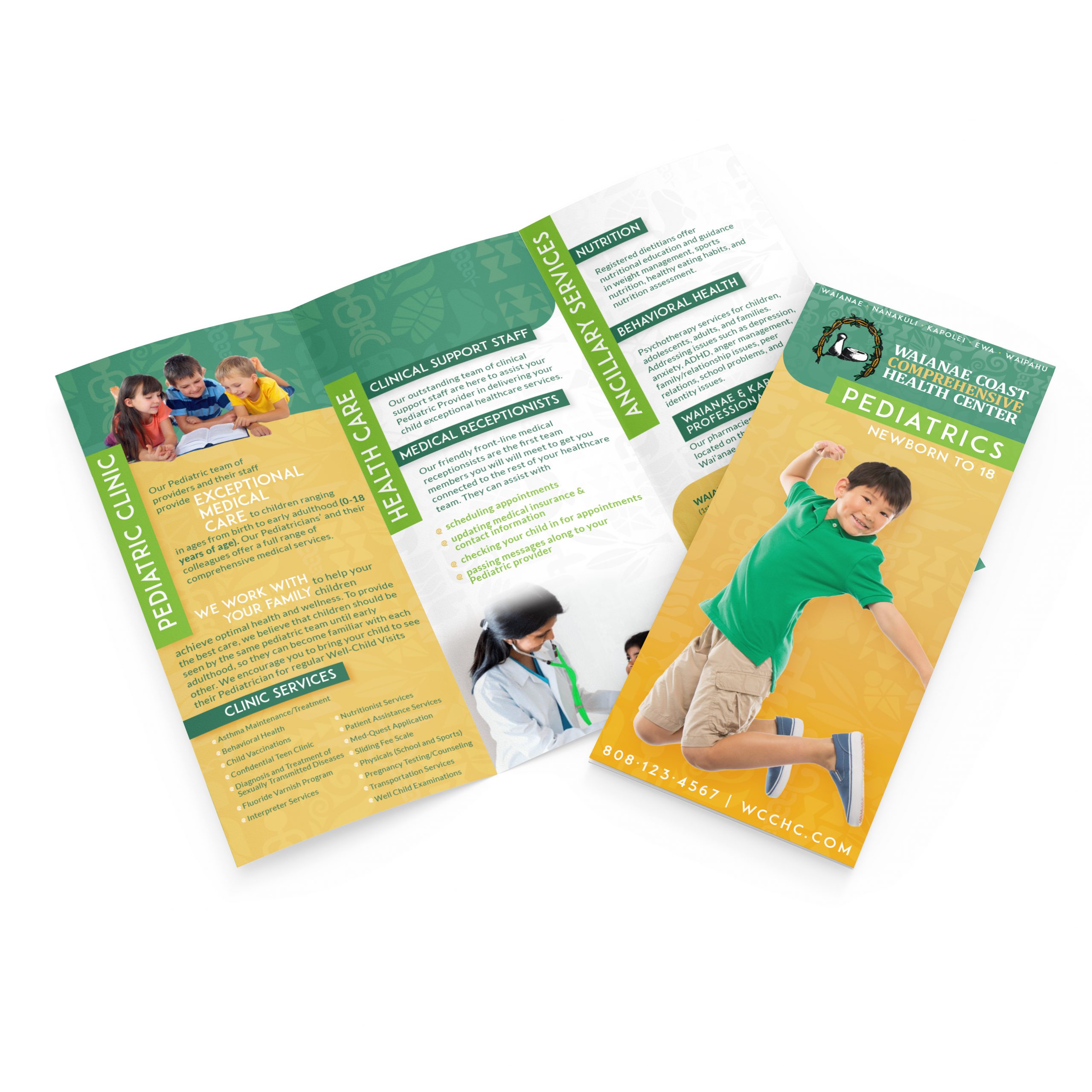
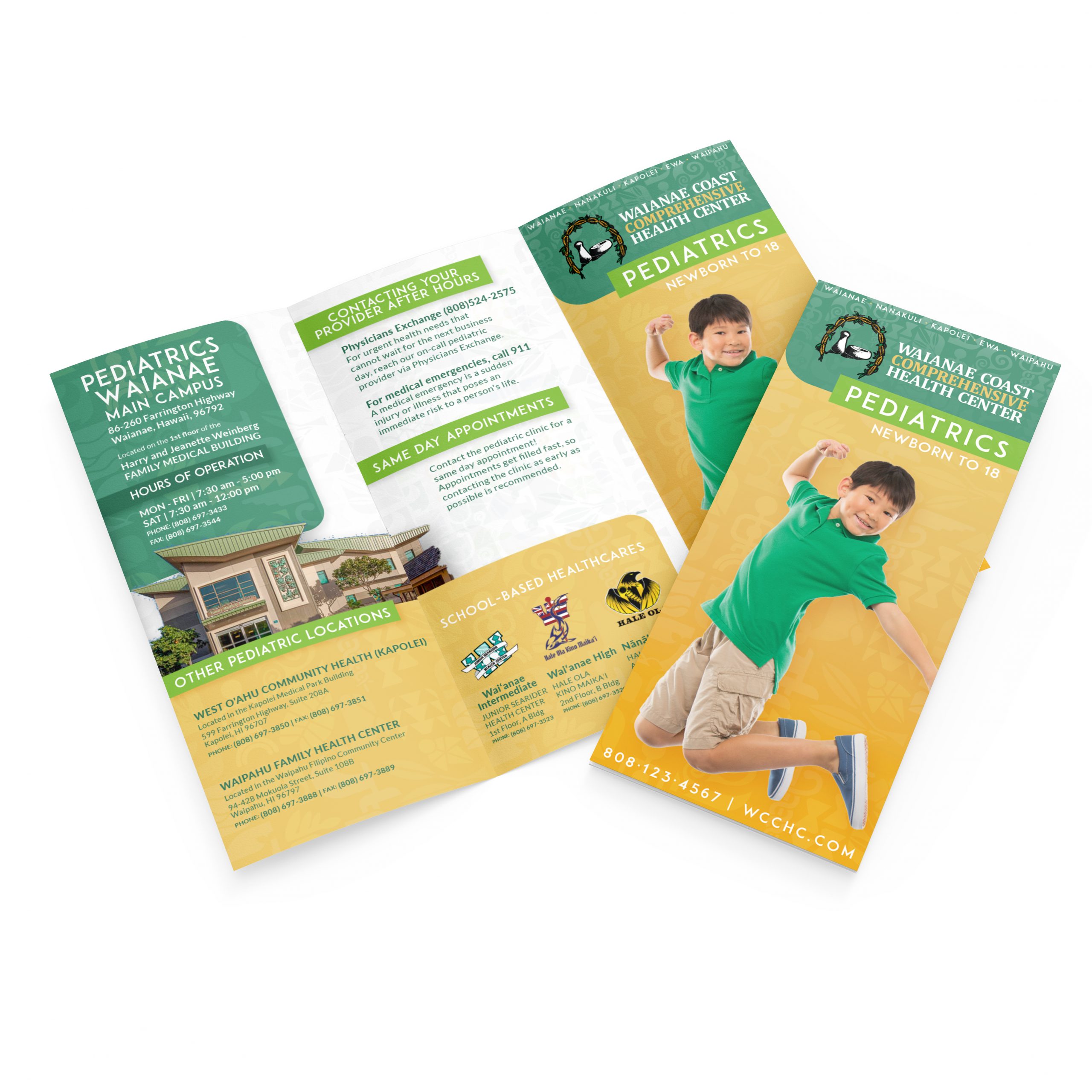
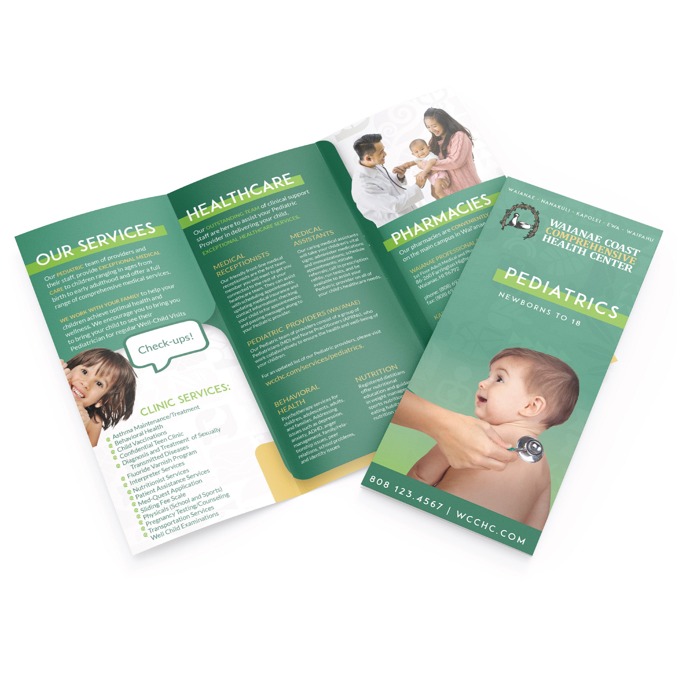
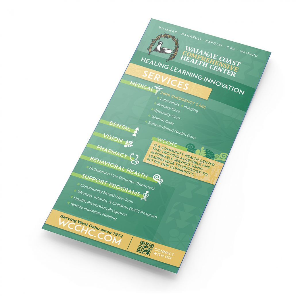
Brochure concept 1
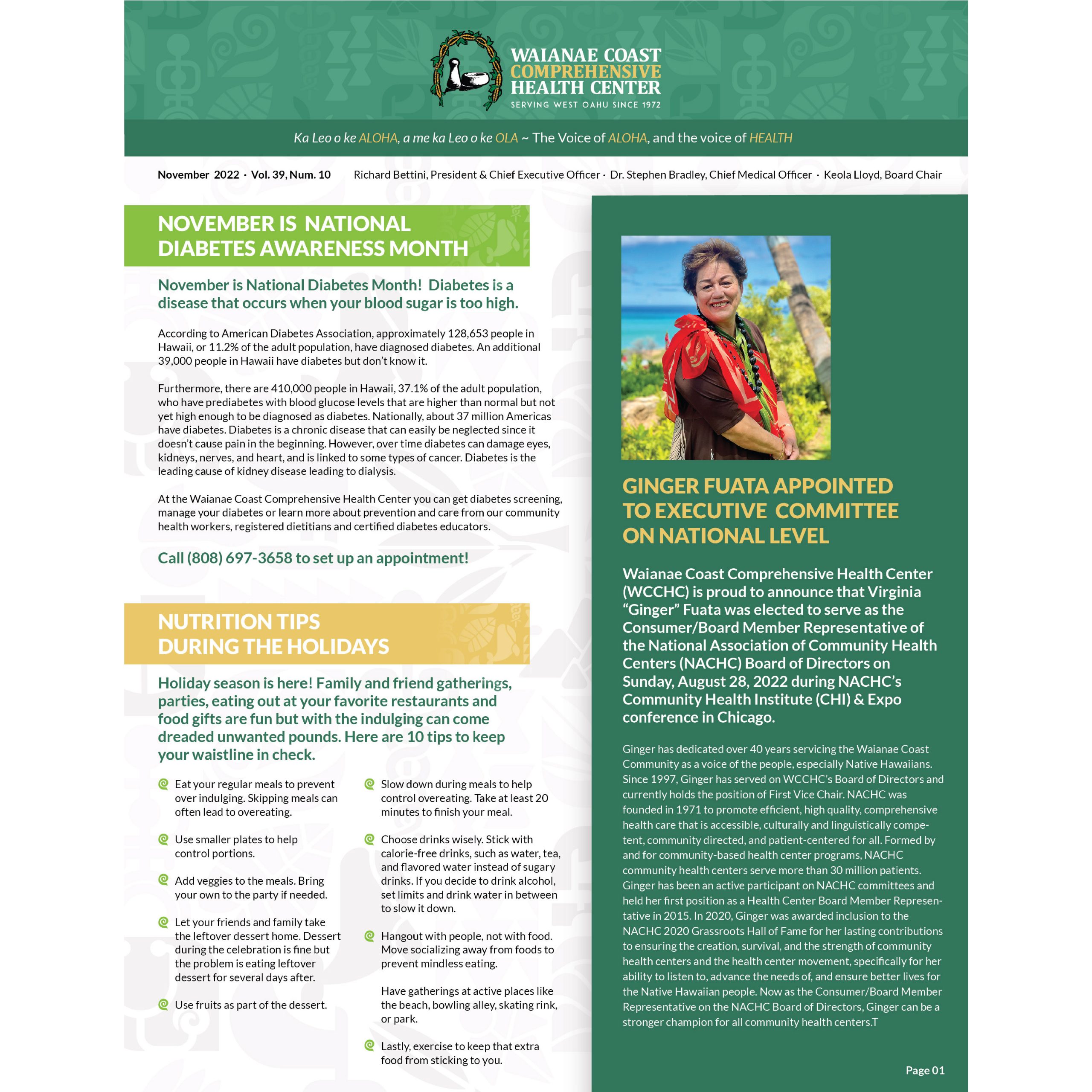
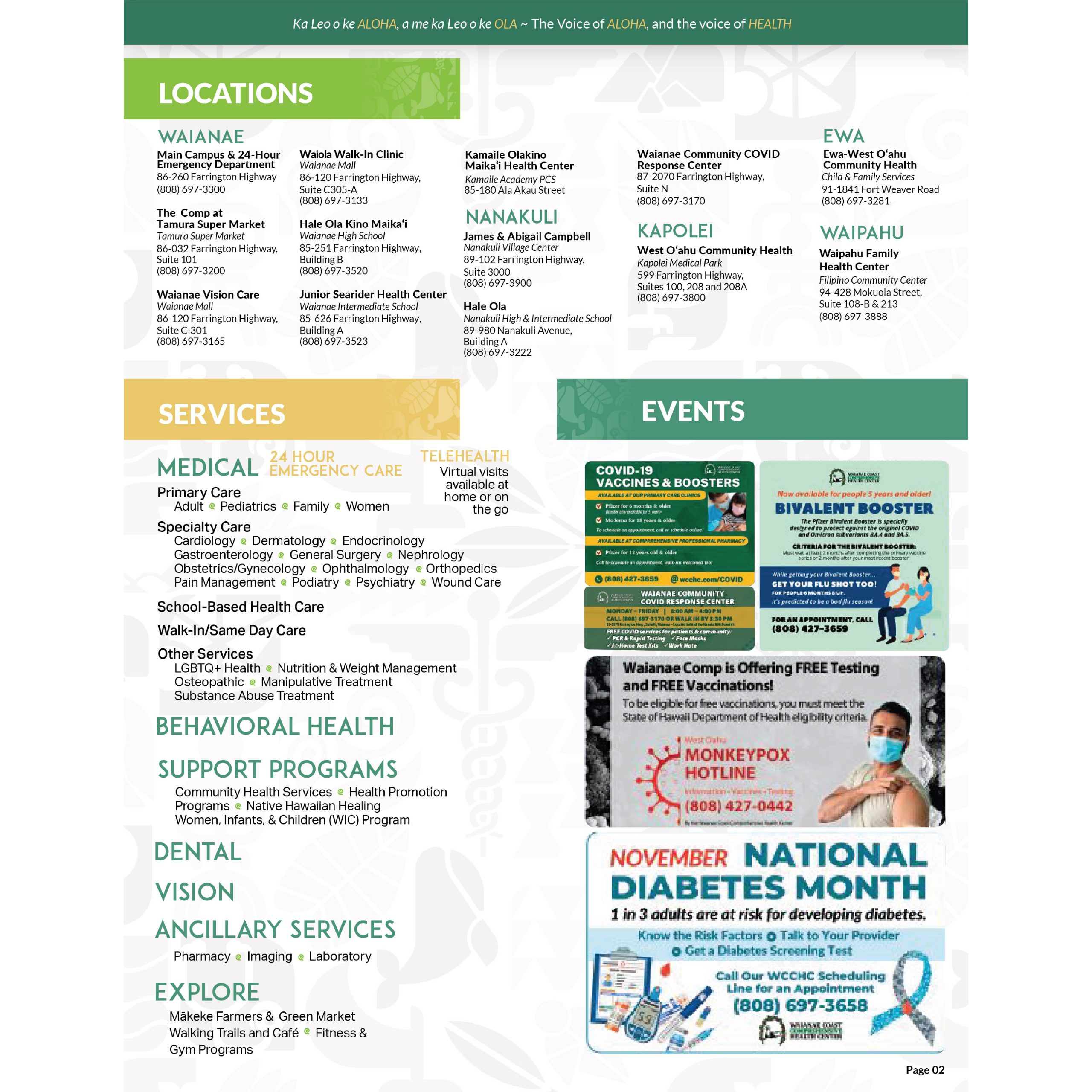
newsletter concept
10/25/22


10/24/22
10/18/22
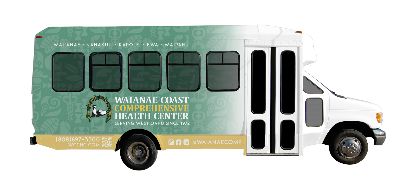
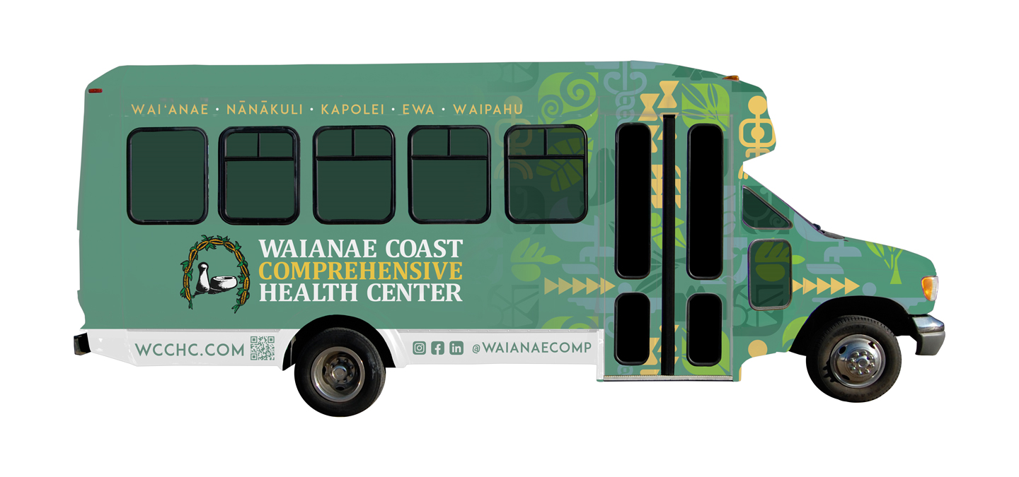
V10
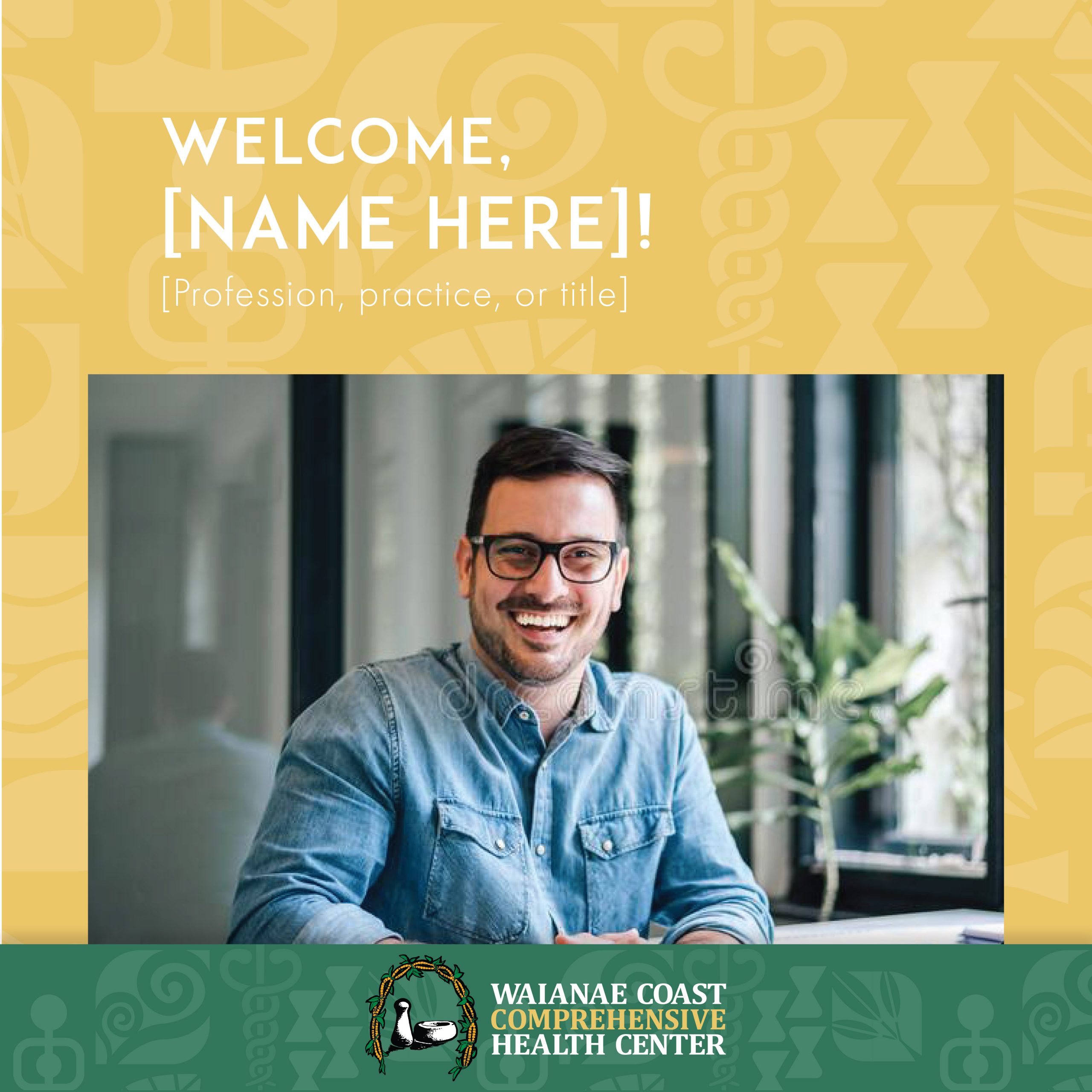
Zoom background options

10/12/22

10/7/22
9/30/22
9/28/22
9/27/22


9/26/22

9/25/22
9/20/22
9/19/22
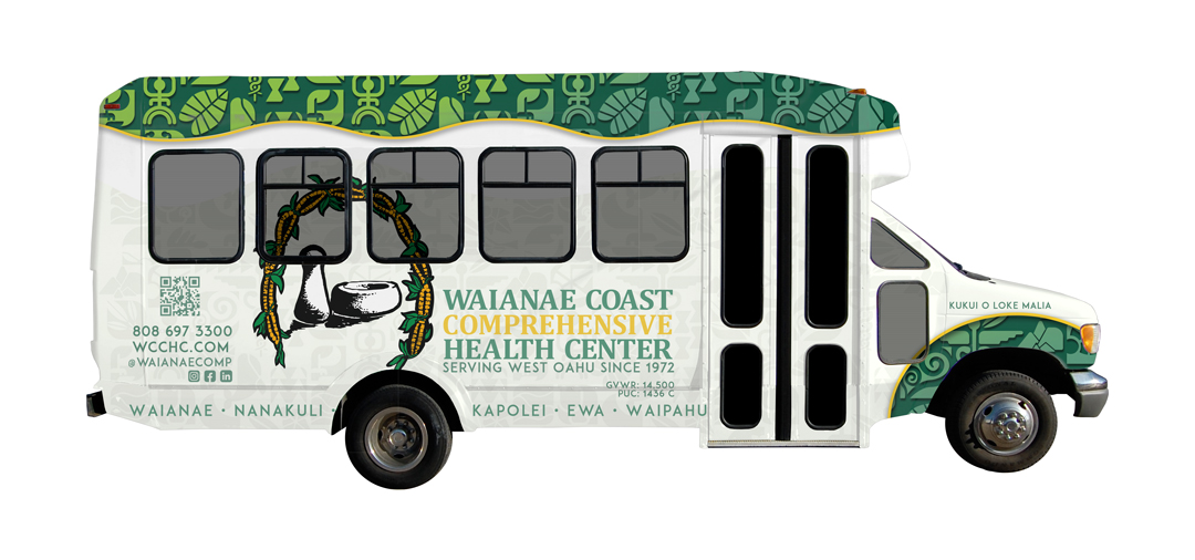
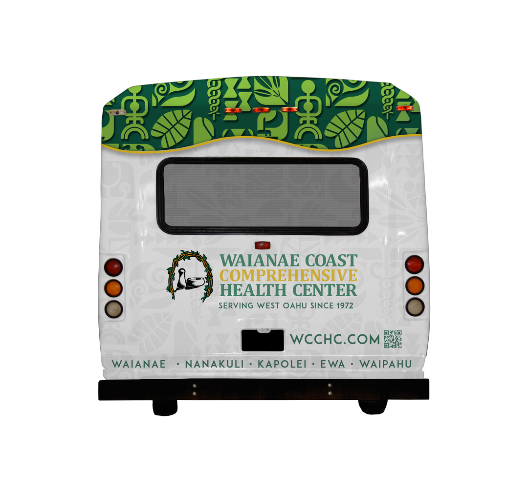
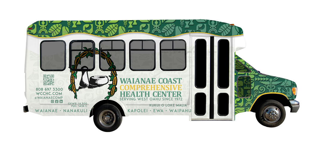
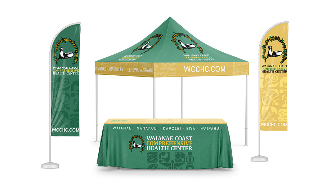
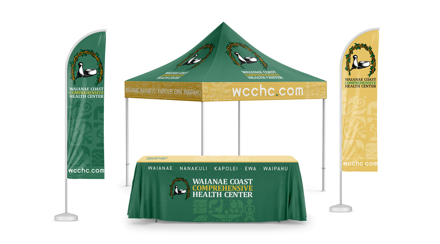
Updated green color and yellow color for flag banners.
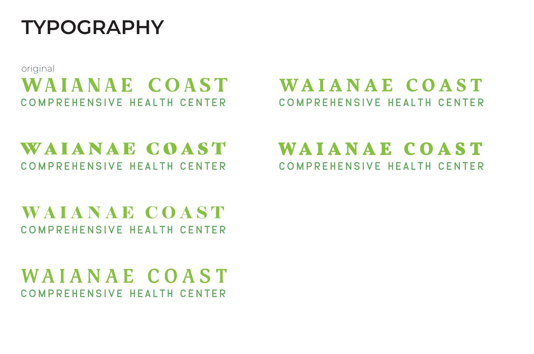
Updated new font for website/locations:
9/16/22
9/13/22
9/9/22
9/8/22
9/7/22
9/2/22
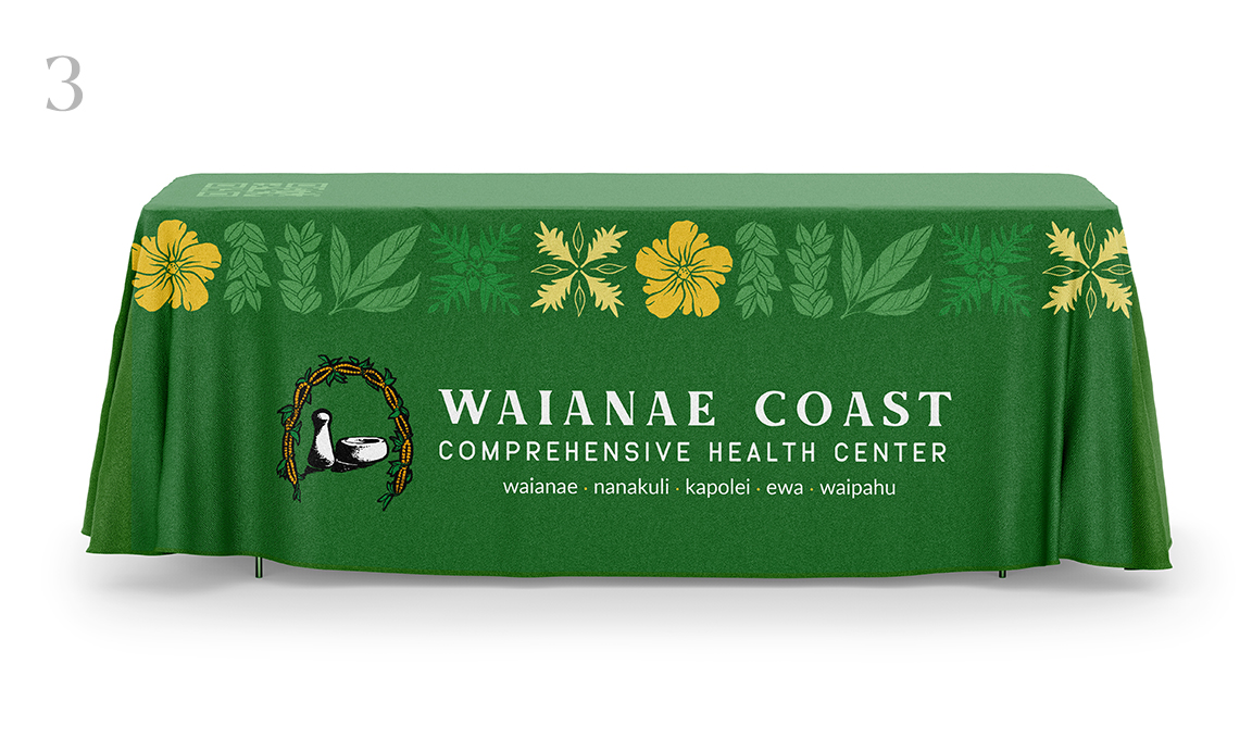
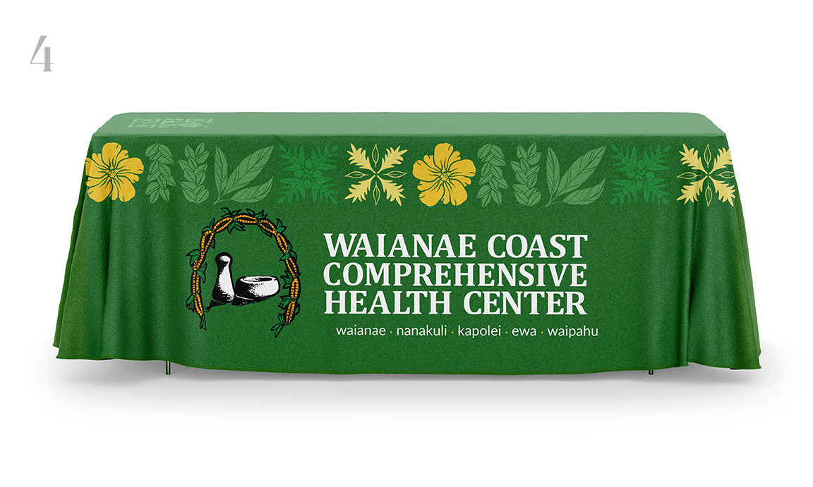
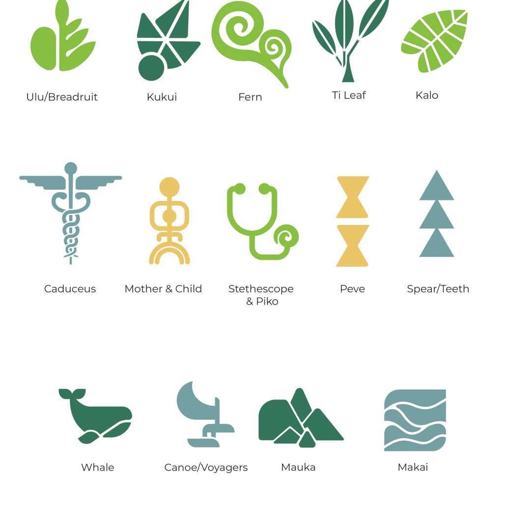
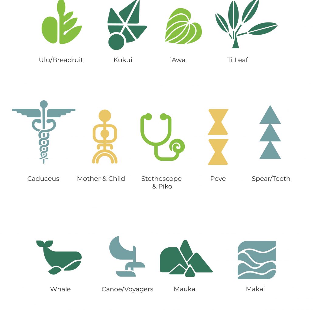
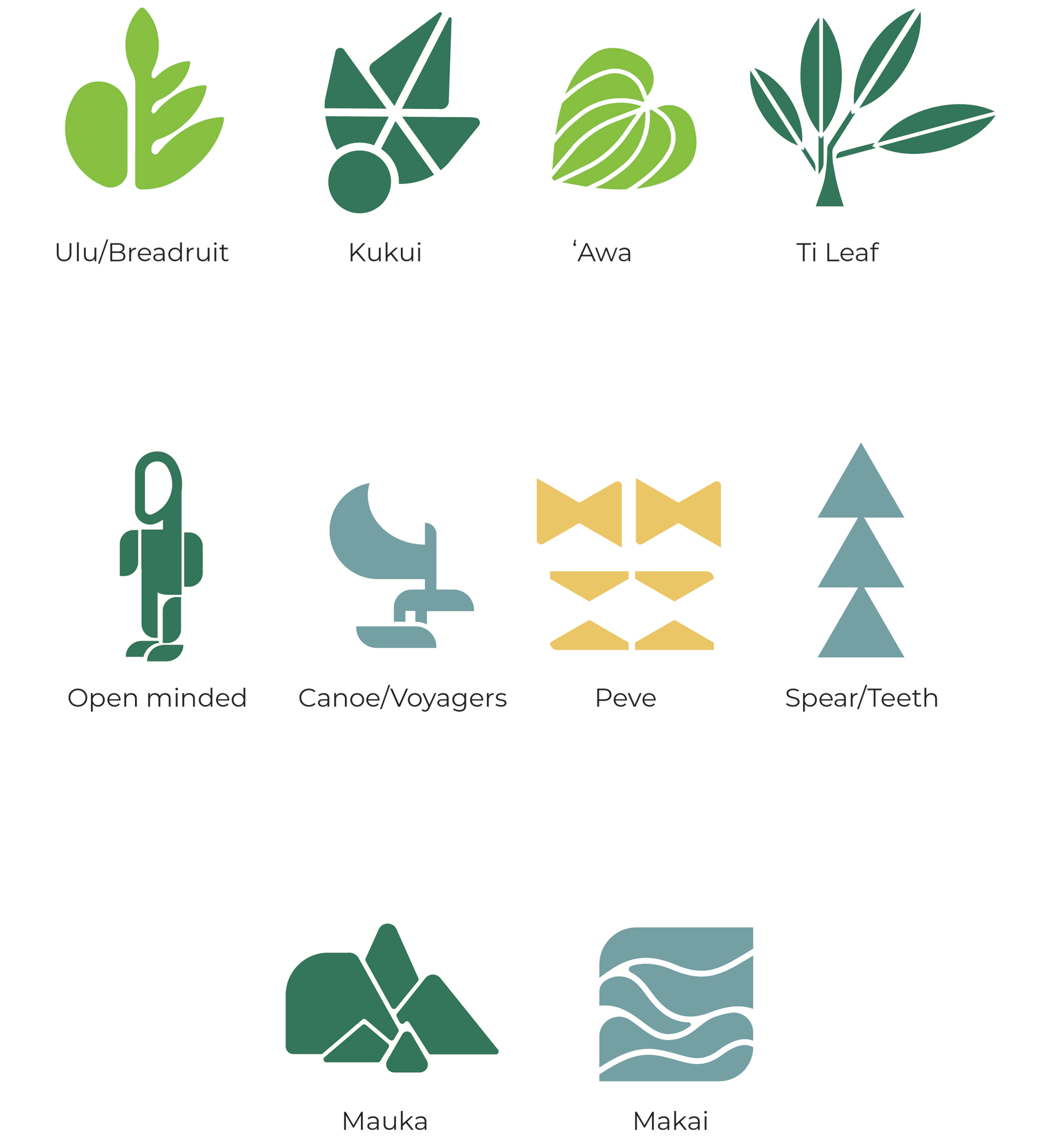
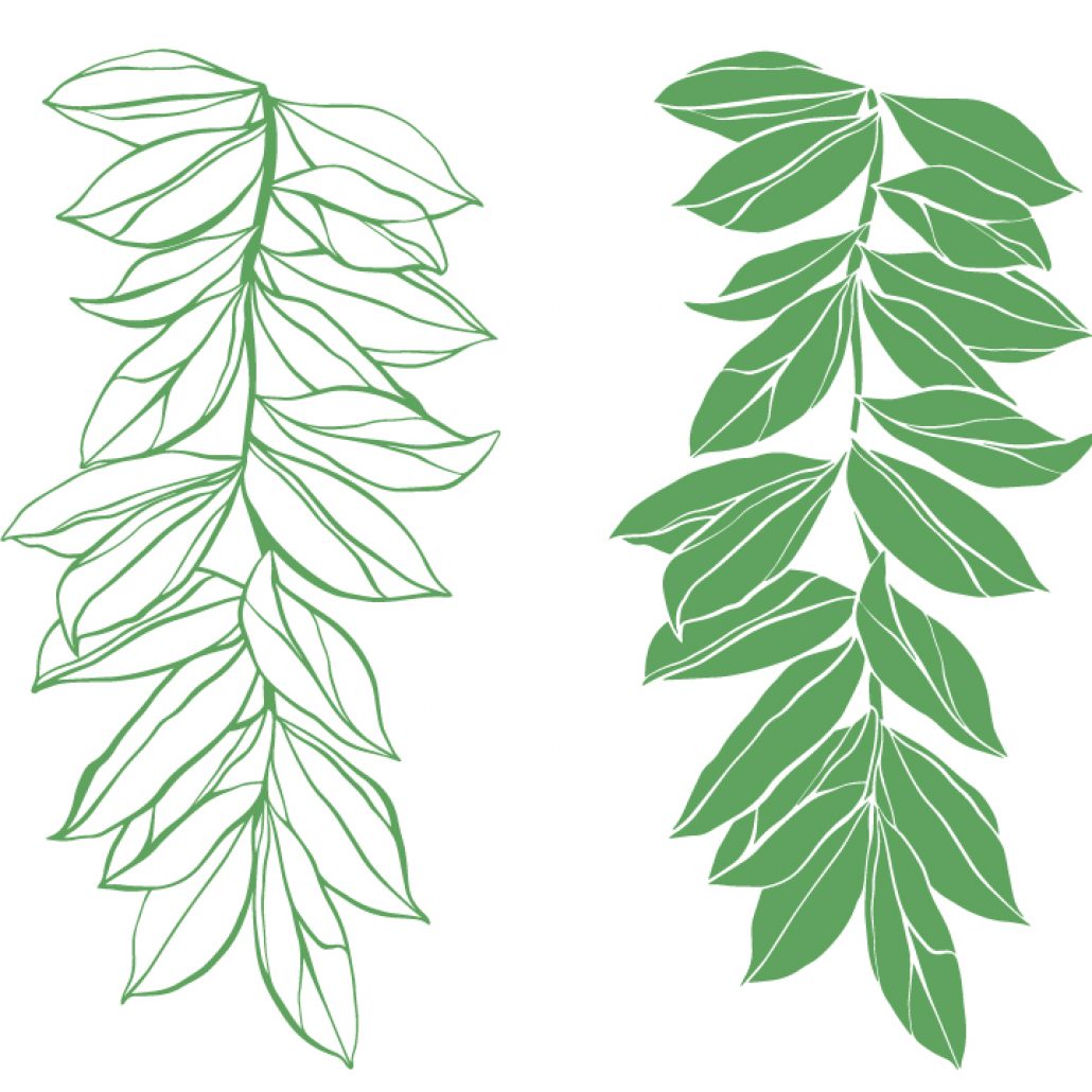
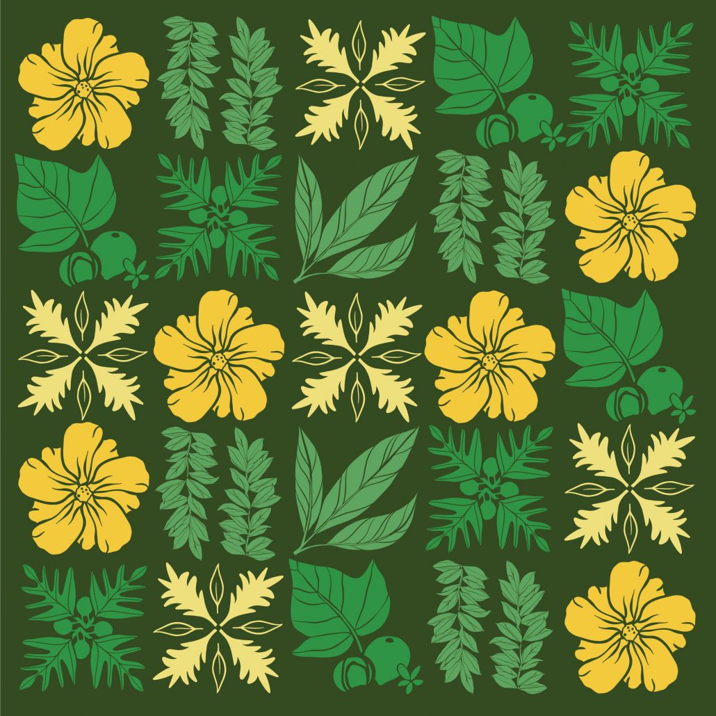
symbols edited: took kava symbol out replaced with fern, created kalo symbol as well
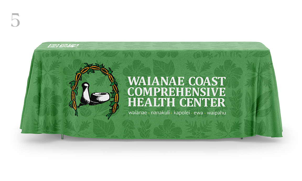
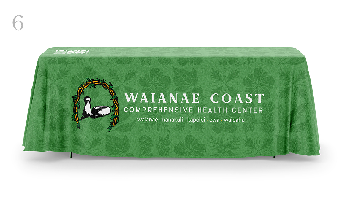
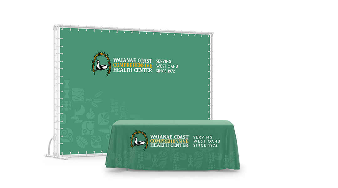
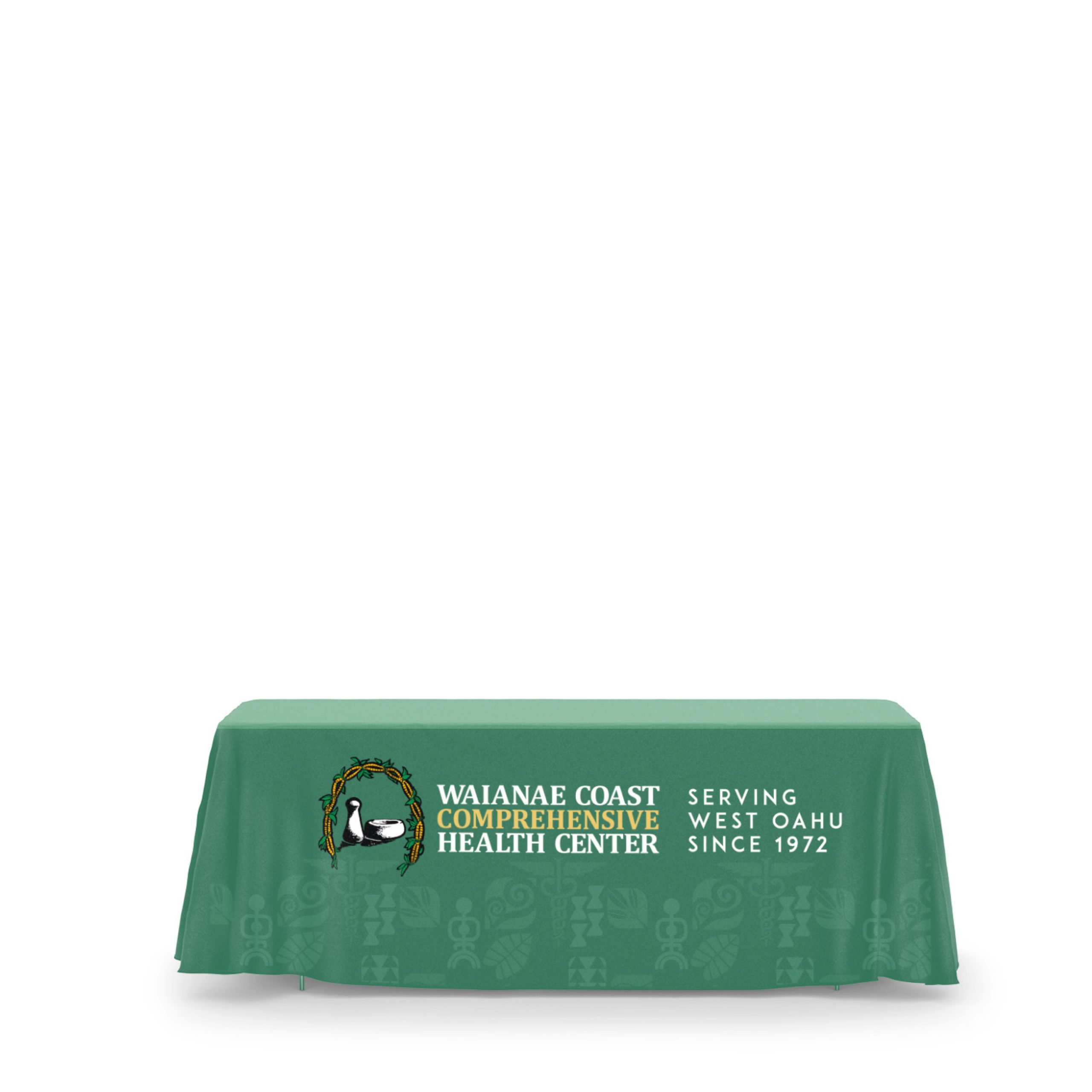
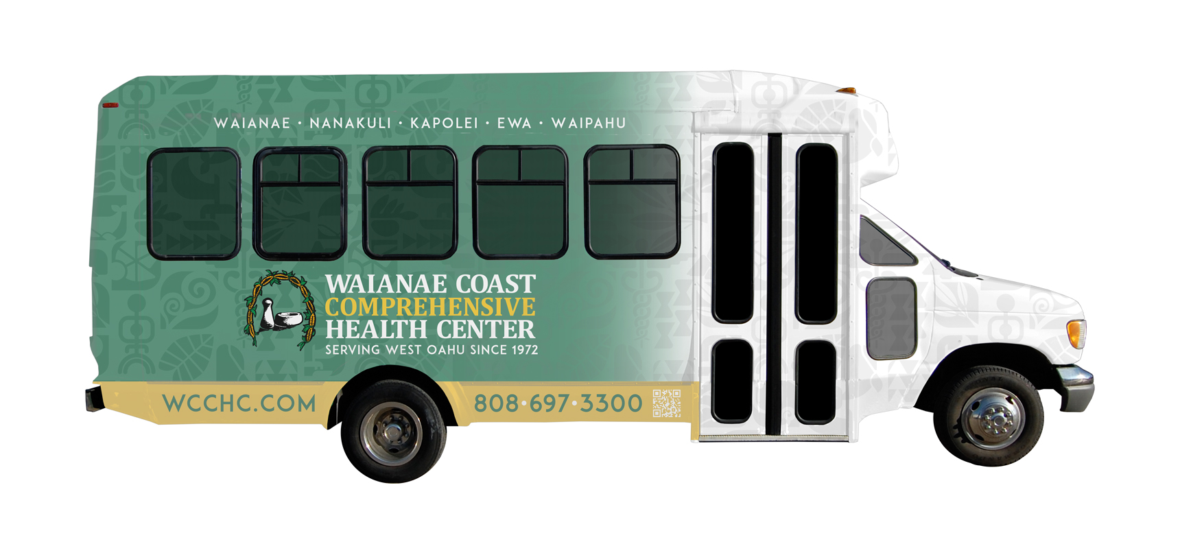
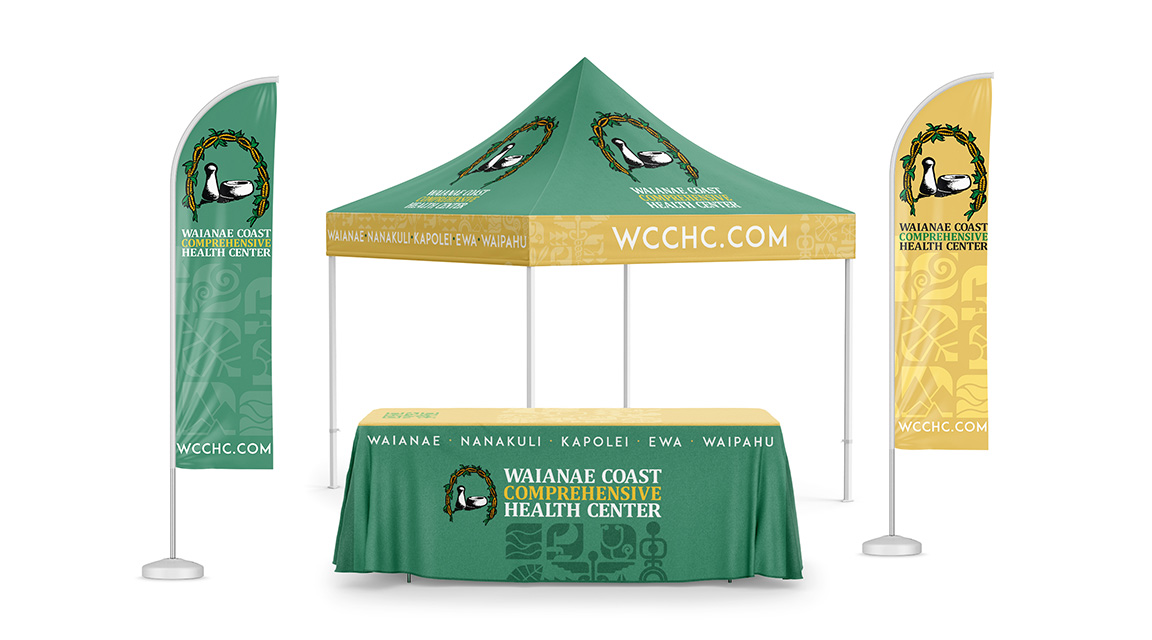
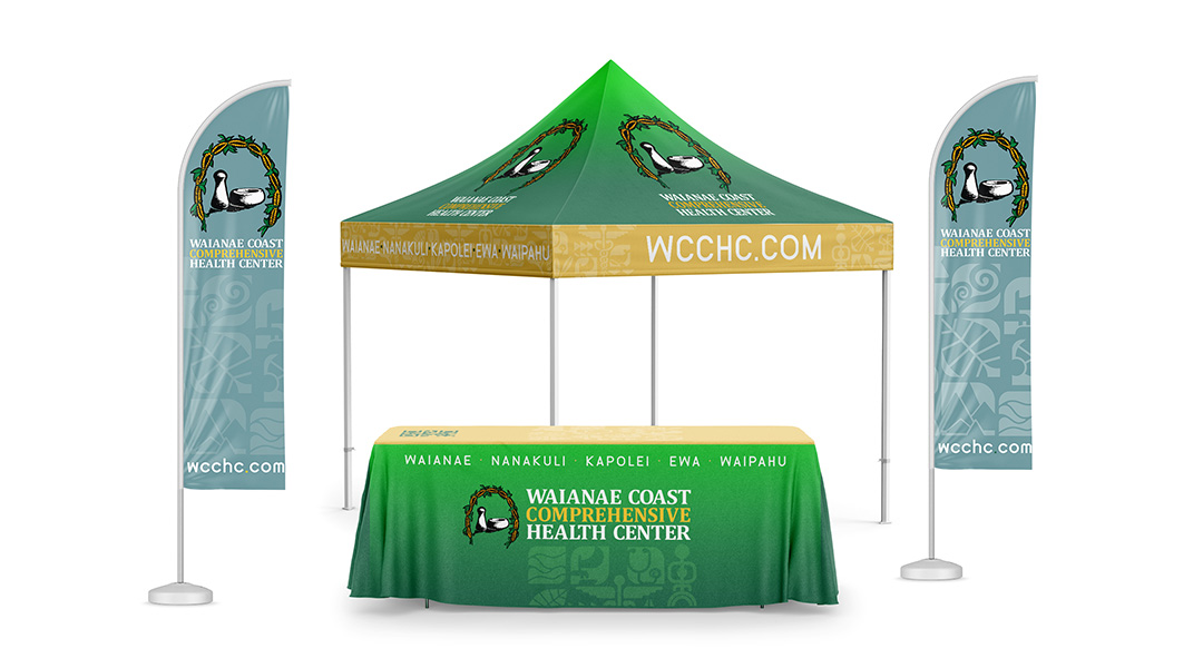
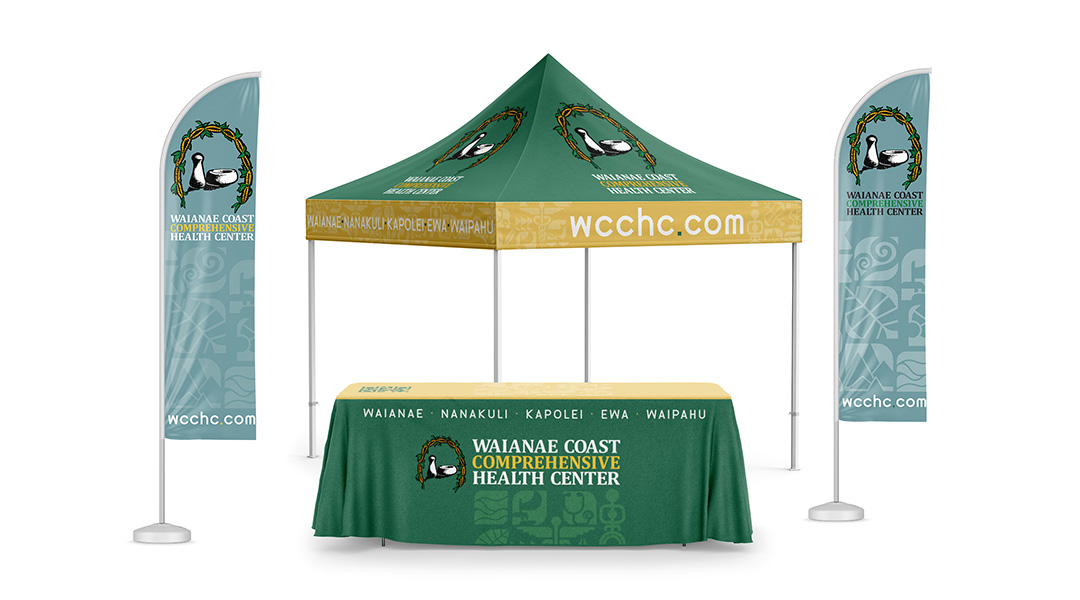
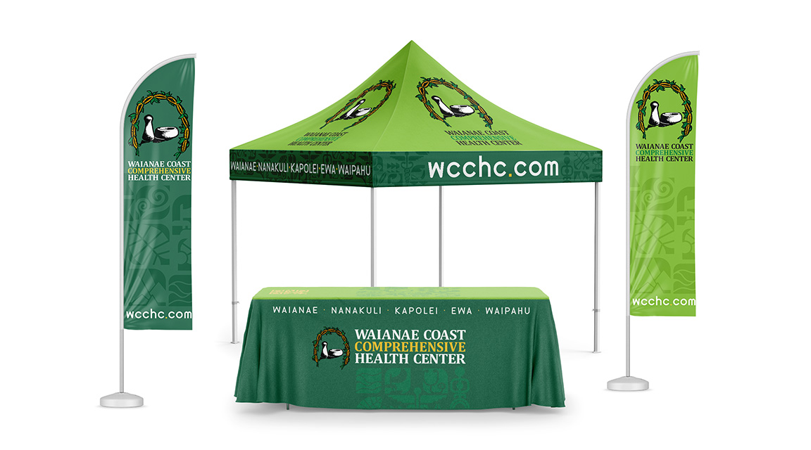
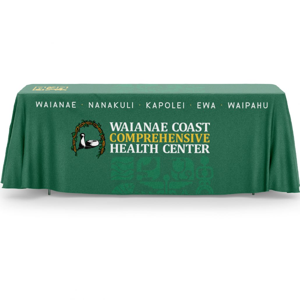
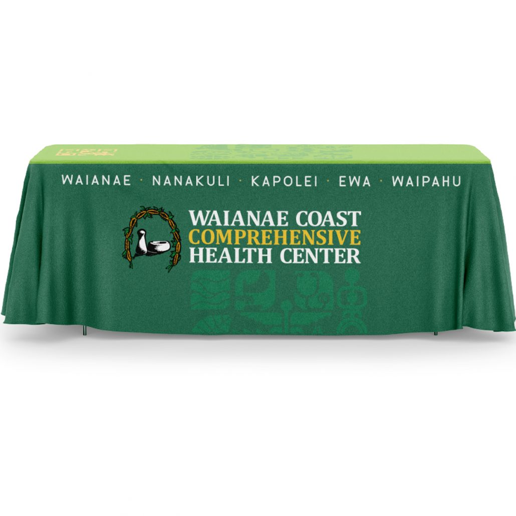
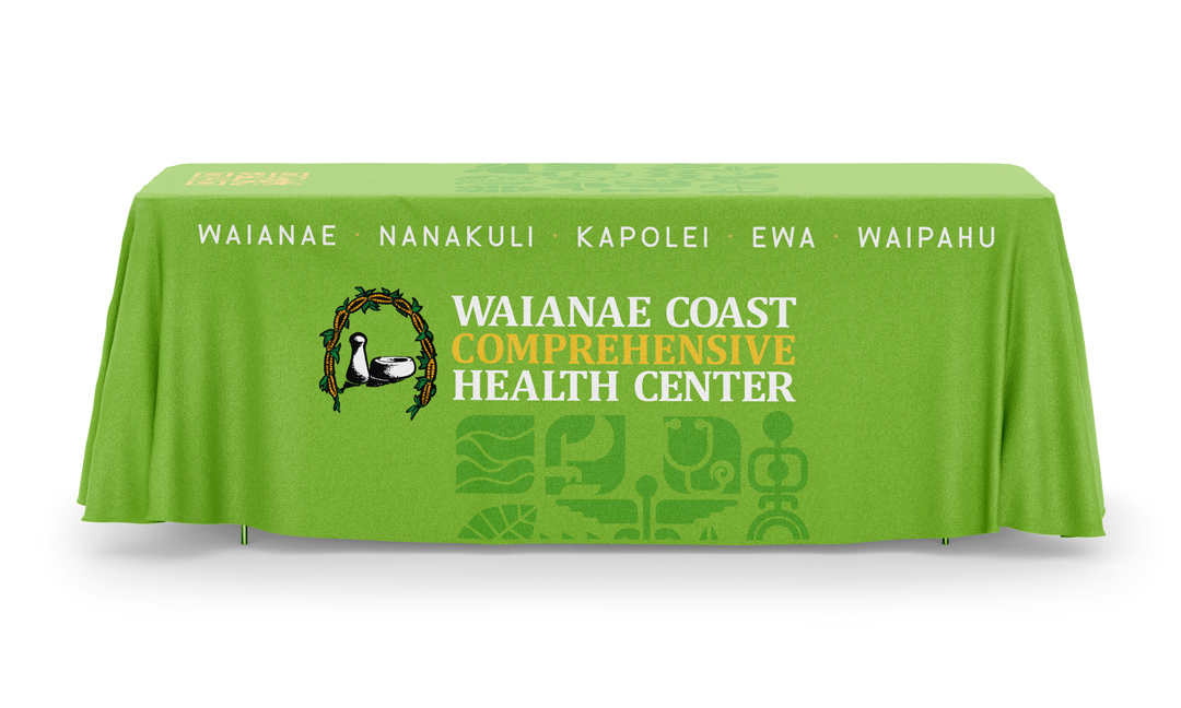
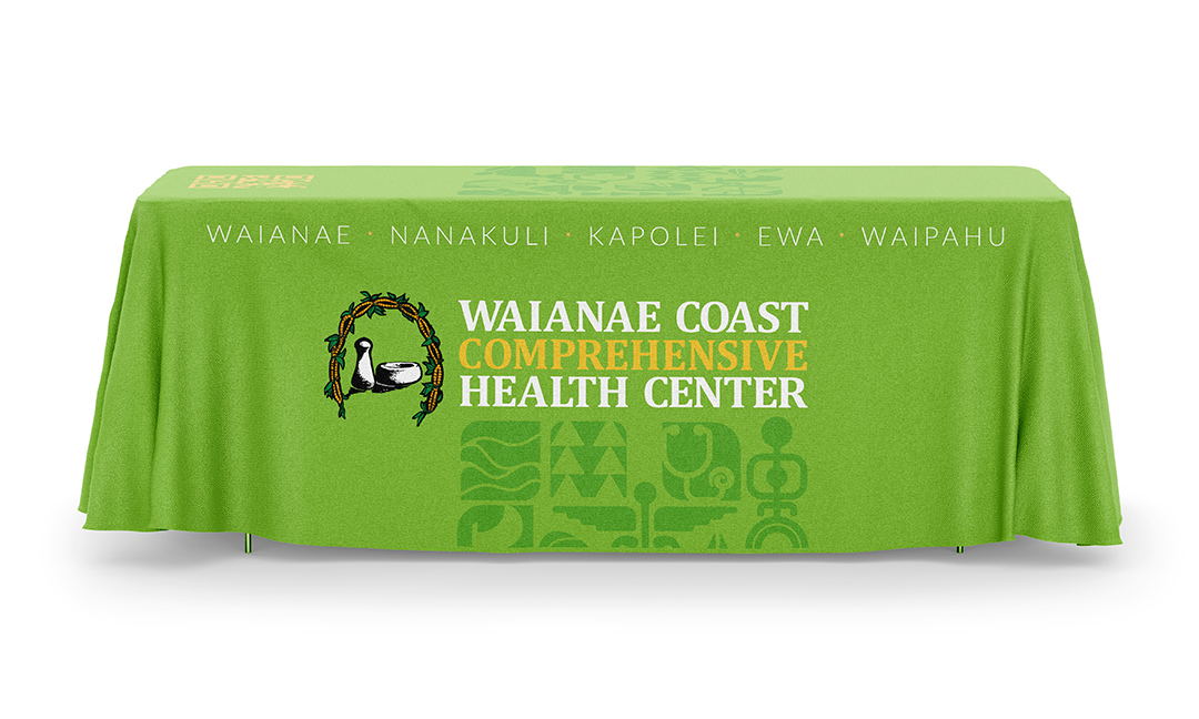
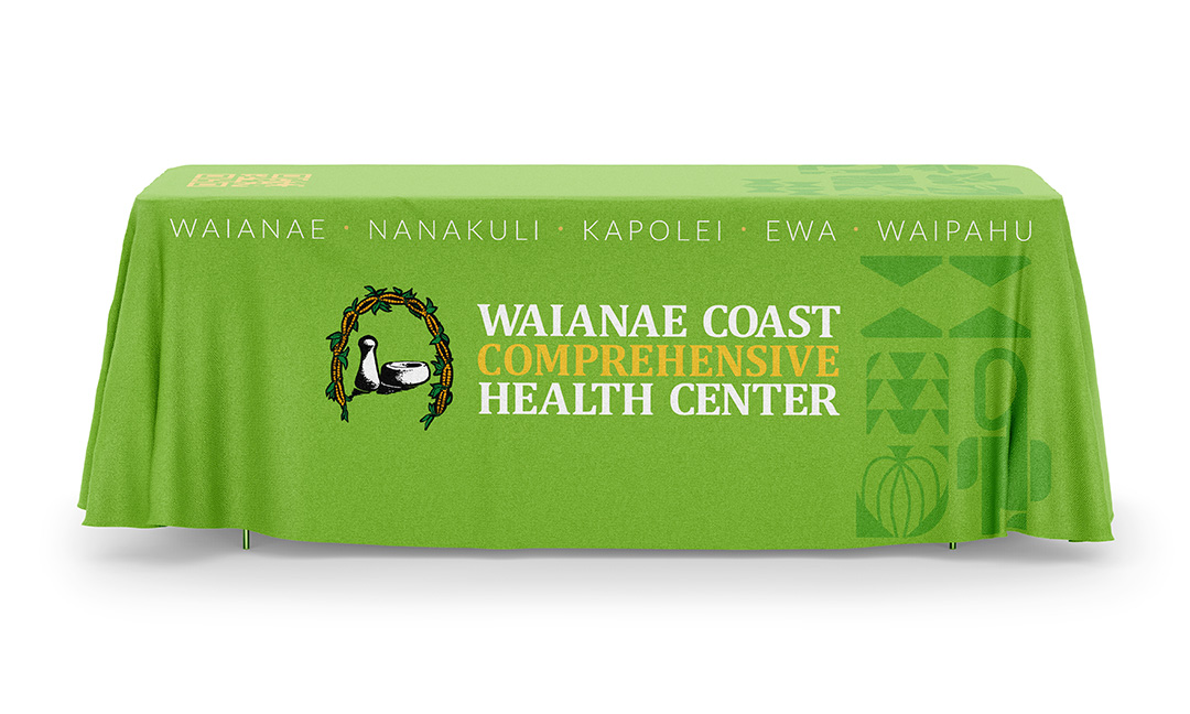
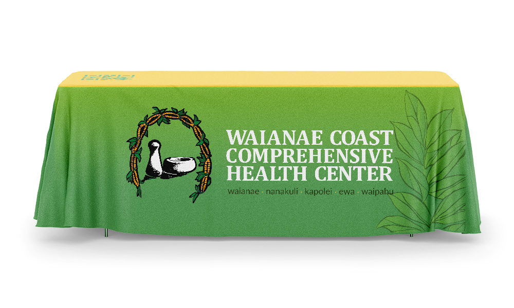
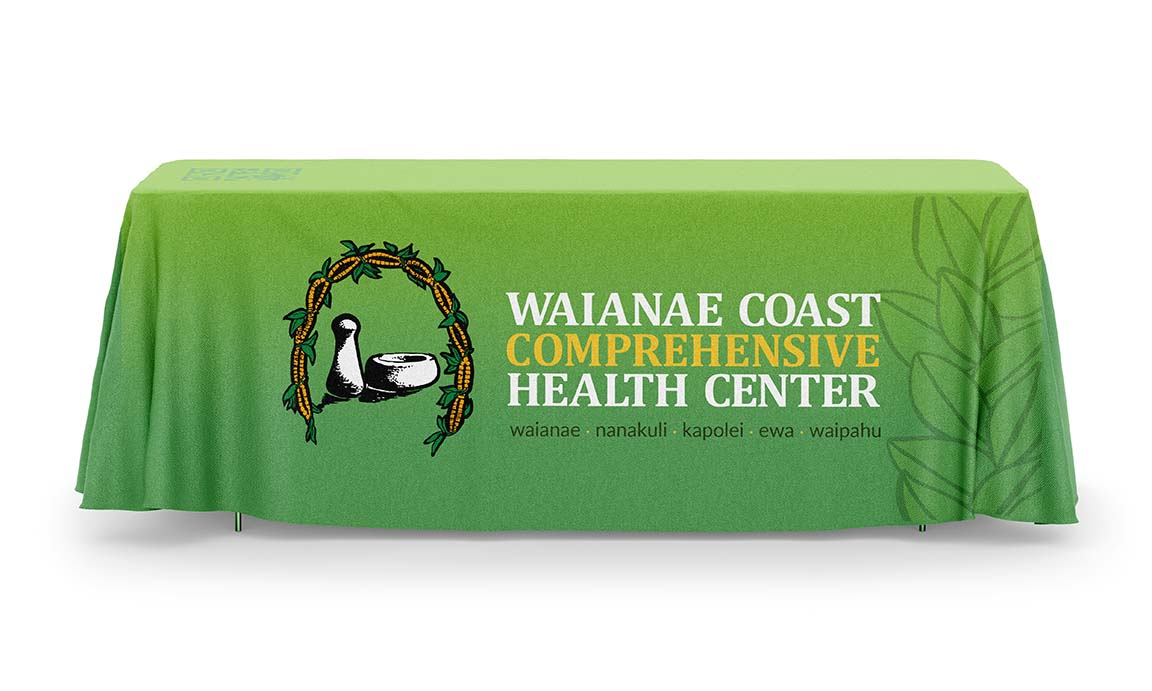
- updated table cover with new pattern and bolder locations typography
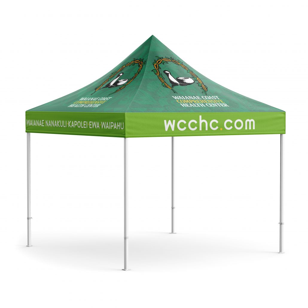
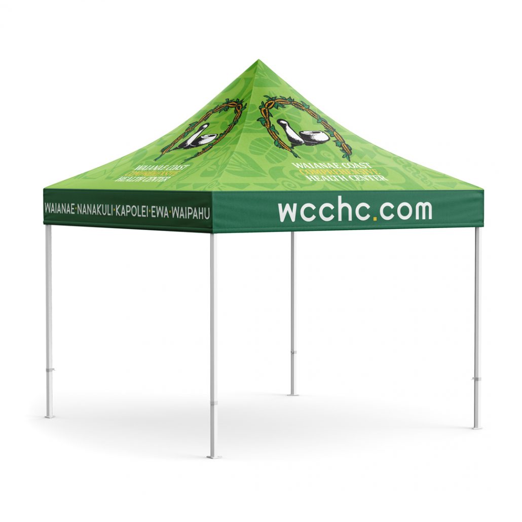
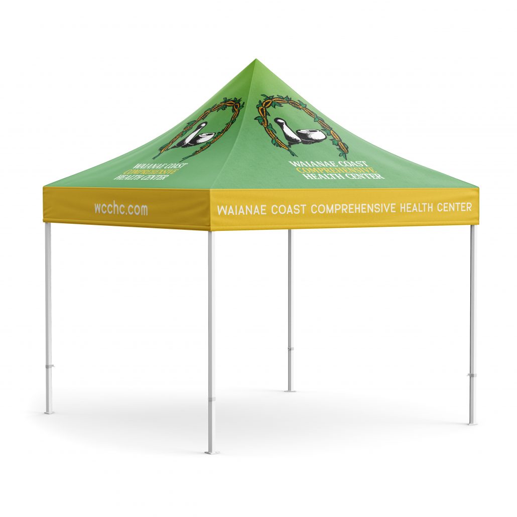
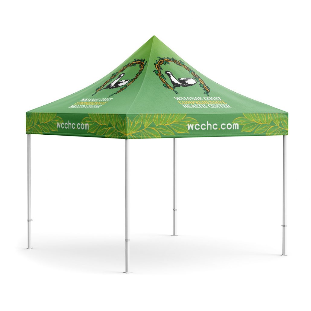
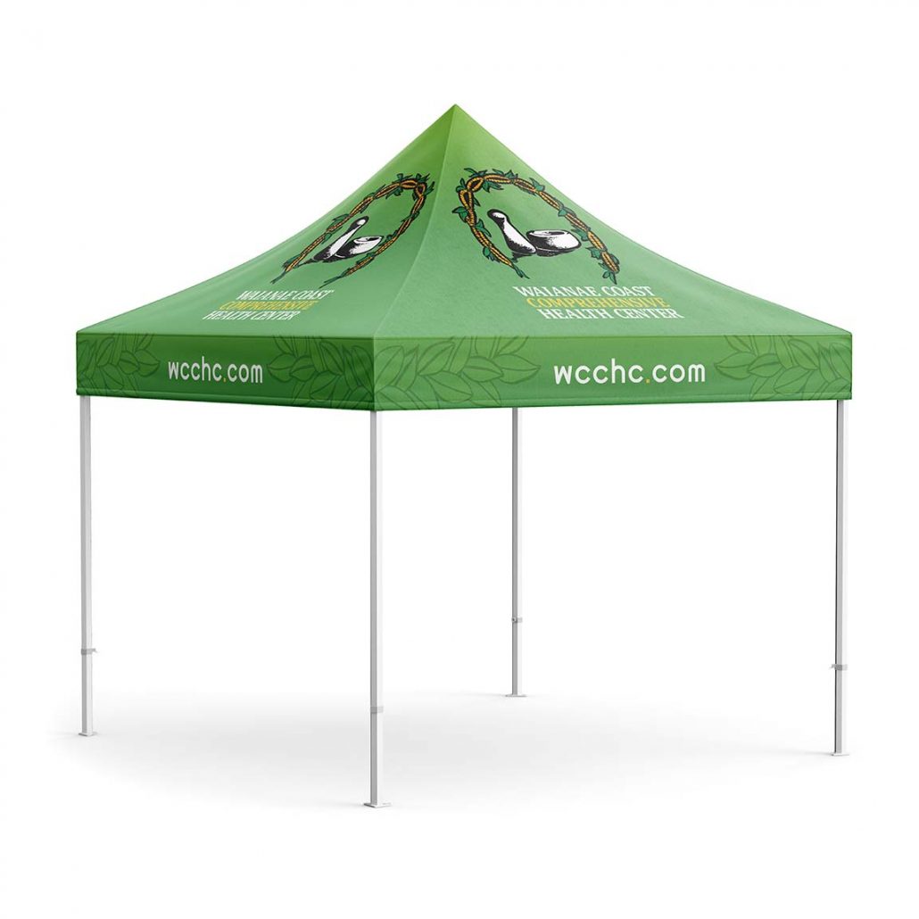
- updated tent with pattern and new typography to take up more space and have a bolder more impactful presence
9/1/22
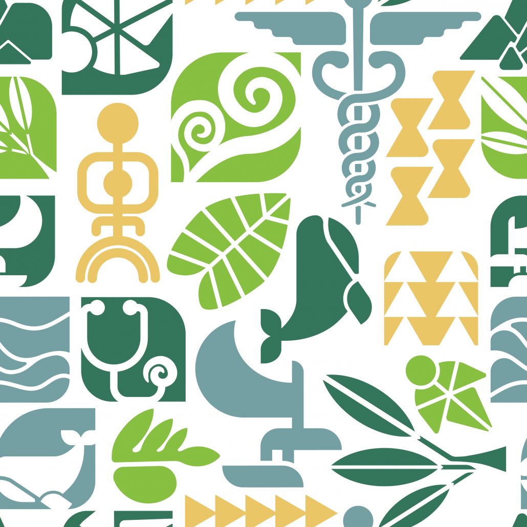
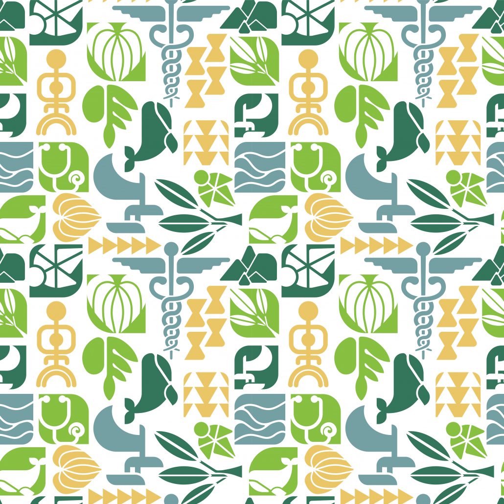
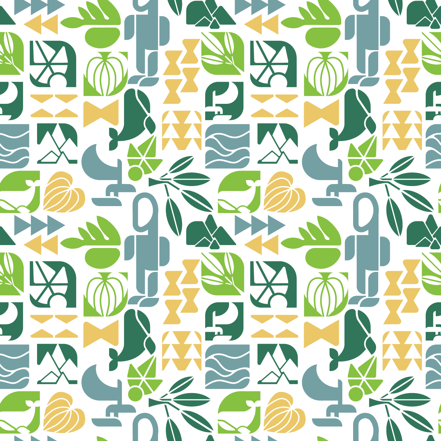
we worked on the revisions of the pattern, adding new symbols based on the notes and removing a couple of them that didn’t work. We also revised the table cover with the new patterns:

Revisit:
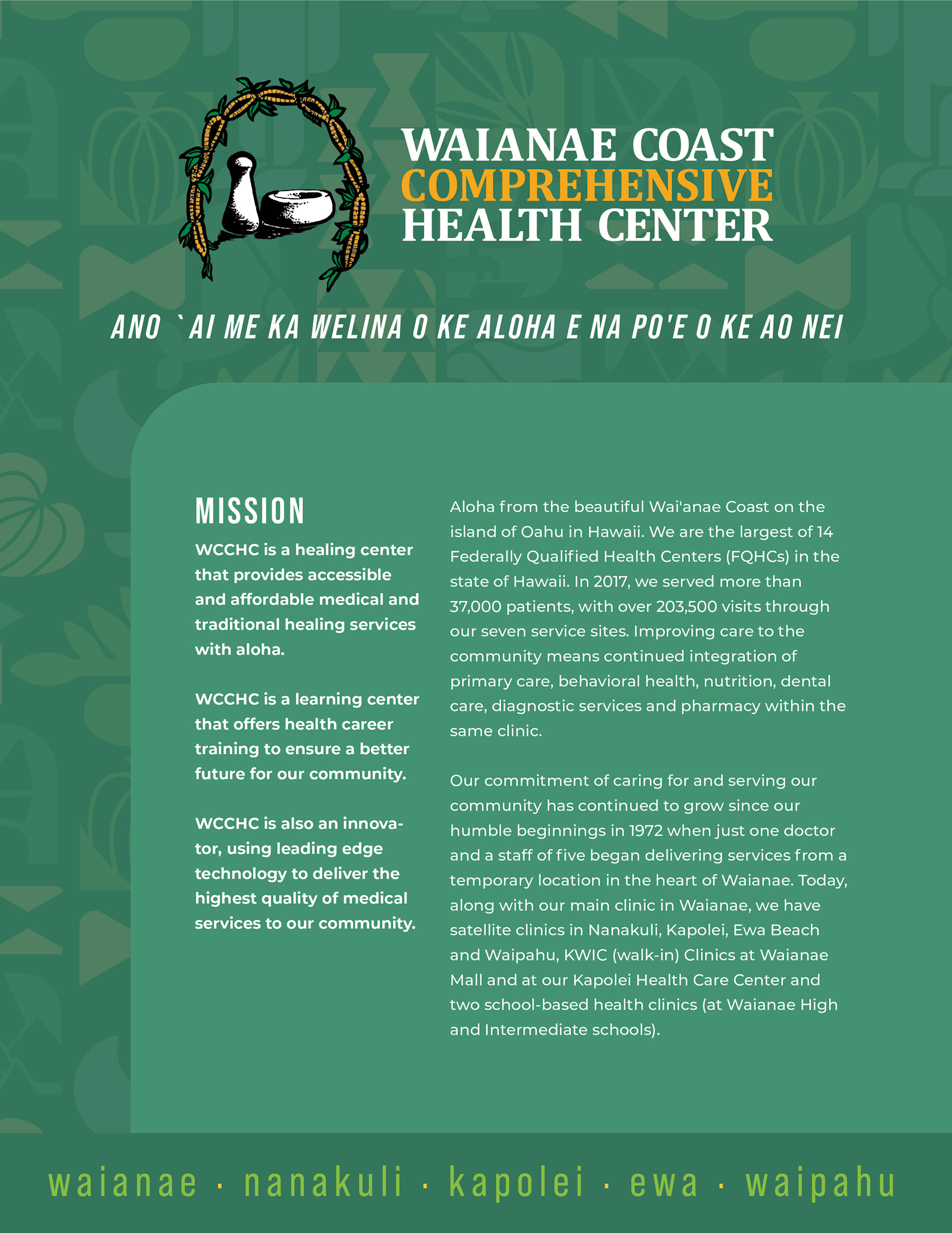
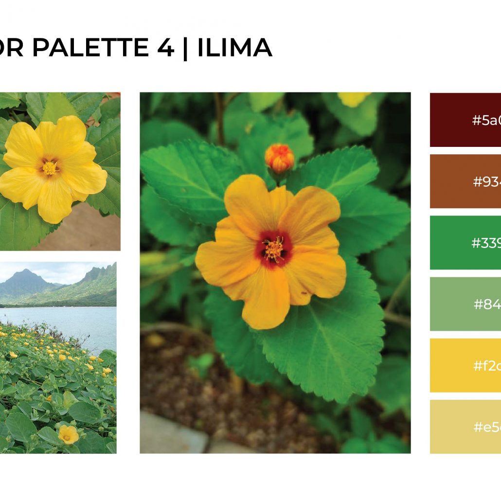
Aloha! Thank you for your time showing me around the center this week. It was very helpful in gathering new research and inspiration for the new direction we are headed in. We revisited the color swatches and took some inspiration from buildings, copper artwork and nature
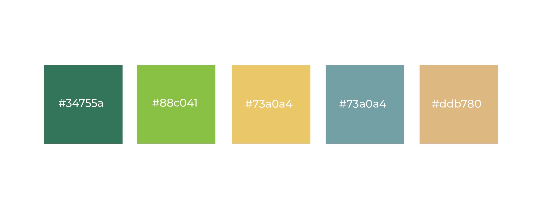
we wanted to elevate the color scheme with adding a few accent colors that are beautiful and fresh
We took the color scheme which we love and began putting ideas down for a creative and new twist to a pattern which is full of meaningful symbols and icons. Below is also a legend to explain each symbol. We carefully combined a variety of important graphics that together serve to tell a story. The styling we chose for the illustrations also brings a very contemporary and unique approach which we feel will help make the brand a recognizable and visually appealing one
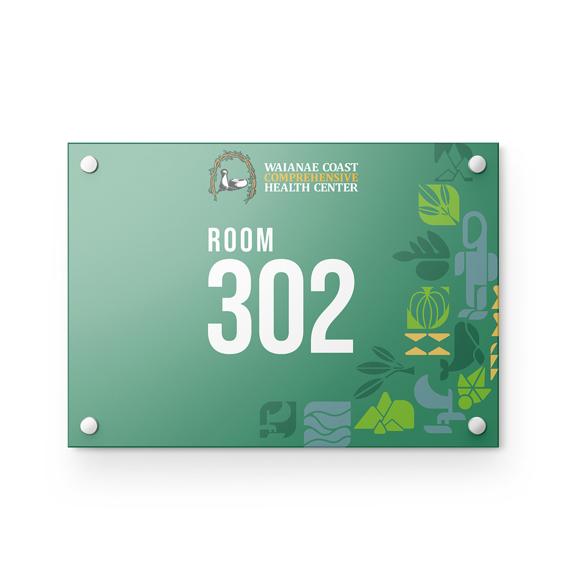
Examples of the possibility of combining colors and patterns: demonstration purposes only
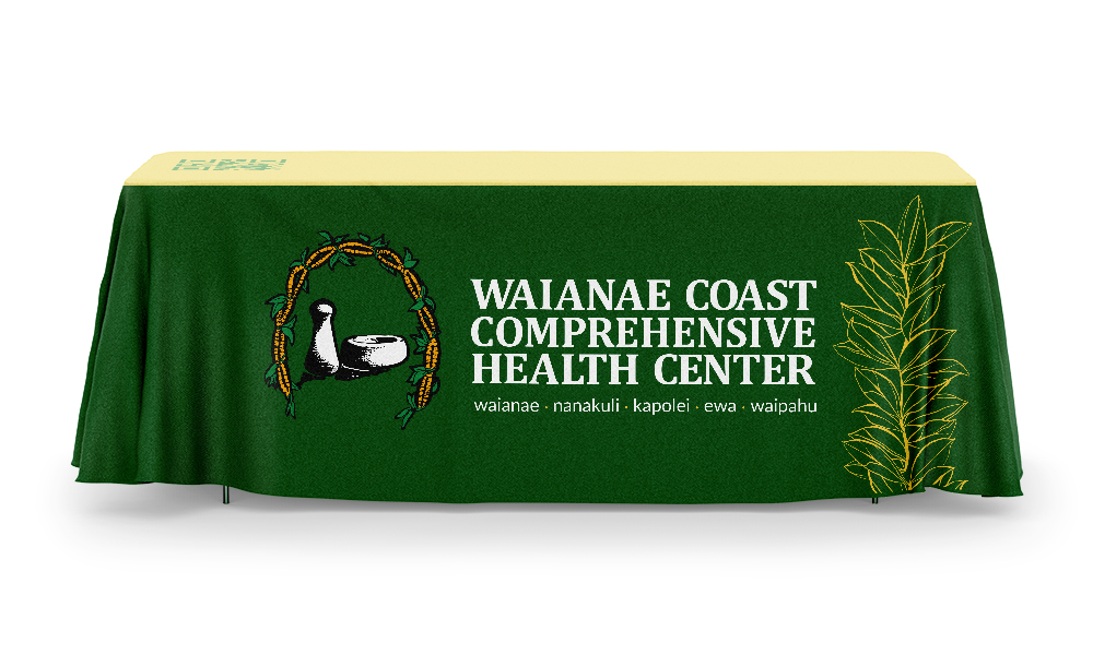
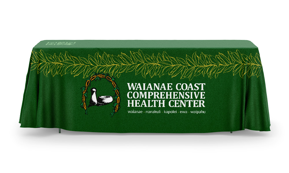
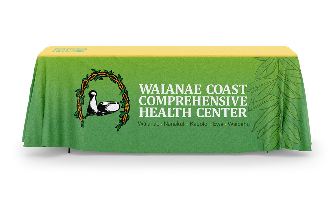
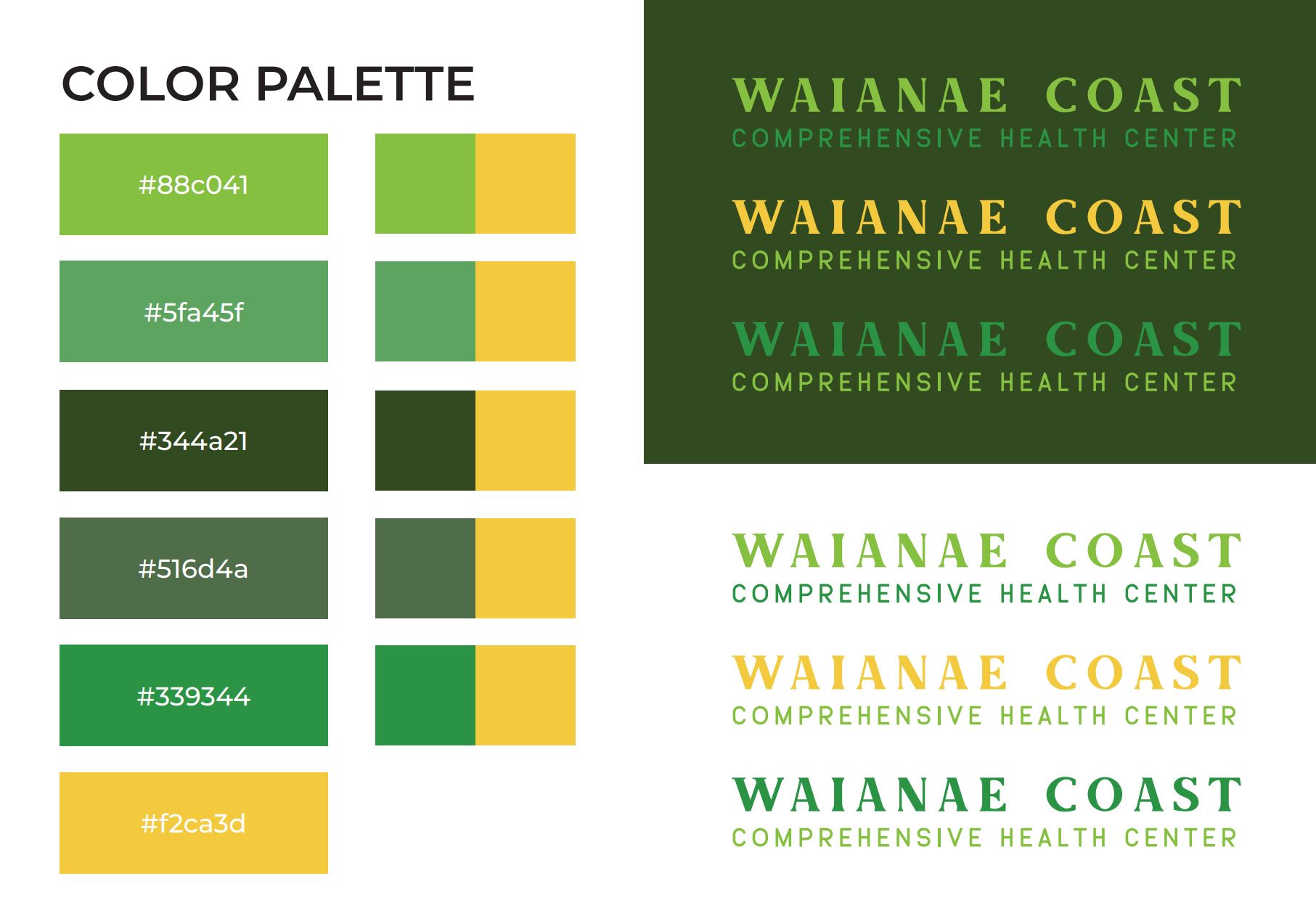
Bolded COMPREHENSIVE text in logo
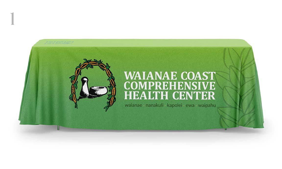
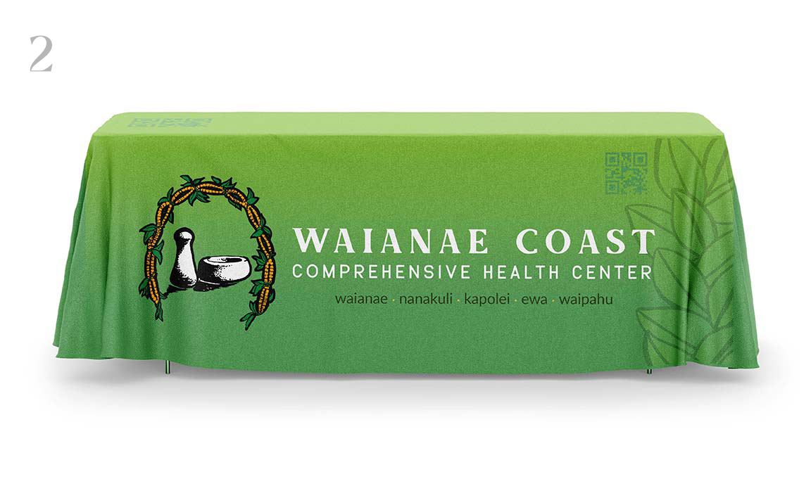
Aloha! We have 3 concepts with two variations in logo typography. We wanted to keep the original logo as is and also present a version with updated typography. The idea between all concepts was to bridge traditional with modern. That is the challenge we are attacking, we wanted to bring elements of traditional Hawaiian motifs that give the branding a sense of nostalgia while bringing it into the modern space. Bold logos and colors make the tables pop and stand out amongst the rest of the competition, we included an option for a QR code either on the front facing side or on top which can be easily scanned by visitors. Let me know what you think! mahalo